Italian Typography History
Italian Typography History
Italian typography occupies a central place in the history of Western printing. Italy was the birthplace of European movable-type printing outside Germany, and Italian printers, type designers, calligraphers, and publishers profoundly influenced the development of Roman type, italic type, book design, and typographic standards.
The Humanist Roman Letter. The foundation of modern Western book typography is the humanist Roman letter. During the fourteenth and fifteenth centuries, Italian humanists developed a style of handwriting based partly on their admiration for classical Roman manuscripts. Humanist scribes rejected the dense, compressed appearance of Gothic textualis in favor of more open, rounded letterforms.
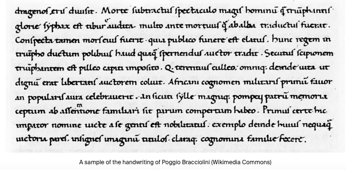
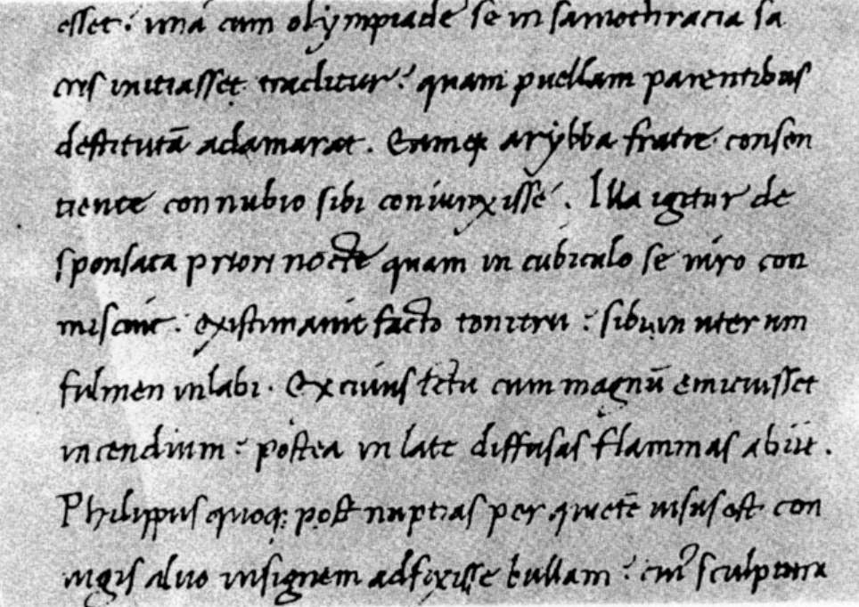
Niccolò de' Niccoli (1364 –1437), an Italian Renaissance humanist, was one of the chief figures in the company of learned men which gathered around the patronage of Cosimo de Medici. Niccoli's chief services to classical literature consisted in his work as a copyist and collator of ancient manuscripts. He corrected the text, introduced divisions into chapters, and made tables of contents. He is also regarded as the inventor of the cursive script, known today as Italic or Cancelleresca. (See my Blog at REFERENCE) (Picture of Niccoli Italic)
Its origins lie in the manuscript and humanist writing of Poggio Bracciolini and Niccolò Niccoli. Poggio Bracciolini, an Italian Renaissance humanist, was born Feb. 11, 1380, in the town of Terranuova, about 20 miles southeast of Florence. Humanists were the people most responsible for discovering the manuscripts of ancient texts and putting the “rebirth” in Renaissance, and Bracciolini was better than most at finding long-lost treasures in monastic libraries. Resolute in glorifying studia humanitatis (the study of "humanities", a phrase popularized by Leonardo Bruni), learning (studium), literacy (eloquentia), and erudition (eruditio) as the chief concern of man, Poggio ridiculed the folly of popes and princes, who spent their time in wars and ecclesiastical disputes instead of reviving the lost learning of antiquity. (Wikipedia)
Printing with movable metal type reached Italy in the 1460s. The first major printing center was Subiaco, near Rome. German printers Konrad Sweynheym and Arnold Pannartze stablished a press there around 1464–1465. Sweynheim & Pannartz ‘Subiaco’ 120R, Proto-Roman first used in Subiaco by Konrad Sweynheim & Arnold Pannartz, for an edition of Donatus in 1465 (no longer preserved) and used until 1467 in four editions in total. Type design workshop with students of ANRT at Biblioteca Statale del Monumento Nazionale di Santa Scolastica, Subiaco, May 2018. Their early types combined characteristics of German textura, Italian manuscript traditions, and Humanist Roman forms.
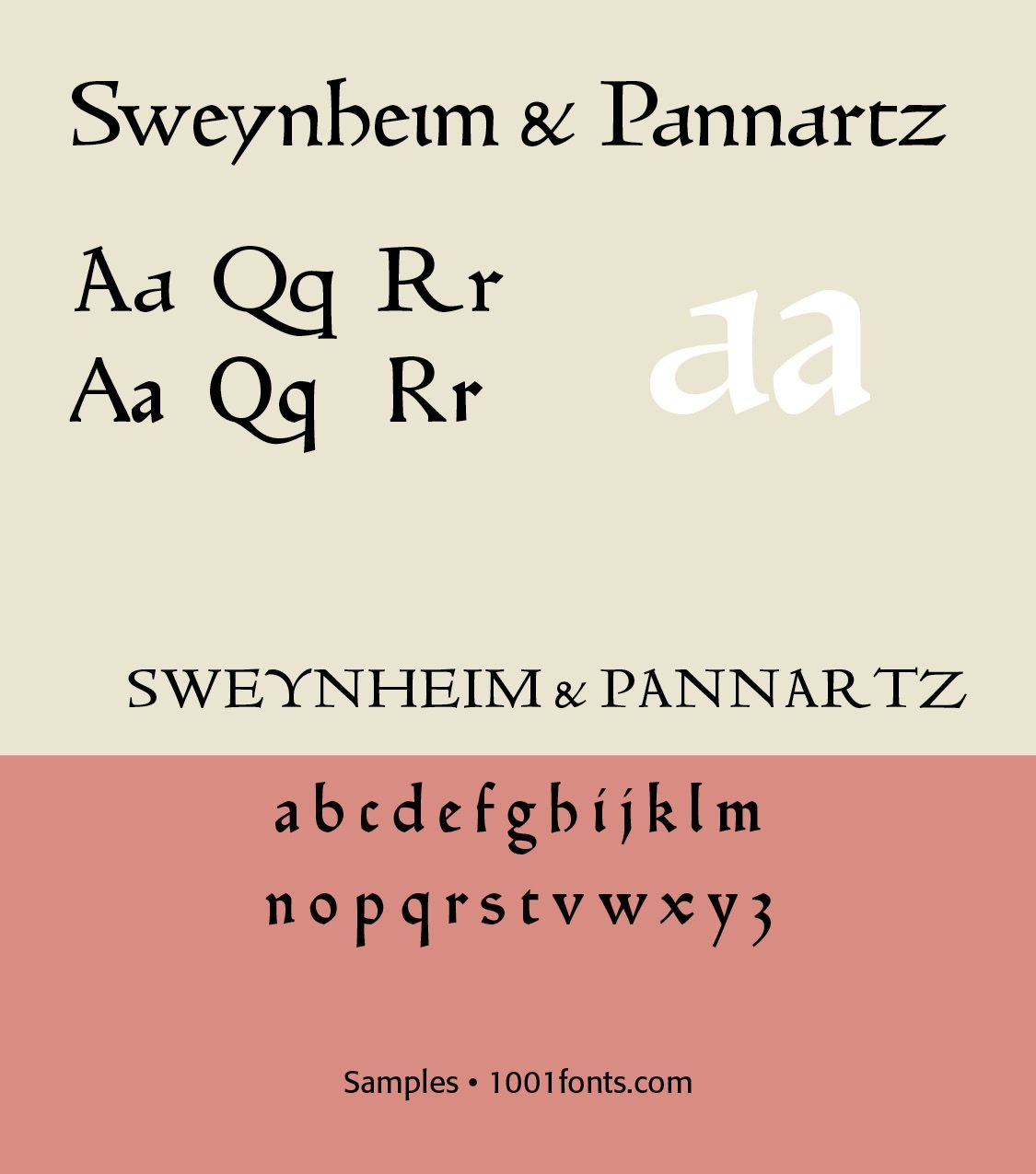
Their work is particularly important because it represents one of the earliest attempts to create a specifically Roman typographic style. In 1467 the printers moved to Rome, where they produced books in a more distinctly humanist style.
The fundamental contrast between ancient Gothic, which is dense, angular, vertical, and Humanist Roman, open, rounded, classical, became one of the defining choices in European typography. The transition from Gothic to Italic typefaces was part of the broader evolution of typography that took place during the Renaissance period, driven by shifts in cultural, aesthetic, and technological factors. Gothic script was primarily used for religious texts, legal documents, and early printed books like the Gutenberg Bible. It symbolized tradition, formality, and authority. Gothic was characterized by its dense, angular, and ornate letters, often with sharp vertical strokes, tight spacing, and elaborate flourishes. It was designed to mimic the style of manuscript writing at the time.
The Renaissance, beginning in Italy in the fourteenth century, marked a revival of classical antiquity and a move toward humanism. This brought a renewed interest in the legible, flowing scripts of Roman and Greek antiquity, which were more readable and aesthetically simple compared to Gothic lettering. The development of the printing press (ca. 1440) by Johannes Gutenberg created a need for more versatile and legible typefaces. The emerging humanist values aligned with a preference for typefaces that resembled the clear, round, and graceful writing of ancient Roman scripts.
Aldus Manutius and the Aldine Press. Perhaps the single most influential Italian printer was Aldus Manutius (c. 1452–1515). He established the Aldine Press in Venice in 1494. Aldus transformed typography in several ways. His innovations included small-format books, portable editions, sophisticated Roman type, italic type, improved punctuation, systematic book design, and editions of classical Greek and Latin literature.
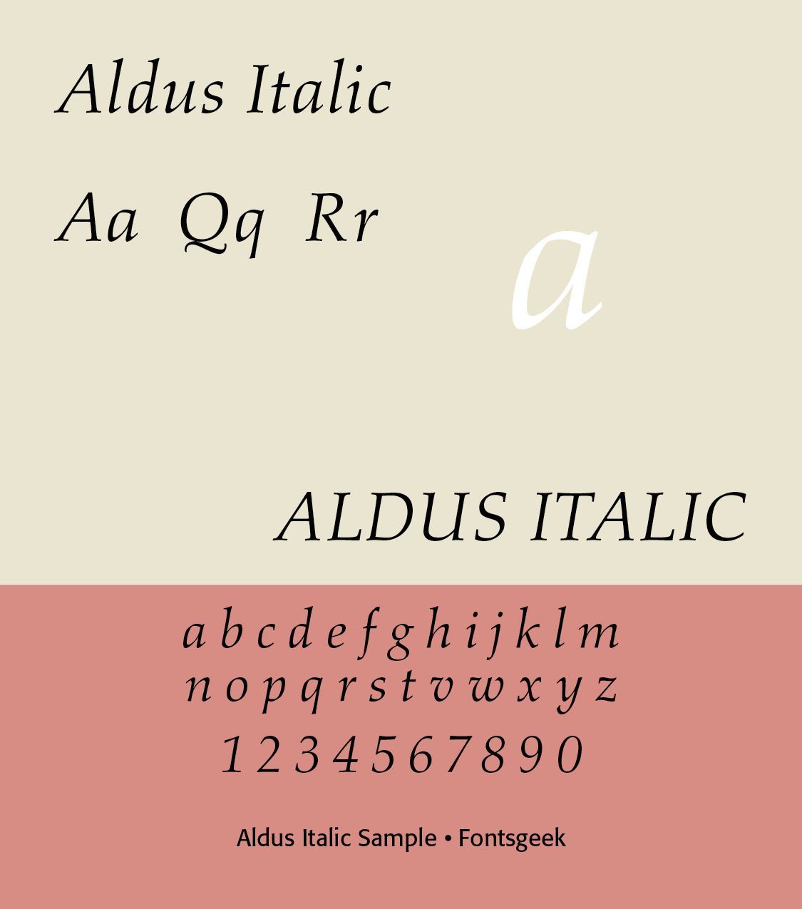
Aldus helped establish the idea that typography should serve efficient, elegant reading rather than simply reproduce manuscript appearance. Aldus's type designer was Francesco Griffo (c. 1450–1518). Griffo created one of the most important developments in typographic history — the early italic typeface. The first major Aldine italic appeared in 1501, in an edition of Virgil. Initially it was not primarily intended as an emphasis face. Aldus used it partly because the narrow characters allowed more text to fit on a page, helping make books smaller and more portable.
Italic type is a cursive font based on a stylized form of calligraphic handwriting. Along with Blackletter (See Blog Jan 16, 2025 Blackletter Type and Universities ) and roman type, italic has served as one of the major typefaces in the history of Western typography.
Italics takes notable influences from hand drawn calligraphy, with italic letters normally slanted slightly to the right. Upper case letters may have typographic swashes, flourishes inspired by ornate calligraphy. The name “italic” comes from their Italian use, to replace documents traditionally written in a hand-written style called chancery hand. Notice also the small “end point bowls” on some of the letters, where the ink pen stopped for a second.
By the late fifteenth century, Venice had become the most important printing center in Italy—and arguably the most important printing center in Europe. Venice possessed several advantages, including international trade, wealthy merchants, educated readers, extensive manuscript traditions, access to paper, connections with the Greek world, and a large publishing market. By the end of the 15th century, hundreds of printers were operating in Venice. Among the most important was Nicolas Jenson, a French printer who established himself in Venice.
Nicolas Jenson (c. 1420–1480) produced some of the most influential Roman typefaces of the Renaissance was a French engraver, pioneer, printer and type designer who carried out most of his work in Venice. Nicholas Jenson has been something of an iconic figure among students of early printing since the nineteenth century when the artist William Morris praised the beauty and perfection of his roman font. Jenson is an important figure in the early history of printing and a pivotal force in the emergence of Venice as one of the first great centers of the printing press.
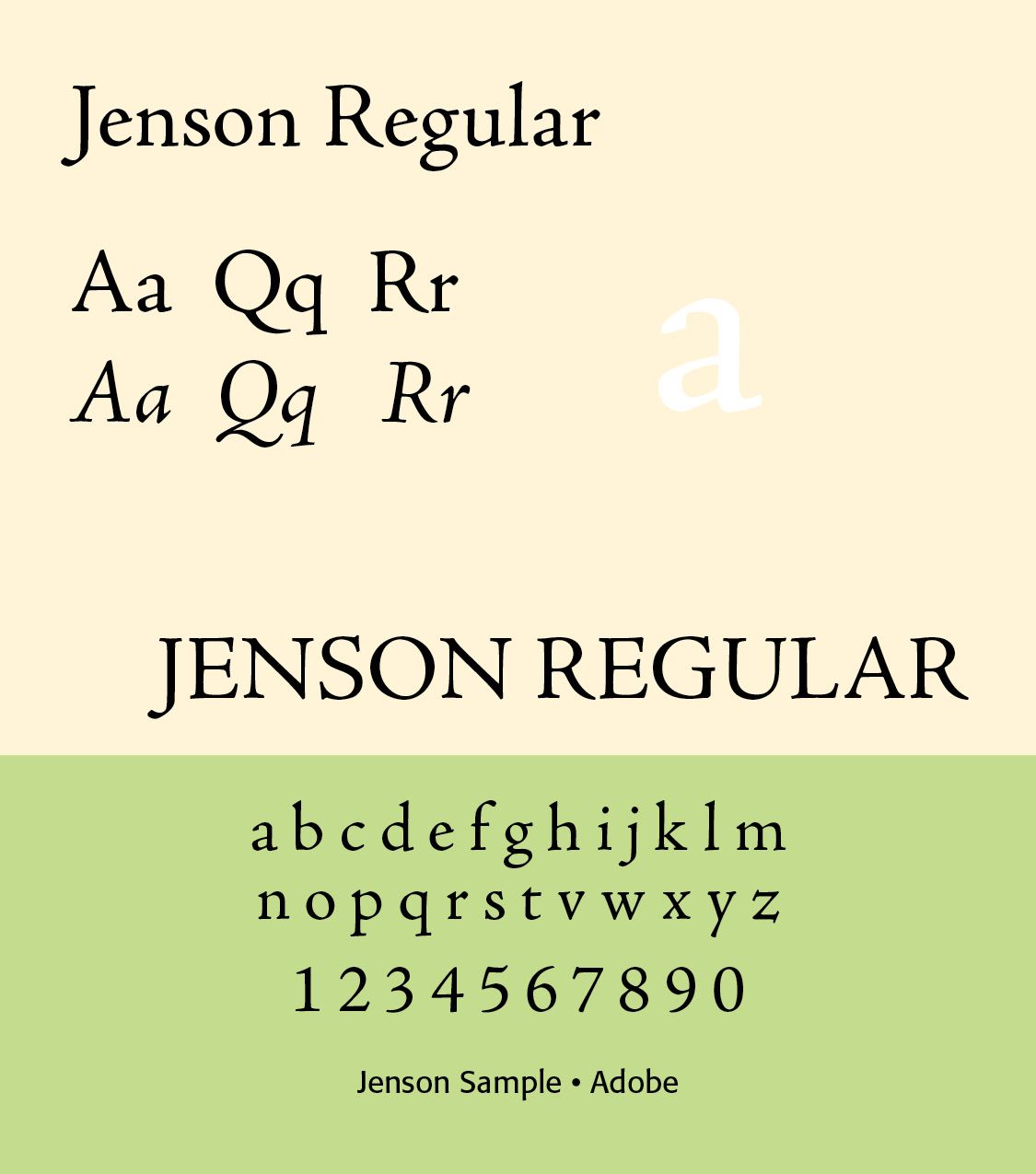
Typeface characteristics of the Jenson type include moderate contrast, bracketed serifs, relatively large x-height, rounded bowls, graceful curves, relatively wide proportions, and a strong distinction between thick and thin strokes. Jenson's type became one of the principal models for later old-style Roman typefaces. Many modern typefaces—including Centaur, Adobe Jenson, and other Jenson revivals—are based upon this tradition.
Renaissance Italian Typography. The fifteenth and early sixteenth centuries established many principles that remain central to Western book typography. Typical characteristics of Italian Roman type were humanist proportions, relatively low contrast, strong calligraphic influence, and bracketed serifs. The Italic faces had slanted axis, cursive construction, narrower proportions, and often connected-looking forms. Page design showed generous margins, relatively restrained ornament, clear hierarchy, classical proportions, woodcut illustrations, and decorated initials.
Seventeenth-Century Baroque Typography. The seventeenth century brought the influence of Baroque design.Typography became increasingly characterized by greater contrast, elaborate title pages, decorative initials, ornaments, engraved illustrations, and more dramatic page composition. Italy remained important for book production, although other European countries—particularly the Netherlands, France, and England—became increasingly influential in type design.Italian typography nevertheless retained its connection to the classical Roman tradition.
The greatest Italian typographic figure of the late 18th and early 19th centuries was Giambattista Bodoni (1740–1813). Bodoni was an Italian typographer, type-designer, compositor, printer, and publisher in Parma. He first took the type-designs of Pierre Simon Fournier as his exemplars, but afterwards became an admirer of the more modelled types of John Baskerville. He and Firmin Didot evolved a style of type called “Modern.” in which the letters are cut in such a way as to produce a strong contrast between the thick and thin parts of their body.
He published the Manuale typografico of 1818, the specimen book to end all specimen books. Published in two volumes, it was over 600 pages long and contained 265 pages of roman characters, “imperceptibly declining in size, romans, italics, and script types, and the series of 125 capital letters; 181 pages of Greek and Oriental characters; 1036 decorations and 31 borders; followed in the last 20 pages by symbols, ciphers, numerals, and musical examples. (Wikipedia)
His typefaces are characterized by extreme thick/thin contrast, vertical stress, unbracketed or minimally bracketed serifs, geometric construction, hairline serifs, highly regular proportions, and strong verticality. Bodoni's typography represented a major transition away from the relatively organic old-style Roman toward the modern or Didone tradition.
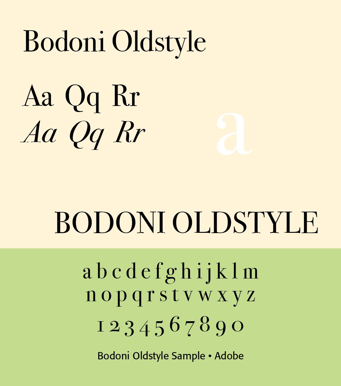
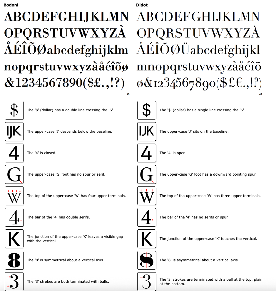
In the typographic world there is most always a comparison between Bodoni and Didot. In general, Didot's are more rigid (thinner hairlines, untapered serifs (or: lack of bracketing) as in the tops of "W", "V" and "l"). But some Bodoni's have untapered serifs and some Didot's are tapered, hmmm. Florain Hardwig (see graphic) identifies the characters that give it away for him: "a" (Didot has a droopy counter), "l" (top), "W" (top), "t" (Bodoni's top very tapered), "J" (Bodoni drops below baseline), "Q" (Bodoni has a dog's tail, Didot has a French feather).( https://luc.devroye.org/fonts-51273.html) Note the Identifont Differences
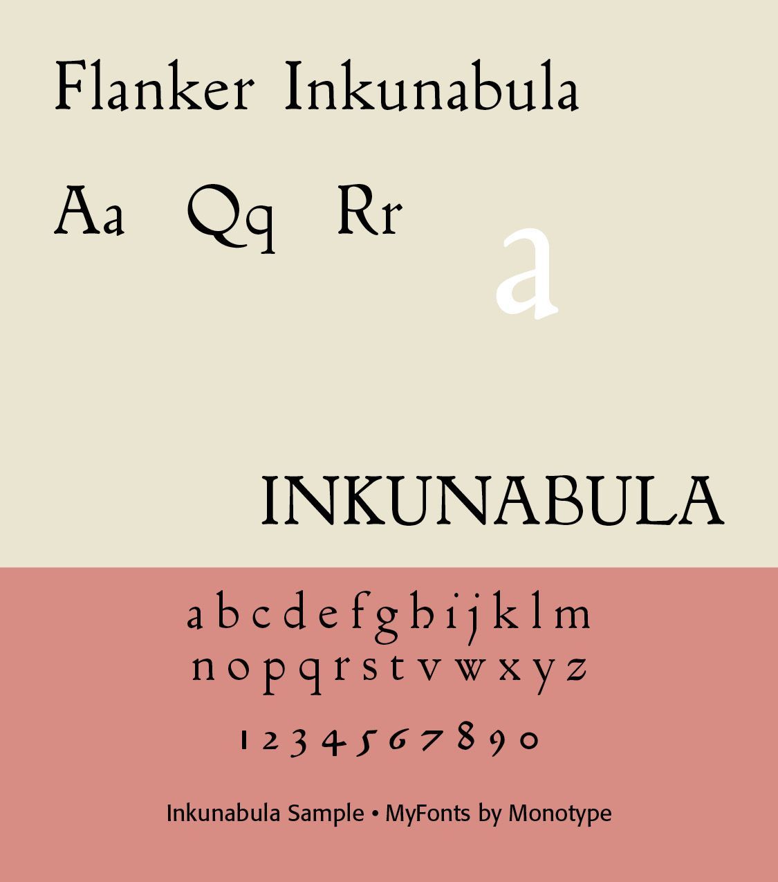
Nineteenth-Century Italian Typography. The 19th century brought industrialization. Italian typography was affected by steam-powered presses, mechanized typesetting, lithography, chromolithography, commercial advertising, newspapers, posters, and mass-produced books. Typography became increasingly divided between traditional book typography and display or commercial typography. Bodoni's forms became especially popular for display purposes. Type designer from Florence, 1875-1941. Bertieri held the position of artistic consultant of the Nebiolo Foundry for most of his life. He made or supervised the production of these typefaces. Inkunabula (1911, Società Augusta). This Venetian typeface is based on the roman of Erhard Ratdolt (1476).
END PART 1
Successful Layout & Design