Advanced Practical Typography: A Review of Walter B. Gress’s Contribution (3)
Display, Ornamentation & Book Typography
As mentioned in Parts 1 & 2 of this series, Walter B. Gress was associated with the American printing trade during the era when letterpress printing, hot-metal composition, and mechanized presses dominated commercial printing. Rather than introducing new typefaces or typographic theories, Gress focused on practical craftsmanship, emphasizing accuracy, efficiency, and standardized production methods.
Gress was most interested in the professional ideals of American commercial printing in the early twentieth century, consisting of legibility over ornament, consistency in composition, careful spacing and alignment, correct use of type families, high standards of proofreading, and the efficient workflow in the composing room. His work and teaching occurred during a transitional period in printing history, where hand composition still existed alongside mechanical typesetting. Linotype and Monotype systems were becoming standard. Commercial printing was expanding rapidly. Trade schools increasingly required instructional texts.
Our overview will consider topics from his practical textbook, Advanced Typography, Instructor in Typography, Carnegie Institute of Technology, Pittsburgh, Pennsylvania, Member, American Institute of Graphic Arts (United Typothetae of America, Washington, D.C., 1931). He was most interested in type choices, harmony of type, balance in typographic composition, tone and contrast, legibility and proportionality. Display type should be applied sparingly. His advice covered detailed book composition, and in display work, everything from business cards, envelopes, letterheads, billheads and statements, receipts, banking forms, rule forms, tags and labels, tickets, blotters, announcements, and handbills, to window cards and posters.
Gress worked during the age of metal type, hand composition and offset presses. His advice is somewhat dated, but highly advisable for do-it-yourself-printing and desktop publishing.
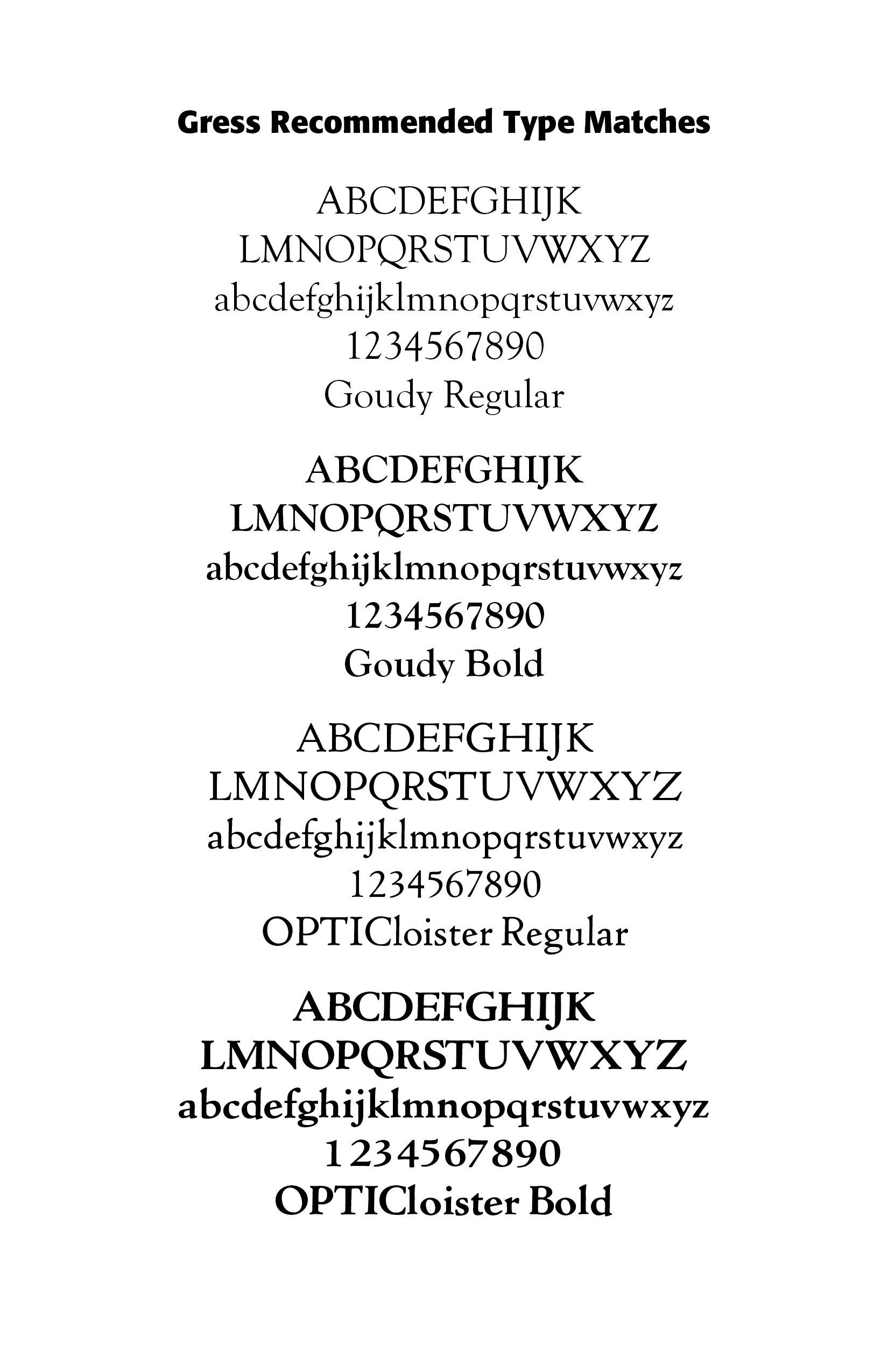
Cloister Oldstyle was designed by Morris Benton in 1913 and released by ATF early the next year. It follows quite closely the noted roman typeface used by Nicolas Jenson in 1470, but is slightly heavier to compensate for the improved printing conditions and smoother papers of the present time. Cloister Bold was designed in 1913; it and Cloister Bold Italic were cut in 1915. (https://luc.devroye.org/fonts-71337.html)
Display & Ornamentation
As you might well guess, Gress applied very conservative, early twentieth century measures, to display type and ornamentation. This advice especially applies to “handbills” or advertisements. “Decoration should be applied very sparingly. If any ornaments or decorative borders are used, they should be especially fitting, and thus justify their use. Plain rule borders are often used on this class of work.”(290)
Again, Gress wants the typographer or printer to stay within the boundaries of one typeface, thus, Goudy Bold with Goudy Light, or Cloister Bold with Cloister Oldstyle. If more than one typeface is used, “make sure that the letters have enough in common that they do not clash with each other. Do not try to display everything, but select the main items, and stress them. All display is no display. . . . Gauge [gage] your plans by the standards of Contrast and Simplicity, and your results will rarely be disappointing. . . . The general principles of good typography should govern all composition.” He goes on to say, “There are many type-faces that are suitable for announcement cards and folders. Very bold or heavy faces should not be used.”(290) (ILLS)
Ornaments, known to printers as “metal flowers,” Gress says “are a two-edged sword in the hands of the unskilled” — “Many an otherwise nice typographic arrangement has been ruined through the use of inappropriate decoration, or by the use of any decoration at all. It is quite obvious that the twenty-six letters of the alphabet are meaningless by themselves and have value only when arranged into words. In like manner borders serve no particular value when arranged in strips or panels.” His advice here is to use “restraint” with its “tone” not heavier than the type with which it is combined.
While simplicity and contrast are standing rules for display copy, cultural trends and expectations here play a significant role. The Victorian ornamentation-laden announcement will look quite different than the Bauhaus bold sans-serif type, strong diagonal lines, clear visual hierarchy announcement or the Neoplasticism of the De Stijl movement. To define contrast and simplicity so narrowly is to negate much of later poster and announcement work. Art Nouveau display fonts were highly decorative, and tied to the broader artistic revolt against rigid academic styles, such as those Gress advanced. Here, all display IS display! If we define all type as necessarily “legible,” we miss the decades of display typography and art.
Book Typography
Gress offers an extensive outline as to what should go into book production and where typical book items should be placed —
1. Book indentions should not exceed one em.
2. Measures longer than twenty-four picas should be avoided.
3. The space between sentences in a paragraph should be the same as the space between words in the line.
4. Related typefaces only should be used.
5. In selecting a suitable typeface, consideration should be given to both legibility and beauty.
6. Borders should not be used on title pages unless appropriately related to the content.
7. Extra leading between paragraphs of straight reading matter should be avoided.
8. The last line of a paragraph should not appear at the top of a page.
9. The running heading, and folio when used at the bottom of the page, should not appear more than six points from the type page.
10. Short-descender types should be set at least two points leaded.
11. Sub-headings may be set in italic capitals and lower-case, Roman capitals, capitals and small capitals, or in small capitals only.
12. Footnotes generally should not be set smaller than eight-point. (124–125)
While he says that book margins are generally a matter of “what looks right to the eye,” he offers a more mathematical way of margin determination — “The formula is as follows: Back margin equals one-eighth of width of paper page. Top margin equals same as back margin. Outside margin equals space equal to top margin plus one-third of combined back margins. Bottom margin equals outside margin plus two picas.” (125)
Moreover, everything should be in its “right place” — DEDICATION on the first right-hand page following the Title page; the PREFACE is on a right hand page and follows the Dedication. An initial letter “may be used to commence the first page of the preface or introduction only when one is used to begin the other important sub-divisions of the book.” QUOTATIONS should be set in a separate paragraph if more than a few lines. FOOTNOTES are set in type two or three sizes smaller than that used for the main text, indicated by standard reference marks or “superior figures.” COPYRIGHT and IMPRINT immediately follows the title page, with small type, “generally not larger than eight-point caps and lower-case or small caps.”
CUT-IN NOTES are “set in type of the same face as the text, but two or three sizes smaller, If this style of note is used in advertising booklets or circulars, as is often the case, a heavy faced letter is sometimes used. . . None should be set into the paragraph to which reference is made, and should be far enough down in the paragraph to be covered by at least three full lines of type. The white space should be equal on three sides of the note.” Modern typography would allow, and even recommend, variation in style and type for cut-in notes.
Gress recommends the Golden Oblong, introduced by the Greeks many centuries ago, “based on the division of spaces on the ratio of three to five. The width will be three-fifths the length of the long side. For more information, see my Blog “Grids, Type and the Golden Ratio” at https://www.caretypography.com/grids-type-and-the-golden-ratio.
Modern book typography and printing generally adhere to Gress’s standards, but digital book printers usually have their own specifications as to margins and sizes.
Concluding Note
“And now a word of caution for the student of typography concerning the application of so-called "rules" laid down for his guidance in handling types. A blind adherence to dogmatic direction in most cases produces a mechanical result, and while it is necessary to prescribe certain clearly defined methods of procedure, the compositor, as he grows in wisdom in his typographic art, finds that the formulas given to him are to be used only in a general sense, and are not intended to be applied literally in every case.(59)
Successful Layout & Design