Wide Is Beautiful
Wide Is Beautiful What makes a typeface beautiful? Aesthetically pleasing fonts or typefaces have differing qualities that make them suitable and beautiful in different contexts and uses. I have chosen six (6) wide or "extended" font faces to highlight the inherent beauty and usability of such type. The samples chosen range from well used Adobe fonts to a specialty antique wide font CARE Typography crafted from an old fashioned type book published by Frederick Nelson Phillips, Inc of New York back in 1945.
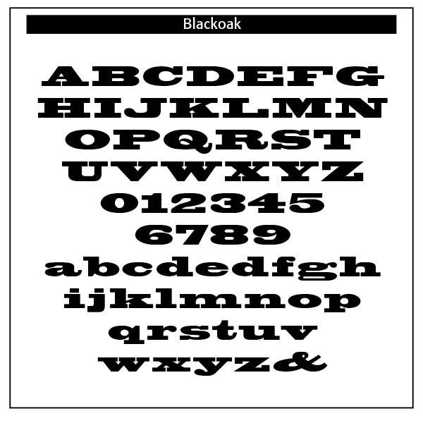
Blackoak. Blackoak is an Adobe font face designed by Joy Redick from Adobe Originals. Blackoak has been adapted from proofs of wood type from the collection at the Smithsonian Institution, has slab serifs and extremely wide letterforms. Used sparingly, Blackoak makes an arresting display type.
The Adobe Originals program started in 1989 as an in-house type foundry at Adobe, brought together to create original typefaces of exemplary design quality, technical fidelity, and aesthetic longevity. Today the Type team's mission is to make sophisticated and even experimental typefaces that explore the possibilities of design and technology. Typefaces released as Adobe Originals are the result of years of work and study, regarded as industry standards for the ambition and quality of their development.
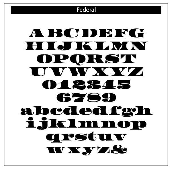
Federal. Designed by Erik van Blokland. From LettError. Instantly recognizable as the voice of a nation, Federal Regular is an amalgam of massive triangular serifs and curvaceous counters. An asset to all documentation whether analog or digital, the high-contrast letters are a proclamation of fiduciary responsibility. In type we trust.
HWT Roman Extended. Designed by Jim Lyles, Miranda Roth, and William Hamilton Page. From Hamilton Wood Type Collection. HWT Roman Extended Fatface is credited to Robert Thorne just after 1800 in England, is considered to be the first type style designed specifically for display, rather than for book work.
English punchcutter and typefounder (1754-1820, North London), designer of the first fat typefaces, founder of the Fann Street Foundry in 1794 and active until his death in 1820, when his foundry was sold to William Thorowgood a few months after his death. Designer of one of the first fat didone typefaces, Thorowgood (1809), and of Thorne Shaded (1820; Thorne Shaded was part of the Reed foundry material, had defective matrices, so Stephenson&Blake had it recut by Karl Gomer in 1938-1940). As metal typeface, Thorowgood was featured in 1953 by Stephenson and Blake.
Quoting from the typophile wiki: In 1794 Robert Thorne purchased the foundry of Thomas Cottrell, a former employee of the original William Caslon, which had been founded in 1757 when Cottrell and Joseph Jackson were fired in a wage dispute. By 1798 Thorne had replaced all of Cottrell's types with his own designs and in 1801 was the first type founder to begin showing the fat typeface types. He went on to design many popular display typefaces. He also moved the foundry to Fann St. renaming it the Fann Street Foundry. Upon Thorne's death in 1820 the foundry was purchased at auction by William Thorowgood using money he had won in a lottery though he was never involved in the type founding business. Subsequently many of the types identified as Thorowgood's are actually the designs of Robert Thorne. Author of Specimen of Printing types (1794, 1803, 1814). (Information from https://luc.devroye.org/fonts-24776.html)
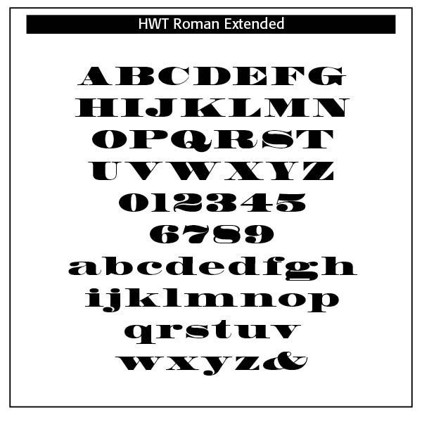
Hamilton Wood Type Collection, established in 2012, is a joint venture between P22 Type Foundry and the Hamilton Wood Type & Printing Museum. The founding goal was to safeguard a typographic era and make classic wood type designs available as digital fonts for modern audiences.
This historical collection of serif revivals, sans reinterpretations, decorative embellishments, script reclamations, and original chromatic designs is stunningly relevant and usable for any imaginative design practice.
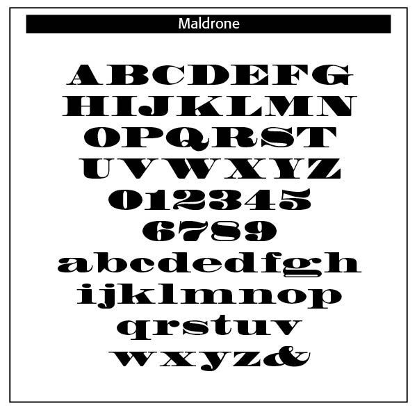
Maldrone. Designed by Barbara Lind. From Adobe Originals.
Madrone is an Adobe Originals typeface designed by Barbara Lind in 1991. Madrone was digitized from proofs of the wood type collection in the National Museum of American History in the Smithsonian Institution in Washington, D.C. A fat face roman, Madrone is typical of popular early nineteenth-century styles. Fat face types are characterized by their squatness and extreme letter width; one familiar version of this design is Bodoni Ultra Bold. Madrone is eye-catching for display uses in advertising and packaging.
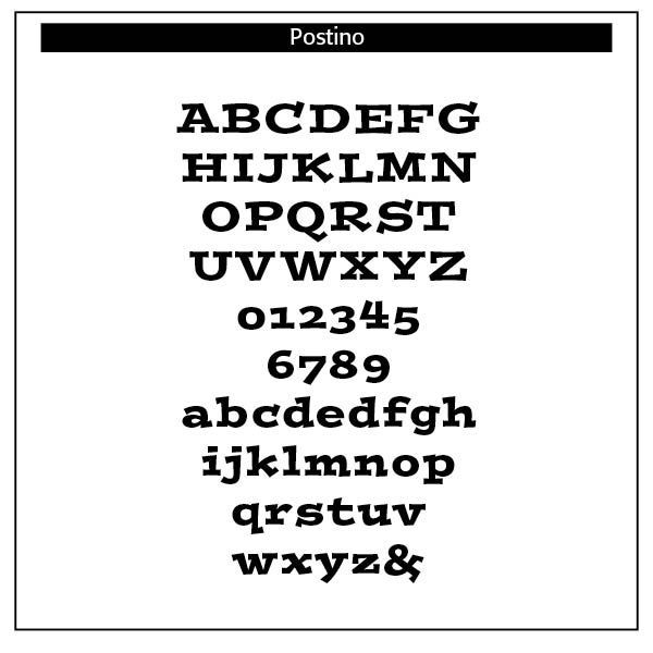
Postino. Designed by Tim Donaldson. From Adobe Originals.
Tim Donaldson, creator of Banshee and Coriander, brings us Postino - a quirky display type modeled roughly on the typewriter face, Courier. Sturdy yet playful, Postino is aptly named by the Italian word for postman or courier. Skimming through a back issue of Visible Language (a journal about written language), Tim was taken aback by the robust beauty of an emboldened Courier typeface. The book designer had used the face to make "cheeky little headlines and they looked superb." Tim decided the world needed a typeface like this but one that "poked its tongue out" even a bit more, while still wearing its functional clothes. After doodling for some time, Postino and its Italic companion worked their way into being on Tim's computer screen. Not-entirely-serious headlines, CD covers, children's books, and advertising copy are all excellent uses for punchy Postino. U.S. Patent Design 415,518.
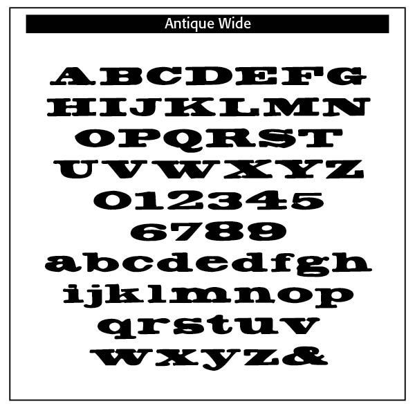
Antique Wide. Antique Wide is one of the historic fonts advertised by Frederick Nelson Phillips in his Old Fashioned Type Book (1945). CARE Typography has digitized this face as part of its ongoing mission to bring to light typefaces that have long since been forgotten or unused but played an important role in text and advertising pieces in days past. This is a serif "fat" face with shortened verticals, a full face with numerals and minuscules.
This website offers a number of rediscovered and digitized faces from pen and hand written type faces of the past. You are invited to check us out and order any number of these faces for your own use in today's world.
Successful Layout & Design


