Font Restoration Mechanics
Font Restoration Mechanics. Let me begin by giving an example from the world of theology, my first love and profession. Many people, even many non-Christian people, know that we are saved “by faith.” But faith in what or who? Well, faith in God. But this is imprecise. It is faith in Jesus Christ the Bible tells us. But once again, this too can be mistaken as just an intellectual nod of the mind toward Jesus without a real life change or transformation. More detailed biblical discussion, with appropriate distinctions, must be made so that we don’t make “faith” a human, works-based activity we do to please God. Or some existential “experience” with no definable qualities. Digging even deeper, faith saves no one, though it is absolutely necessary for salvation. It is Jesus Christ who saves. Faith becomes an “instrument” of salvation. Theologians have been unpacking this salvation “by faith alone” for centuries. Books and “how-to” sermons have been written and preached and taught here. Do you see the tremendous amount of refinement that “faith” requires? Precise typography claims similar distinctions and refinements in letter development and typeface creation.
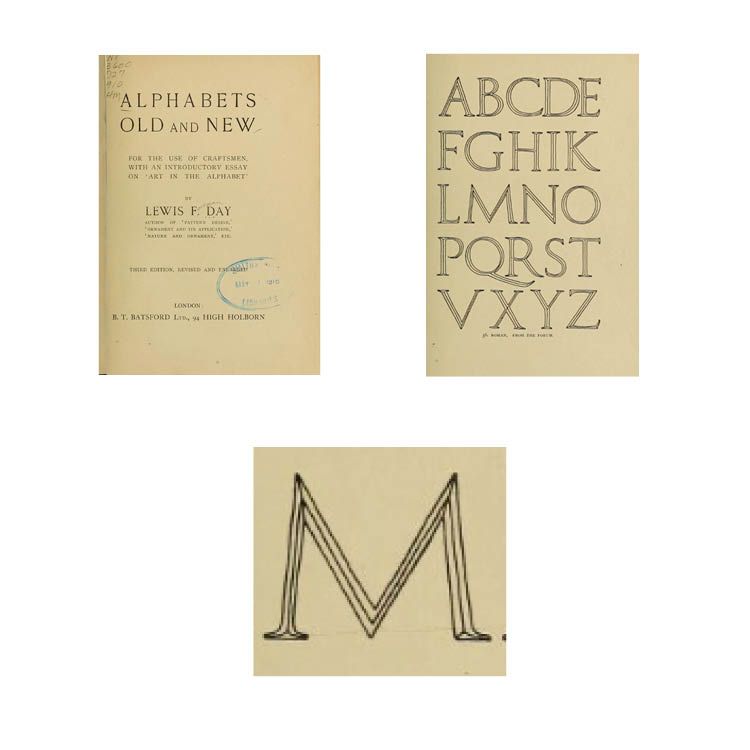
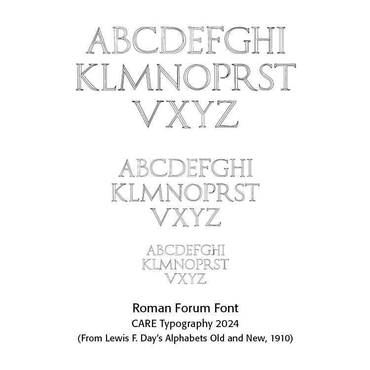
CARE Typography has been able to restore older hand-drawn fonts from various sources to modern digital typefaces. One of those most prolific sources has been from Alphabets Old and New — For The Use of Craftsmen, With An Introductory Essay on ‘Art in the Alphabet’” by Lewis F. Day, London, 1910.There is a wealth of older fonts shown by Day, one of them being a Roman Forum font from an old Roman Forum engraving.
It might be thought that to copy and paste the letters and import them into a font design program, like FontLab’s Fontographer, is simple and rather straight-forward. Not so. From a font designer’s work, the transfer from a screenshot of an old book to a clear and professional open type font (SEE my Blog on “Open Type Fonts” in “More About Fonts” March 9, 2021) takes care and lots of work. It is both tedious and time intensive. The details of such work are often overlooked. Here’s an inside look at such work.
The restored Roman Forum Capitals typeface. Let’s take the Capital M. Using Fontographer, we need a precisely scanned letter form. So, we take a computer picture of the page from Day, as shown in the image. However, each letter of this picture must be captured in is own frame. We therefore isolate M and save it as a JPEG file for import into Fontographer.
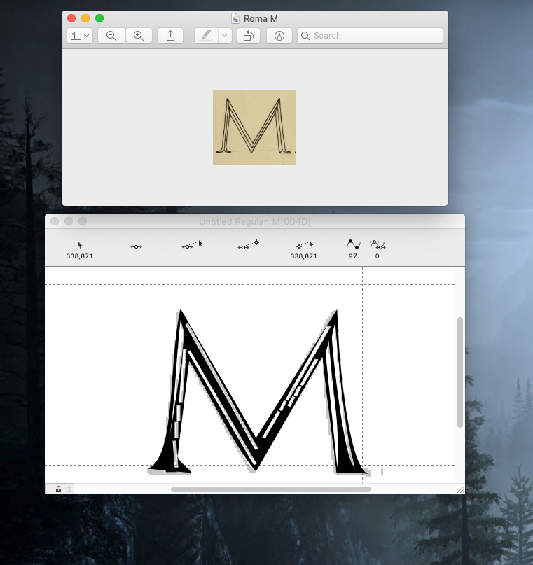
However, behind the scenes is the fact that the saved M in jpeg format is only in 72 dpi (dots per inch — SEE my Blog on “All About Color” September 5, 2022), a far less precise tracing than what is needed for a good scan for Fontographer. In fact, if we simply copy this M image without any other transformative work, and ask Fontographer to trace the image we get a very distorted M character. And, if we enlarge the M image captured in 72 dpi, we get a jagged image, and if ported into Fontographer, more distortions are evident. We could, perhaps, try to clean up the distorted M image in Fontographer, but that is clearly too tedious and results in an “unclean” character.
One of the first rules in scanning an image for Fontographer is that the image must be clear and free of image blurs or incidentals. All images need to fit into the 1000 mm Fontographer character box (800 height and 200 for those letters that go below the baseline). Since these capital letters do not go below the baseline, we do not have to worry about character descents.
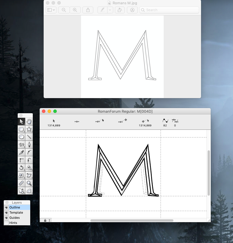
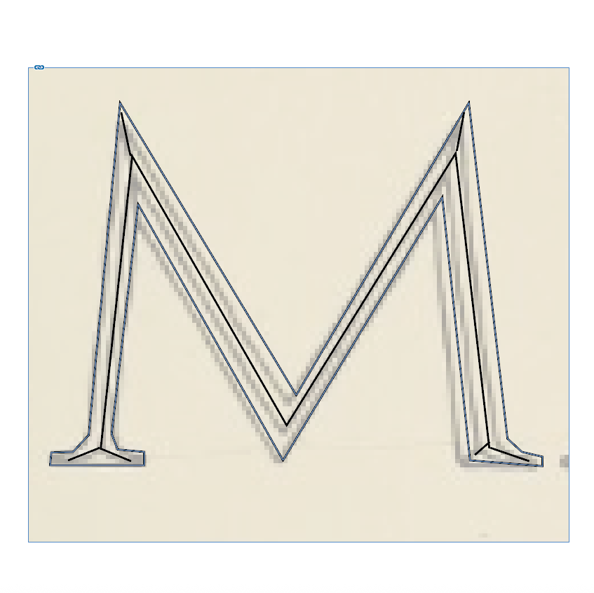
The problem is with the fine lines in the M image. They don’t translate well. Consequently, I had to redraw the M image in a design program (like InDesign from Adobe) for the crisp and clear lines of the M. Then, saving that redrawing as a JPEG, I could scan it into Fontographer, whose automatic tracing technique produced an M like the original drawing. Every letter has to be done this way. They then need to be sized to fit the required character spacing in Fontographer. I told you it would be time intensive.
Letter spacing and kerning come next, so that letters typed together look like they belong together. More information on this process can be found in my Blog — “Kern, Kern, Kern October 21, 2023.” Adobe’s InDesign program will metrically and optically kern letters so that they appear well together. This is not true, however, in Word documents and others.
We end up with a properly spaced Roman Forum Font, with crisp clear letters at any size.
Successful Layout & Design


