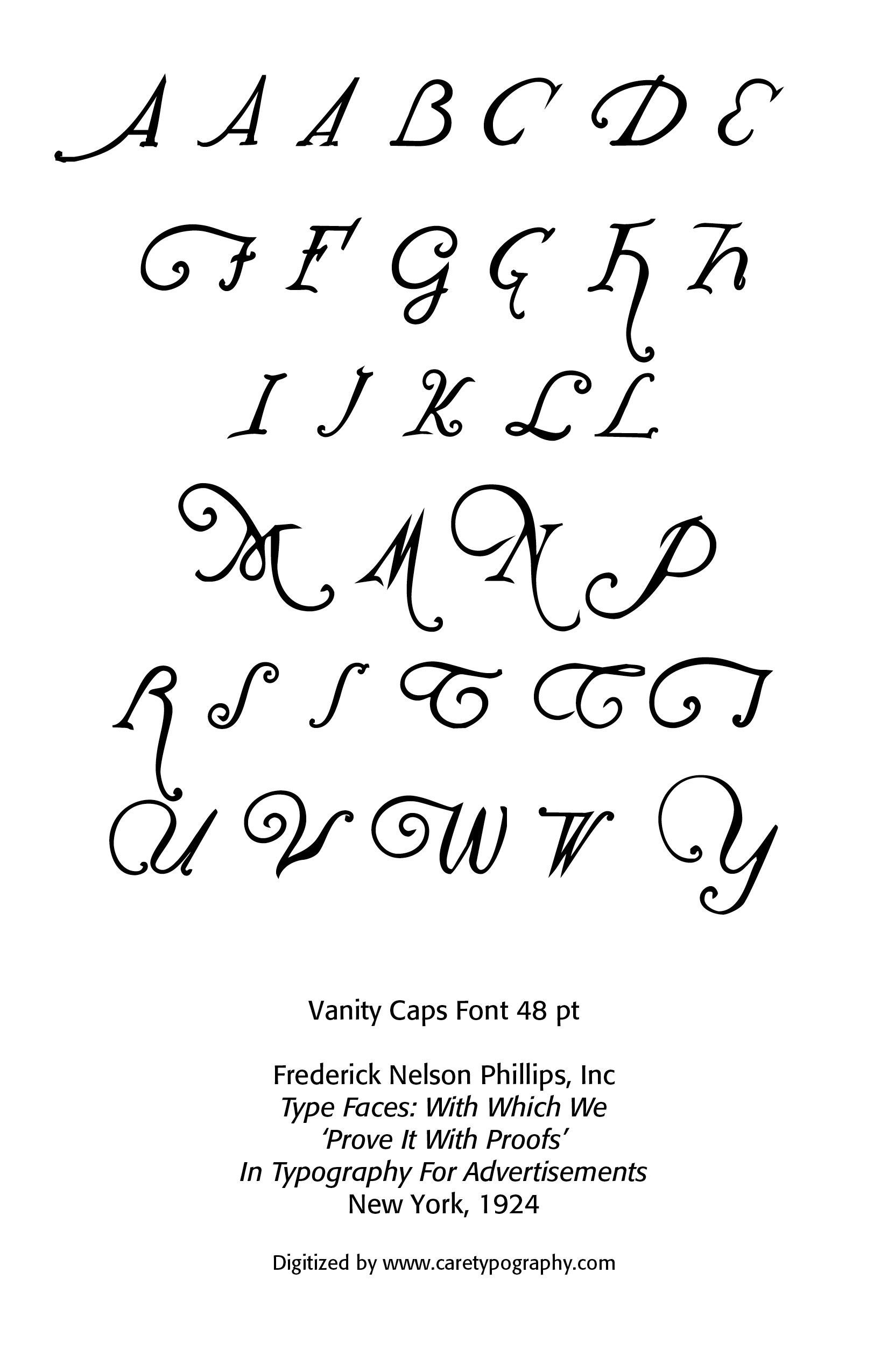
Vanity Type
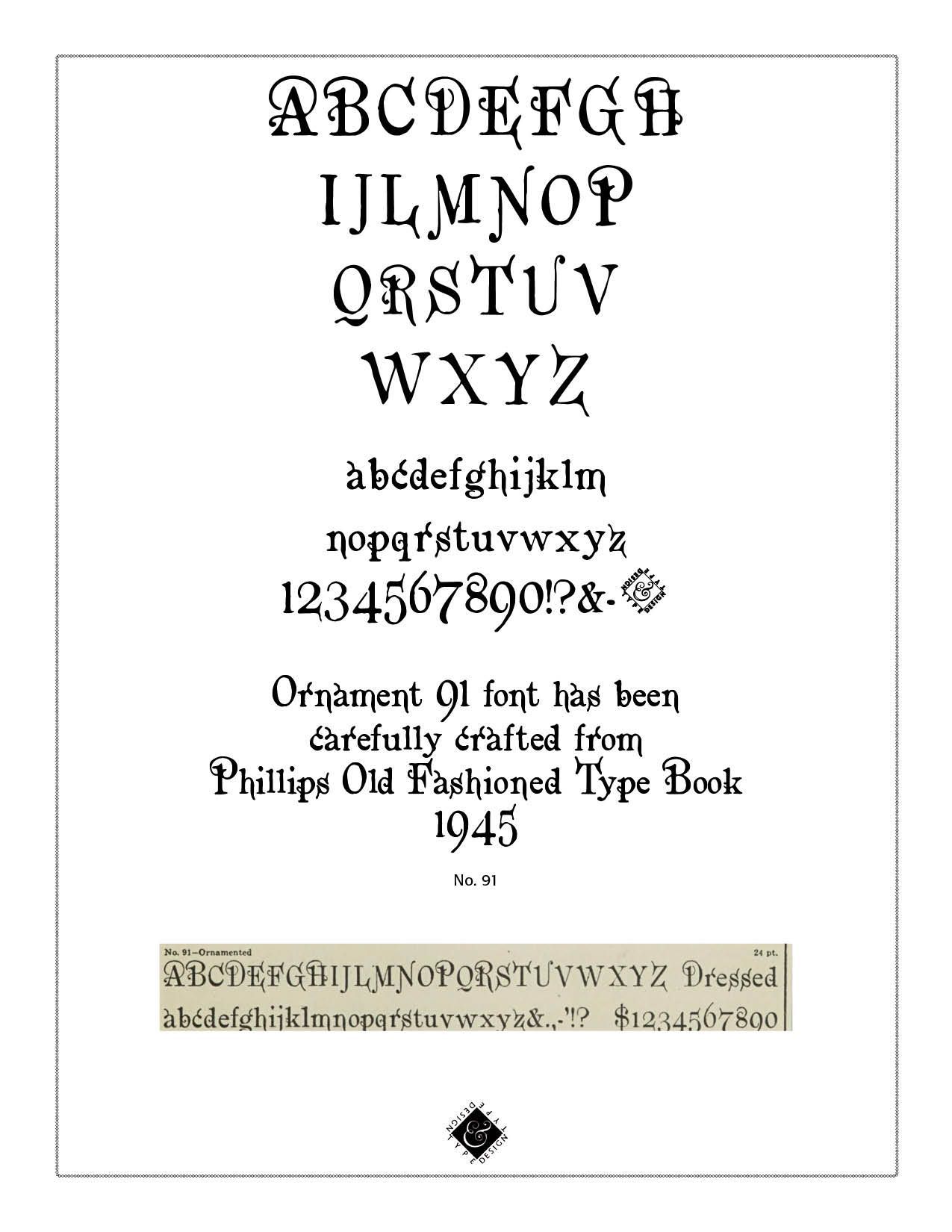
Reading through an old volume of Frederick Nelson Phillips, Inc, Type Faces:With Which We 'Prove It With Proofs' in Typography for Advertisements (New York, 1924), I came across some type that falls outside of the standard typography models, called "vanity type." The term “vanity typography” is not a formal category in typographic history like Old Style, Transitional, Modern, or Sans Serif. Designers typically use the phrase informally to describe typography that draws attention primarily to itself rather than serving the text or reader.
Vanity typography occurs when type is used as a display of the designer's skill, fashion, or personal taste rather than to improve communication. Readability is sometimes sacrificed for self-expression and artistic flair. Such type styles use excessive ornamentation, decorative letterforms, overuse of effects like shadows, outlines, gradients and distortions, unusual spacing, and generally typography used to impress rather than inform.
Notice in the sample by Phillips, the different "A's," "F's,", "G's," "H's," "L's," "M's," "S's," T's" and "W's." This is not calligraphy lettering, but rather type that could have been used for verses or opening letters to paragraphs or stories.
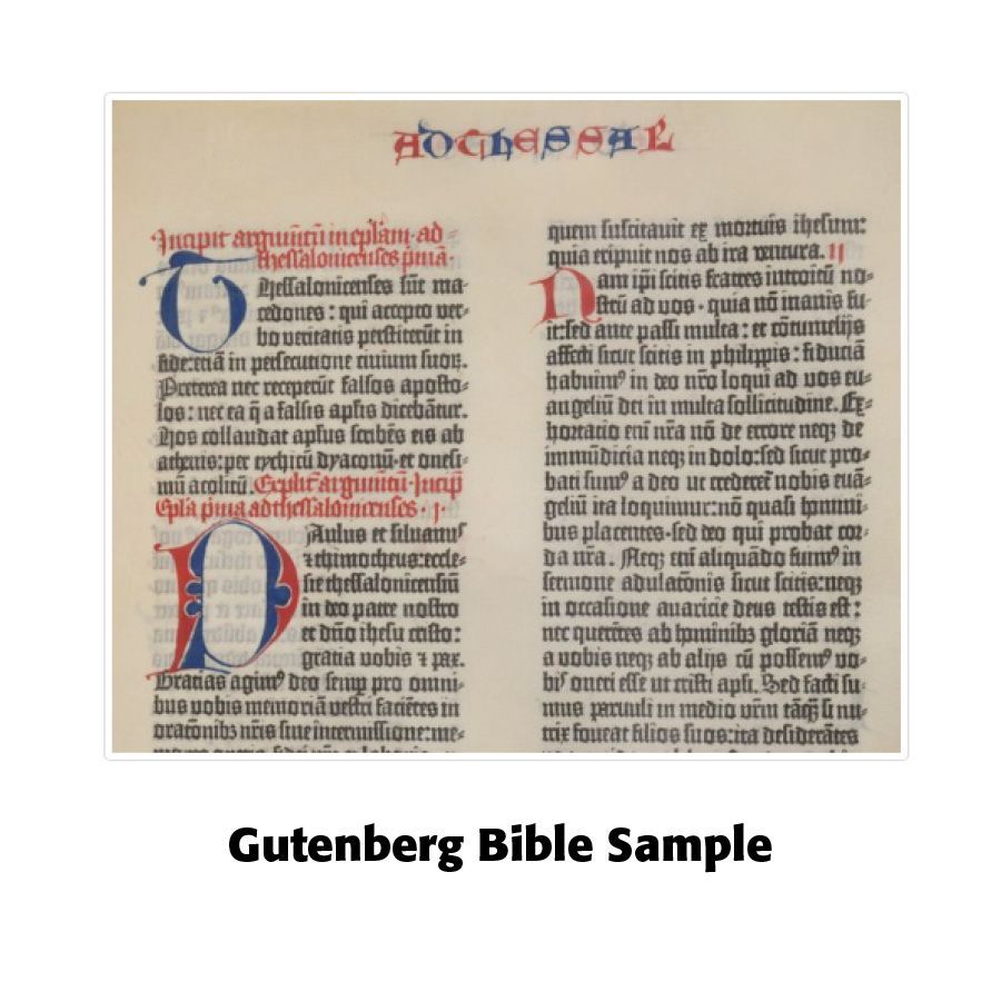
Historical Development. The first printers, including Johannes Gutenberg, sought to imitate respected manuscript traditions. Typography was generally conservative and subordinate to the text. Roman and italic types developed from humanist handwriting traditions, emphasizing clarity and elegance rather than personal display.
Note the Gothic lettering along with the opening vanity type, following scribal typography patterns.
Baroque and Rococo Ornament (1600s–1700s)
As printing matured, title pages became increasingly elaborate. Decorative borders, flourishes, engraved lettering, and ornamental initials often served prestige and display purposes. Wealthy patrons and publishers used typography to project status.
This period contains some early examples of what modern critics might call "vanity" design—where visual grandeur sometimes outweighed functional reading.
Baroque and Rococo are two closely related decorative styles that dominated European art, architecture, furniture, printing, and design from the seventeenth through the eighteenth centuries. Both styles favored ornament, but they differed significantly in mood, scale, and purpose.
Baroque Ornament (c. 1600–1725)
Baroque ornament emerged during the age of absolute monarchies, the Catholic Counter-Reformation, and expanding European empires. It sought to inspire awe, grandeur, and emotional impact.
Baroque printing featured: elaborate engraved title pages, decorative borders, large ornamental initials, flourishes and scrollwork, and complex coats of arms. Printers often combined classical Roman types with richly engraved illustrations and ornaments.

Rococo Ornament (c. 1720–1780)
Rococo developed in France as a lighter, more playful reaction to the grandeur of Baroque. It emphasized elegance, intimacy, refinement, and pleasure rather than power and drama. Rococo influenced printing through elegant borders and frames, delicate floral ornaments, lighter page compositions, graceful engraved vignettes, and decorative headpieces and tailpieces.
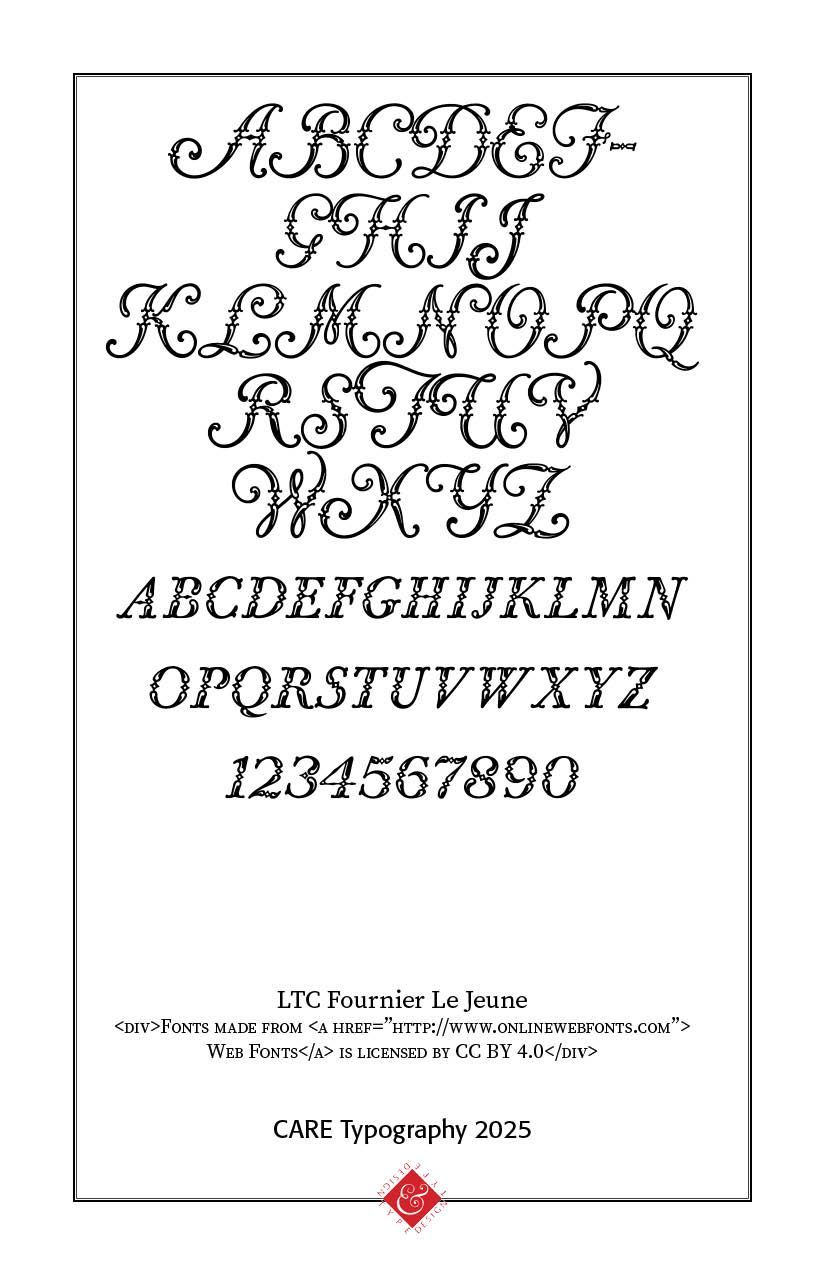
French printers such as Pierre-Simon Fournier helped establish the refined aesthetic associated with eighteenth-century typography. (SEE https://www.caretypography.com/more-fournier)
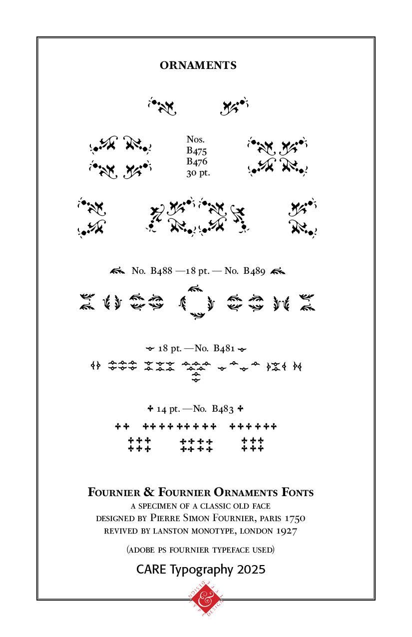
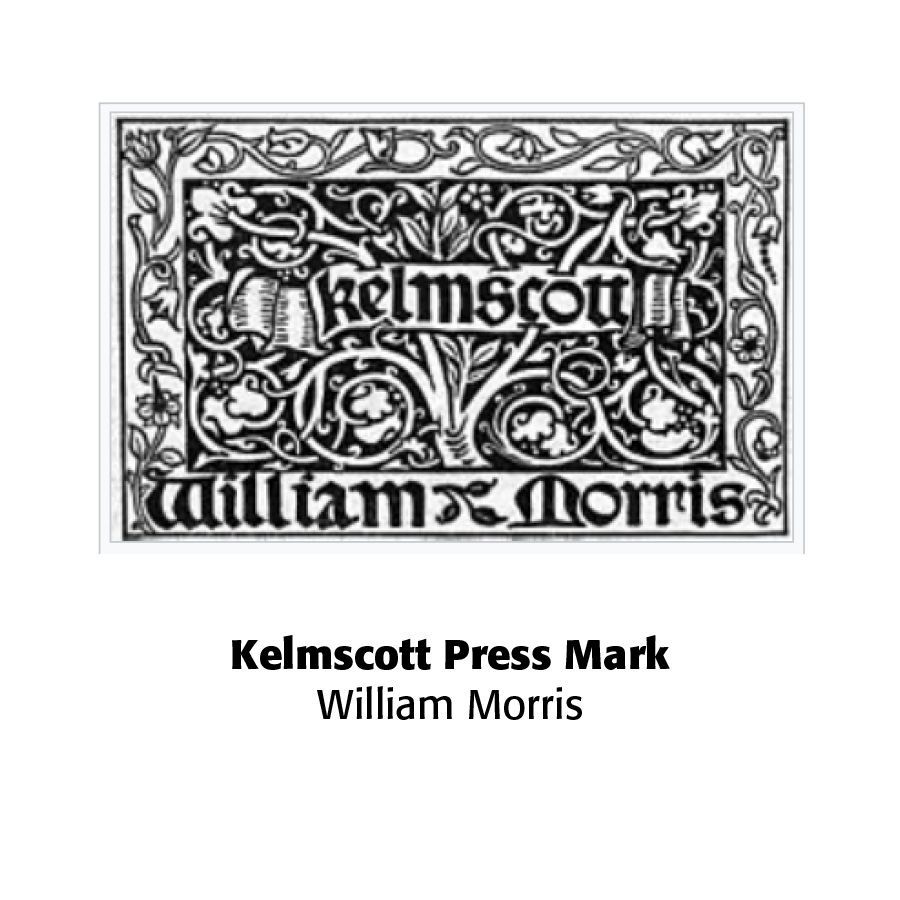
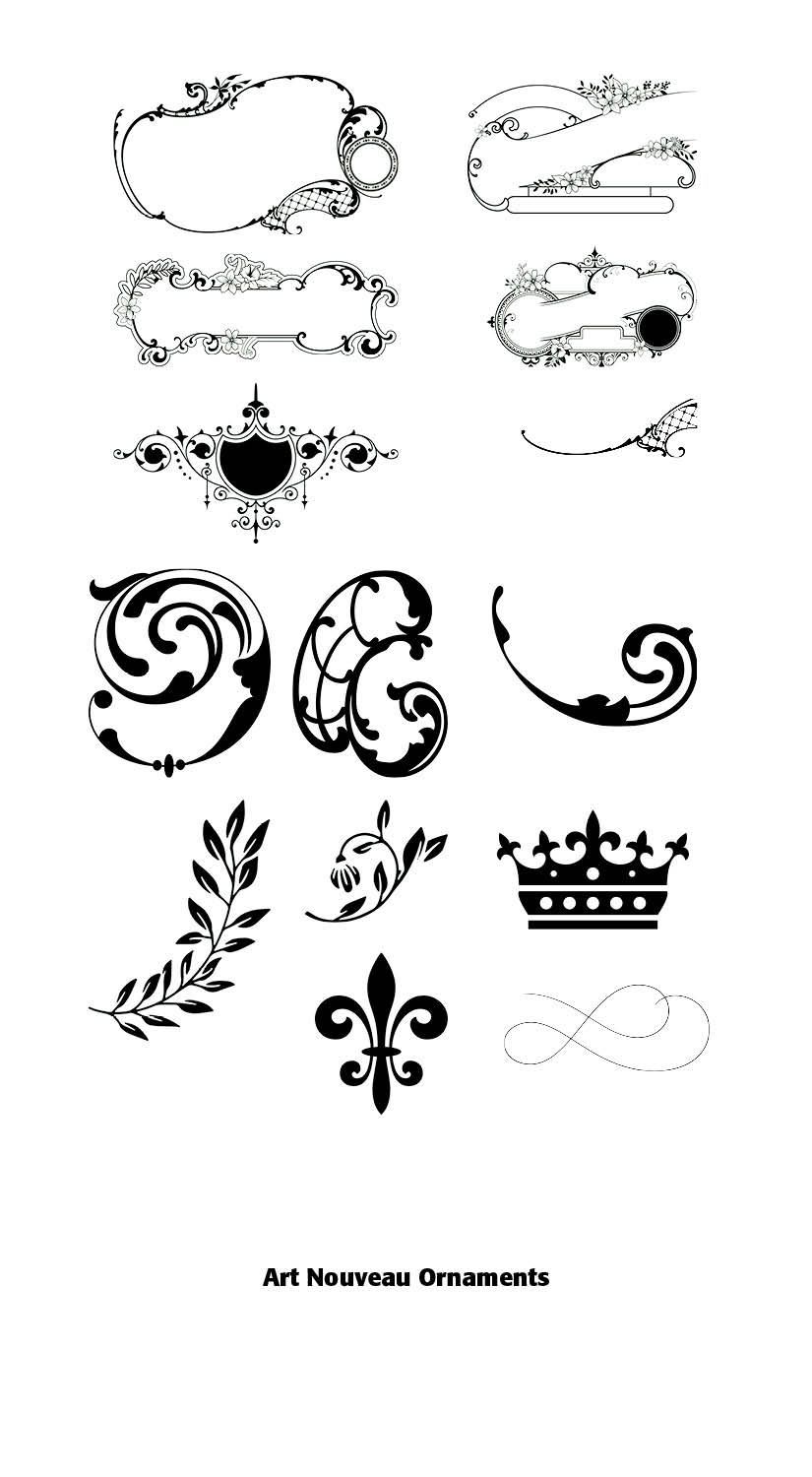
Many traditional typographic ornaments originated in these periods, including fleurons, decorative borders, printers' flowers, engraved frames, initial capitals, cartouches, corner ornaments, and heraldic embellishments.
These elements continue to appear in wedding invitations, certificates and diplomas, luxury branding, church publications, Bible and devotional book design, fine press printing, and historical and classical book typography.
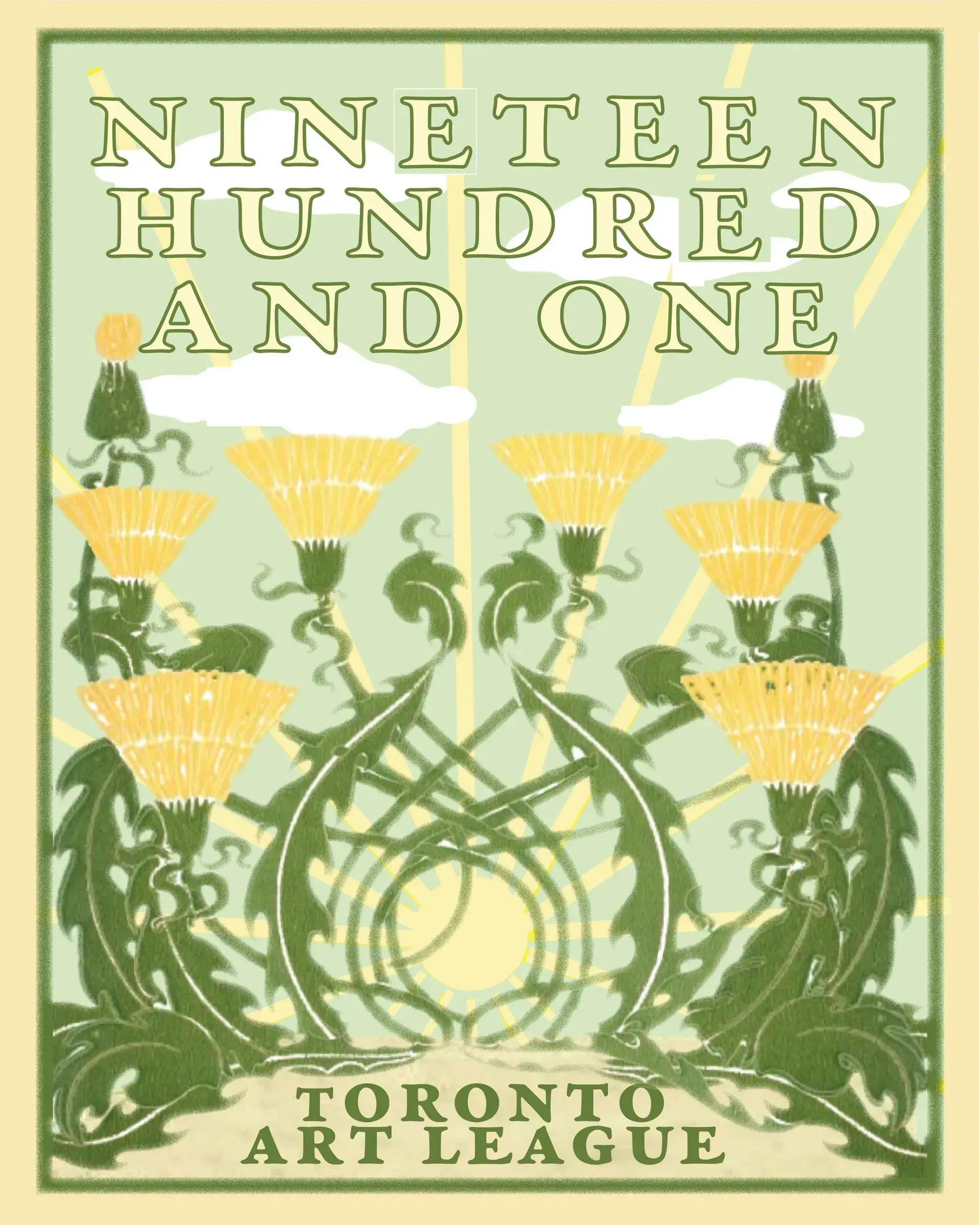
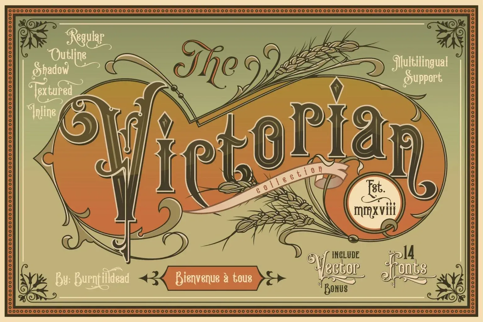
The Industrial Revolution transformed typography. New printing technologies enabled massive display letters, decorative wood type, condensed and expanded faces, shadowed, outlined, and chromatic type, and highly crowded advertising layouts
Victorian posters frequently used many typefaces on a single page. To modern eyes, this era often represents the classic age of typographic excess. Yet these designs were highly effective for attracting attention in crowded commercial environments.
Postmodern Typography (1970s–1990s)
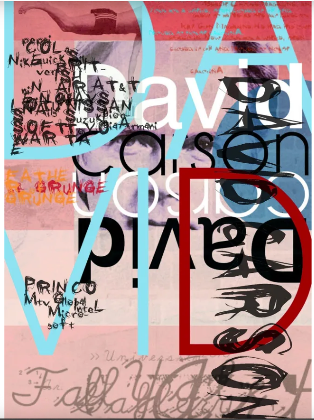
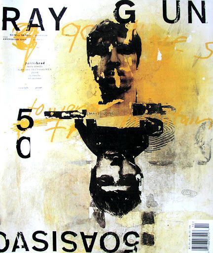
Postmodern designers challenged strict modernist rules. Figures such as David Carson intentionally disrupted readability through layered text, irregular spacing, fragmented layouts, and very expressive typography. Supporters viewed this as artistic expression; critics often described it as typographic vanity because the design sometimes overshadowed the message.
David Carson, for example, did not simply make magazines look messier. He changed what graphic design could do on the page. At a moment when modernist order still shaped much of editorial design, Carson pushed typography toward friction, texture, ambiguity, and mood. His layouts did not behave like neutral containers for content. They behaved as if they were part of the content itself. That shift became visible first in surf and youth culture publishing, then more famously in music media, where Carson made the page feel unstable, physical, and culturally charged rather than perfectly resolved. He came to design relatively late, after competitive surfing and teaching, which helps explain why his work never felt obedient to inherited rules.((https://www.hueandeye.org/david-carson/)
Vanity Typography vs. Good Typography
A useful principle often attributed to twentieth-century typographic thinking is that good typography is noticed after the message is understood; vanity typography is noticed before the message is understood. This does not mean decorative typography is wrong. Display typography, branding, invitations, certificates, and posters often benefit from expressive type. The question is whether the typography supports the purpose of the communication or competes with it.
The history of vanity typography is essentially the history of the ongoing debate between expression and communication. From ornate Victorian posters to postmodern magazine design and today's digital graphics, designers have continually balanced the desire to create visually striking typography against the fundamental purpose of type: making language understandable. The most enduring typographic traditions generally succeed because they combine beauty with clarity rather than sacrificing one for the other.
Successful Layout & Design


