Type Details Matter: Typos & Fractions
Type Details Matter: Typos & Fractions
Carl Shank
March 31, 2026
“The practice of typography, if it be followed faithfully, is hard work — full of detail, full of petty restrictions, full of drudgery, and not greatly rewarded as men now count rewards. There are times when we need to bring to it all the history and art and feeling that we can, to make it bearable. But in the light of history, and of art, and of knowledge and of man’s achievement, it is as interesting a work that exists—a broad and humanizing employment which indeed can be followed merely as a trade, but which if perfected into an art or even broadened into a profession, will perpetually open new horizons to our eyes and new opportunities to our hands.” (“Thoughts Upon A Typographic Custom,” Alexander S. Lawson, Electronic Publishing, January 28, 1994)
Such detail and “petty restrictions” are to be found in the consideration and history of typographic errors (typos) and the use of fractions. In my March 23, 2023 blog I noted that we need more than a spellchecker. Spell checkers are great. They help us in busy offices doing busy tasks everyday. EXCEPT they cannot correct errors of statement or errors of typography.
Grant Weisbrot of New York City has noted that "it is impossible to efficiently proofread without a knowledge of typesetting and printing procedures." ("The Typographic Eye: Proofreading," Electronic Publishing, May 13, 1994) Thus, the note to “raise the register mark and close up the space” in an article is translated by the typographer to “kern the register mark five units and raise it 1¼ points.”
He gives some examples of errors of statements — spelling when letters are missing, like "he" for "the;" spelling in a piece published in Britain, like "color" for "colour;" using a correctly spelled word in a wrong way, like 20 carat gold (carat is a diamond weight, karat is an alloy of gold, caret is an insertion mark, and carrot is a vegetable); awkward sentence structure, incorrect or inconsistent capitalization, ungrammatical or awkward sentence structure, failure to apply indents or hangs when suitable, and errors of fact, like the kangaroos of Tibet.
Typos
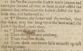
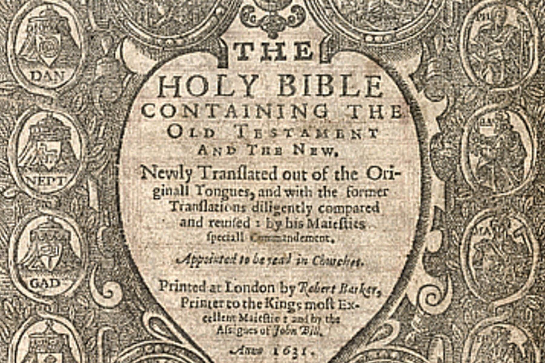
Typos have an old and famous—some would say infamous— history. What has been called “The Wicked Bible” in 1631 left out the word “not” in the seventh commandment — “Thou shalt not commit adultery” was transformed into “Thou shalt commit adultery.” When the error was discovered, the ramifications were swift and severe. King Charles 1 fined the printers £300 (around $70,000 today), revoked their printing license, and proceeded to find and destroy as many copies of the Wicked Bible as possible, turning it into a rare collector’s item. While his religious policies, coupled with his marriage to a Catholic, generated antipathy and mistrust from Reformed religious groups such as the English Puritans and Scottish Covenanters, who thought his views too Catholic, this typo was too much to bear. Today, only about 20 copies remain in circulation. (History Facts at http://bit.ly/4rXvTZZ)
Digitized copy of "The Wicked Bible" in Exodus 20.
Aotearoa's Wicked Bible Digitisation Collection
A simple coding mistake scuttled NASA’s Mariner 1 mission on July 22, 1962. While it’s been reported that a missing hyphen in the software coding was to blame, NASA noted that it was an “omission of an overbar for the symbol R for radius in an equation,” as well as a guidance antenna on the atlas, that caused the failure. This was probably the most expensive typo in history, costing the space agency $18.5 million (over $180 million today).
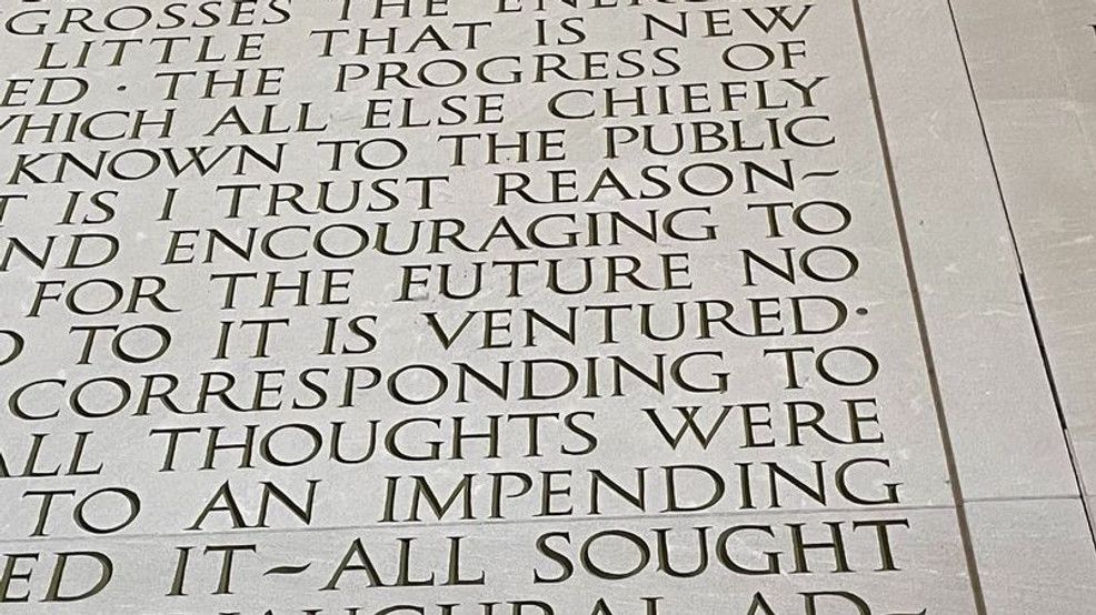
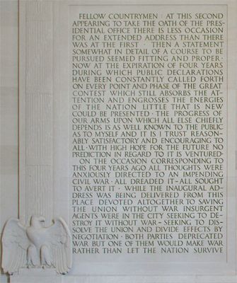
The etchings on the Lincoln Memorial in Washington, D.C. are truly historic. However, etched into Lincoln’s Second Inaugural Address on the wall of the memorial are the words “WITH HIGH HOPE FOR THE EUTURE.” The error was corrected by filling in the bottom of the first “E,” in “EUTURE” but, like a paper erasure, the correction is obvious to those looking.
Even the esteemed Webster’s Dictionary has not escaped typos. In 1934 the nonword “dord” appeared between the word “dorcopsis,” a small kangaroo species, and “doré,” meaning “golden in color.” “Dord” was listed as a noun referring to density in the fields of physics and chemistry. The intended entry was actually “D or d,” the abbreviation for density used by physicists and chemists. The dictionary editors in sorting out and separating abbreviations from words in preparing the dictionary's second edition, a card marked “D or d” meaning “density” somehow migrated from the “abbreviations” stack to the “words stack. The entry existed in more than one printing from 1934 to 1947. It is called a “ghost word,” a word that does not actually exist.
Then there are errors of typography, like primes (' ") for apostrophes or quotes, or quotes used for inch marks, double-hyphens (--) for an em-dash (—), fractional mistakes, kerning that is on or off, word spacing that is inconsistent, unbalanced centered copy, allowing widows, orphans, ladders or rivers, wrong sized bullets, subscript or superscript failures (NIKE (TM) instead of NIKE™), two spaces after a sentence ending instead of just one space (a common typist mistake), asterisks to represent bullets, using the letter "l" for the number 1, capital O for the digit 0, and misnumbered pages.
Interestingly, the ancient Koreans were known for the quality of their proofreading work. If a novice made one typo, they lost a finger. The second typo caused the loss of a hand! In 1539, France required printers to hire proofreaders or to be fined and held liable for damages due to typographical errors. Today, we just add a "not responsible for typographical errors" to ordinary newspapers and mailers. We have grown sloppy, uncaring, and typographically ignorant—sad to say. Frank Romano in a March 1993 Electronic Publishing article, "The History of the Typo," says that "today artificial intelligence and fuzzy logic are being used to electronically generate typographical errors without human involvement."
Weisbrot notes that "a proofreader must correct the proof and enhance the typography without ever making changes in the text or specifications; editors usually frown on a proofreader's pretensions to improve the language, but it is rare for a designer to complain if the layout is typographically improved."
Fractions
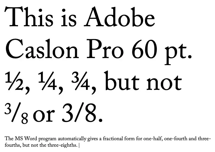
The Franklin Covey Style Guide in advising writing fractions says that we should spell out and hyphenate fractions appearing by themselves in ordinary text, especially if they are followed by “of a” or “of an” — one-half foot; one-tenth inch, five-eighths of a mile. Yet, measurements in scientific and technical documents it says require figures — ½ foot; 7 ¼ meters and if combined with abbreviations or symbols — 34 1/3 km; 8 ½ hr. However, there’s the typographical problem. 8½ looks fine but 34 1/3 looks clunky and 34 and one-third is tedious and amateurish. Microsoft Word in a number of standard typefaces does not supply nearly enough fractions.
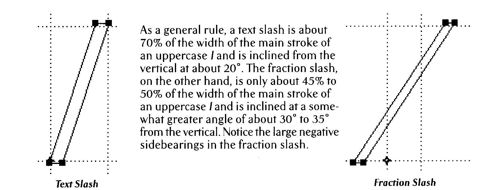
In addition, besides the clunky look, the forward slash used in 34 1/3 is not typographically correct. Indeed, a “fractional slash” is needed there. “As a general rule, a text slash is about 70% of the width of the main stroke of an uppercase “l” and is inclined from the vertical at about 20°. The fraction slash, on the other hand, is only about 45% to 50% of the width of the main stroke of an uppercase “l” and is inclined at a somewhat greater angle of about 30° to 35° from the vertical. And there are large negative sidebearings in the fraction slash.” (Stephen Moye, Fontographer: Type By Design, MIS Press, 1995) (See Diagram)
And there is even another typographical problem that raises its ugly head in fractional uses. The number 1¾ , while still the same typeface, has a “thicker” “1” and a thinner ¾ than should be. One way around this might be 1¾ with the ¾ in Bold, but that still does not look very good typographically.
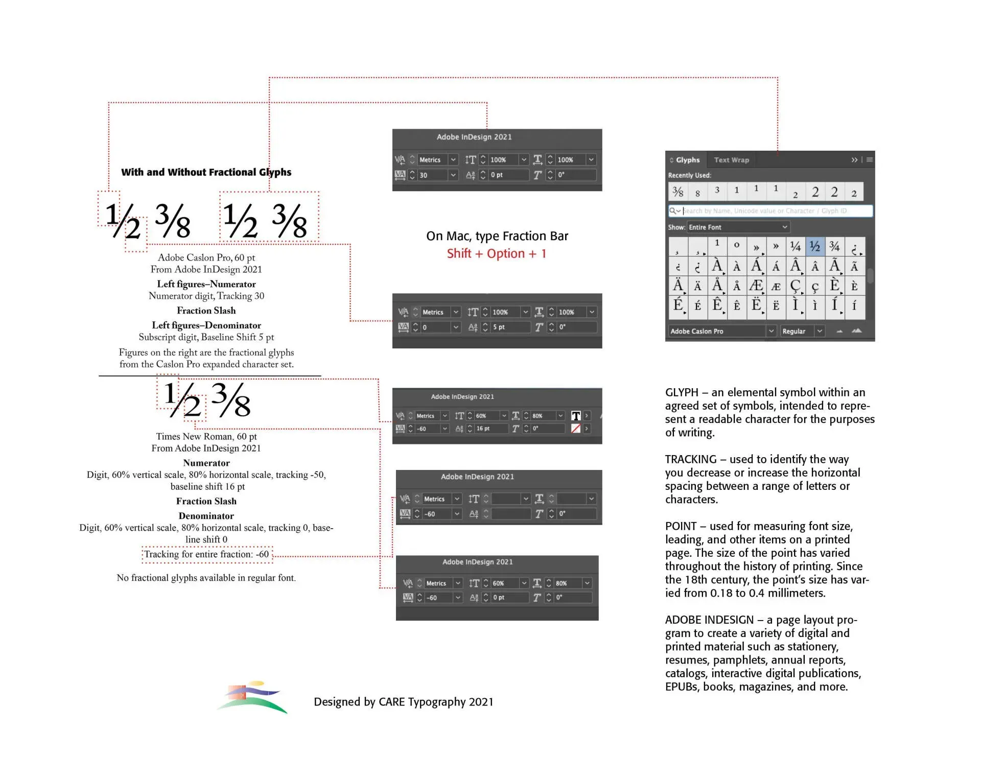
We all use fractions, especially in texts that reference recipes or construction of some kind. If we don't use the words, like one-half, three-eighths, and so forth, we stick them into all kinds of writings — however they look. So, using a typical program like Microsoft Word, if the fraction we want is contained in the typical 256 character description of the font, Word will usually automatically and successfully put the font in the text so that it looks like it belongs. But fractions that go outside the bounds of the normal character set of the font we are using create problems in how to type them into our document so that they look good and naturally belong. Workarounds are limited. An example is below. However, these are constructed in layout programs, like Adobe InDesign which are not normally used in typical day to day letters and publications.
Rather than purchasing a subscription to Creative Cloud from Adobe to download and use a program like InDesign (Adobe Creative Cloud) what should we do? We could find a free or minimal cost font that is mostly made up of fractions, like Fraction Free Fonts, like KG Traditional Fractions by Kimberly Geswein —a b c d e f g h k — or settle for a less than suitable word translation in running texts, like five-thirtysixths (instead of 5/36). The fraction Free font will most likely not reflect the typeface you are using. That may be acceptable in a recipe listing where the fraction stands outside the line of text, but it will not look professional at all.
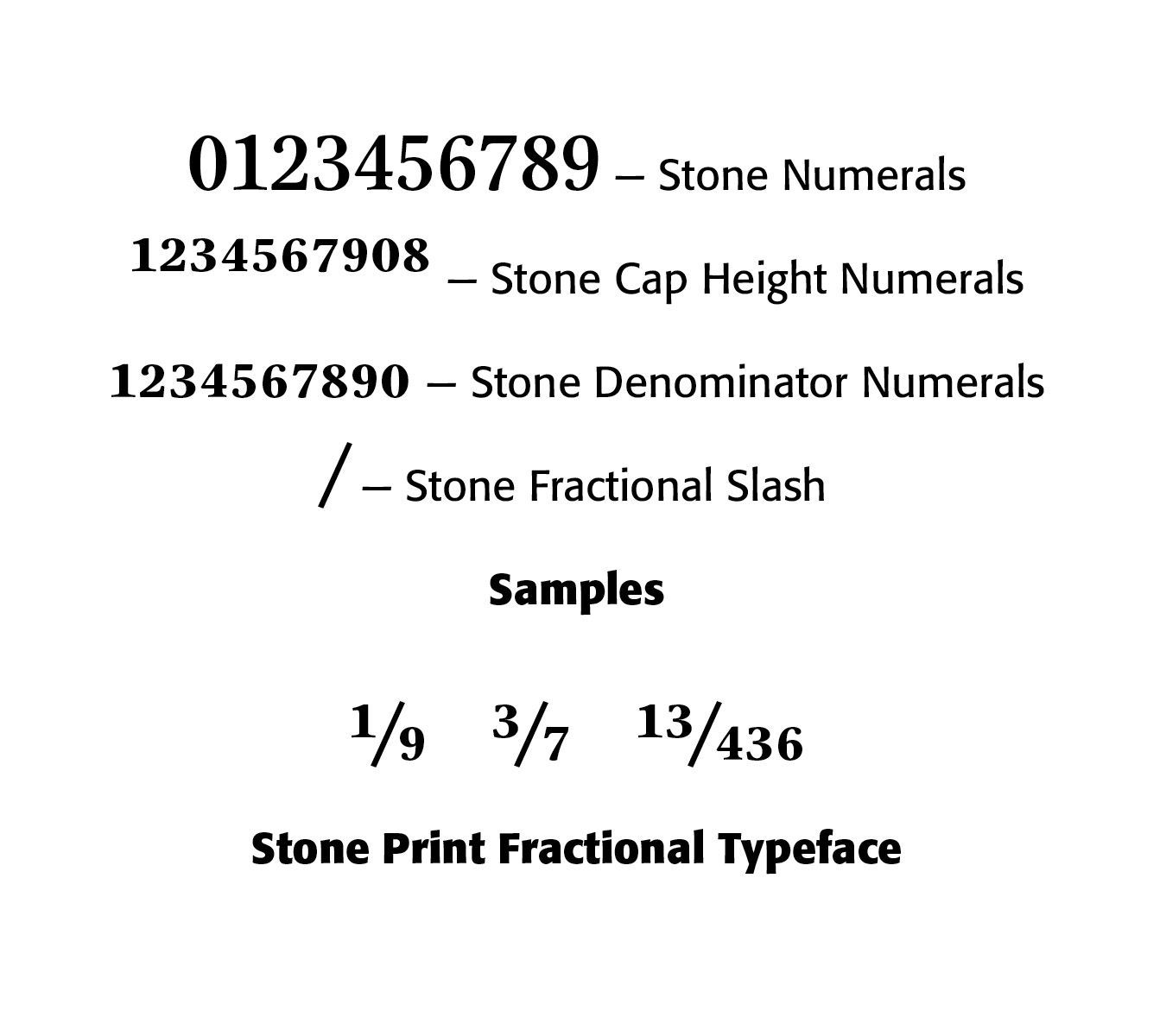
Another solution would be to use a font that has plenty of fonts already built-in. So, instead of the typical Times Roman fractions — ½, ¼, ¾ — you could use a specialty font like Mrs Eaves Fractions — GHIJKLMNO — yet still limiting and not the same text. And you would need to purchase this typeface. Or use Sumner Stone’s Fractional Stone Print font. Stone has created an all-purpose fractional font — the number keys have cap height numerals, the Shift-key has numerator numbers; the Option-key has the denominator numbers, and Shift-Option has the x-height numerals. (See Sample Below)
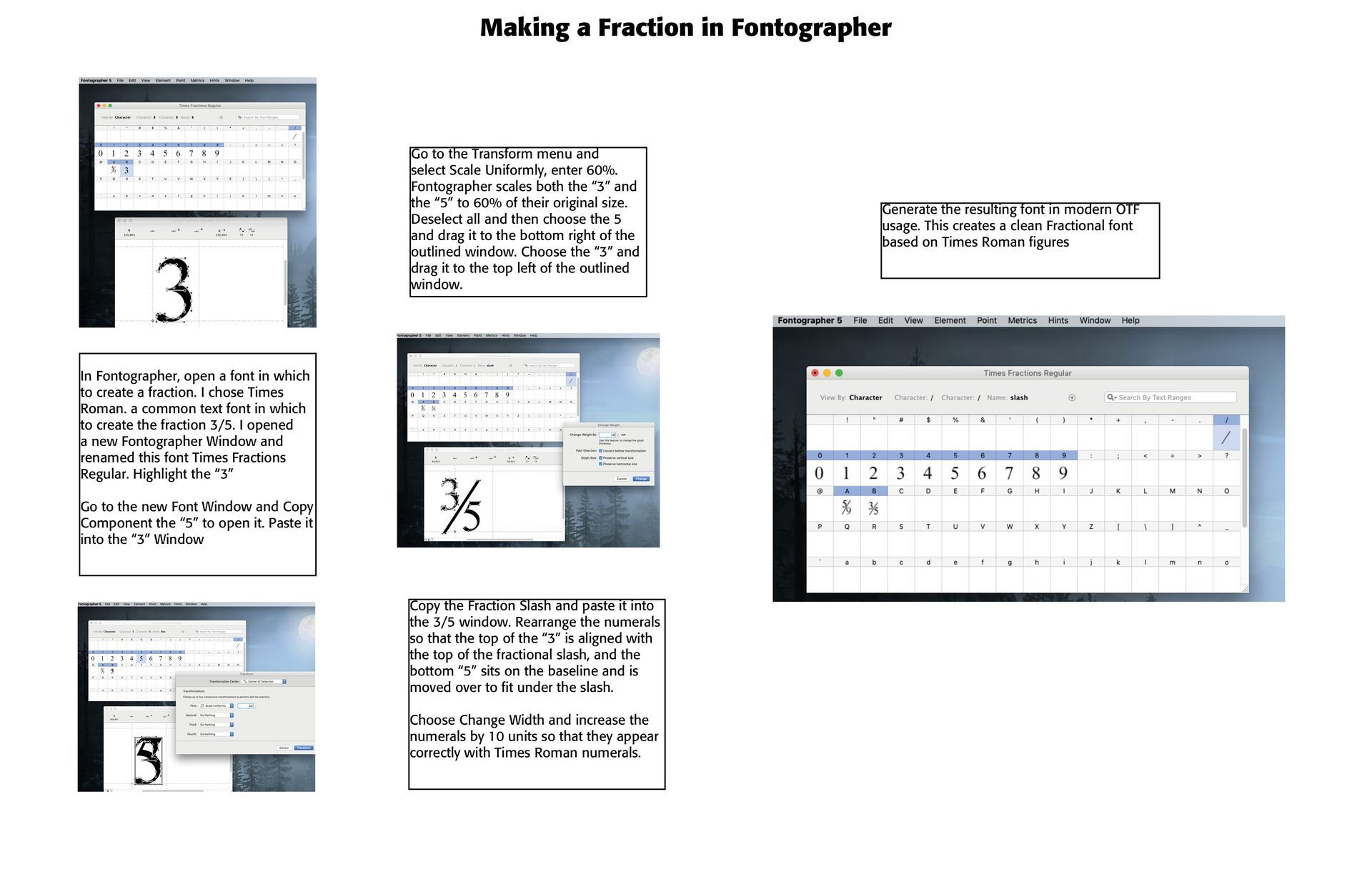
Still another (perhaps better) solution would be to contract out a font designer, like CARE Typography, to develop or enhance your preferred typeface with fractions you use. This latter solution is preferable to most, given the need for suitable fractions. An example of how this is done in a program called Fontographer is below on the fraction three-fifths (3/5) in Times Roman.
A
Using Adobe's InDesign Program
Successful Layout & Design


