King James Bible Typography
The King James Bible (KJV), commissioned by King James 1 in 1604 and published in 1611, has been a profound Bible translation and masterpiece of beauty through the ages. It has been one of the most influential English translations of the Bible. Its history combines politics, religion, and literary achievement in early modern England. It has an elevated, poetic style that influenced many later writers. It has been prized for its literary beauty, historical continuity and memorability in public reading and worship (ChatGPT).
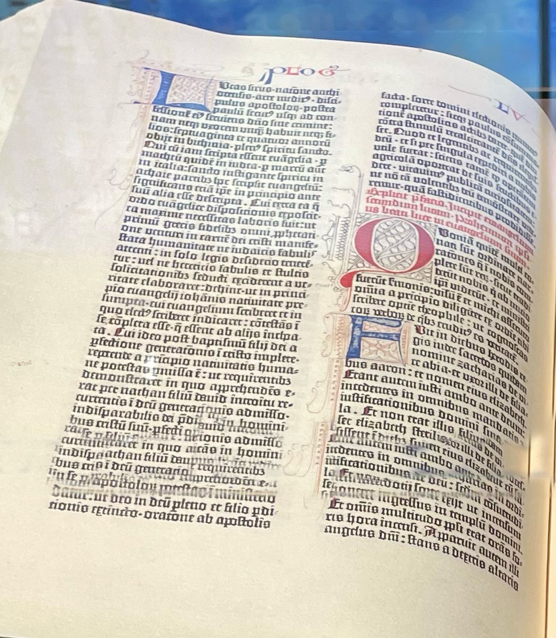
My interest in this blog is to investigate the typography of the KJV, noting its typographical history and offerings. Everyone typographically agrees that Gutenberg’s printing press transformed typographic offerings and history. I have commented at length in these blogs about that historical transition. Bible renderings follow typographical history and traditions. The copy in the Museum of the Bible in Washington, D.C. displays the Blackletter typeface of the 1611 KJV.
(Museum of the Bible — Gutenberg Bible 300)
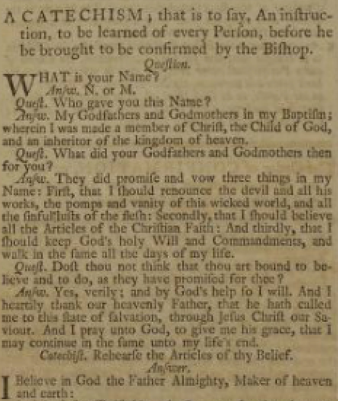
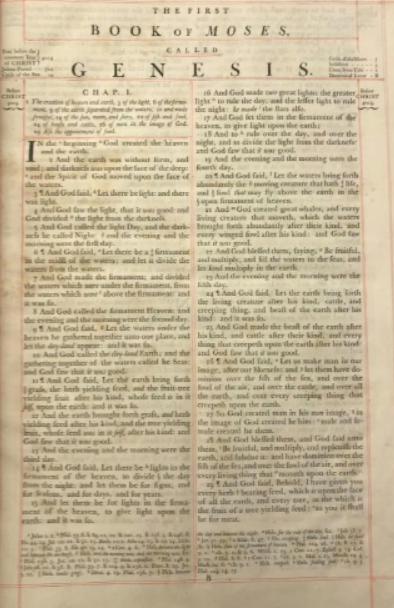
What stands out typographically in the 1611 Bible version is the use of the “long s”, visually representing a modern “f,” as in the word “Gofpel.” The “long s” can be seen in the 1762 Parris Book of Common Prayer And Adminiftration of the Sacraments And Other Rites and Ceremonies of the Church, According the the Ufe of The Church of England: Together With The Psalter of Psalter or Psalms of David Pointed as they are to be fung or faid in Churches. Note “A CATECHISM, that is to fay, An infruction, to be learned of every Perfon, before he be brought to be confirmed by the Bifhop.”
The long s was derived from the old Roman cursive s in the middle of words. When the distinction between majuscule (uppercase) and minuscule (lowercase) letter forms became established, toward the end of the eighth century, it developed a more vertical form.
Other striking features include: that the letter 'j' had not yet fully grown away from 'i' ('Iohn' vs. 'John'); the letter 'v' had not developed from 'u' ('euery' for 'every'); and that there are two alternative forms of the lower-case 'r', selected in the Bible according to no clear or consistently used definition. “The r rotunda (ꝛ), "rounded r", is a historical calligraphic variant of the minuscule (lowercase) letter Latin r used in full script-like typefaces, especially in Blackletter fonts.
An example in the 1611 can be found in John 1:15 where the word preferred is typeset as pꝛeferred.
Unlike other letter variants such as the 'long s', which were originally seen as orthographically distinctive, R rotunda has always been a calligraphic variant, used when the letter r followed a letter with a rounded stroke towards the right side, such as o, b, p, h (and d in typefaces where this letter has no vertical stroke, as in ∂, ð). In this way, it is comparable to numerous other special types used for ligatures or conjoined letters in early modern typesetting.” (https://blackletterkingjamesbible.com)
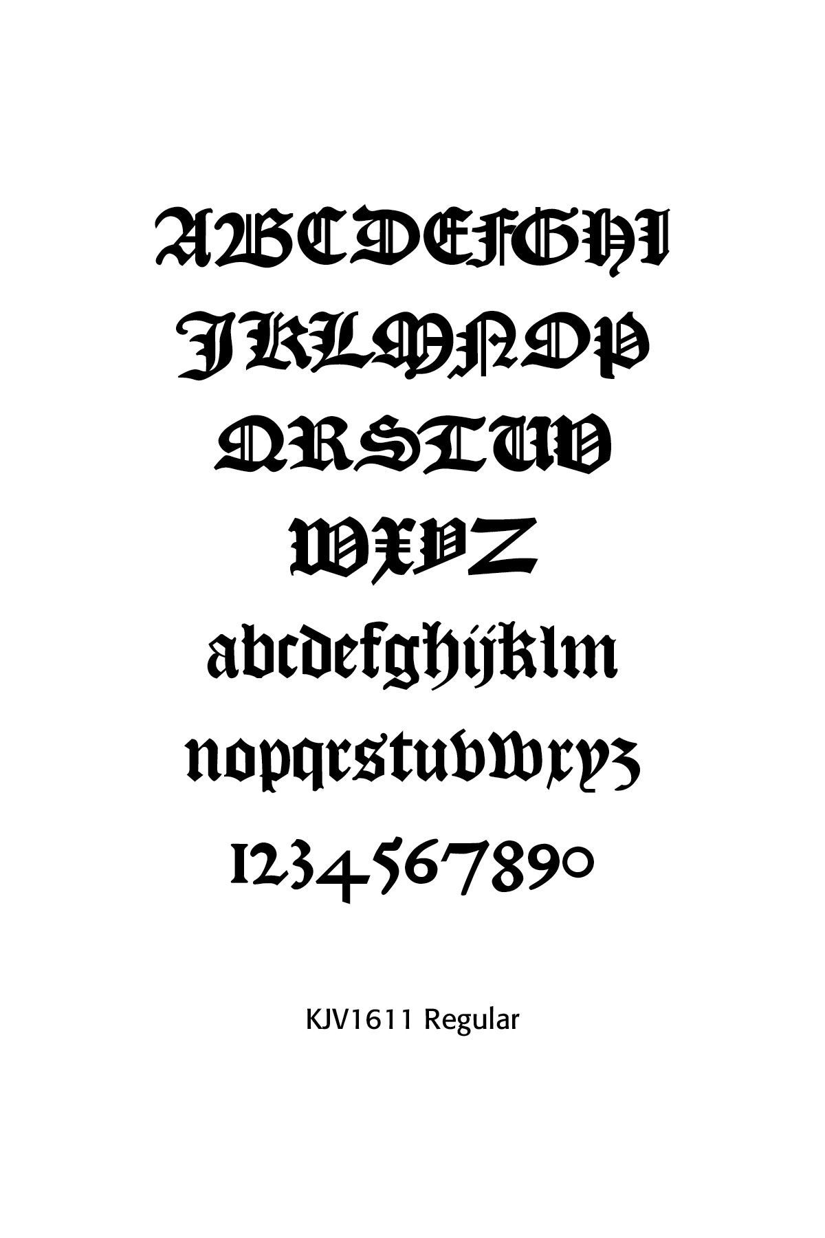
A faithful recreation of this particular font by Frederick R. Brennan is the KJV 1611 Blackletter.
The Baskerville Bible
In English Bible printing, John Baskerville gained recognition in the 1750s for his editions of the works of Virgil and Milton. In 1758, he was appointed printer for the University of Cambridge and granted permission to produce a new folio Bible. Baskerville published his Bible in 1763 using a typeface he created (now called “Baskerville” font) and a smoother “wove paper,” which he helped develop and introduce. The punchcutter John Handy cut the typeface into metal.
Baskerville’s “magnum opus” is his folio printed at Cambridge in 1763. The Bible uses his types, paper and ink, and shows his characteristic ‘machine-made’ finish — very smooth and even in color and impression, with glossy black ink on smooth paper. The design is traditional, but the quality of material and workmanship is so high, and the conventions are so delicately modified and consistently applied that the result is extremely impressive. (Cambridge History of the Bible, 464). Only 1,250 copies were ever made, yet his design and craftmanship shaped future Bible typography.

In typography, Baskerville is a transitional typeface, copying old style typefaces of the period, especially those of William Caslon. Baskerville increased the contrast between thick and thin strokes, making the serifs sharper and more tapered, and shifted the axis of rounded letters to a more vertical position. The curved strokes are more circular in shape, and the characters became more regular. These changes created a greater consistency in size and form. (Wikipedia)
The Baskerville Bible was made out of metal punches. In 1953, thousands of them arrived at Cambridge, packed in oak boxes, donated by the French type foundry Deberny & Peignot. They are presently housed in the Cambridge University Library. The current day Cambridge KJV Family Chronicle Bible combines Baskerville typography, over 200 illustrations by Gustave Dore and an extensive family record section.
The Gideon Bible
I have chosen the Gideon Bible as an ongoing KJV Bible, from its hotel inception in 1908 to the present day. In 1908, Archie Bailey, a Gideon member, proposed to the proprietor, Edna Wilkinson, of the Superior Hotel in Superior, Montana that a Bible be placed at the front desk for patrons. She ordered 25 Bibles to be distributed throughout her establishment. She started a trend that grew immensely and by the 1920s the Gideons were synonymous with hotel Bible distribution. The early American Standard Version was superseded by the King James Version and then the New International version in 1974. Bibles were distributed not only to hotels but to hospitals, public classrooms and the U.S. military. Bible distribution went overseas to Sweden in 1919 and the British Isles in 1949.
From 1908 to 2022, the Gideons distributed a massive 2.5 billion Bibles. Roughly 80 million Bibles are donated each year, funded through private donations. While 95% of hotels placed Gideon Bibles as recently as 2006, that percentage dropped to 79% by 2016 and estimates from 1015 show a continued decline down to 69%. Even with that decline, tens of millions of hotel rooms have seen a Gideon Bible awaiting weary and sometimes perplexed travelers looking for peace and rest in their rooms. (Bennett Kleinman, historyfacts.com, March 26, 2026)
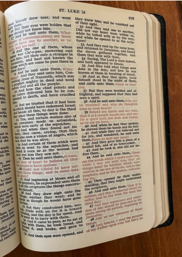
What has interested me as a student of typographic history is the long-lived type history of the Gideon Bible — King James Version (until 1974), two-column printing, verse by verse rendering, and somewhat hard to read type. While the typographic world was advancing, the KJV of 1611 remained steadfast typographically for decades. What has been ignored or not known in the typography world was that there was and has been brewing in the conservative biblical world a raging controversy over Bible translations and renditions.
While the KJV was old, and its typographical renderings outdated, the issue was the integrity of the Word of God set against its liberalizing detractors. To change the Bible, even typographically, was to invade and dethrone the inspired Word with modernistic, liberal theological ideas and programming. The Scofield Bible and the march from Princeton to Westminster Seminary by Machen and others fueled the fire. Indeed, in my early seminary years, we used the American Standard Version for our English studies. In one of my first churches, it took a rigorous two to three years to convince a conservative Presbyterian congregation to move from the KJV to the NIV, and even that was done over the hue and cry of some of the saints at the door after the morning service — “When will you read from the ‘real’ Bible again?” The “Battle for the Bible” wars in the 1980s did not help either.
The twenty-page preface of the Gideon Bible is inclusive in the true sense, addressing all sorts and conditions of men—the uninitiated, the back-slid, the faithful—with reasons to open or re-open the Good Book, and it tries to make navigation as easy as possible. For pressing personal questions, a Bible verse with a page number for easy finding supplies the answer. Are you alone? Go to Hebrews 13:5. Addicted? John 8:36. Experiencing temptation? Second Timothy 2:22. Considering suicide? Psalm 116. On the big metaphysical matters, too—God and mankind, sin and death, Christ and the Holy Spirit, heaven and hell, eternal life—a Gideon Bible guides the pilgrim to Scripture’s safe havens. Gideons can joyfully recount the numbers of those finding salvation from reading the Gideon Bible in their hotel rooms, or the savage in Africa who found a torn page from a Gideon Bible, and God used it for their salvation from hell.
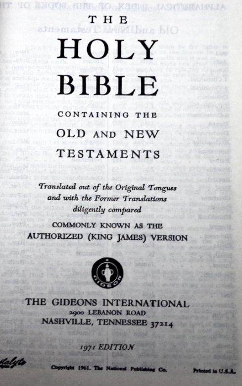
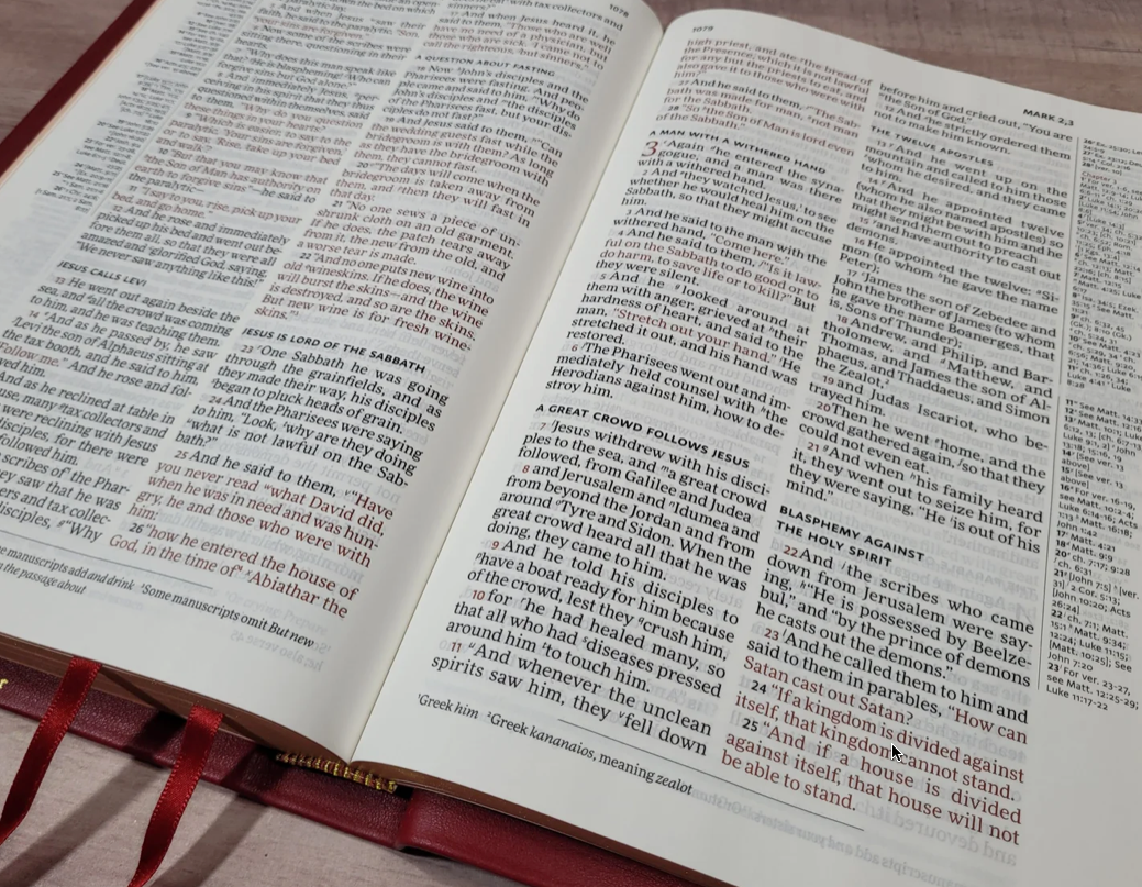
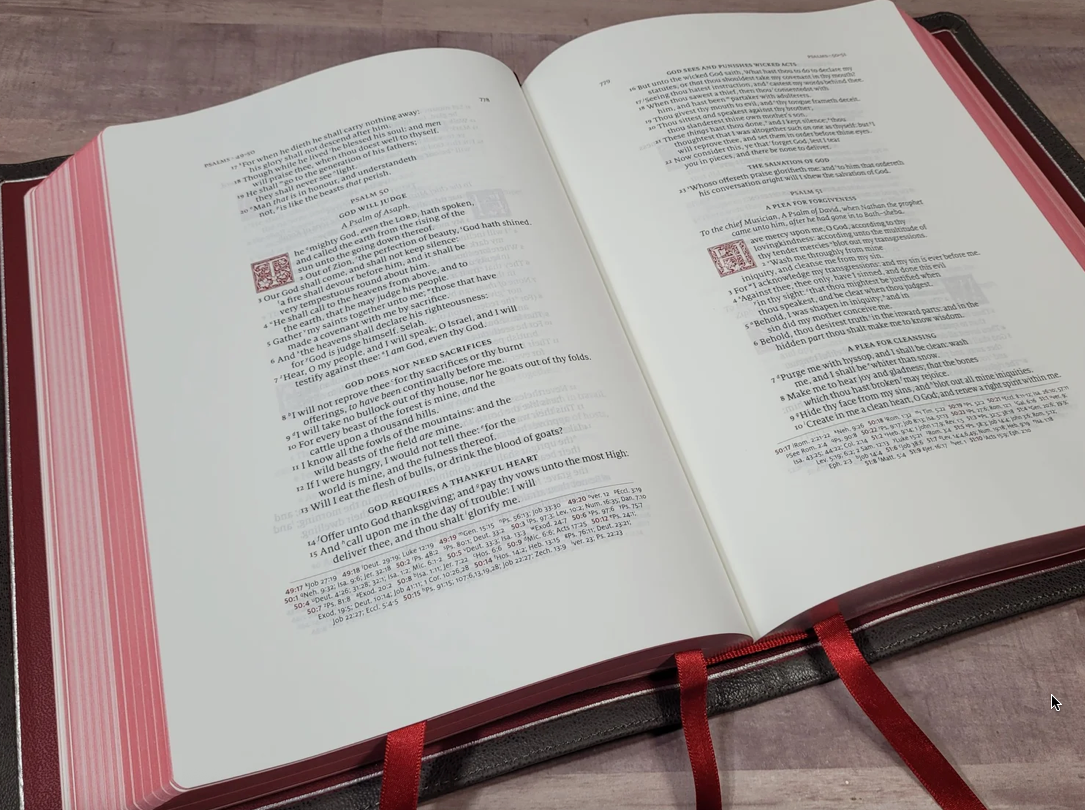
To change the text of the Bible, even typographically, took years. Note the samples of the Gideon Bible of 1958 & 1971. Most Gideon Bibles, especially the classic hotel editions, use a traditional serif “Bible type” that appears compact and highly legible in small sizes, based on classic Renaissance style faces, like Garamond or Times New Roman (in more modern printings) or Bembo, because they appear well in dense, double-column text. The Gideons wanted printed Bibles with maximum readability and low cost, not typographic distinctiveness. Printers therefore favored narrow letterforms, to fit more text per page, moderate contrast, easy on the eyes, and familiar book typography, so that nothing was distracting to the casual reader.
Modern Bible Typography
Why is Bible typography important? The older KJV (King James Version) two-column Bibles (like the Gideon Bible) often used by congregants were ill-designed, hard to read at small sizes, and each verse a separate paragraph with verse numbers and other markers interrupting the flow of the textual thought. They were not reader-friendly Bibles, and they often separated biblical thoughts and gave unfortunate fuel to “biblicism,” that is, quoting verses and thoughts out of context. Atomistic quoting of single verses became the trend of preachers and well-intentioned Bible study leaders. Contexts were ignored, and through bad typography, verses were clumped together in an unfortunate manner.
Those who appreciate the biblical text want it read accurately and legibly. Paragraph divisions were incorporated into the Biblical Hebrew (Old Testament) and Greek texts (New Testament) arbitrarily. Even the verse numbers and divisions were arbitrary, supposedly for better study of the inspired Word, but led to unfortunate theological problems and even heretical points of view. The point I am making is that while we need to study the Bible as the Word of God to us and pore over the biblical theology therein, we need better Bible typography to do so.
In a 2021 issue of Bible Study Magazine, Mark Ward, editor, provided a well written and visual article “A Revolution in Bible Design: Meet the People Who Designed Your Bible.” In that piece he reviewed the work of Bible designers and crafts people who design today’s versions of the Bible, noting the typeface designs used and paper quality. In fact, in a YouTube segment, Mark has an entire talk on Bible typography well worth your time. (https://www.youtube.com/watch?v=tu4t9FKn9M4. And Mark Ward, “A Revolution in Bible Design: Meet the People Who Designed Your Bible,” Bible Study Magazine, November–December, 2021.)
In fact, Ward issued a “Bible Typography Manifesto” in which he called upon Bible printers and publishers to typographically make the Bible more readable —
“Pay attention to typography. Pay actual designers to lay out your Bibles. There are standards for ideal line length, type size, and leading that have been established over the centuries. Lexicon is an exceptionally good typeface for Bible publishing.
Do not try to sell Bibles by including cutesy material that undermines the gravity of the text—or edgy, worldly material that undermines its holiness. Bibles should not look like teen magazines or gift-store kitsch.”(https://byfaithweunderstand.com/bible-typography-manifesto/)
He says that Readers’ Bibles should keep “the flow of thought going for Bible readers. The paragraphs will break up the thought where the thought itself breaks instead of at fixed intervals (as in our current system), and the single- column format—along with appropriate modern typographic conventions—will say “narrative” or “letter” (etc.) rather than “reference book,” as double-columns do. Treating the Bible like a reference book to the exclusion of Story has been one of the cardinal errors of evangelical interpretation.”
I, with Mark, have seen too many of the problems with verse-by-verse preaching and teaching and even writing that “proof-texts” a certain point of view, rather than being truthful to the context of Scripture.
Proper typographical line length, type size, leading, and typefaces that have been established over the centuries of good typography are ignored and shuttled to the side for what is supposedly dramatic and consumer driven. Clean lines and readable, legible and clear text are sometimes missing in printed Bibles. This does not have to be so, given the wealth of good typographers and typographic standards we have available. Use them. Obey them.
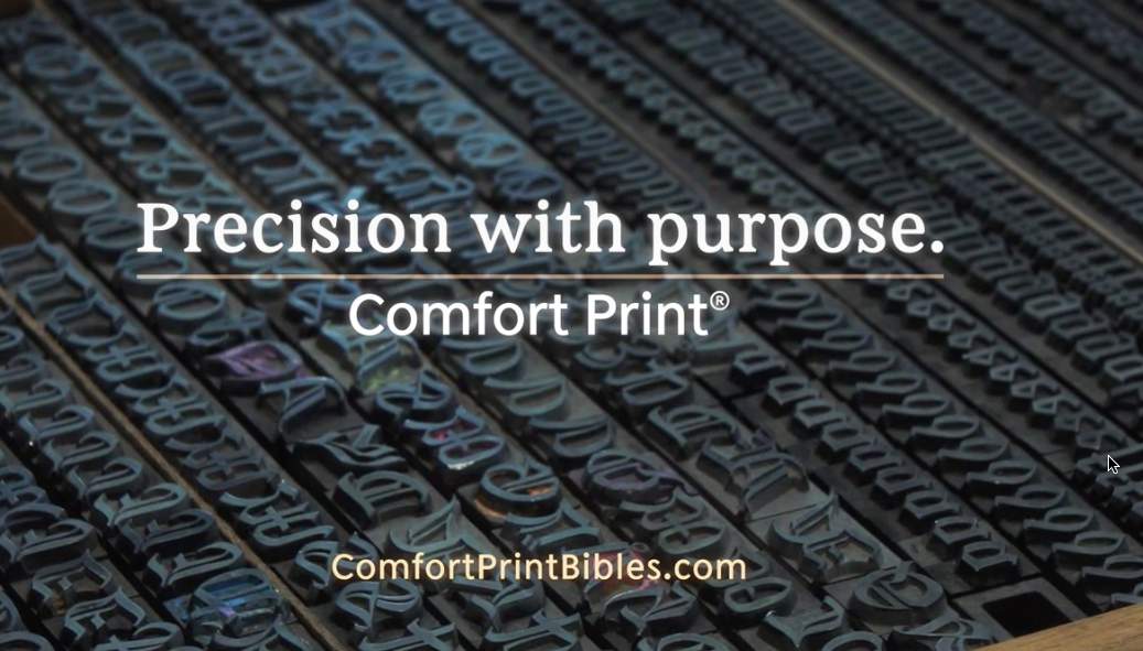
Well, someone has listened to these typographic voices! In 2015 Zondervan launched the company’s Beautiful Bible initiative. Partnering with 2K/DENMARK, the foremost Bible type foundry, a typeface has been created that uniquely complements modern English Bibles.
NIV Comfort Print “is a highly readable typeface that uses a unique mix of open and closed letters, making it easier to read for long periods of time. It is also spatially efficient, directly contributing to the company’s initiative to reduce its carbon footprint and reduce unnecessary paper usage.(https://www.thomasnelsonbibles.com/ comfort-print/)
Comfort Print Bibles stand out for their unique design focused on readability and comfort. Typically featuring font sizes between 10 to 12 points, these Bibles use enhanced typography and spacing to make text easier to read compared to standard print versions.” Thomas Nelson Comfort Print®type fonts have been uniquely created for the NKJV, KJV, NET, NIV, NASB. These exclusive family of fonts are expertly designed reflect the history and legacy of each translation, and also use the latest in the art and science of typography design to create a smooth reading experience.
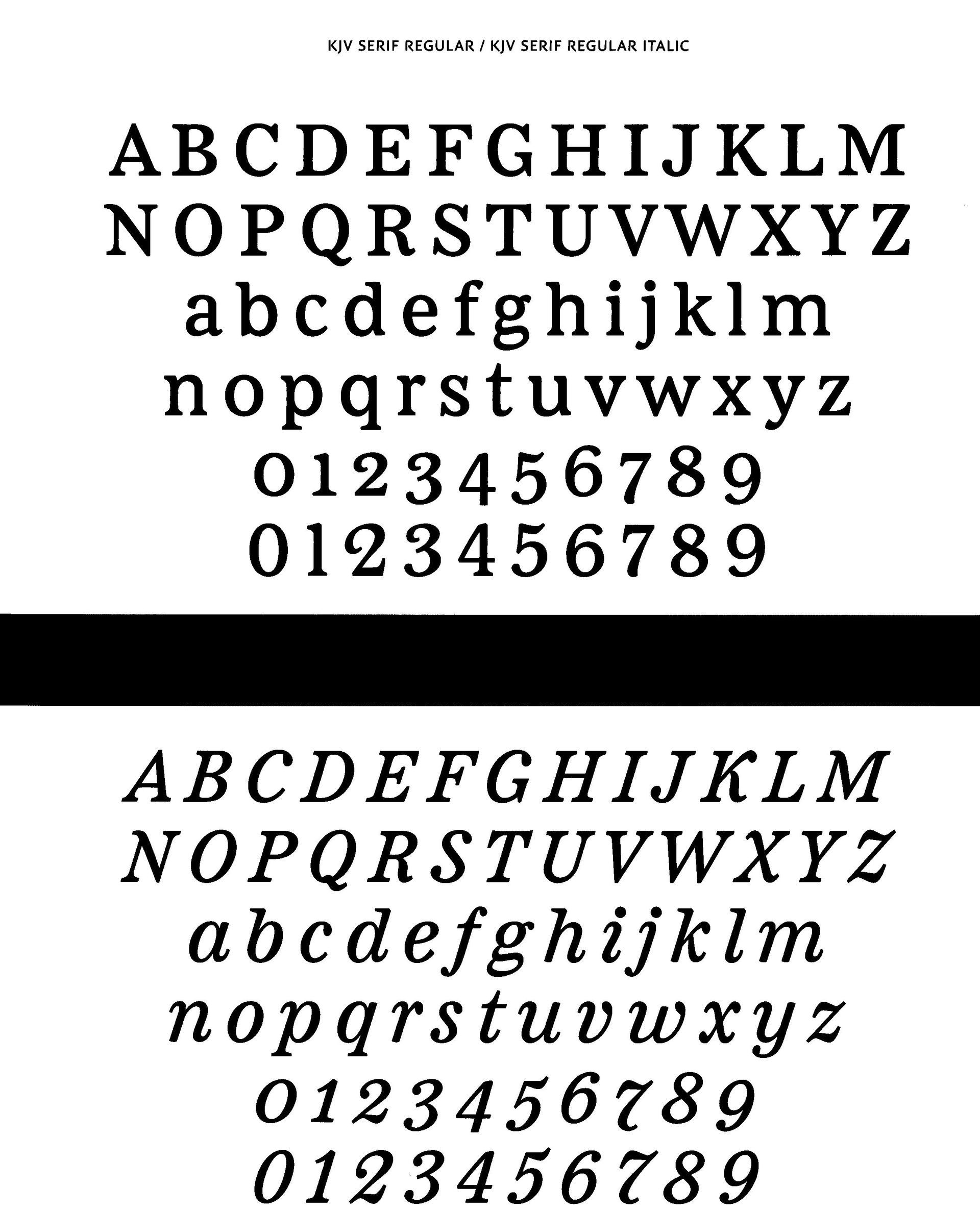
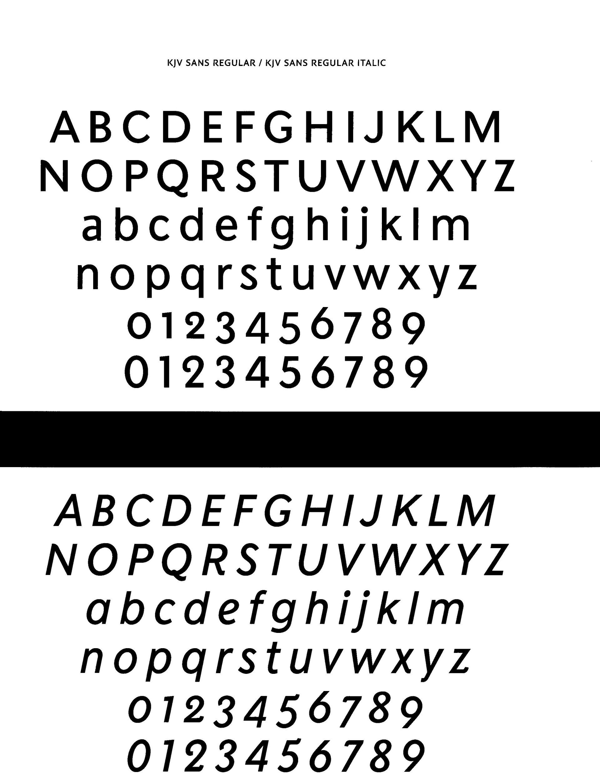
The sample text faces are TN KJV Serif Regular & Italic and TN KJV Sans Regular & Italic. From The Comfort Print™ Story: Seven Bible Typeface Families Created by 2K/DENMARK for HarperCollins Christian Publishing
A New American Standard Version — "Presenting The American Literary Version — a respectfully revised edition of the 1901 American Standard Version, reviewed by a team of Ph.D. scholars from esteemed institutions including Oxford, Duke, Wheaton, and Fuller.
Archaic language has been modernized with care (e.g., “thou” to “you”), while preserving the original translation’s exceptional accuracy and literary richness.
This revision isn’t meant to smooth over or explain away the complexities inherent to the text — rather, it invites readers into the profound depth and literary artistry of the biblical library.
Through a careful and measured modernization of the ASV, while maintaining a commitment to literal translation, the ALV offers a unique pathway to experience the raw beauty, complexity, and timeless power of these ancient writings.
(https://www.bibliotheca.co/about)
support@bibliotheca.co
Writ Press
811 9th St, Ste 120 / 258
Durham, NC 27705 USA
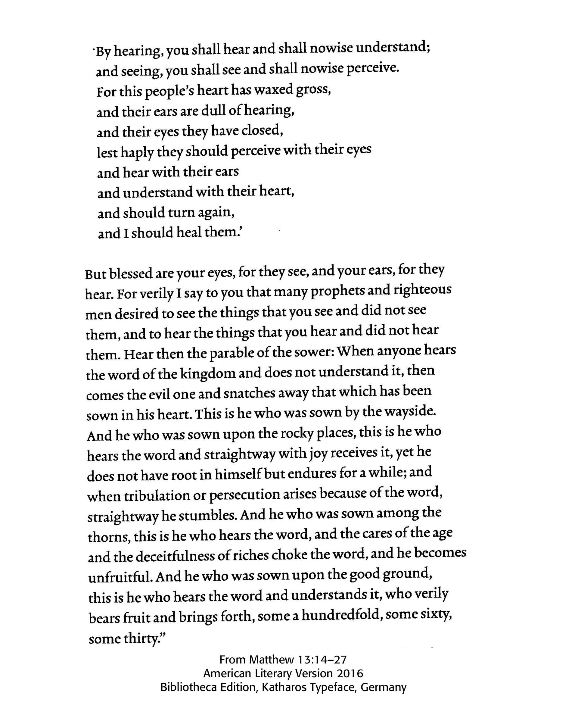
Introducing Katharos — a custom-designed typeface created specifically for Bibliotheca, blending timeless elegance with optimal readability. Its clean, open forms and carefully balanced proportions are tailored to support immersive, effortless reading."
Successful Layout & Design


