Seven Revived Fonts
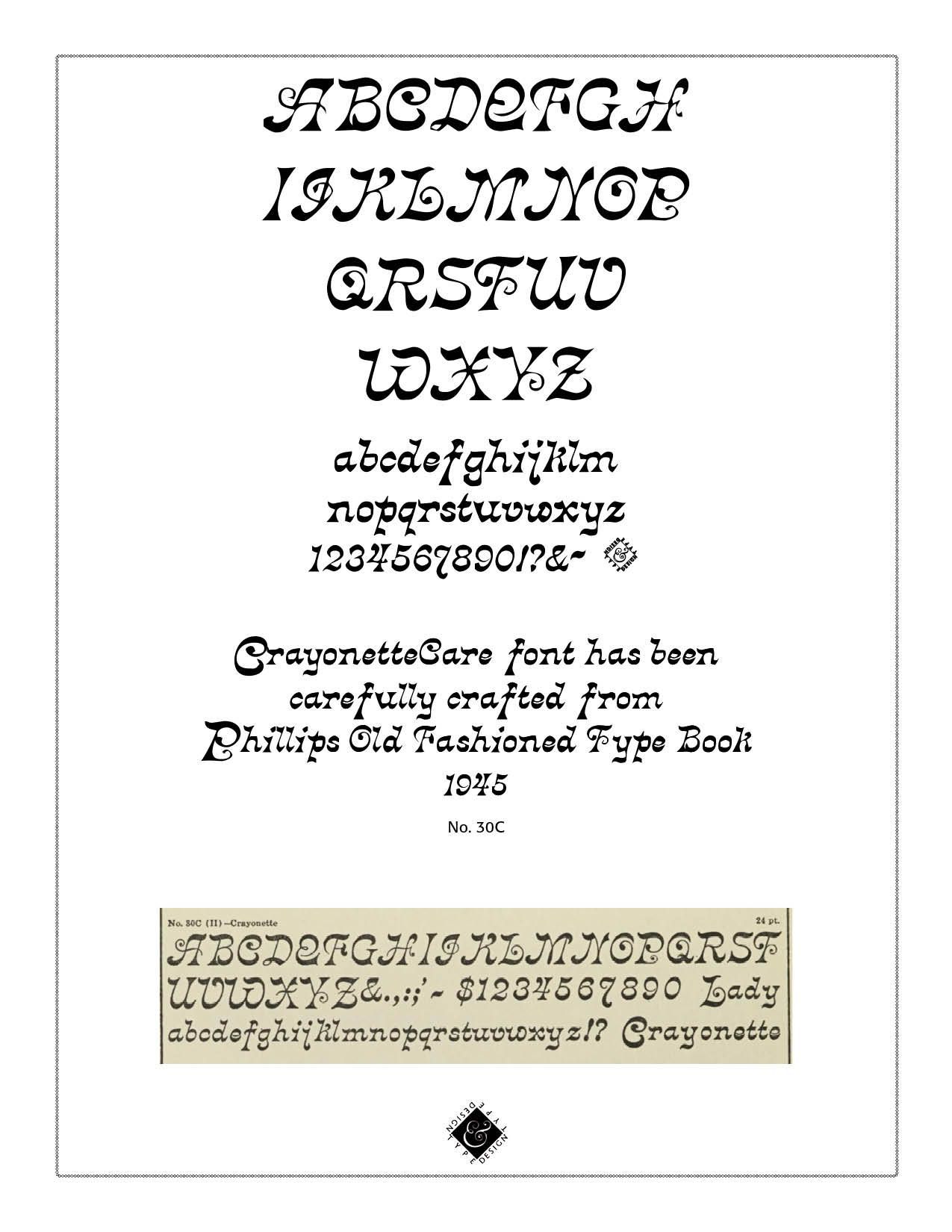
Seven Revived Fonts. CARE Typography is pleased to introduce seven fonts, revived from Phillips Old Fashioned Type Book (New York, 1945). The CrayonetteCare font has been ably presented elsewhere by David Jonathan Ross as Crayonette DTR (https://djr.com/notes/crayonette-djr-font-of-the-month) in 2017 and is also available on Adobe fonts. Crayonette was designed by Henry Brehmer in 1889 and first issued by Philadelphia’s Keystone Type Foundry. It is a weird and wonderful Victorian design that, to Ross's knowledge, had never received a suitable digital revival. And thanks to research by Indra Kupferschmid, he also found out that Crayonette came in an Inline version as well, and also appeared under various other names such as Almah, Columbian Italic, Fantaisie, Italienne Cursiv, and Zierschrift. The CrayonetteCare font version here has been digitized by CARE Typography using the Phillip's font samples book, sample #30C.
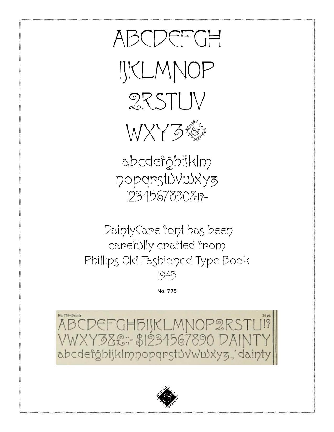
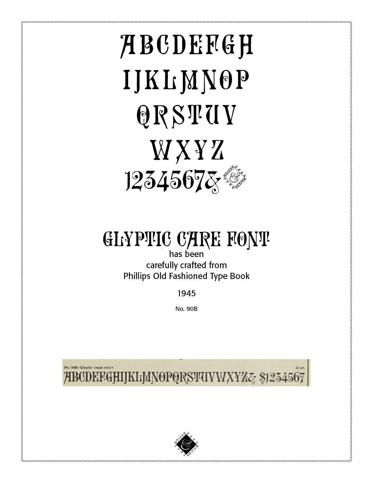
The DaintyCare font (Sample #775 from Phillips) is a light an airy typeface with both Caps and smaller case lettering. What is notable is the distinctive "Q" and "Z" letters. Note also the capital "H" and the unique ampersand "&" of the font. The GlypticCare typeface does not have all the numerals and is primarily a caps only font. The fancy ampersand is to be noted in this rendering. Glyptic is an ornamented Latin serif designed in 1878 by Herman Ihlenburg and issued by the Philadelphia type foundry Mackellar, Smiths and Jordan. David Ross produced a fine rendering of the Glyptic font and it is also available on Adobe fonts.
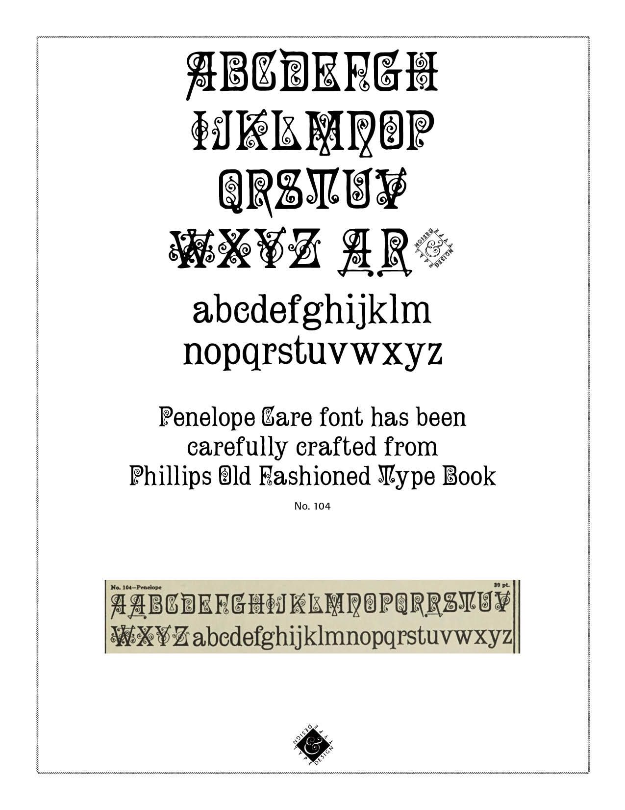
The PenelopeCare font is a decorative typeface digitized from the Phillips book of old fonts. Its original version of all caps was designed and offered by Typographer Mediengestaltung, by Dieter Steffmann, Kreuztal, Germany, and is part of a package of 357 old time fonts. A more developed rendering has been offered by Dan Solo of Solotype in Cleveland in 2004 on myfonts.com. That version is $19.95 from MyFonts. Steffmann has offered Penelope as a free font, for both personal and commercial use. He writes — "For several years, I have completed not only erroneous public domain fonts, but I have digitized or vectorized complete fonts. Nowadays, even high-quality fonts are available and affordable for everyone. Therefore, I have specialized in collecting and digitizing "blackletter" (Fraktur) fonts, which have no market value to large font houses because of insufficient demand, and are therefore generally not available for purchase. Since I consider fonts to be cultural heritage, I do not agree with their commercialization. Fonts once made out of metal type obviously had a price along with their metal value, and the cost of designing, cutting and casting is convincing, particularly since the buyer also acquired ownership of the purchased fonts! Anyone who believes that they can buy a magazine now a days and then have the property acquired as in the times of metal setting, is wrong: The font foundries only sell "licenses" for a file of nothing but "zeros and ones" with no real material value, and the buyer usually does not become the owner, but only a licensee! For all these reasons I am giving out my fonts to everyone for free for commercial purposes without any restrictions and I hope you enjoy in these fonts as much as I and many other font-friends around the world do!" The PenelopeCare font is therefore free to all who want it from CARE Typography.
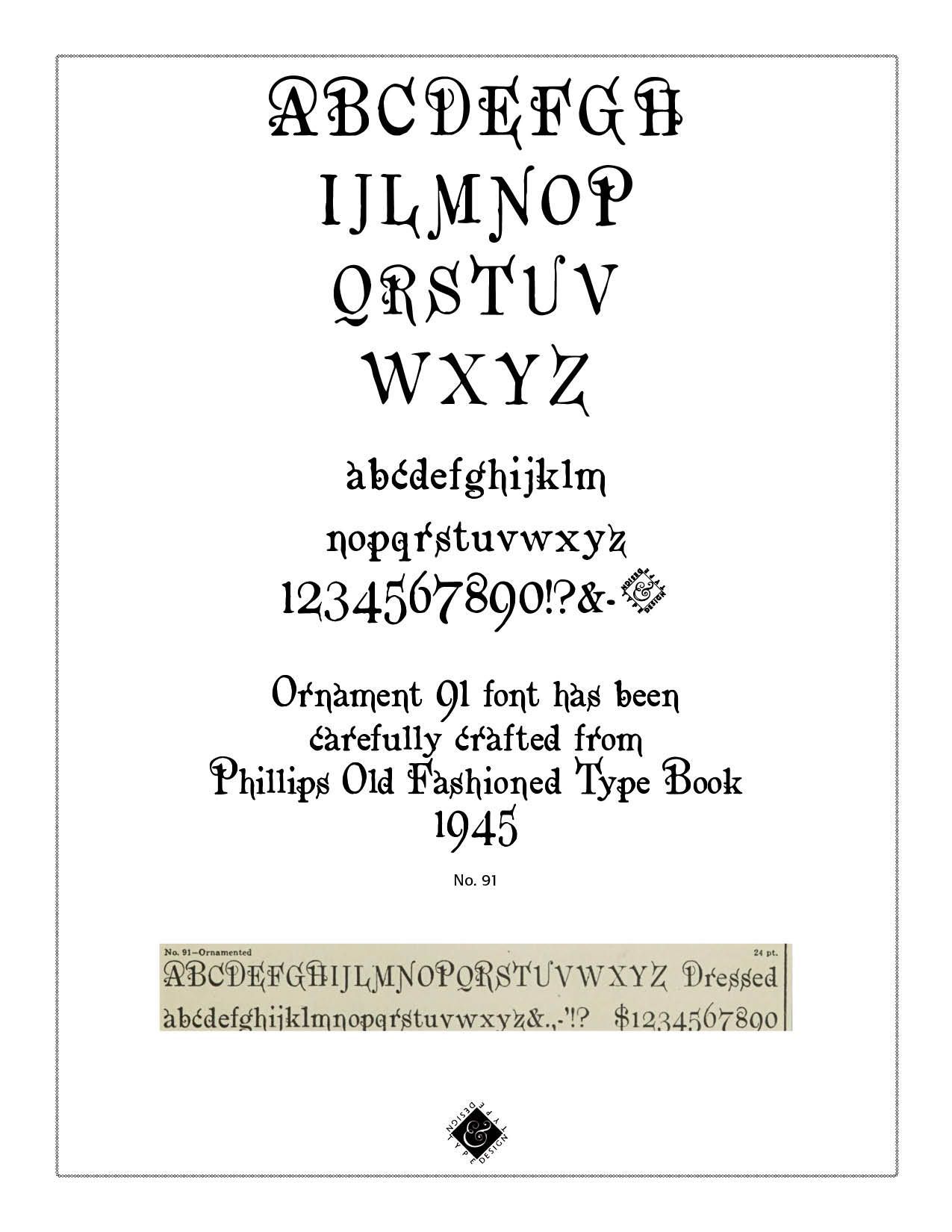
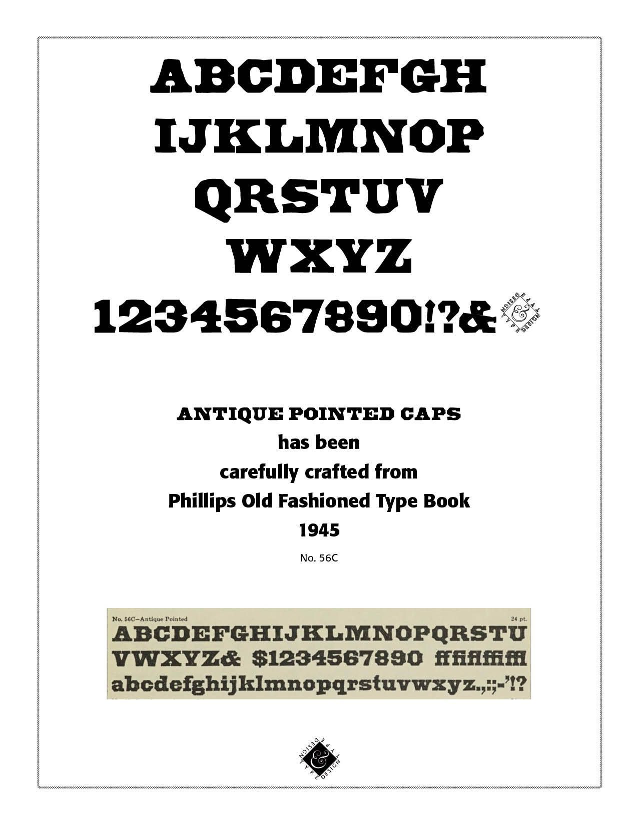
The Antique Pointed Caps font (#56C from Phillips) with numerals is a bold, blackletter font with distinctive squared off edges. The Old Flemish font (#18 from Phillips) has the telling characteristics of pre-Victorian days with abundant flourishes. The Ornament91 font has slim lines and accented flourishes. These seven fonts are also available from CARE Typography and can be ordered from our email site — cshanktype@gmail.com — for a small fee. They can also be ordered as a group for $35.

Successful Layout & Design


