Early American Printing & Type Foundries
Early American Printing & Type Foundries.* Printing was introduced into America at Mexico by the Viceroy Mendoza in 1536. The first book printed was the Escala Espiritual de San Juan Climaco, of which no copy is known to exist; but the oldest American book now extant is the Manual de Adultos, dated 1540, of which only the last four leaves are to be found in the library of the Cathedral of Toledo. The name of the earliest printer is a matter of question.
Cambridge, Massachusetts, is entitled to the distinction of having the first printing-press in North America, which was under the charge of Stephen Daye. For this press the colony was mainly indebted to the Rev. Jesse Glover, a non-conformist minister possessed of a considerable estate, who had left England to settle among his friends in Massachusetts. Some gentlemen of Amsterdam also “gave towards furnishing of a printing-press with letters, forty-nine pounds and nothing more.” This was about 1638. The first book issued was the Bay Psalm-Book, in 1640.
The first book issued in the Middle Colonies was an Almanac, printed by William Bradford in 1685, near Philadelphia. Bradford was sent from England in 1682 by William Penn. As the government of Pennsylvania became very restrictive in regard to the press, Bradford in 1693 moved to New York, and was appointed printer to that colony, where he established in 1725 the New York Gazette, the first newspaper published there. He died May 23, 1752, after an active and useful life of eighty-nine years. The first paper-mill in America was established near Germantown, Pa, in 1690, by William Rittenhouse.
The first newspaper in America was the Boston NewsLetter, which was first issued by John Campbell on Monday, April 24, 1704. It was regularly published for nearly seventy-two years. The second was the Boston Gazette, begun December 21, 1719. The third was the American Weekly Mercury, issued in Philadelphia, by Andrew Bradford, on December 22, 1719. James Franklin, an elder brother of Benjamin, established the New England Courant, August 17, 1721. The oldest living paper of the United States is the New Hampshire Gazette, published at Portsmouth, now (Oct. 7, 1877) one hundred and twenty-one years old. The North American United States Gazette leads the existing daily press of this country in point of antiquity. It is the successor of the Pennsylvania Packet, (begun in 1771 and becoming a daily paper in 1784), and was the chief commercial journal of Philadelphia. According to Holmes's American Annals, about 200 newspapers were printed in the United States in the year 1801, of which seventeen were issued daily, seven three times a week, thirty twice a week, and one hundred forty six weekly. There must also have been at the same time as many as sixty offices engaged in miscellaneous printing. The whole business had increased threefold in eleven years.
Type Foundries in Early America. A type foundry is a company that designs or distributes typefaces. Before digital typography, type foundries manufactured and sold metal and wood typefaces for hand typesetting and matrices for line-casting machines like the Linotype and Monotype, for letterpress printers. Today's digital type foundries accumulate and distribute typefaces (typically as digitized fonts) created by type designers who may either be freelancers operating their own independent foundry, or employed by a foundry. Type foundries may also provide custom type design services.
A foundry, principally for German type, was established at Germantown, Pennsylvania, about the year 1735, by Christopher Saur, (or Sower,) a printer, who executed in German the first quarto Bible printed in America, as well as other valuable works in the German language. Three editions of the Bible were printed, in the years 1743, 1763, and l776, the latter two by his son. In 1739, Saur also published a newspaper in Germantown. An abortive attempt was made about 1768 to set up a foundry at Boston by a Mr. Mitchelson from Scotland, and another in Connecticut in 1769 by Abel Buel. In 1775, Dr. Franklin brought from Europe to Philadelphia the materials for a foundry, but little use of them was made.
John Baine, a type-founder of Edinburgh, sent a relative to this country with tools for a foundry. At the close of the Revolutionary War, his son came over himself. They carried on the business until 1790, when Mr. Baine died, and returned to Scotland. Dutch founder, Adam G. Mappa, settled at New York about 1787, and cast Dutch and German faces, as well as Roman styles.
Another type-foundry was put in successful operation in Baltimore, about 1805, by Samuel Sower & Co. It had in it some molds and matrices which had been used by Christopher Sower, who had printed in Germantown, near Philadelphia, and cast his own types. He printed with German characters; but now the foundry was revived with excellent Roman and Italic letters, and among other extraordinary things it had the size called Diamond, with a smaller face than had ever been cast before. It was the smallest type in the world at that time. The early Diamond typeface, sometimes referred to in the context of early American printing, has distinct characteristics that arose during the period of its use. The Diamond typeface was typically used in very small sizes, often referred to as “diamond” in the context of type sizes. This made it popular for compact printing formats, such as almanacs and pocket-sized books. Early versions often featured condensed letterforms, allowing more text to fit into a limited space while maintaining legibility.
The design often included sharp angles and geometric forms which contributed to its distinctive look. The early characters tended to have minimal contrast between thick and thin strokes, which was a hallmark of types from this period, contributing to a more unified visual appearance. Some variations of the Diamond typeface featured ornamental serifs or embellishments, reflecting the decorative style of the time. Despite its small size, the diamond typeface maintained a level of legibility that was crucial for effectively conveying information in smaller prints. These characteristics made early Diamond types particularly suitable for the practical needs of printing in early America, as they balanced elegance and functionality in small formats.
In 1811, Elihu White established a type-foundry in New York. He had been long engaged, in connection with Mr. Wing, in the manufacture of printing types at Hartford, Connecticut, upon a plan of their own invention, by which twenty or thirty letters were cast at once; but, abandoning that invention, he adopted the bid plan of casting and having a good assortment of faces and bodies, his removal to New York was a great convenience to its printers, and they gave him a very satisfactory support. But the principal business in type-founding still continued for some years to be done in Philadelphia.
A bid plan for type casting, typically used in the context of typography and printing, outlines the proposed approach and costs associated with creating typefaces through the casting process. In a “bid plan” was included the Project Scope, which clearly defined the extent of the type casting project, including the number of typefaces to be created, specific styles (serif, sans-serif, display, etc.), and any custom requirements. Details for the materials to be used, such as alloys for metal type, and any specific preferences for typeface characteristics (weight, width, etc.) were part of the plan. The Plan outlined the type of casting techniques to be employed, whether traditional hand casting or later modern digital methods, with explanations for choices made, timelines and milestones for project completion, cost breakdowns, quality control measures, revisions and approvals, delivery methods and a communication plan throughout the project. A well-developed bid plan ensured clarity and set expectations for all parties involved in a type casting project, facilitating smooth collaboration and successful outcomes.
In 1813, another type-foundry was begun in the city of New York, by D. & G. Bruce, principally to cast types for their own use. They had carried on book-printing for seven years, and had now become acquainted with the stereotype art.
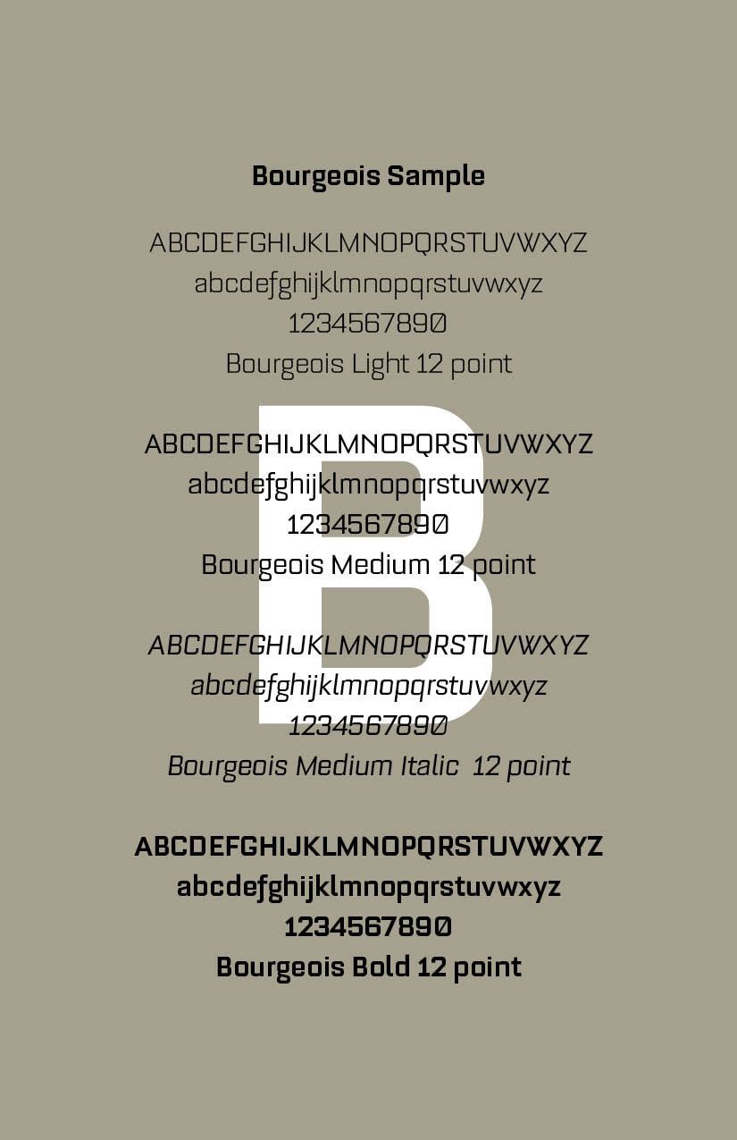
Their first font was Bourgeois (SEE SAMPLES) with which they cast two sets of plates of the New Testament, (the Common School Testament,) having sold one of these to Matthew Carey, of Philadelphia, retaining the other for their own business. But these were not completed until 1814. The process of stereotyping was also used, however, entirely different from that of ordinary type-founding, and it was, therefore, generally carried on as a separate function for one molder, one caster, and three finishers, who, among them, completed, on an average, fifty pages of octavo per day, a traditional book format that refers to the size for pages used in the printing of early books in which a large sheet of paper or parchment is folded three times to produce eight leaves.
Stereotyping in printing is a historic method that transforms a printed page into a durable and reusable type form. This process gained prominence in the nineteenth century and involved creating a solid, cast plate from a mold of a page of type. The concept is derived from earlier practices of creating molds for typesetting. Initially, individual letters were set in a frame to print pages, which was time-consuming.
The process typically involved several steps: (1) Making a Matrix: A page of type was first covered with a soft material (often a mixture of chalk and glue) to form a relief of the letters; (2) Casting: Once the matrix was made, it was used to cast a plate – usually made of lead or a lead alloy – which reproduced the entire page at once; and, (3) Printing: This cast plate could then be used in a printing press, allowing for the same page to be printed multiple times without needing to reset individual type.
Stereotyping enabled printers to produce large quantities of copies quickly, making it particularly advantageous for newspapers and books. Unlike movable type, which could wear out or break, stereotype plates were more durable and could withstand heavier printing processes. It significantly reduced printing costs and time, making it easier to distribute literature more widely.
Stereotyping was widely used until the advent of offset printing and modern digital techniques in the twentieth century. It played a critical role in the democratization of printed materials, making publications more accessible to the masses. Overall, stereotyping marked a pivotal advancement in the history of printing technology, setting the stage for further innovations in the publishing industry.
John Watts, of England, also commenced stereotyping in New York in 1813, and completed the Westminster Catechismthat year, a volume of 120 pages. David Bruce invented the planing-machine for equalizing the thickness of stereotype plates, which became used in every stereotype foundry in the United States.
In 1818, or soon after, a type foundry was established in Boston, also in Cincinnati, principally through the enterprise of the late Elihu White, who, having the means of multiplying matrices with facility, took this method for the extension of his business. Others followed his example, and type-foundries were established in Albany, Buffalo, Pittsburgh, Louisville, and St. Louis, with several additional in New York, Boston, Philadelphia, and Baltimore.
The business, in fact, was overdone, and failures and suppressions took place, as competition reduced the prices of types. The mode of type-founding within forty years underwent important changes, which must no doubt were considered improvements
The first successful type-casting machine was invented by David Bruce, Jr., of New York, and was patented March 17, 1838. The patent was sold to George Bruce, and the machines were used by him until 1845. David Bruce meanwhile patented another machine in 1843, which, with new improvements, patented two years later, gave entire satisfaction, and was in general use in American foundries. By Bruce's machine, three
times the quantity of type that was cast by Binny & Ronaldson's improved mold was now cast in a given time, and nearly five times the quantity that had been cast by the common hand-mold eighty years previously.
This improvement passed into Europe, and adopted by most of the German type-founders. However, in Great Britain for some time it found little favor. A so-called “automatic machine,” for casting and finishing type, invented by Johnson & Atkinson, was in operation in London, but its rate of production seemed to be less than that of the American machine, while, from its multiform operations, the proportion of imperfect type increased.
MACHINE CASTING. In machine-casting, a pump forces the fluid metal into the mold and matrix, and gives a sharper outline to the letter than was formerly given. The practice of casting a single type one at a time became popular. The first idea of this machine originated with William M. Johnson, who obtained a patent for it in 1828.
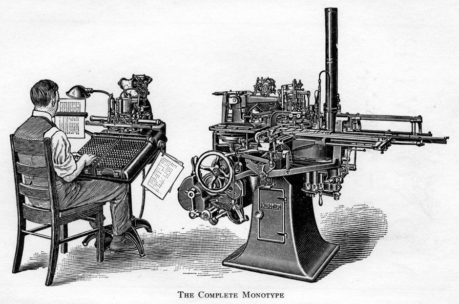
Machine casting in printing refers to the process of automatically casting type and other printing elements using machinery rather than traditional hand-setting techniques. It revolutionized the printing industry by increasing efficiency and reducing labor costs. The origins of machine casting can be traced back to the late nineteenth century when manual typesetting was labor-intensive and time-consuming. The first notable machine for casting type was the Monotype machine, developed in the 1880s by Tolbert Lanston. It allowed for the creation of type using a keyboard and a casting mechanism (See Picture).
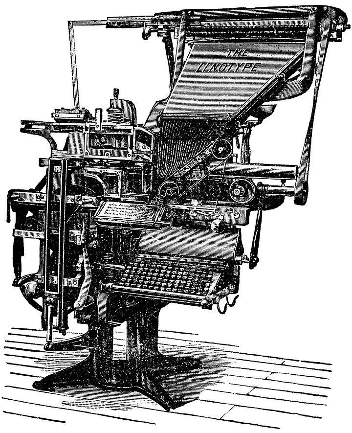
In 1886, the Linotype machine was invented by Ottmar Mergenthaler (See Picture), which took the concept of machine casting further. It enabled the simultaneous casting of an entire line of type from molten metal. This invention significantly transformed newspaper and book printing, allowing for faster production and more complex typography.
Throughout the twentieth century, improvements were made in both Monotype and Linotype systems, and additional machines were developed, leading to the ability to produce more intricate designs and varying typefaces efficiently.
With the rise of phototypesetting and digital printing technologies in the late twentieth century, machine casting became less common. However, its influence remains in modern printing methods.
Machine casting drastically reduced the time required to set type compared to manual methods. The machines produced uniform type pieces, ensuring consistency across printed materials. It minimized the need for skilled typesetters, allowing for a more streamlined production process. Machine casting marked a significant advancement in the printing industry, providing enhanced speed and efficiency that paved the way for more modern printing technologies.
Elihu White put it into use in his type-foundry, and persevered in using and trying to improve it as long as he lived; but he did not succeed in removing the greatest fault, which was a hollowness in the body of the types cast by it, that inclined them to sink under the pressure of the printing press.
Protection afforded by patent laws checked the piratical production of matrices by electrotyping (except in plain faces, a practice still pursued by unprincipled type-founders,) and the leading founders in this country were encouraged to produce types of new styles which in beauty and ingenuity surpassed those of foreign origin.
Four type-foundries sprung up in Boston, five in New York, one in Buffalo, three in Philadelphia, two in Baltimore, two in Cincinnati, four in Chicago, one in Milwaukee, two in St. Louis one in Richmond, one at St. Paul, and one in California, in all, twenty-seven. These foundries not only supplied the printers of the United States, but most of the printers in Canada, some in the British West India Islands, Mexico, the Spanish and Danish and South America. American type, in quality, style, and finish, equaled, if not superior, to any made in Europe.
*SOURCES
Phillips’ Old Fashioned Type Book —showings, alphabetical and otherwise, of approximately one thousand odd fonts of old-fashioned, exotic, ancient and antique type faces, old-time printers' ornaments, borders, cuts, &c., many old specimens of printing, advertisements, bills, labels, &c., old reprints of history & other interesting data on printing & typography of long ago, Frederic Nelson Phillips, New York, 1945.
ChatGPT on "Stereotyping," "Bid Planning," "Machine Casting"
Successful Layout & Design


