How They Handle Typography: Survey of Canva, Kittl and Express
How They Handle Typography: Survey of Canva, Kittl, and Adobe Express
How do some of the major quick illustration programs handle typographic challenges? First, a disclaimer. This is not an exhaustive survey of Canva, Kittl or Adobe Express. However, since I have used these three programs in illustrative purposes, I wanted to find out how they might handle a typographic challenge, namely the banner of a 1901 Calendar. I have worked with this Calendar on a separate blog ("Digitizing the Past") and you can find important information there about the Calendar's source and creators. I have also worked to some extent on Adobe Express, Kittl and more recently Canva. All three have their purposes and strengths and weaknesses in comparison with one another. This blog is not about that comparison.
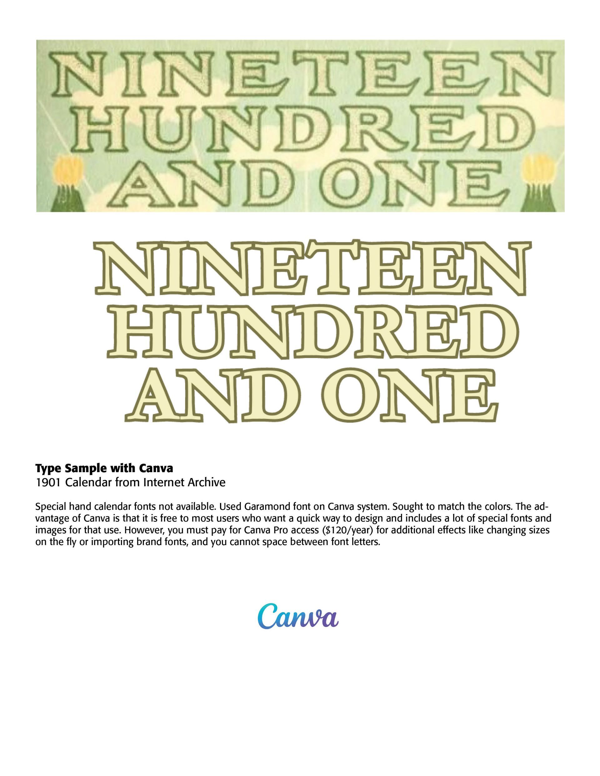
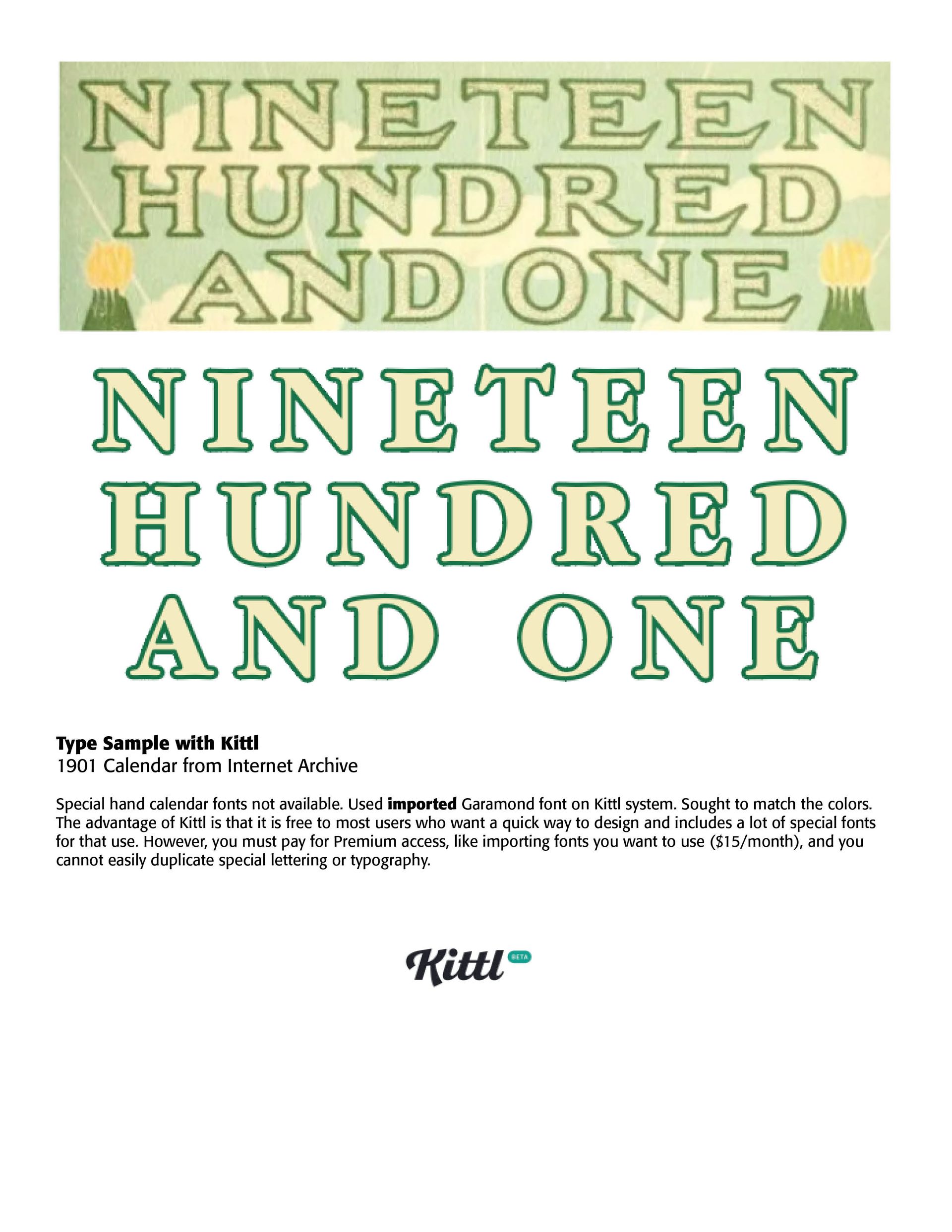
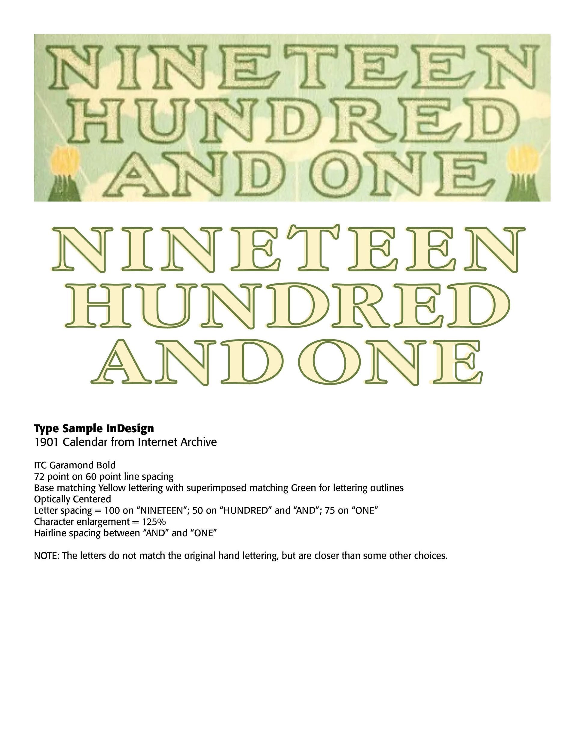
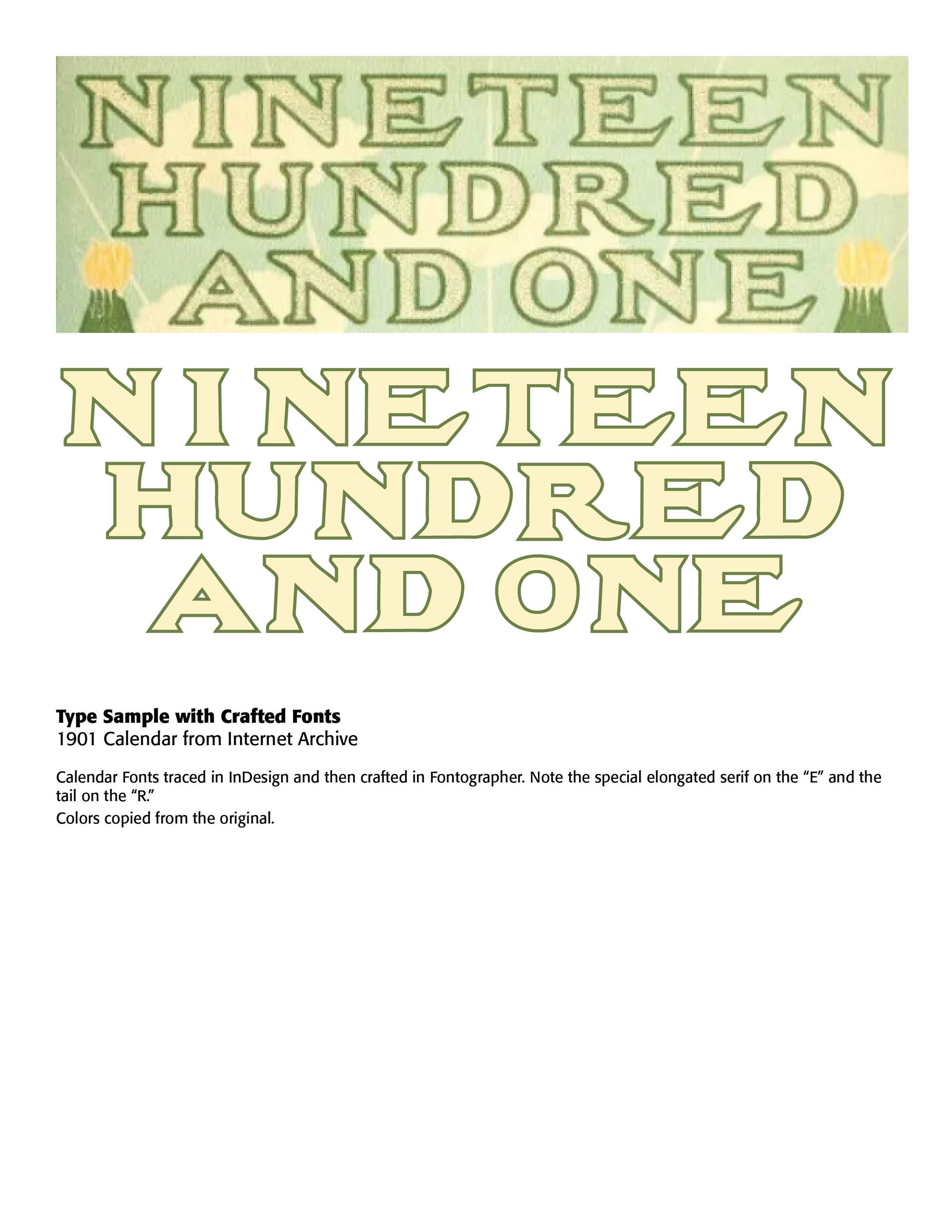
I wondered how these three programs would deal with a typographic challenge presented by this old 1901 Calendar. It would only be fair to say that none of the programs, nor my professional Adobe InDesign program, was up to the challenge, since the typeface used on the Calendar was not to be found anywhere (it might be closest related to Legal Brief JNL Regular, but that's a stretch). It was most likely hand drawn letters (I would invite my readers to state and show otherwise), especially noting the elongated bottom serif on the "E" of the banner and the "R."
Some general comments in using Express, Kittl and Canva might be in order in terms of typography. First, they are not precise typographic programs. They are mostly used and have been created for non-designers to be able to draft pleasing and eye catching illustrations and designs, especially for POD tasks (Printing On Demand). Kittl especially provides some nice Victorian art and design venues for an older look. Canva has the greatest image factory with thousands of images and designs at your fingertips. Adobe Express allows Creative Cloud members such as I am to quickly draw or design something not using Photoshop's or Illustrator's many features and steep learning curves. And Premium membership is free for Creative Cloud subscribers.
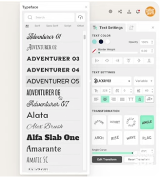
Kittl, and to a lesser extent, Canva, allows the typographer to play with type in a creative and fun way. In Kittl you can twist, rotate, skewer, shade and do other special effects on type that would require much time and work in the classic design programs, like Illustrator, Photoshop and the older Freehand. I have a number of issues of that wonderful design magazine, Before & After, by John McWade, now out of print, that delighted illustrators and type designers like I am for a number of years. These three programs are quick-draw, down-and-dirty, if I may use that phrase, programs that are sight oriented with little to no measurement or precision. What looks good or nice or playful or whatever is what they give you. Precise typesetting tools and measurements are not there, such as technical letterspacing. Small caps are often missing on the glyphs presented in the programs, though they do have many of the glyphs of a regular typeface. But, they would say that more technical programs are what are to be used by professional typesetters and layout designers, especially for typesetting.
I have provided below the Calendar challenges and what I discovered these programs, along with my trusty Adobe InDesign program, can provide. I am not an expert user of Canva, or Kittl, or Express, and I am certain that tweaking is possible with these illustration programs. You can judge for yourself. What I finally had to do to give typographic justice to the banner in the 1901 Calendar was to actually craft a typeface from the letters provided on the calendar using Fontographer.

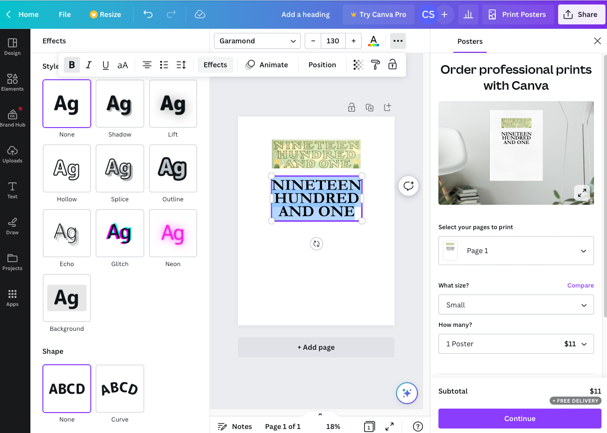
Canva (above) and Kittl (right)
Successful Layout & Design


