Digitizing Faust
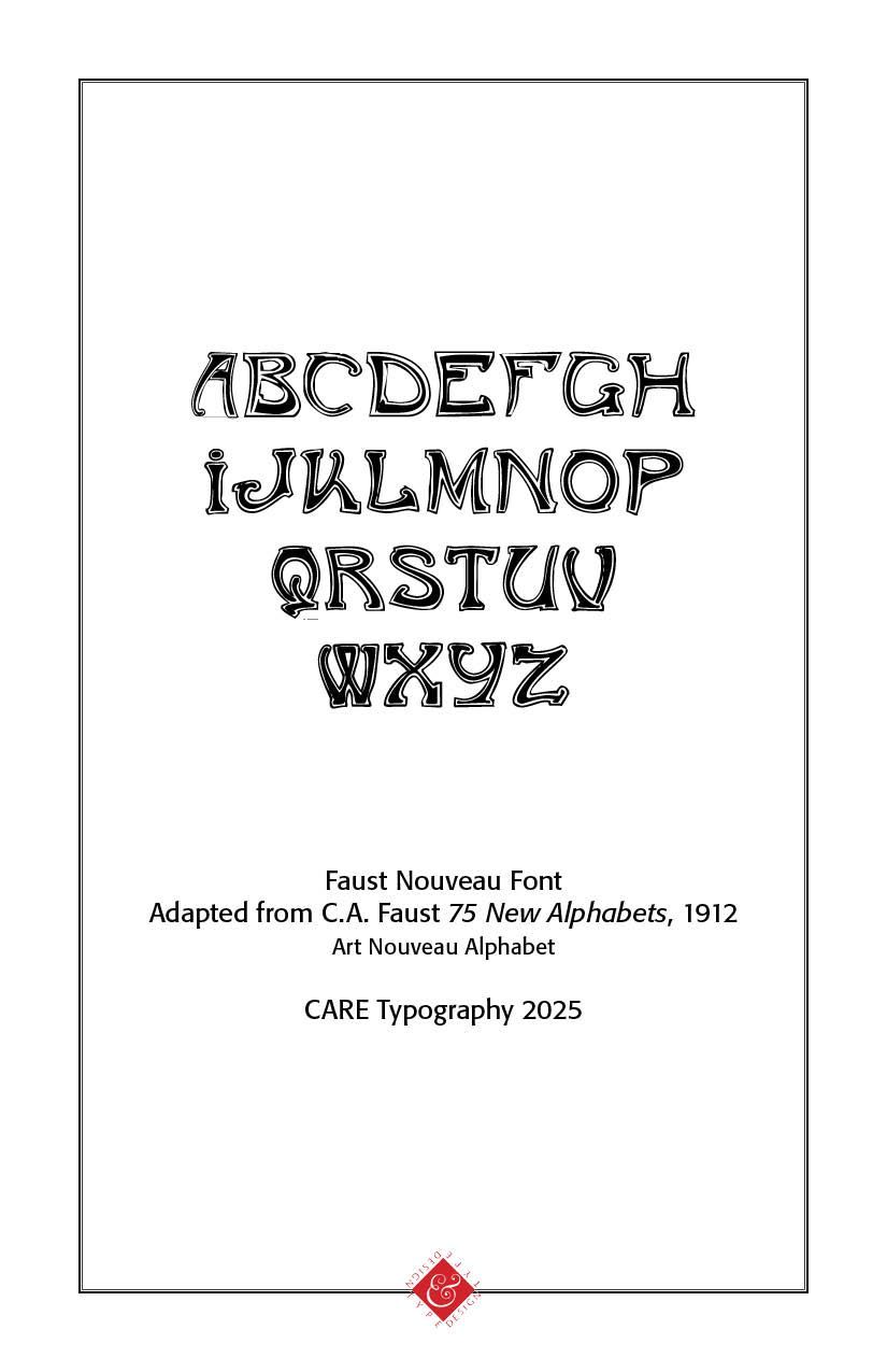
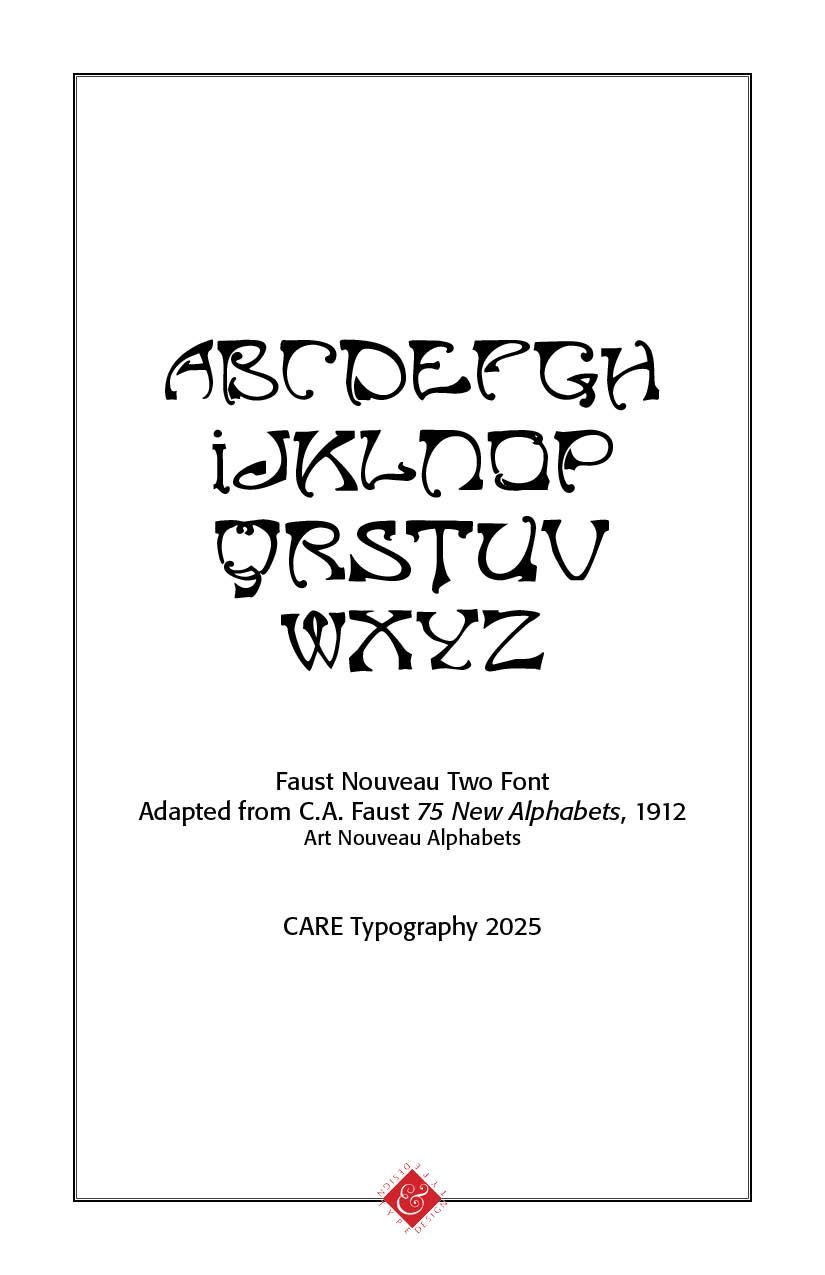
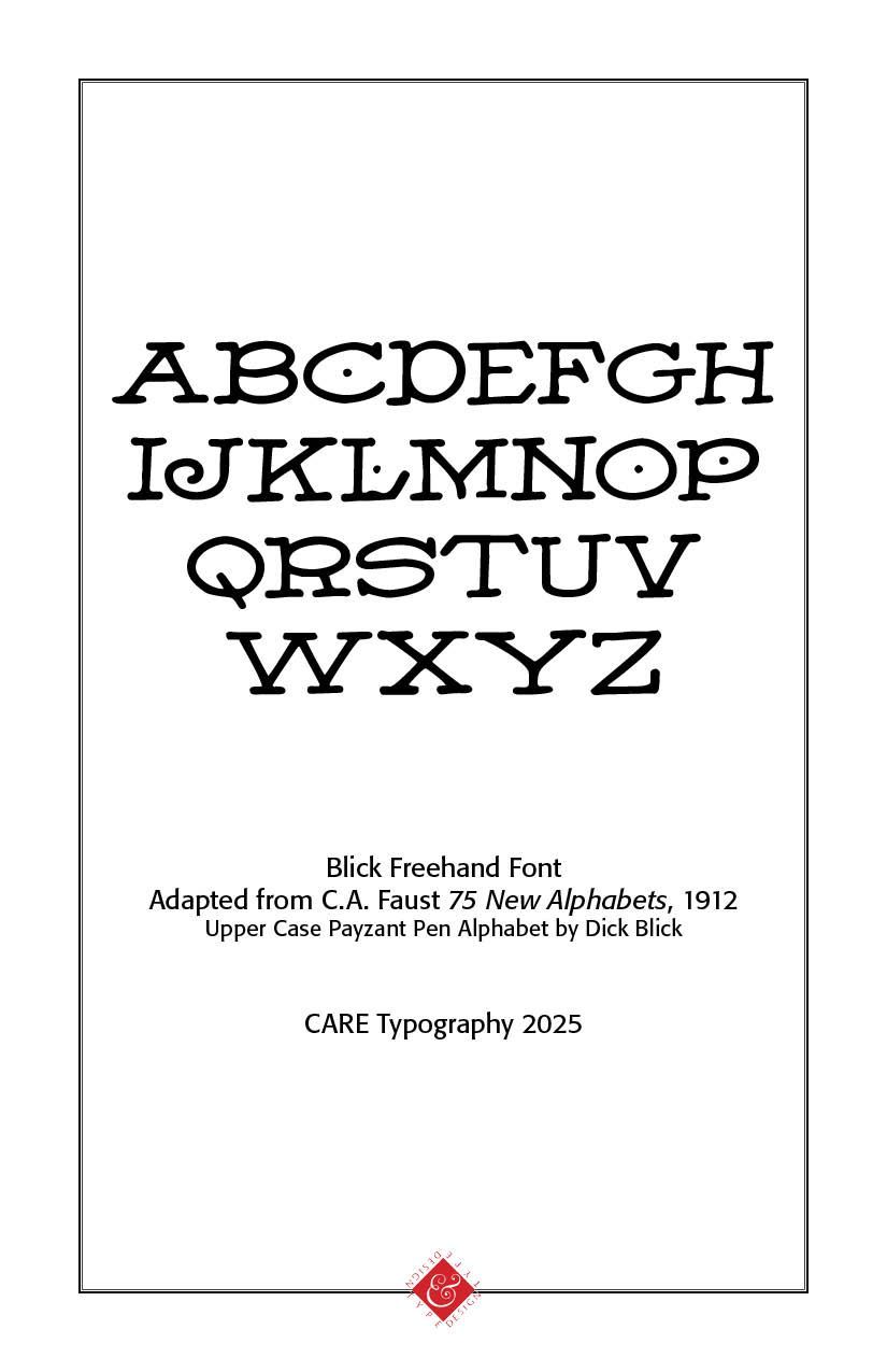
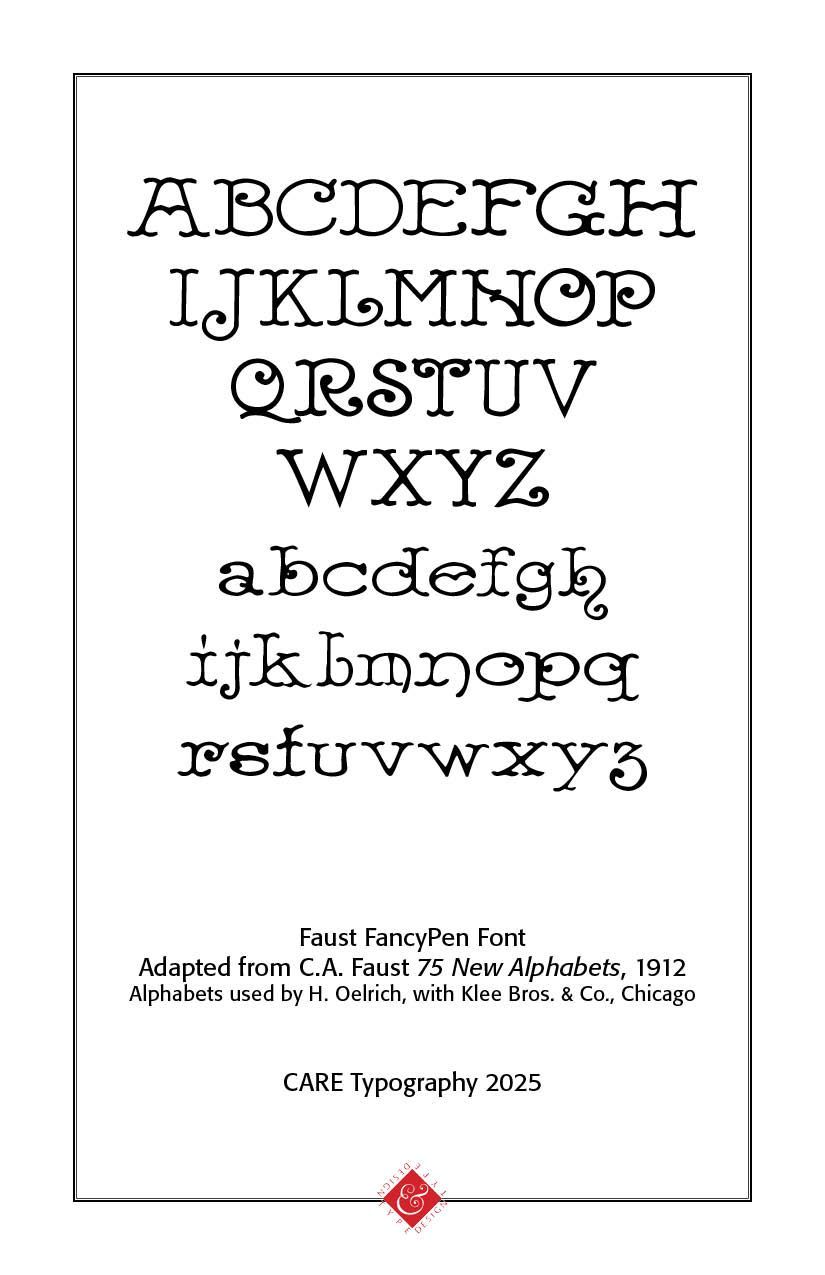
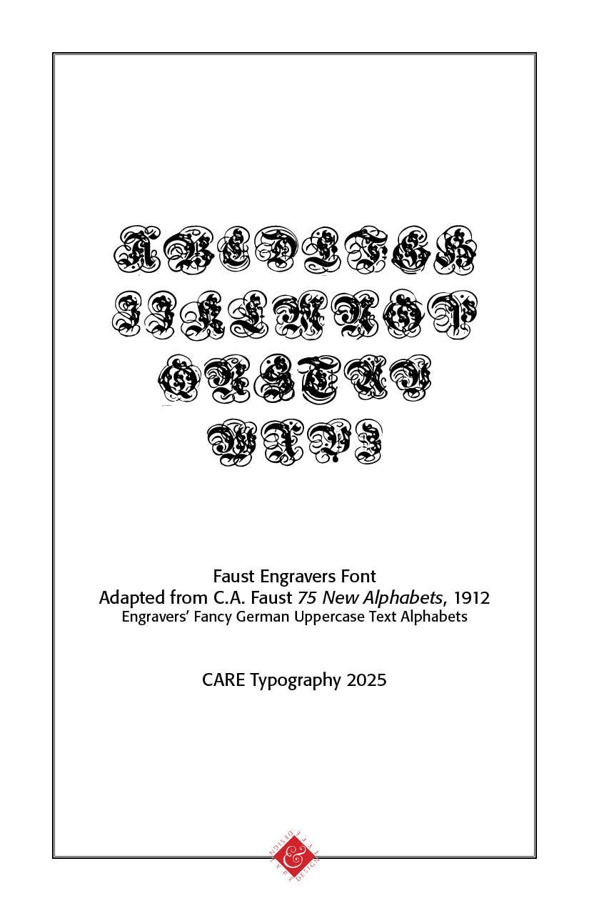
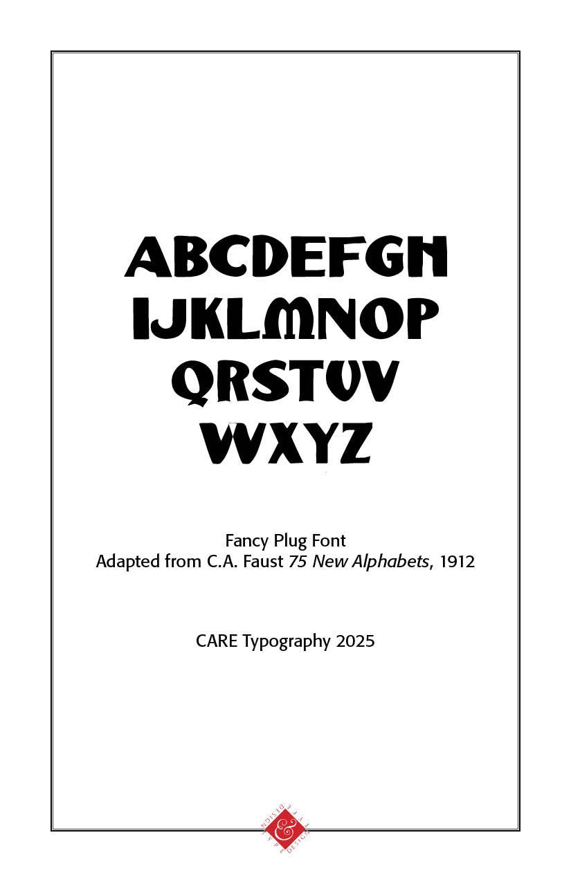
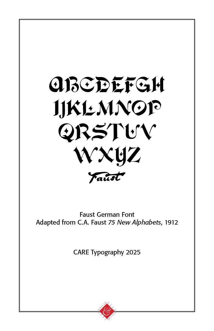
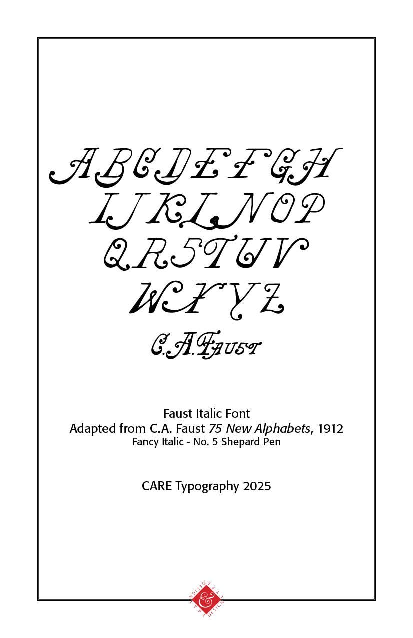
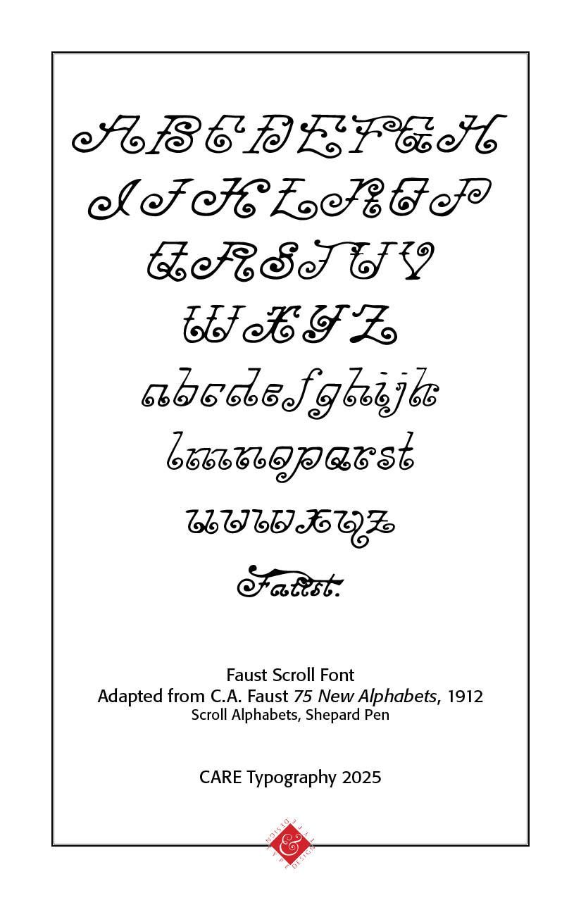
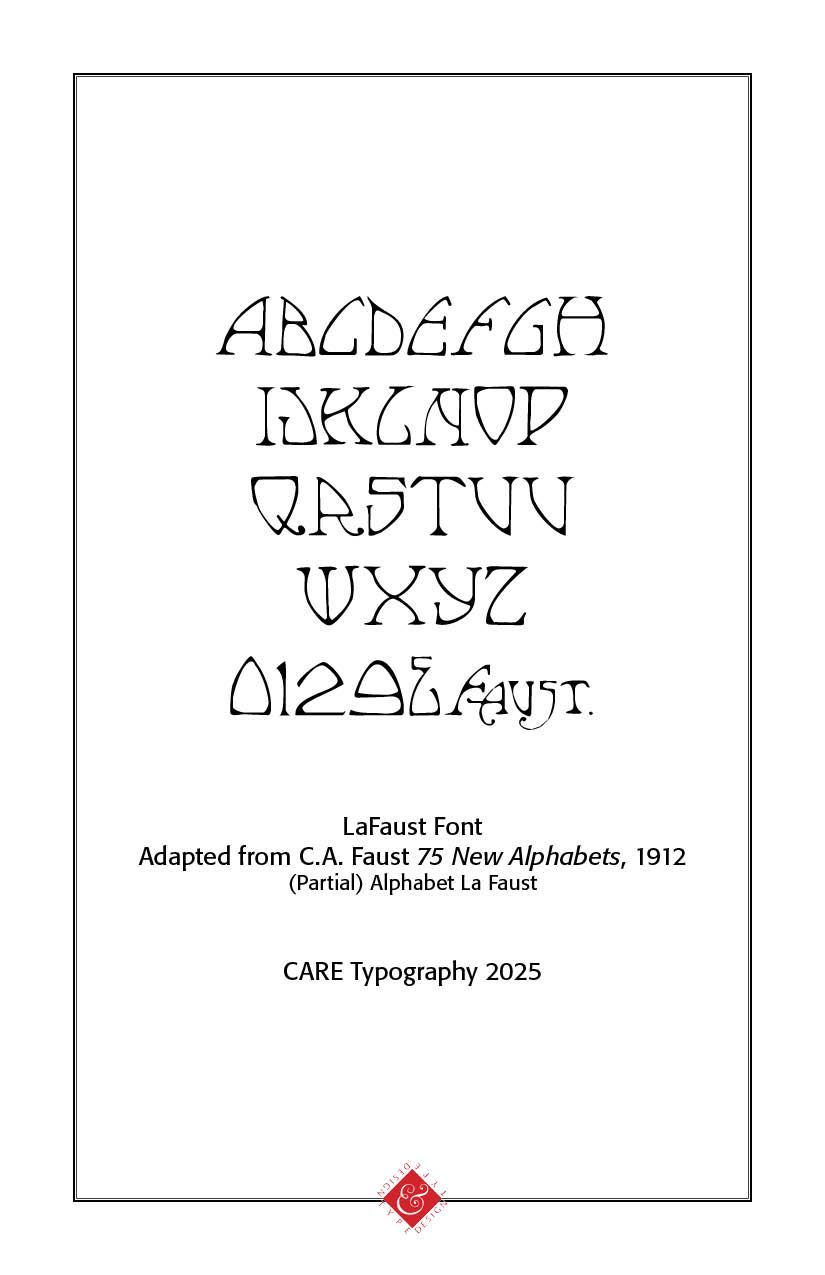
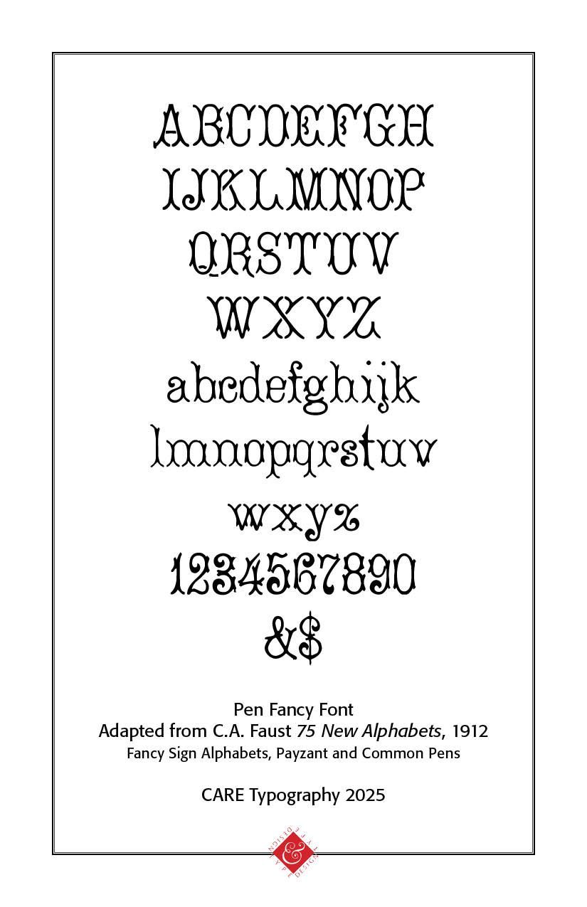
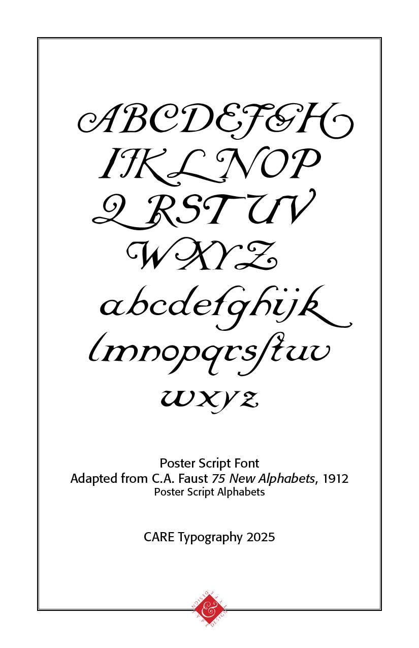
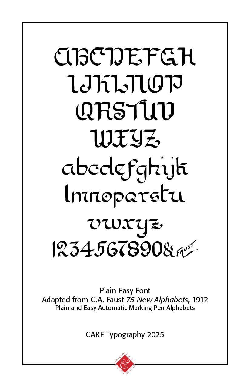
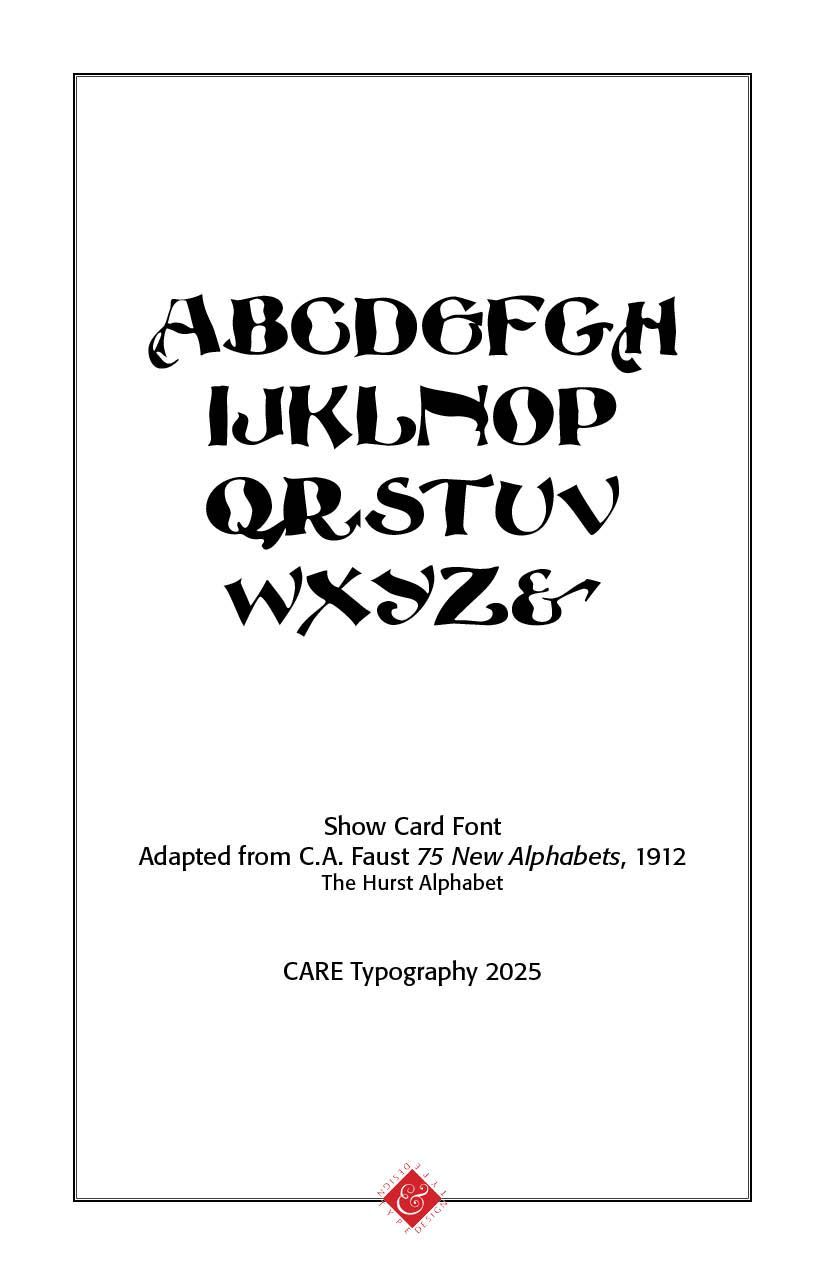
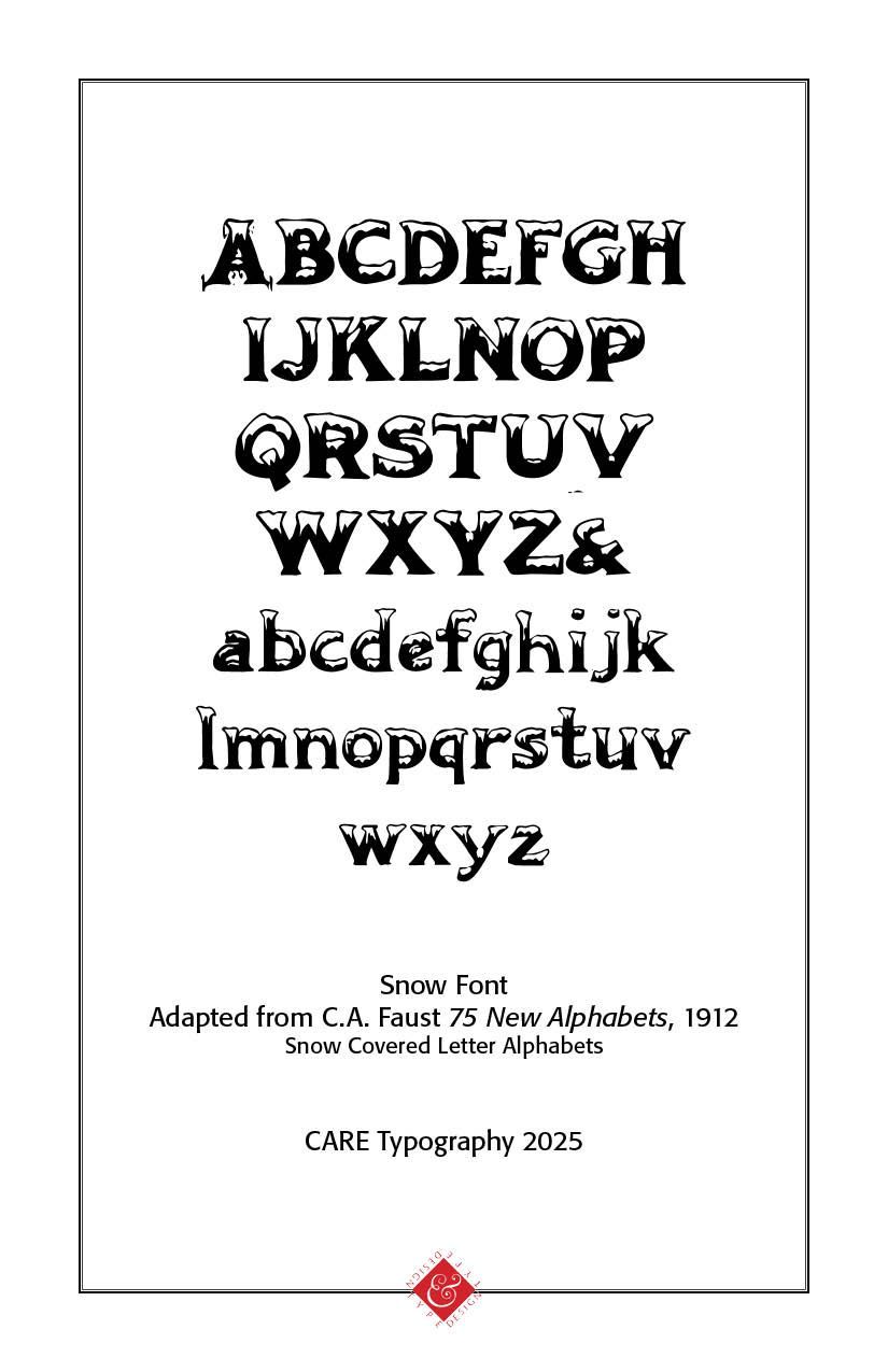
Charles Ayers Faust (b. 1860) was an American calligrapher and typographic designer known primarily for his 1912 compendium Faust’s 75 New Alphabets, a richly illustrated manual of lettering techniques. Published in Chicago by the C. W. Braithewait Company, this 72‑page volume is now in the public domain. CARE Typography, in its mission to digitally restore older typography, has restored some of Faust's designs for the modern type world. 75 unique alphabets for artistic lettering, including brush, air-brush, air-pencil, relief, stencil, marking, shading, and both ornate (Payzant, Soennecken) and practical “common pen” styles. They are Highly visual, serving as both an instructional guide and inspirational specimen book for sign-writers, designers, artists, and printers of the early 20th century.
As a historical reference these pen inspired drawings offer a snapshot of commercial and decorative lettering techniques before the rise of digital typography. They are still used today by lettering artists and calligraphers looking for period-authentic styles. The pen styles range from Art Nouveau (2 styles) to large poster display type to fancy pen lettering.
A note about the payzant pen. The Payzant pen is a specialized broad-edged lettering pen associated with expressive calligraphy, particularly for display and titling purposes. It's named after Canadian calligrapher, artist and educator Douglas Payzant, who popularized a unique, energetic, and highly legible script style using this tool in the mid-20th century. Payzant was known for his expressive, rhythmic lettering, developing a distinctive style that emphasized rapid execution, clarity and boldness, and a sense of liveliness. His style was especially influential in the 1960s–1980s during a resurgence in interest in expressive pen-lettering techniques. The pen techniques included flowing and natural stroke sequences, wide verticals versus narrow horizontals, legible but informal, and designed for large-scale lettering such as in sketchbooks, scrapbooks, and decorative journal pages. It was perfect for posters, title pages, and public signage due to its bold strokes and was commonly used in manual layouts, advertising mockups, and theatre/film title art.
CARE Typography has digitized some of these pen lettering samples from Faust, seeking to retain the descriptive flair and flavor of the lettering. They are available as a package or as select fonts. Contact CARE Typography at cshanktype@gmail.com for ordering and prices.
Successful Layout & Design


