Classic Caps
Classic Caps. Lewis Foreman Day (1845-1910) was an influential English designer, author, and lecturer who played a significant role in the Arts and Crafts movement of the late 19th and early 20th centuries. He became a prolific designer, working across various mediums including wallpaper, textiles, stained glass, pottery, and metalwork. He authored numerous books on design, including The Anatomy of Pattern (1887), The Planning of Ornament (1887), and Nature in Ornament (1892), which became important references for designers and students. Day advocated for the integration of form and function, emphasizing the importance of practicality in design alongside aesthetic considerations. His work and writings contributed significantly to the development of British design education and theory in the late Victorian era.
His book, Alphabets Old and New, published in London, in 1910 gives sterling examples of his typography work. Day's approach to design, blending traditional craftsmanship with modern industrial techniques, helped shape the transition from Victorian aesthetics to more modern design principles. CARE Typography has digitized a number of the font faces in the book for modern use and aesthetic appeal. The typefaces below illustrate the beauty and craftsmanship of Day which can contribute to modern typography.
These mostly pen drawn typefaces have been digitized by CARE Typography using Fontographer to make them available as usable fonts. Caps or Unicals are often used in display faces and advertising. Some of these classic faces can enliven your printing and advertising projects. They are available, either individually, or as a set, for a modest fee. Contact CARE Typography cshanktype@gmail.com for more information and ordering.
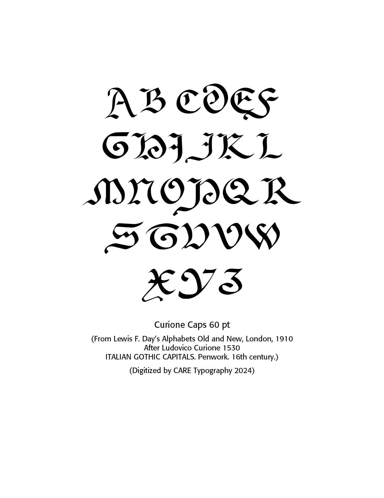
Curione Font. Ludovico Curione (1503–1569) was an influential figure in the field of printing and publishing during the Renaissance. He was an Italian scholar, humanist, and printer who made significant contributions to the dissemination of classical and contemporary works. Curione was born in a period of rapid intellectual and cultural development, and his work reflected the growing emphasis on classical learning and humanist ideals.
Curione was particularly known for his role in editing and publishing works that were crucial to the Renaissance revival of classical texts. He was involved in the publication of important Greek and Latin texts, including works by ancient philosophers, poets, and historians. His efforts helped to preserve and spread classical knowledge, which was central to the humanist movement of the time.
One of his notable achievements was his work on the publication of the Opera omnia of the Greek philosopher Proclus, as well as his contributions to the edition of the Corpus Christianorum. His work was highly regarded for its scholarly rigor and accuracy, and he became a prominent figure in the scholarly community of his time.
Curione’s impact on the field of printing extended beyond his own publications; he was part of a broader movement that transformed the way knowledge was produced and shared. His contributions helped to establish standards for scholarly editing and set a precedent for future generations of scholars and printers. Overall, Ludovico Curione is remembered as a key figure in the history of printing and publishing, whose work played a crucial role in the Renaissance and the preservation and dissemination of classical and humanist texts.(ChatGPT)
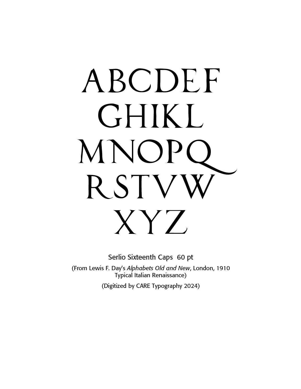
Sebastiano Serlio, an Italian Mannerist architect, engraver and painter of the sixteenth century, designed some of the most refined variants of the classic Roman letters—the prototypical Italian Renaissance roman alphabet, also known as Serlio's Alphabet. Born in Bologna in 1475, he died in 1554. He was part of the Italian team building the Palace of Fontainebleau.
This font digitized by CARE Typography from Day's Panels, notes the flourishing tail of the "Q" letter. Note also the tail of the letter "R." The serifs are precise and inviting. There are a few roman capital fonts in the digital age. These include Serlio (1990, Linotype), Sentian (Novel Fonts) and Opti Serlio (Castcraft).
The modern font Serlio has been digitally produced by Linotype. Note that the tail on this Linotype "Q" does not match the flourishing tail on the original "Q" above. Serlio is a fine digital Titling typeface. OptiSerlio has been copyrighted by Castcraft Software, Inc. 1990-1991, but is available for personal use by many other companies.
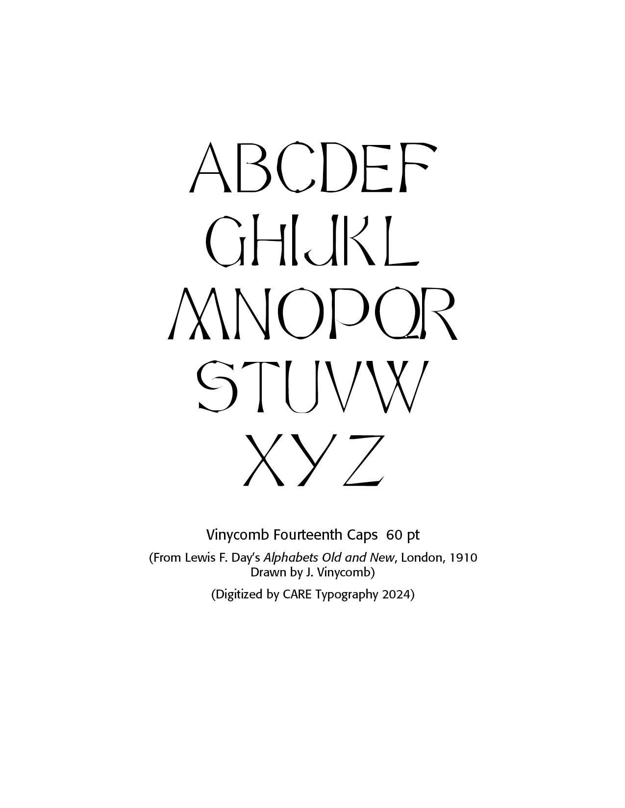
Vinycomb Fourteenth Century. This century, as modeled by Victorian calligraphic artist, John Vinycomb, an internationally acknowledged expert in heraldry, saw the number of carefully drawn alphabets delivering a "skeleton" of lettering with all letters of equal stroke width in his Modern Sans font.
He also drew a number of other alphabets, Italian 14th Century Capitals, Modern Roman French Style and Modern Roman Italics OldStyle. The 14th Century Italian Caps are digitized by CARE Typography from Day's book. Dick Pope in 2012 created the digital typefaces LFD Thin French 208 and LFD 14th C Italian 75 from Day's panels. In 2020 Paul Hardin released LDN Queenstown at London Type.
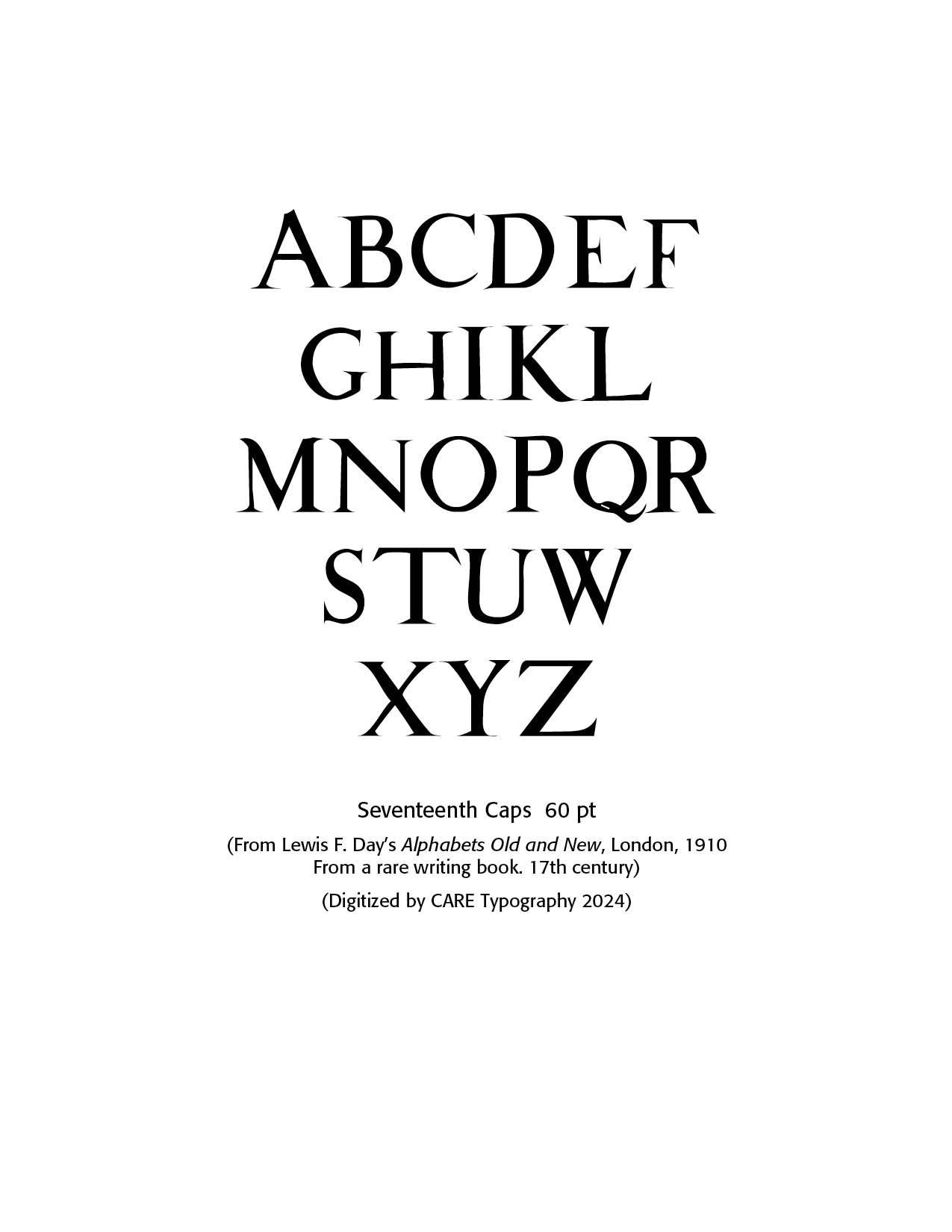
Seventeenth Century. The sample provided by Day is noted by the short middle stems in the "E" and "F" letters. This has also been digitized by CARE Typography. These capital letters are from a rare writing book, says Lewis Day. They stand out as fine samples of Roman serif type.
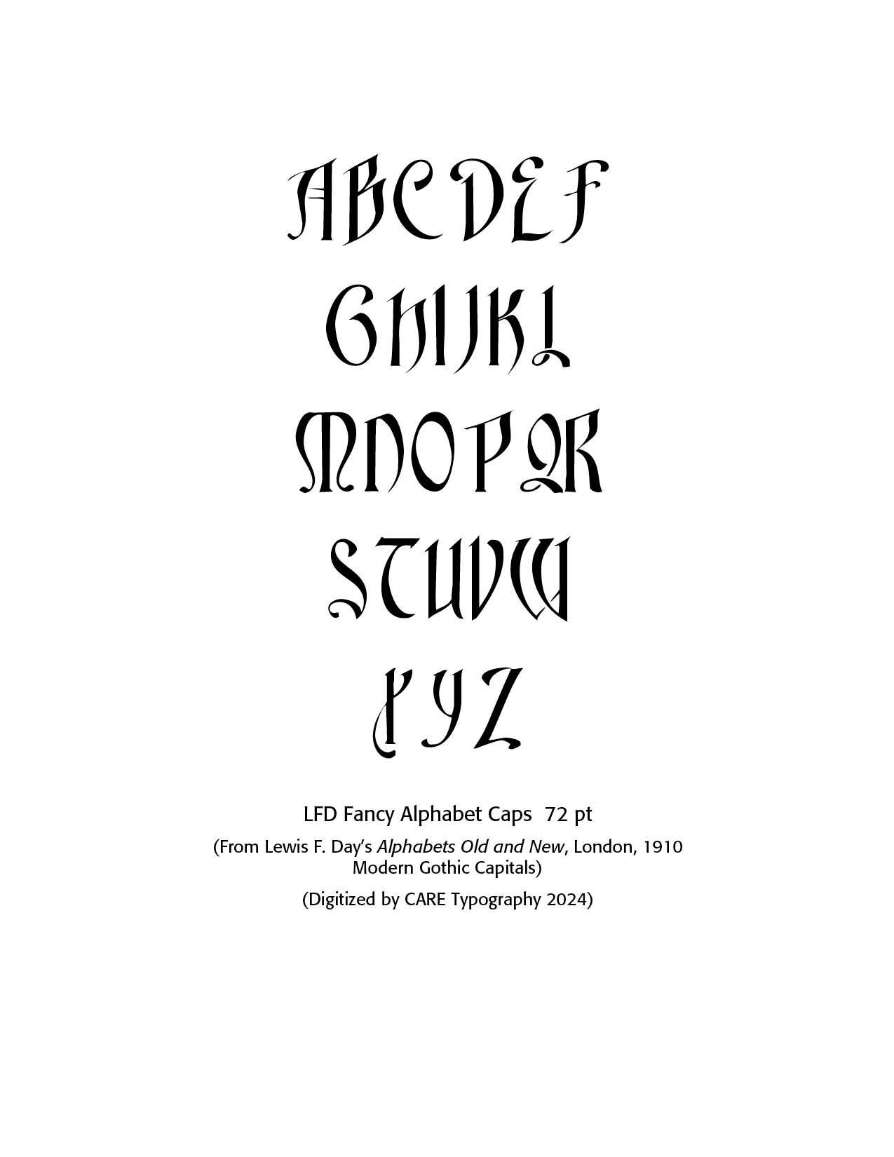
LFD Fancy Alphabet Font. It is Modern Gothic Capitals digitized from Day's book by CARE Typography. Lewis Day introduces this font with the words — "Meant to be fanciful, but not to do any great violence to accepted form. An alphabet in which there is the least approach to design is always in danger of being considered illegible. Legibility is for the most part the paramount consideration; but there are cases, however rare, in which it is permitted even to hide the meaning so long as it is there, for those whom it may concern."
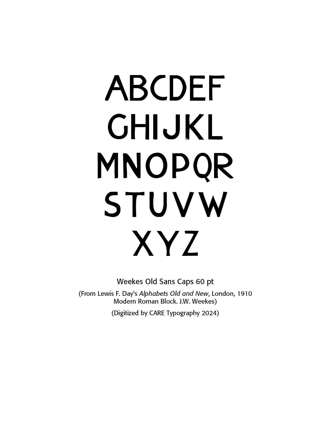
Weekes Old Sans. J.W. Weekes produced a "sans serif" (without feet) modern Roman block font, miscalled "Egyptian" as Day notes in his book. Weeks was a letterer from the last part of the 19th century. Examples of his alphabets, taken from the 1910 book by Lewis Foreman Day, include Modern Roman and Modern Roman Block. Crane TitlingNF by Nick Curtis in 2006 is a digital typeface with medieval-inspired uppercase letters drawn by famed book illustrator Walter Crane. This Modern Roman Block font, called Old Sans in the diagram, has been digitized from Day's book by CARE Typography.
J.W. Weekes is a distinguished typographer and printer renowned for his contributions to the art and craft of typography. With a deep appreciation for the historical and aesthetic aspects of print design, Weekes has dedicated his career to advancing the standards of typographic excellence.
His work is characterized by a meticulous attention to detail and a commitment to blending traditional techniques with modern innovations.
Weekes' expertise spans a range of disciplines within the field, including type design, letterpress printing, and bookbinding. His innovative approach to typography has earned him recognition in various design and print media, and his projects often reflect a deep respect for the craft's rich heritage.
In addition to his professional work, Weekes is a passionate advocate for the preservation of traditional printing methods and the promotion of typographic education. His contributions to workshops, publications, and conferences have helped to inspire a new generation of designers and printers. (Chat GPT)
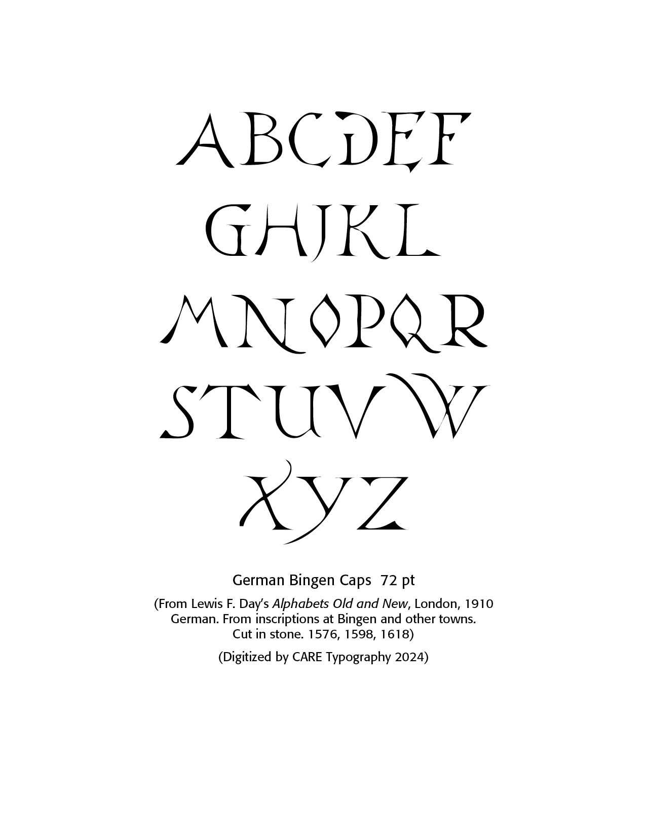
The Bingen Font. This is a typeface developed from Day's Alphabets Old and New taken from stone masons in the old German town of Bingen. Bingen am Rhein, often simply called Bingen, is a town in the Mainz-Bingen district in Rhineland-Palatinate, Germany. The settlement's original name was Bingium, a Celtic word that may have meant "hole in the rock" a description of the shoal behind the Mäuseturm, known as the Binger Loch. Bingen was the starting point for the Via Ausonia, a Roman military road that linked the town with Trier. Bingen is well known for, among other things, the story about the Mouse Tower, in which the Bishop of Hatto I of Mainz was allegedly eaten by mice. Saint Hildegard von Bingen, an important polymath, abbess, mystic and musician, one of the most influential medieval composers and one of the earliest Western composers whose music is widely preserved and performed, was born 40 km away from Bingen, in Bermersheim vor der Höhe. Bingen am Rhein was also the birthplace of the celebrated poet Stefan George, along with many other influential figures. (Wikipedia & Claude.ai)
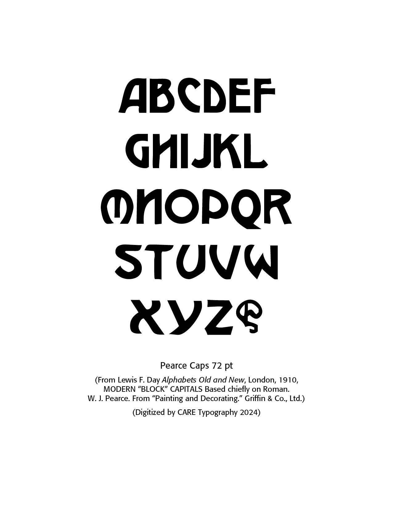
Pearce Caps. W.A. Pearce was a prominent figure in the printing industry, especially noted for his contributions during the late 19th and early 20th centuries. Although not as widely recognized today, his work was significant in the development and advancement of printing technologies and practices of his time.
Pearce was known for his innovation in printing techniques, including the use of advanced machinery and methods that improved efficiency and quality in print production. He was involved in publishing various materials, including books, newspapers, and other printed media. His work contributed to the dissemination of information and literature during his era.
Pearce’s contributions to the technical aspects of printing were significant. He was involved in the development and implementation of new printing technologies that helped shape the modern printing industry.
Although detailed records of his life and career are limited, Pearce’s impact on the printing industry is recognized through his advancements in printing technology and the quality of his publications.
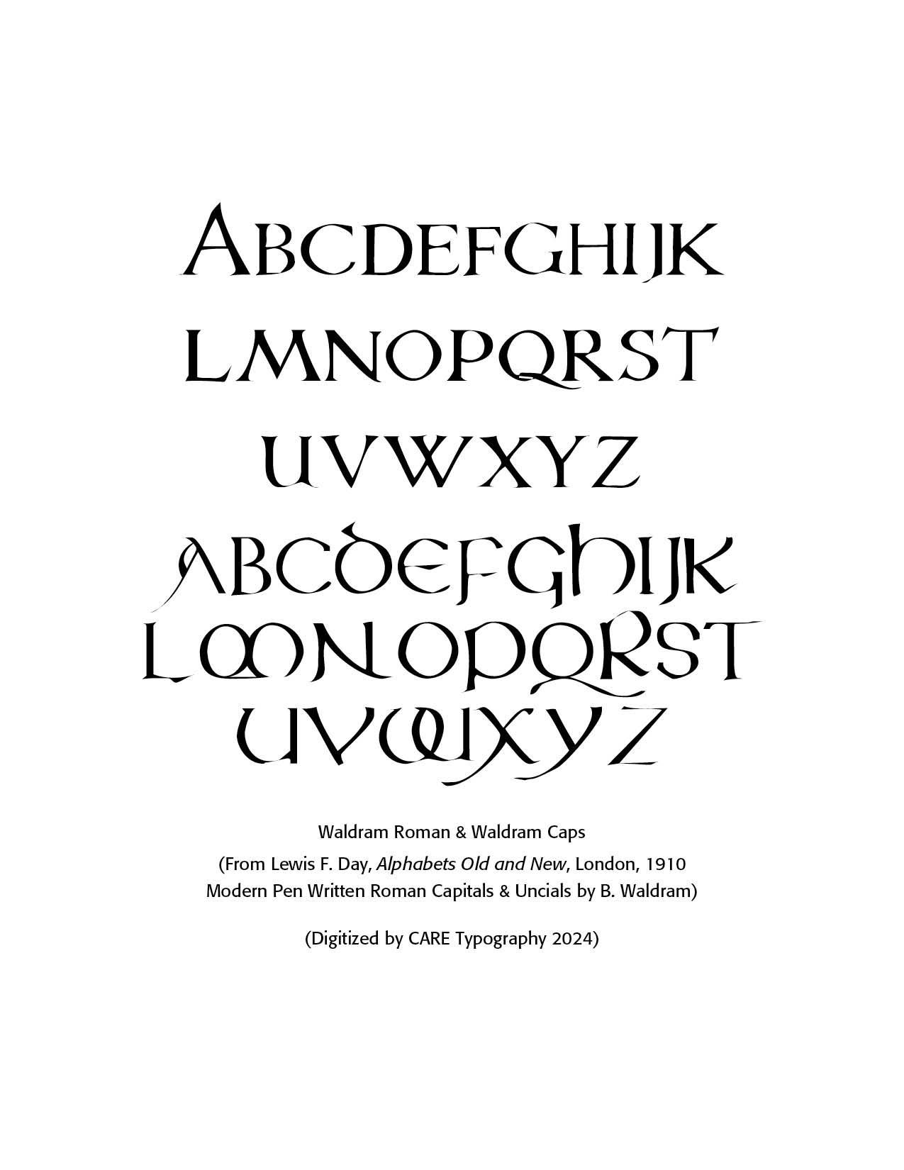
Waldram Caps. B. Waldram is a notable figure in the field of printing, particularly recognized for his contributions to the development and enhancement of printing technologies. His work has had a significant impact on modern printing practices, with a focus on improving efficiency, quality, and sustainability in the industry.
Waldram’s career in printing began with a strong foundation in mechanical engineering, which he applied to innovate various aspects of printing machinery and processes. His expertise spans a range of printing techniques, including offset, digital, and flexographic printing. Through his research and development efforts, he has been instrumental in advancing the capabilities of printing presses, optimizing print quality, and reducing waste.
One of Waldram’s key contributions is his work on developing more environmentally friendly printing solutions. He has been involved in creating and promoting technologies that reduce the environmental footprint of printing operations, such as eco-friendly inks and energy-efficient printing systems. In addition to his technical achievements, Waldram has been a prominent figure in industry associations and has shared his knowledge through publications and presentations at conferences. His commitment to advancing the printing industry has earned him recognition and respect from peers and professionals alike.
Overall, B. Waldram’s influence in the field of printing is marked by his dedication to innovation and sustainability, making him a significant contributor to the evolution of modern printing practices.
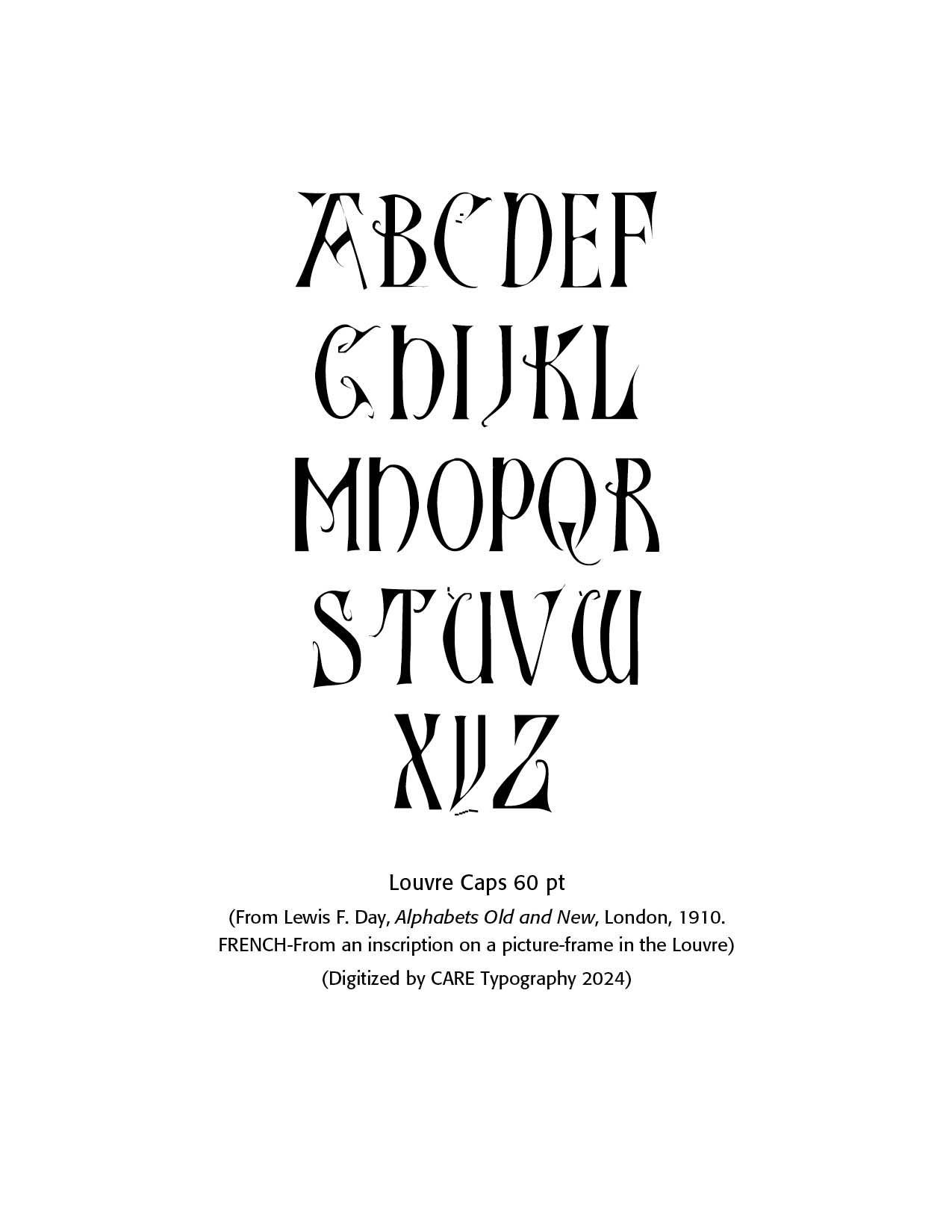
Louvre Caps. The Louvre Museum, located in Paris, France, is one of the world's largest and most famous art museums. Originally built as a fortress in the late 12th century under King Philippe Auguste, it was transformed into a royal palace in the 16th century. In 1793, during the French Revolution, it was opened as a public museum.
The Louvre's architecture is a striking blend of historical styles, with its most notable feature being the glass pyramid entrance designed by architect I. M. Pei, which was inaugurated in 1989. This modern addition contrasts sharply with the surrounding classical and Renaissance buildings, creating a visually intriguing juxtaposition.
Inside, the Louvre houses an extensive collection of art and historical artifacts, spanning from ancient civilizations to the 19th century. Among its most celebrated works are Leonardo da Vinci's "Mona Lisa," the ancient Greek statue of the "Venus de Milo," and Eugène Delacroix's "Liberty Leading the People." The museum's vast collection is divided into eight departments, including Near Eastern Antiquities, Egyptian Antiquities, Greek, Etruscan, and Roman Antiquities, and Paintings.
Lewis Day recorded a tapestry of lettering in the Louvre, which he provided in his Old and New Alphabets book. These are French inspired letterings that reveal a carefully refined narrow ambiance and are more art than functional letters.
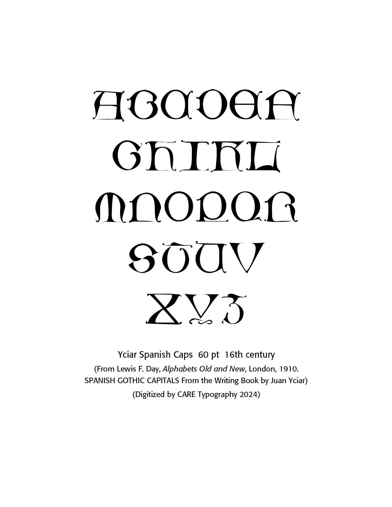
Yciar Spanish Caps. Juan de Juan de Yciar was a notable Spanish calligrapher and mathematician who lived in the 16th century. Born around 1515–1520 in Durango, Biscay, part of the Basque Country in Spain, Yciar was primarily known for his work in calligraphy and penmanship. In 1548, he published Arte subtilissima, por la cual se enseña a escribir perfectamente (The Subtlest Art, by which Perfect Writing is Taught), one of the first printed writing manuals in Spain. This manual was highly influential and went through multiple editions. It included various typefaces and alphabets, as well as instructions on how to make quills and prepare ink.
Yciar was also a mathematician. He published works on arithmetic and geometry, including Libro intitulado Arithmetica practica (Book Entitled Practical Arithmetic) in 1549. He worked as a writing master in Zaragoza, where he taught calligraphy and mathematics. Yciar's work contributed significantly to the standardization of handwriting in Spain during the Renaissance period. The sample font above from Day highlights Spanish Gothic capitals from Yciar's Writing Book.
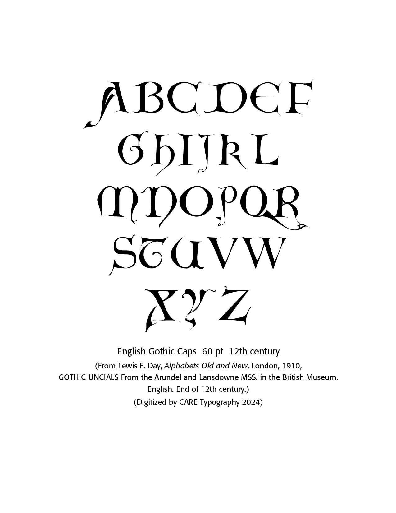
English Gothic Caps. Uncial is a majuscule script (written entirely in capital letters) commonly used from the 4th to 8th centuries AD by Latin and Greek scribes. Uncial letters were used to write Greek and Latin, as well as Gothic. Around AD 600, flourishes and exaggerations of the basic strokes began to appear in more manuscripts. Ascenders and descenders were the first major alterations, followed by twists of the tool in the basic stroke and overlapping. Certain characteristics include relatively narrow F, P, I while M, N. and U are relatively broad. The letter R has a long, curved shoulder. E is formed with a curved stroke. In the sample to the right, the fancy swishes are apparent in the A, H, J and K letters. Note especially the tail on the Q and the P and Y lettering.
Lewis F. Day's Alphabets Old and New (London, 1910) is a treasure trove of fantastic historic typefaces. From the Arundel and Lansdowne manuscripts in the British Museum, Day provides an English Gothic font, drawn near the end of the 12th century. These letters often framed the opening paragraphs of a book or story.
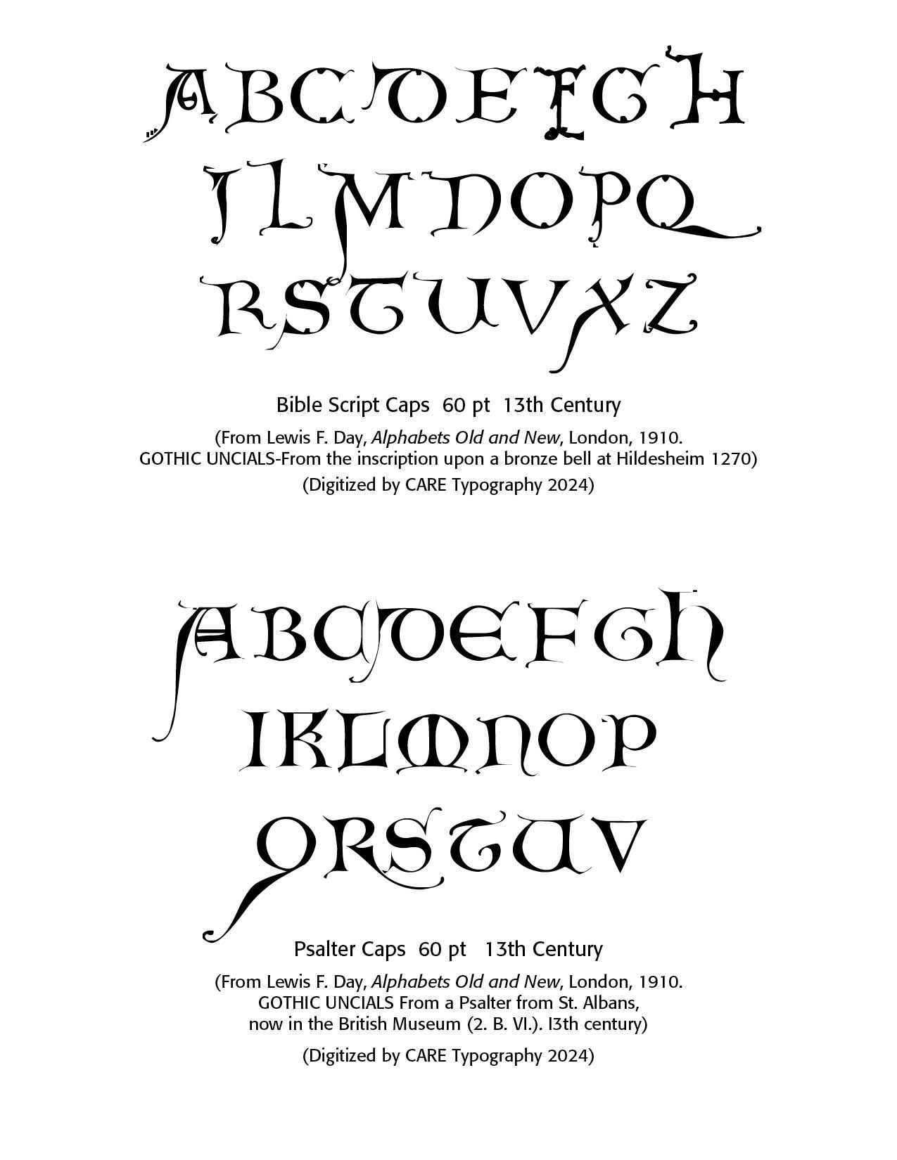
Fancy Gothic continues with the Bible Script capitals (my designation). Day notes these caps are from the inscription upon a bronze bell at Hildesheim in 1270 AD. The Psalter Caps are Gothic uncials from a Psalter from St. Albans, now in the British Museum, from the 13th century. Again note the tail on the A, Q and R letters. Many of these letters were pen drawn calligraphic masterpieces in their day.
These uncials have been carefully digitized by CARE Typography and provided in modern font settings.
Successful Layout & Design


