All About Logos

Carl Shank • September 1, 2022

I like and resonate with what John McWade said to us novice designers in the magazine he founded and edited, "Before & After," in the 1990s — "Learn typography. In my years of reviewing the portfolios of college graduates, I've seen most consistently a weakness in handling type. Type is the voice of the printed word, and your greatest tool. Learn it well. If you're learning on your own I suggest you study the typography in major magazines. Pay attention to the ads. Watch for type selection, size, spacing, position on the page, relationship to other type, contrasts and so forth. Duplicate what you see." (Before & After, Vol. 4. No. 6, 1995) His most ardent desire was for us to practice craftsmanship, which he reflected in the pages of these issues of Before & After. If you can get hold of them, prize them, study them and reflect on the craftsmanship in them.


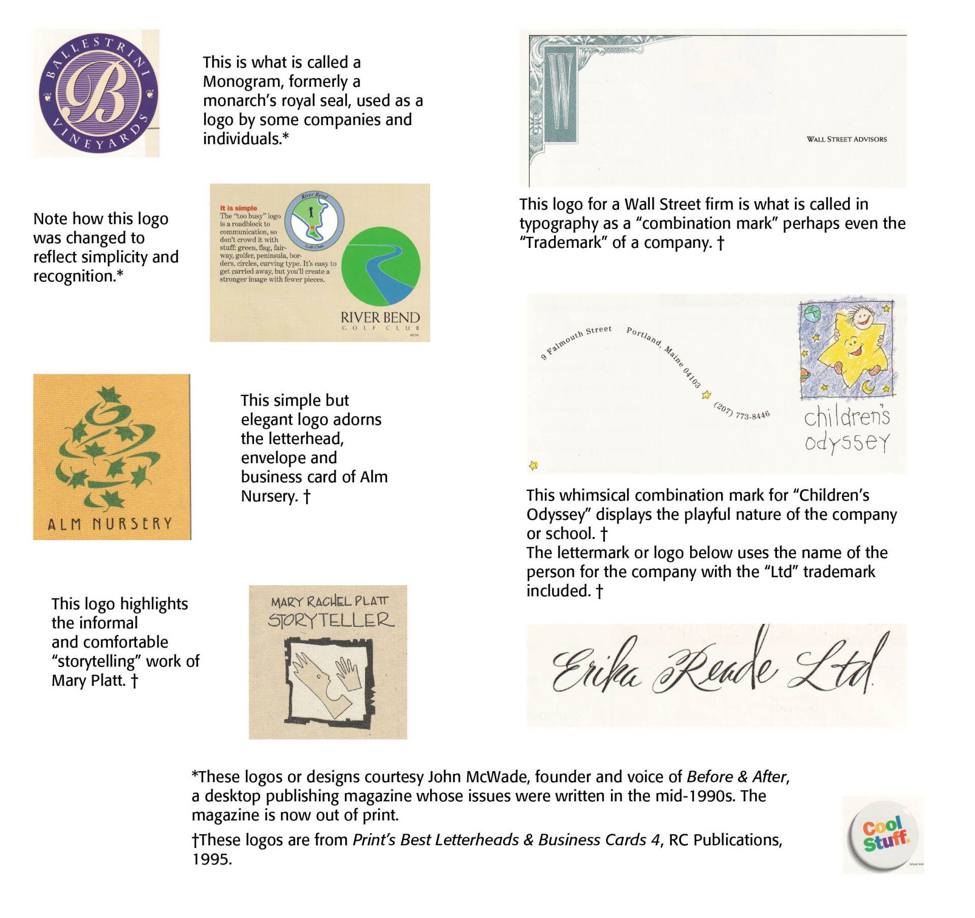
He left nothing to sloppiness or a truncated view of typography. In his remarks about logos, he wrote — "In graphic design parlance, the word marks properly refers to the broad group of designs that are used as corporate signatures. Marks without type are called symbols, but symbols used to communicate (like in traffic signs and on restroom doors) are really pictographs. When marks are wholly typographic, they can be either lettermarks, which are usually initials or abbreviations, or logos, which may be entire words or the company name. When symbols and logos are used together, they are referred to as combination marks. And when any of the above are registered and protected by law, they are referred to as trademarks." (Before & After, , Vol. 5, No. 3, 1996, p. 5)


You can see some of these logos below in the sample.

Successful Layout & Design

By Carl Shank December 17, 2025
Nothing New Under The Sun: A Look at Current Typographic Trends As a typographic historian of sorts, and owner of CARE Typography, a small design studio focusing on reviving historic and often missed typefaces, I read a number of type reports and books. Of special interest is the newsletter from the Monotype corporation highlighting trends and faces for today. (See https://bit.ly/3Y1R1BV ) A couple of statements in their latest reports by Phil Garnham, Creative Type Director, at Monotype got me thinking about culturally laced typographic styles and faces that have graced our historic type landscapes. He notes a “new universal style emerging: flat design in modern online brands, almost reverting to the minimalist style of five years past. Many companies are going for clean geometric style with type.” This is hardly a new concept or trend. A deeper dive into the history of type design over the centuries helps us understand what may be happening. In the history of typography, on which I have written (See H. Carl Shank, Typographical Beauty Through the Ages: A Christian Perspective, Lulu.com, 2025), the visual dissonance of the Dadaist movement in type was replaced by the order of Constructivism and its functional accessible design principles. Art Deco gave way to Swiss type beauty with its readability and visual harmony in the faces of Helvetica and Univers. Grunge and Psychedelic type by Wes Wilson gave way to the sans serifs used universally today. Hippie children of the 60s grew up to be corporate CEOs of the 80s and 90s, shedding their anti-establishment and even destructive behaviors for the boardroom and nice houses with ordered yards and gardens. This has been the story of all cultural movements, including typographic movements. They reflected their cultural morés of the times, but the bold, audacious, violent, raucous types always gave way to what we internally want and desire — a return to simplicity, functionality and order and type viability. From a theological viewpoint, the thought provoking words of the writer of Ecclesiastes of the Bible apply here — “What has been is what will be, and what has been done is what will be done, and there is nothing new under the sun. Is there a thing of which it is said, “See, this is new”? It has been already in the ages before us.” (Ecclesiastes 1:9, 10) “Customers are seeking affinity with brands that seek justice in our world, and that goes beyond a brand’s mission. People want to see brands actively involved in solving societal problems.” The issues of climate change, diversity movements, equity and inclusion initiatives are seemingly new but typographically rehearse type’s movements from Gutenberg to today. Calligraphers and typographers have been dealing with cultural changes and shifts for ages. I applaud what Monotype and others are seeking to do with variable fonts and digital type, but I would historically caution us in the business not to place too much excitement and hubris after cultural trends. Carl Shank CARE Typography December 2025
By Carl Shank December 10, 2025
AI & Typography: A Christian-Theistic Present Look Monotype Corporation recently released their 2025 Report concerning Artificial Intelligence and Typography called Re-Vision (See https://bit.ly/4aEUePf ). This eReport looks at the various typographical, social and cultural issues surrounding AI and how it affects and impacts the craft and science of typography. A selected summary of the Report is available below.
Show More