All About Hard Drives

Carl Shank • September 13, 2022

All About Hard Drives. A Primer. What is a hard drive and why do you need it? In every computer there is a storage space, called a hard drive. The main hard drive of your computer stores the operating system for your computer as well as files of data, photos, videos, and other work and play and home files. Most drives have matured over the years through technology, by getting smaller, lighter, more efficient and durable, in many cases, their basic operating structure has also radically changed. There are four basic hard drives — PATA (IDE) drives, SATA drives, SSD drives and NVMe drives.


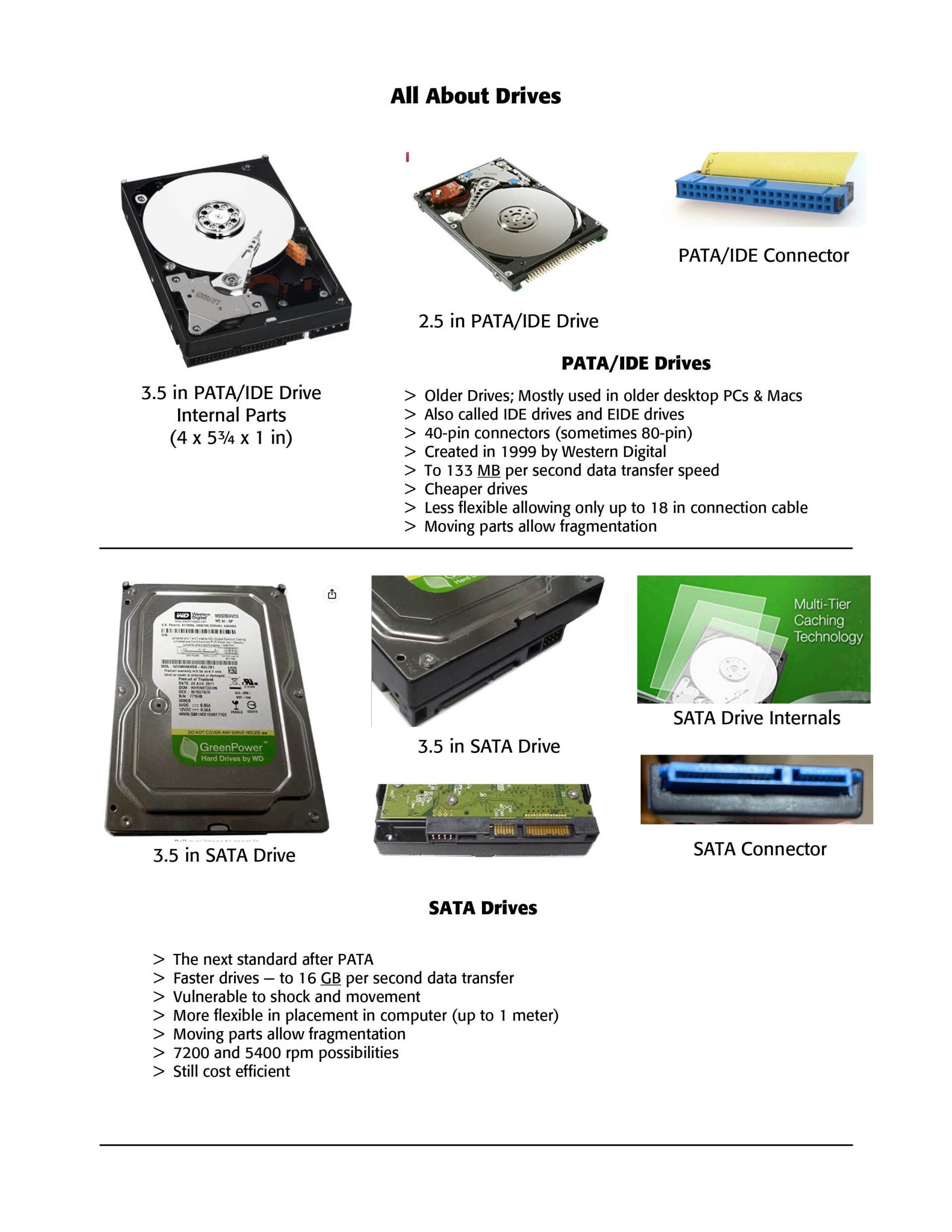
PATA drive. Also known as IDE or EIDE drives, these are the older drives that used to run especially desktop computers.The initials "ATA" stand for Advanced Technology Attachment and PATA means Parallel Advanced Technology Attachment. These were mostly designed by Western Digital. Western Digital, Seagate and other familiar names are on them. They come in two sizes, a 3.5 inch drive and a 2.5 inch drive for laptops. Actually, the 3.5 inch is dimensionally, 4 x 5.75 x 1, but  the innards are 3.5 in across. The drive has a spinning platter inside with an electronic needle that moves across the platter as you are writing and reading data from your computer. It looks like a CD (remember those?) These drives have on the outside mostly a 40-pin connector with an additional 6 or 8 dual pin combination to tell the computer if the drive is a "master" or a "slave" to another drive on the computer. (See Example Below). As you can imagine, as data is written on the drive platter, the data can become scattered or "fragmented," and often for faster drive access and use, we need to "defragment" them. They are generally the slowest of all drives, reading and writing at up to 100 or 133 MB per second, which may seem fast, but is fairly slow according to modern standards. The larger the drive, the slower the access.


SATA drive. These are  the daughter of PATA drives and is what are used in most computers today. They are faster than PATA drives, and can read and write up to 16 GB per second, as contrasted with up to 133 MB per second with PATA. SATA attachment cables are also longer than the maximum 18 inch cable with PATA and therefore can be placed within the computer frame at a more convenient place. SATA offers two connection points, one to the drive and the other to the motherboard of the computer. Again, data is written to a moving platter and therefore can become fragmented over time. They are generally less expensive than the drives that followed them. SATA drives can be purchased in large storage sizes. (See Examples Below)


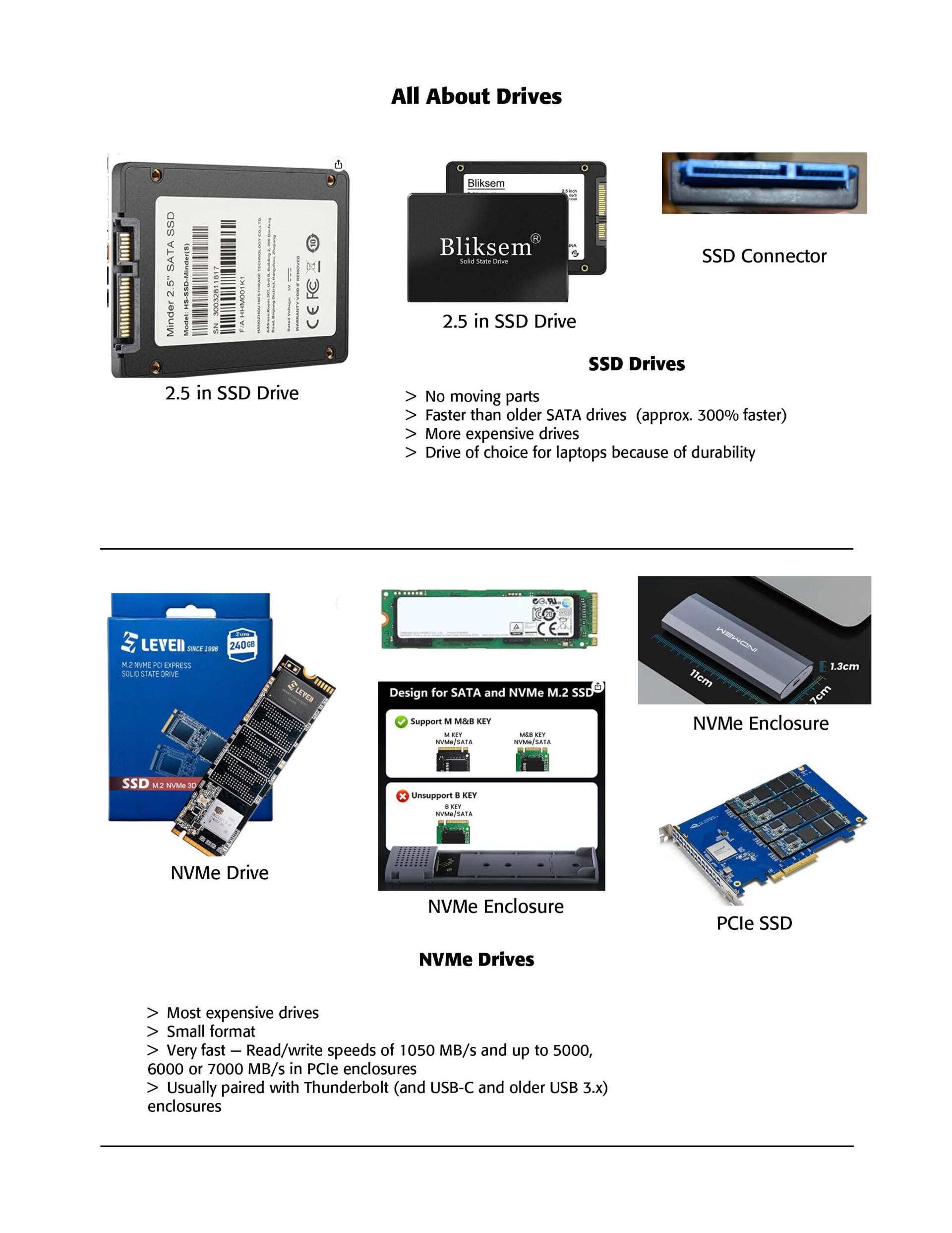
SSD drive. SSD stands for Solid State Drive. These drives have no moving parts and all data is stored on non-volatile memory chips. These drive can be anywhere from 120 GB to over 2 GB in size. These drives are the preferable 2.5 inch drives found in laptops and since they have no moving parts can withstand shocks much better. They are more expensive, perhaps two to four times as much as regular SATA drives. The connection is still a SATA connection to your computer. (See Examples Below)


NVMe drive. Released in 2013, NVMe drives (Non-Volatile Memory Express) are usually attached to a PCI Express (PCIe) slot on the main board of your computer. They are incredibly fast drives with read and write speeds of 32 GB per second and upwards. They are mostly used for gaming and high resolution video editing on the computer. They are very expensive and used for high end work. (See Examples Below)


Successful Layout & Design

By Carl Shank February 12, 2026
Free Fonts: A Deal or Trouble? The latest Google estimate of available fonts is over 300,000 and counting. Other estimates have catalogued over 550,000 fonts. There are over 36,000 font families, over 4,000 type designers and over 2,700 professional font foundries, not counting smaller font entrepreneurs like CARE Typography, which provides restored fonts from yesteryear. (Quora source https://www.quora.com/How-many-fonts-are-there-in-existence-Does-any-group-attempt-to-keep-a-record-of-all-the-fonts-that-exist ) There are commercial fonts from sources like Adobe and MyFonts (Monotype) which require payment for their use in various platforms. Both provide a subscription service, which usually requires a substantial monthly or yearly fee to download and use their fonts. When I began using Apple Macintoshes in the 1980s, font manufacturers like Adobe and Monotype would “sell” the right to use a number of their fonts for thousands of dollars. And, by the way, you never really “own” the font. You have paid only for the use of the font for a specific purpose or machine. Moreover, the price varies for print use, or web use, or a digital ad use. Even today, the font Trinité Titling by Bram de Does, used in a number of Bibles and biblical studies, costs over $4,000 for the use on a single computer and much more for a number of computer users. Individual users of such fonts are mostly priced out of their budget. Why the seemingly extravagant cost? We had a valve on one of our household plumbing lines go bad. I called the plumber, and he replaced the valve — at a cost of several hundred dollars, while the valve itself cost only a few dollars. Was that fair? Yes, because I was paying for the time and training and effort going into replacing that valve in my house. The same holds true for professional font designers. They spend hundreds, sometimes thousands, of hours in font development. We are paying for their livelihood. Font licenses cover four basic parameters around font usage — “The What: The weight and style of the typeface; The Where: Literally where you’ll use the font – a website, digital ad, or in print; The Who: The number times a font can be installed on a computer (aka the number of people who can use it); The How many: For example, web font licenses describe the number of allotted page views, and app and digital marketing licenses set similar parameters.” (Monotype Report) Companies like Monotype are rarely concerning with an individual using a font for a home, individualized project, but rather an entire design company or printer using that font for commercial gain and advertising dollars. There are fonts available “for personal use only,” prohibiting their use for commercial or money-making projects. There are what have been called “shareware” fonts, fonts with a minimal cost which require attribution of the type designer or provider on projects. Most fonts provide a EULA, or font license, which outlines and determines the legal restrictions and ramifications for their use. What about free fonts? Monotype warns against using unlicensed or what are called “free” fonts for several valid reasons, but, in my opinion, this is an obvious ploy to get the user to buy or subscribe to their font services. One Monotype report cites six issues associated with what are deemed “free” fonts. Free fonts may pop up in similar ads or designs to industry competition, perhaps prompting a lawsuit or cease-and-desist actions. Free fonts often have the inability to scale, add special characters, or even different alphabets. Free fonts have limited creative scope. They may be saddled with malware or software viruses. Poor font design can be a problem with such fonts. A sixth problem with so-called free fonts is that they can be actually “pirated” fonts, copied from legitimately designed fonts. “Aside from branding issues, free fonts also suffer from a whole host of performance issues. Fonts are software files that interact with applications and the operating system on which it’s installed; without the guidance of a skilled font engineer, rendering issues may arise from crashing glyphs, or a lack of proper kerning (the space between glyphs) text in certain scenarios. A free font downloaded from a random website might not support a broad range of languages and or complex scripts (e.g., Japanese or Arabic), or basic diatrics to cover commonly used Latin languages.” (Monotype Report) Monotype maintains that free fonts won’t give a company the individual style it deserves to help it stand out in the marketplace. They also point to the legal ramifications involved with font licensing, not a glamorous subject but one in which company attorneys are hired to examine for possible litigation. Types of Free Fonts There are four sources of free fonts — Open Source fonts with an SIL Open Font License (SEE https://openfontlicense.org ); OS fonts, fonts that come with your operating system and hardware; Subscription add-on fonts that come as an add-on to a subscription service; and, advertised free fonts by independent font designers, such as CARE Typography. Many or most of such free fonts come from freeware, shareware, public domain or demo fonts downloaded or reconstructed from an archive or library, like Internet Archive. Companies such as Website Planet offer free “commercial” fonts, fonts that can be used in business and corporate applications. See https://www.websiteplanet.com/blog/best-free-fonts/. Several cautions, however, are still in order here. First, a font that “looks like” a standard, business font is not the same thing as its “older brother.” An example is Website Planet’s Playfair Display font, both a variable and static font designed by Claus Eggers Sørensen licensed under the SIL Open Font License agreement. Yet, this font looks a lot like the standard Bodoni font, created by Giambattista Bodoni in 1767 and revived by Morris Fuller Benton in 1911 under Linotype’s commercial license.
By Carl Shank December 23, 2025
More on the Greek font. In a previous post ( It's Greek To Me! March 18, 2023) we noted that Cursive Greek type appeared as a chancery script by Francesco Griffo in 1502 and lasted two hundred years. Robert Bringhurst notes that "chancery Greeks were cut by many artists from Garamond to Cason, but Neoclassical and Romantic designers . . . all returned to simpler cursive forms . . . in the English speaking world the cursive Greek most often seen is the one designed in 1806 by Richard Porson." This face has been the "standard Greek face for the Oxford Classical Texts for over a century." ( Robert Bringhurst, The Elements of Typographic Style, Hartley & Marks, Version 3.1, 2005 , pp. 274, 278) In fact, asking Google for the best Greek face to use, it points us to Porson Greek. Porson is a beautiful Unicode Font for Greek. It's not stiff, like many of the cleaner fonts, which are usually san serif. It is bold and easy to read and seems to more closely match the orthography in newer textbooks. (Jan 8, 2004) 
Show More