All About Ampersands
To help pay my way through seminary, I painted the outsides of old Philadelphia homes in the summers. During those months of fighting off bees and wasps and enduring the heat of summer work, I often ran across very intricate fascia trim designs from the Victorian era. These fascinating and complex designs represented the work of the craftsmen of older days and required time intensive sanding and repainting. I usually ignored, and sometimes complained, about such fancy decorative pieces.
Ampersand History. Like these carefully crafted pieces, ampersands, symbols derived from the Latin or French et, meaning and, are one of the oldest alphabetic abbreviations. In The Printer's Handbook of Trade Recipes (Charles Thomas Jacobi, London, 1891), the “character and” or “ short and” as it is known among printers, has the title "ampersand" in the dictionaries, where it is said to be “a corruption of and, per se and, ie. and, by itself and.” It was originally formed as may be seen in some old-style italic fonts of today — of a combination of the capitals E and T, making the French and Latin word “et,“ signifying “and.” Its preferred use is in connecting firm and corporation names, and it is sometimes permitted in display lines where the whole word cannot be inserted. The famous typographer, Robert Bringhurst, notes that "since the ampersand is more often used in display work than in ordinary text, the more creative versions are often the more useful." (The Elements of Typographic Style)
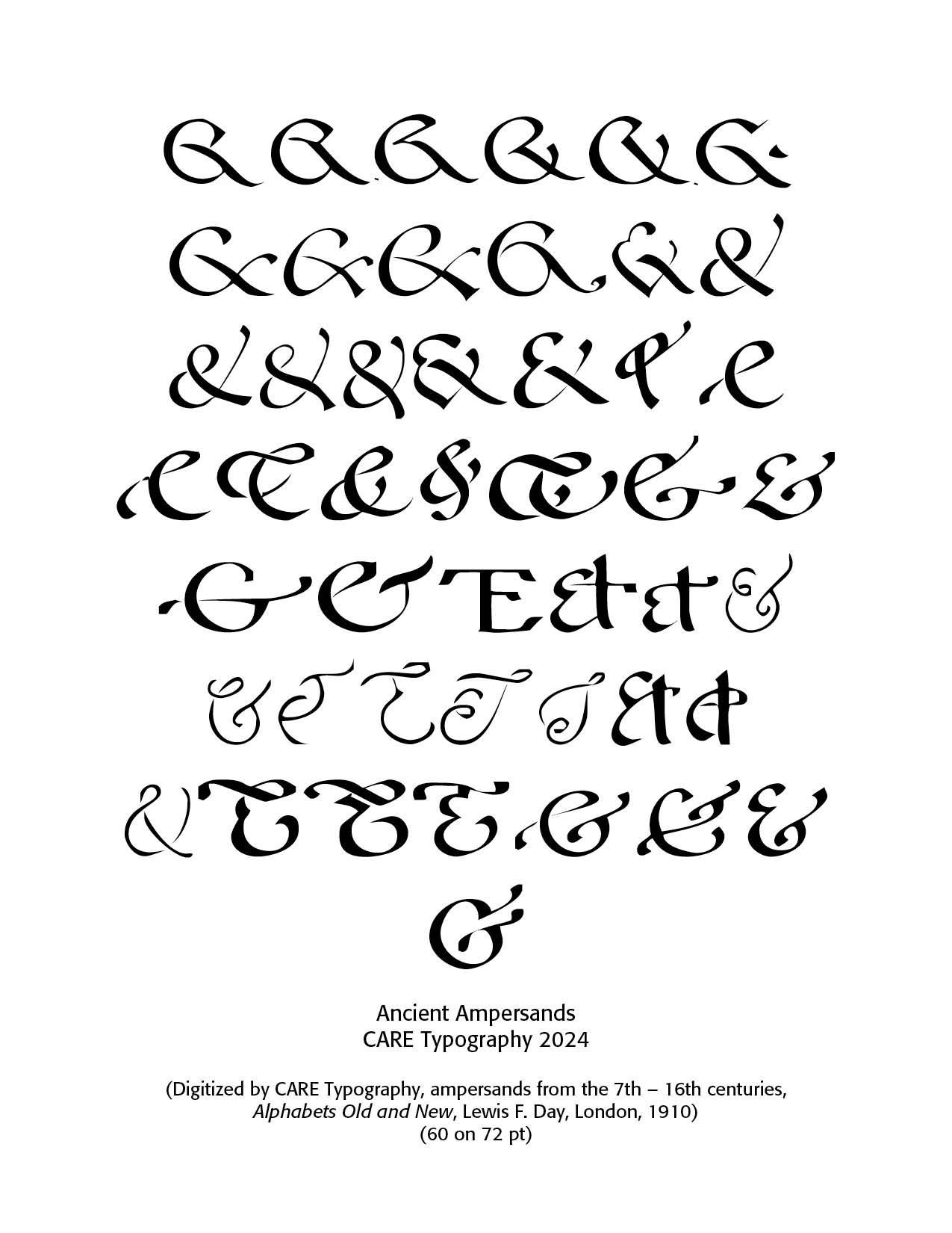
One of the first examples of an ampersand appears on a piece of papyrus from about 45 A.D. Written in an early Roman capital cursive (the handwriting of the time), it shows the ligature ET. A sample of Pompeian graffiti from 79 A.D. also shows a combination of the capitals E and T, and is again written in early Roman script. The ampersand is generally interchangeable with "and." This is why “etc.” can sometimes be seen written as “&c.” Interestingly, there are a number of versions of the word in various British dialects: ampussy, ampusand, amsiam.
The Ligature ET Actually, the ampersand is what is called a ligature, first adopted with the invention of printing in the early 15th century, which occurs when two or more letterforms are written or printed as one unit. Generally, ligatures replace characters that occur next to each other when they overlap. One of the most common ligatures is “fi" (f plus i). Because the dot of the i interferes with the loop of the lowercase f, when they are printed next to each other, the two letters are combined into a single glyph with the dot absorbed into the f, or eliminated. Frank Romano in the August 2004 Issue of Electronic Publishing notes that "ligatures were originally used by medieval scribes to increase writing speed. A 14th century manuscript included hundreds of ligatures and early typefaces used ligatures to emulate the appearance of hand-lettered manuscripts. Gutenberg’s font had 292 glyphs—most of them 2- and 3-letter ligatures to fool Bible buyers into thinking it was handwritten. Most ligatures fell out of common use except for the five f-ligtures (fi, ff, fl, ffi, ffl), and the two dipthongs in upper- and lowercase (Æ and Œ). Only recently has computer-based typesetting had automated ligatures."
Bringhurst notes in his callout about ampersands that earlier typographers made liberal use of them — "The 16th century French printer Christophe Plantin sometimes uses four quite different ampersands in the course of a single paragraph, even when setting something as unwhimsical as the eight-volume polylingual Bible on which he risked his fortune and to which he devoted more than six years of his life." (Elements of Typographic Style, 78) (For more on Plantin, See my Blog on "Early Printing and Typography — An Extended Early History," July 10, 2024)
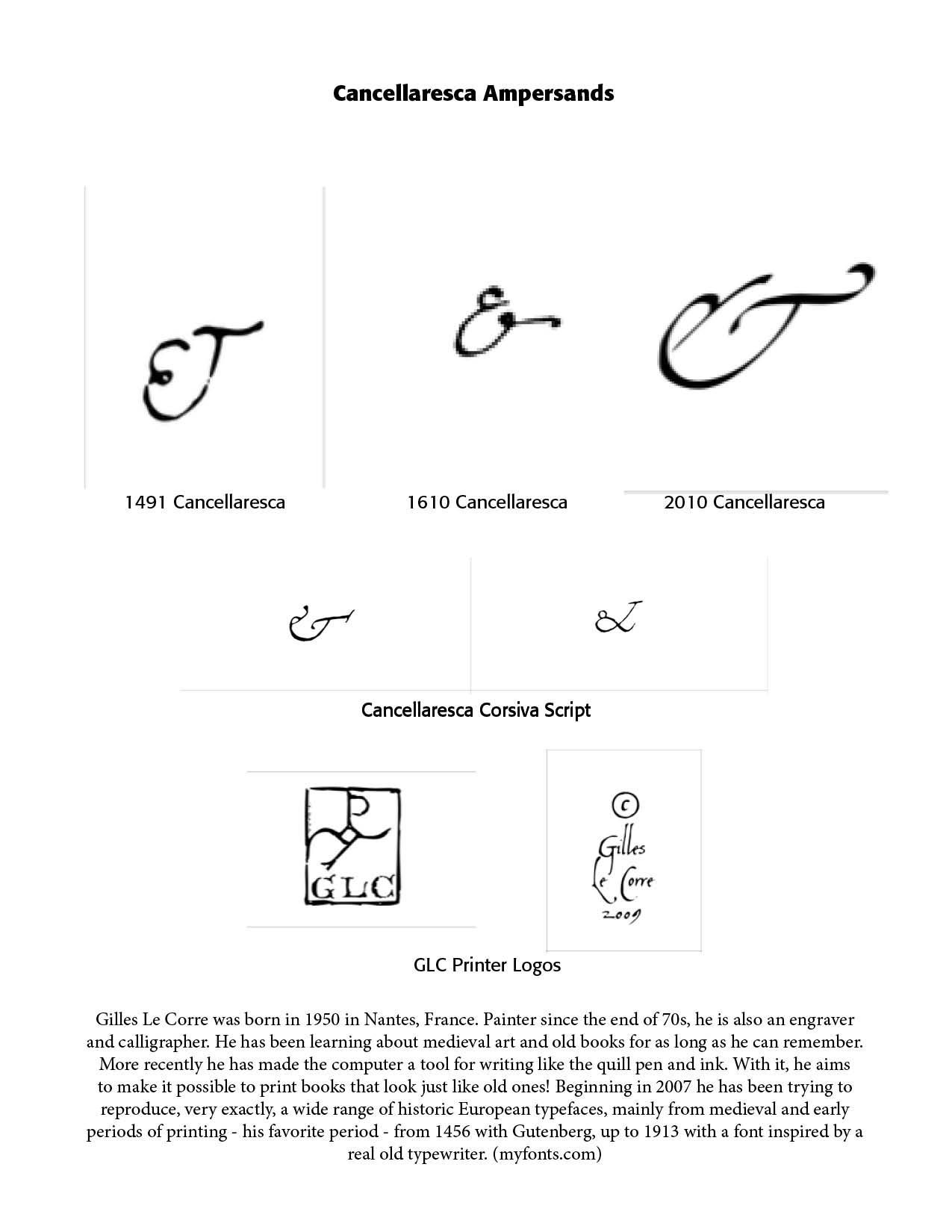
But even earlier than the printed page were scribal calligraphic writings, in which the combination E T was a ligature from the 8th century onward, depending on the calligrapher's handwriting style. We see an early form of the ligature in the Cancellaresca fonts used by calligraphers in the 1400s, In one of its historically five variants, Cancellaresca was the handwriting of Titian, Michelangelo and Raphael, of Bembo, Aldus, Lorenzo de Medici and many others. Arnold Bank notes in his lecture, From Calligraphy and Its Influence in the Time of Plantin, that this well-used calligraphic font "was also the official business and correspondence script of the scholars and writers engaged in the secretarial departments of those court and papal chanceries requiring at this time a literary style of Latin composition for which the usual secretary and mercantile hands were considered unsuited."
Encyclopedia Britannica notes that "cancellaresca corsiva, in calligraphy, script that in the 16th century became the vehicle of the New Learning throughout Christendom. It developed during the preceding century out of the antica corsiva, which had been perfected by the scribes of the papal chancery. As written by the calligrapher and printer Ludovico degli Arrighi of Vicenza in the early decades of the 16th century, the cancellaresca corsiva can range from eye-arresting contrasts of Gothic-like thick and thin strokes to a delicate, supple monotone tracery. Arrighi’s ascending letters, rather than terminating in serifs as in earlier versions, wave plumelike to the right, offset by the leftward swing of the descenders. Lively yet disciplined, responsive to various cuts of nib and speeds of movement, the cancellaresca corsiva was revived under the popular name italic in the 20th century for personal, primarily decorative purposes." (Britannica.com)
Gilles Le Corre, born in 1950 in Nantes, France, is an engraver and calligrapher who rediscovered this typeface and gave us the 1491 Cancellaresca font family. The 1610 Cancellaresca font family was "inspired by the “Cancellaresca moderna ” type, which was calligraphed by Francesco Periccioli (published in 1610 in Siena, Italy). It was entirely handwritten by the designer for each circumstance, using quill pen and medieval ink on a rough paper, with added characters as accented ones and a lot of ligatures with respect for the original design." (MyFonts.com) Alan Meeks designed Cancellaresca Script, a decorative typeface in 1982, The 2010 Cancellaresca font family was inspired by the Cancellaresca pattern (look at the 1491 Cancellaresca and 1610 Cancellaresca), in particular Spanish one, from Francisco Lucas, who was working in the late 1500s. It is a modern variation, including West European accented characters and a lot of initial and final alternates. The sampling below shows the ampersand choices redrafted by Gilles Le Corre (GLC). Along with the opening selection of digitally reproduced ampersands of the 7th–16th centuries, we have a choice selection of ET ligatures, ampersands, that have survived the test of time.
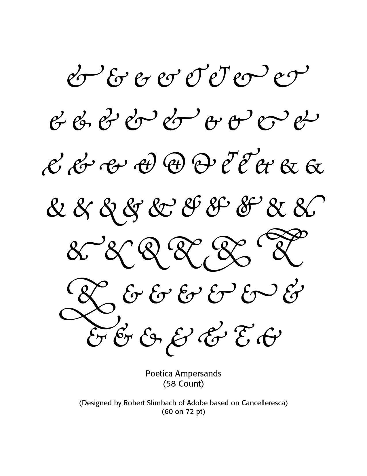
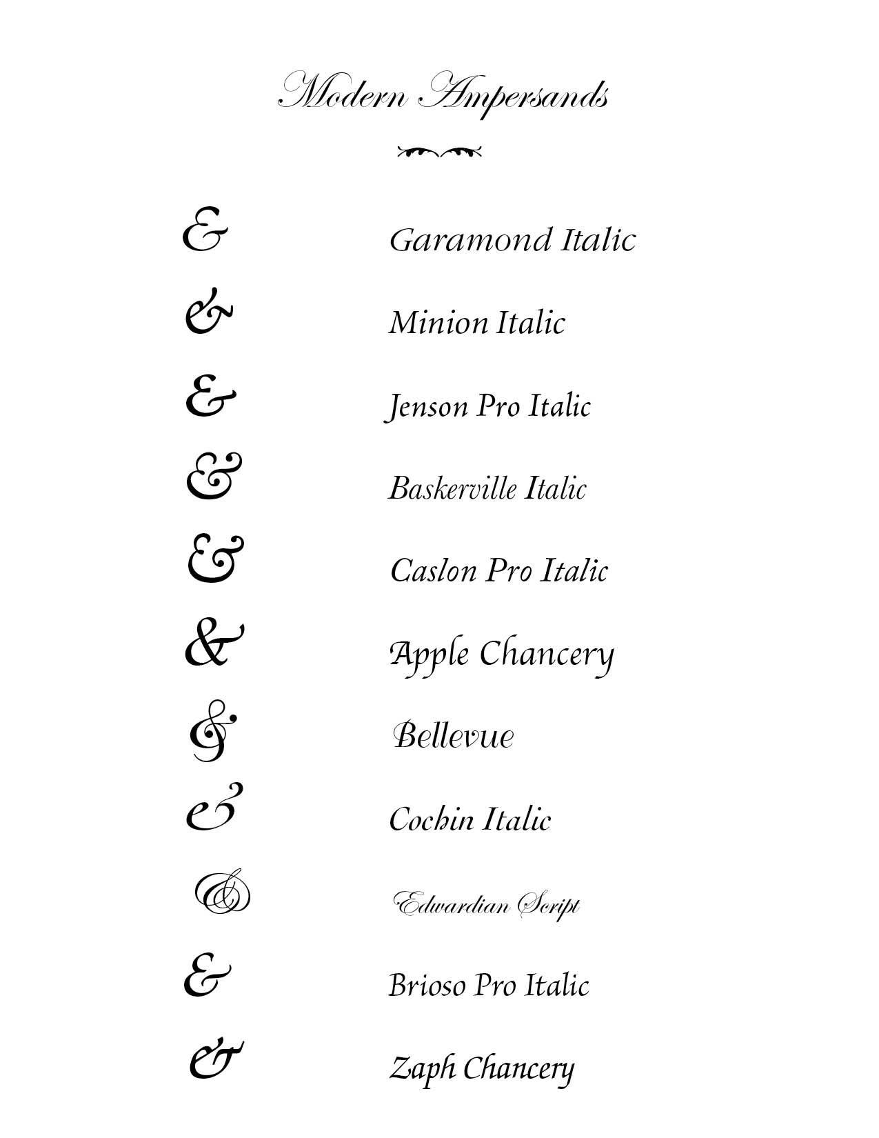
The Poetica typeface family, designed by Robert Slimbach of Adobe and based on Cancelleresca, has 58 ampersands (one more than Heinz catsup). Some typefaces have especially beautiful ampersands—the italic ampersands for Garamond, Minion, Janson, Meridien, Baskerville, and Caslon are gorgeous. With the appearance of slab serif and sans serif typefaces in the 19th century, typefounders preferred the roman version of the ampersand in italic as well as roman styles. Ampersand usage varies from language to language.
Sources
Arnold Bank, Calligraphy and Its Influence in the Time of Plantin, Visiting Lecturer at the Royal College of Art, London, www.dbnl.org.
Robert Bringhurst, The Elements of Typographic Style, Hartley & Marks, 1992, 1996, 2004, 2005.
Charles Thomas Jacobi, compiler, The Printers’ Handbook of Trade Recipes, Hints & Suggestions Relating to Letterpress and Lithographic Printing, Bookbinding, Stationery, Engraving, Etc., London, 1891
Frank Romano, From Ampersands to Interrobangs, Electronic Publishing, August 2004
Stephen Moye, Fontographer: Type By Design (MIS Press:1995)
Various font articles from MyFonts.com
Successful Layout & Design


