About Ampersands

About Ampersands
The ampersand is a corruption of “and (&) per se and,” which literally means “(the character) & by itself (is the word) and.” The symbol (or glyph) & is derived from the ligature of ET or et, which is the Latin (and French) word for “and.” One of the first examples of an ampersand appears on a piece of papyrus from about 45 A.D. Written in an early Roman capital cursive (the handwriting of the time), it shows the ligature ET. A sample of Pompeian graffiti from 79 A.D. also shows a combination of the capitals E and T, and is again written in early Roman script. The ampersand is generally interchangeable with "and." This is why “etc.” can sometimes be seen written as “&c.” Interestingly, there are a number of versions of the word in various British dialects: ampussy, ampusand, amsiam.
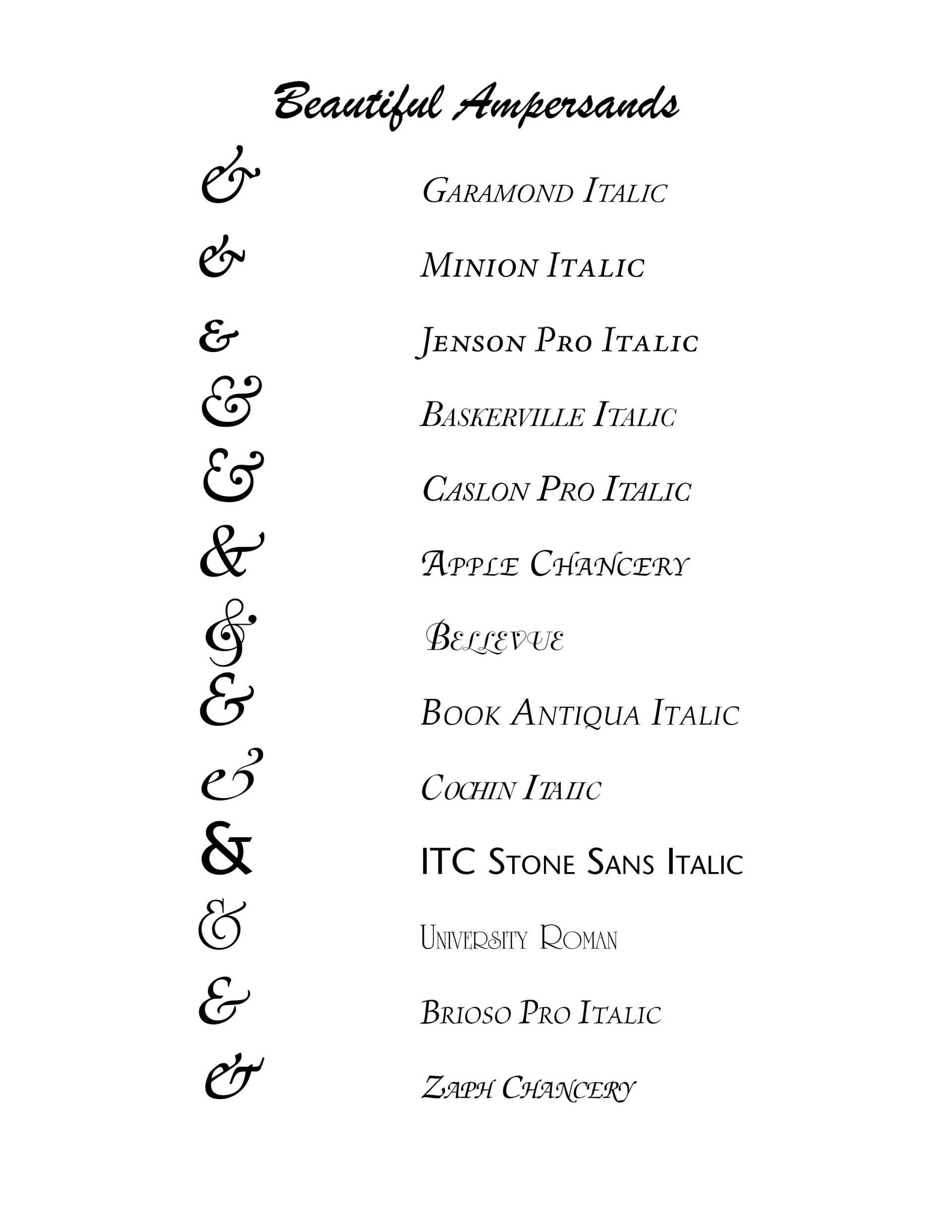
The Poetica typeface family, designed by Robert Slimbach of Adobe and based on Cancelleresca, has 58 ampersands (one more than Heinz catsup). Some typefaces have especially beautiful ampersands—the italic ampersands for Garamond, Minion, Janson, Meridien, Baskerville, and Caslon are gorgeous. With the appearance of slab serif and sans serif typefaces in the 19th century, typefounders preferred the roman version of the ampersand in italic as well as roman styles. Ampersand usage varies from language to language.
SOURCES
From Ampersands to Interrobangs, Electronic Publishing, August 2004
Stephen Moye, Fontographer: Type By Design (MIS Press:1995)
Successful Layout & Design


CARE Typography is a Christian based type and design service.
