End Marks

Carl Shank • October 10, 2021

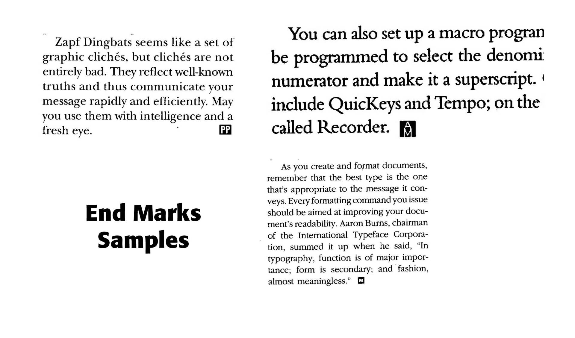
End Marks are used in magazines and articles, especially when the article is spread over a number of pages along with other articles or ads or images. They tell a reader when that particular article ends. The End Marks Samples above are from three different publications. The upper left is from an article by Kathleen Tinkel in Publish Magazine, March 1991. Upper right is from an instructional article on making fractions in PageMaker (4.0) in Aldus Magazine, July/August 1991. The bottom is from an article by Jim Heid in Macworld, June 1989. Each end point is different and each distinctive.


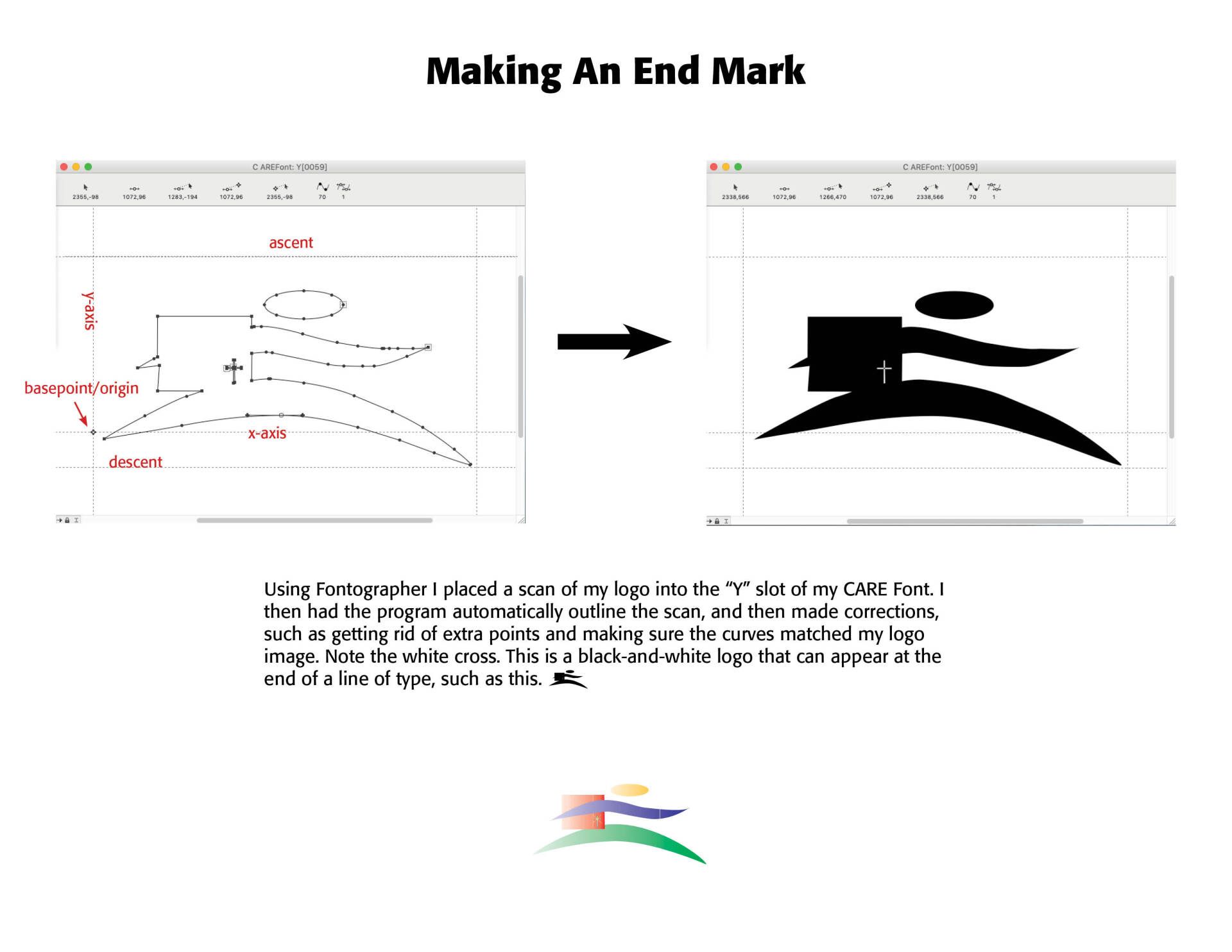
How are they made? Usually an image is scanned into a font developer program, like Fontographer, and placed in a character slot. It is then made into a glyph, a separate letter, if you will, in the font or in another font. This allows the writer or editor to conveniently and neatly place the end mark without having to shrink the main image and then somehow maneuver it into the end of a paragraph. See the diagram below as to how an end mark can be made.

Successful Layout & Design

By Carl Shank December 9, 2025
Variable Fonts & AI Renderings: An Introduction History & Use “Variable fonts are a single font file that behaves like multiple fonts.” (John Hudson) The technology behind variable fonts has been around for a while. Starting in the 1990s, interpolation and extrapolation have been used to create different masters, and weights in typefaces. For example, by designing a regular and bold weight a semibold could be interpolated from the two masters. 
By Carl Shank December 1, 2025
Advances in Typography: Late Twentieth to Twenty-First Centuries A Historical Sketch (Part 3) Late Twentieth to Early Twenty-First Century: Corporate and Contemporary Digital Jonathan Hoefler (b. 1970) is an American type designer known for influential typefaces such as Hoefler Text, Gotham, Knockout, and Mercury. Gotham, co-designed with Tobias Frere-Jones, gained international fame through its use in Barack Obama’s 2008 campaign and has since become a staple in corporate and editorial branding. Born in New York City, Hoefler’s early fascination with everyday typography led him to a self-taught career in type design. In 1989, he founded the Hoefler Type Foundry, quickly earning recognition with Champion Gothic for Sports Illustrated. His partnership with Roger Black and later Tobias Frere-Jones resulted in dozens of widely used typefaces. Hoefler’s work is characterized by a blend of historical research and modern engineering, shaping digital typography standards. His typefaces are used by major publications, cultural institutions, and corporations worldwide. In 2021, Monotype acquired his company, marking a significant moment in the evolution of digital type design.  Hoefler’s approach has redefined contemporary type design, bridging historical revivals and modern usability. His influence extends across print and digital media, setting new standards for clarity, versatility, and typographic excellence.
Show More