Reviving Old Fonts
Reviving Old Fonts. Lewis Foreman Day (1845-1910) was an influential English designer, author, and lecturer who played a significant role in the Arts and Crafts movement of the late 19th and early 20th centuries. He became a prolific designer, working across various mediums including wallpaper, textiles, stained glass, pottery, and metalwork. Day advocated for the integration of form and function, emphasizing the importance of practicality in design alongside aesthetic considerations. His work and writings contributed significantly to the development of British design education and theory in the late Victorian era.
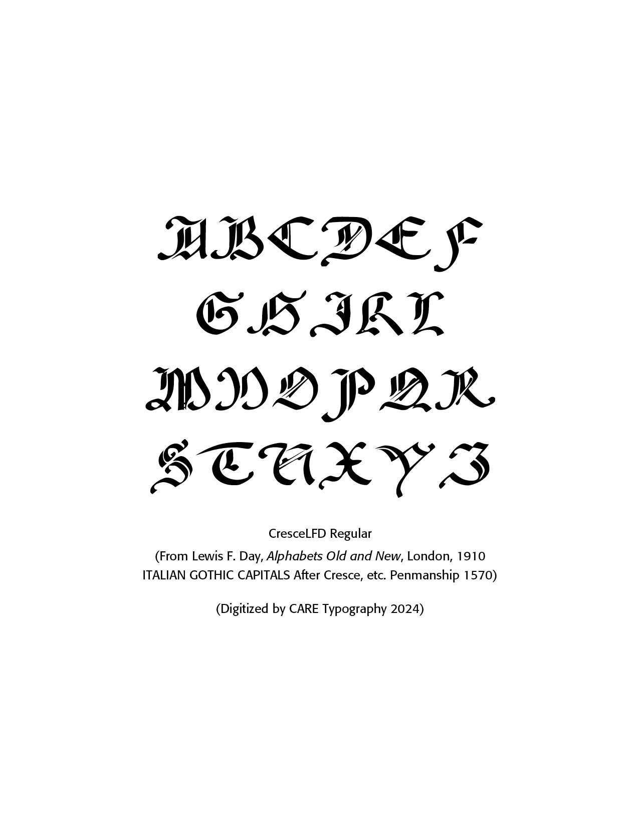
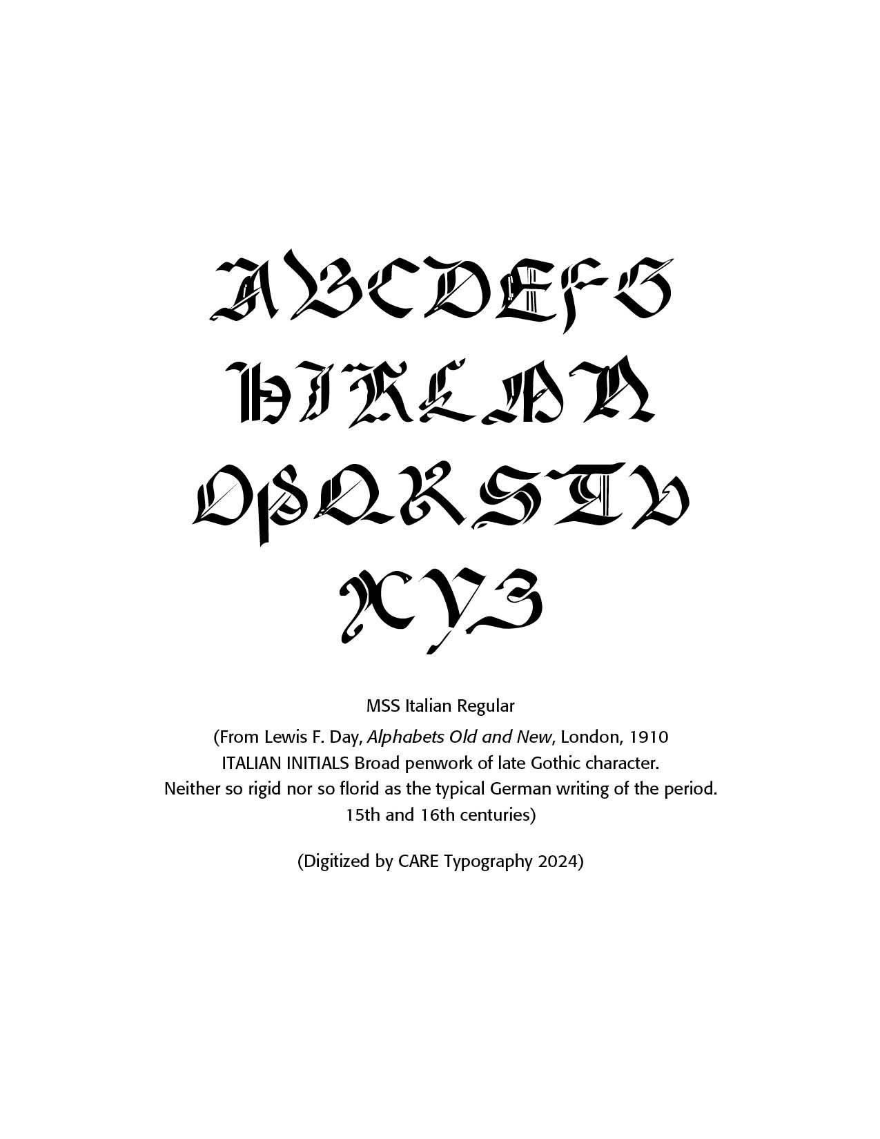
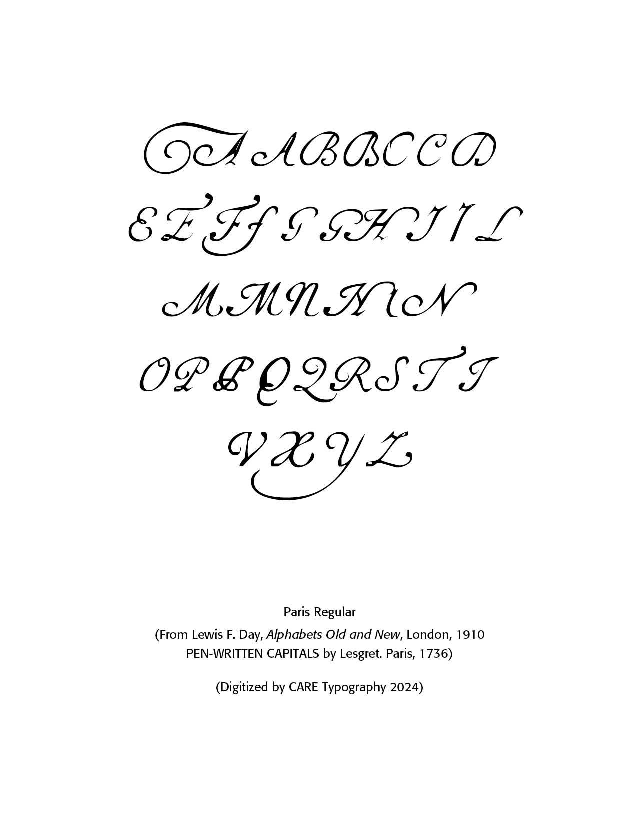
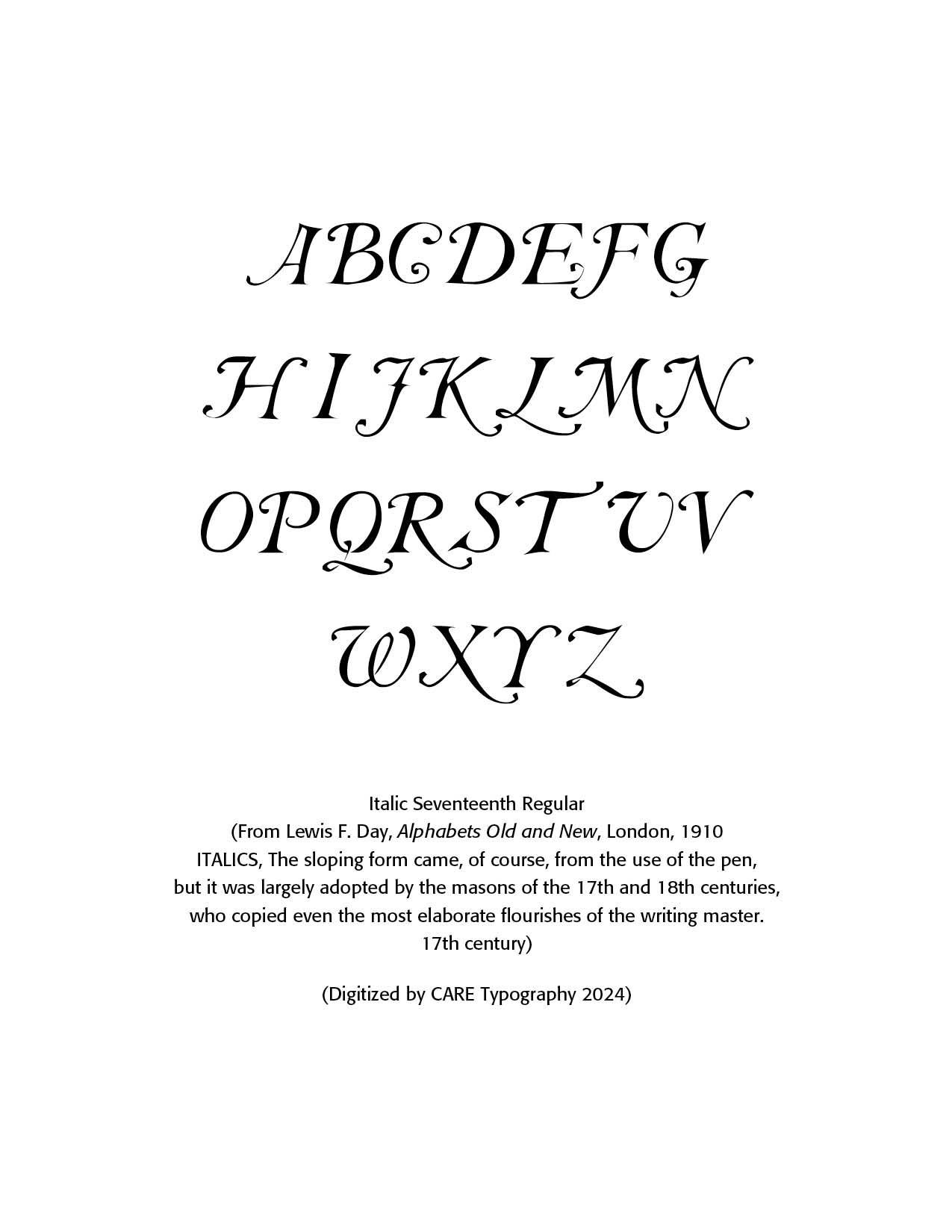
His book, Alphabets Old and New, published in London, in 1910 gives sterling examples of his typography work. Day's approach to design, blending traditional craftsmanship with modern industrial techniques, helped shape the transition from Victorian aesthetics to more modern design principles. CARE Typography has digitized a number of the font faces in the book for modern use and aesthetic appeal. The typefaces below illustrate the beauty and craftsmanship of Day which can contribute to modern typography.
These mostly pen drawn typefaces have been digitized by CARE Typography using Fontographer to make them available as usable fonts. Caps or Unicals are often used in display faces and advertising. Some of these classic faces can enliven your printing and advertising projects. They are available, either individually, or as a set, for a modest fee. Contact CARE Typography for more information and ordering, email cshanktype@gmail.com.
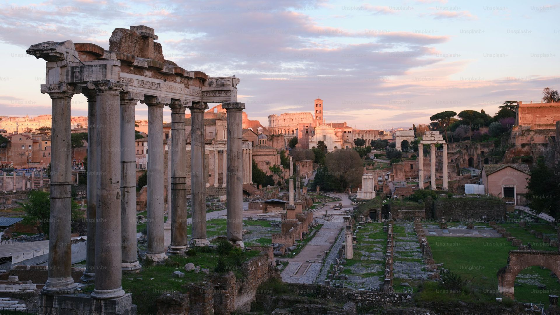
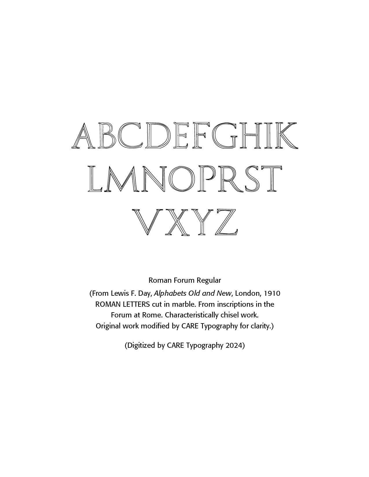
Roman Forum Regular. Day notes these as ROMAN LETTERS cut in marble. From inscriptions in the Forum at Rome. Characteristically chisel work. CARE Typography made the copying and digitizing of these capitals more precise using Adobe InDesign and Fontographer.
The Roman Forum (Forum Romanum in Latin) was the political, social, and economic heart of ancient Rome, serving as the central public space for much of the city's history. It was a place of great significance where triumphal processions, elections, public speeches, trials, and commercial activities took place. The development of the Roman Forum spans many centuries, reflecting the growth and transformation of Rome from a monarchy to a republic, and ultimately to an empire.
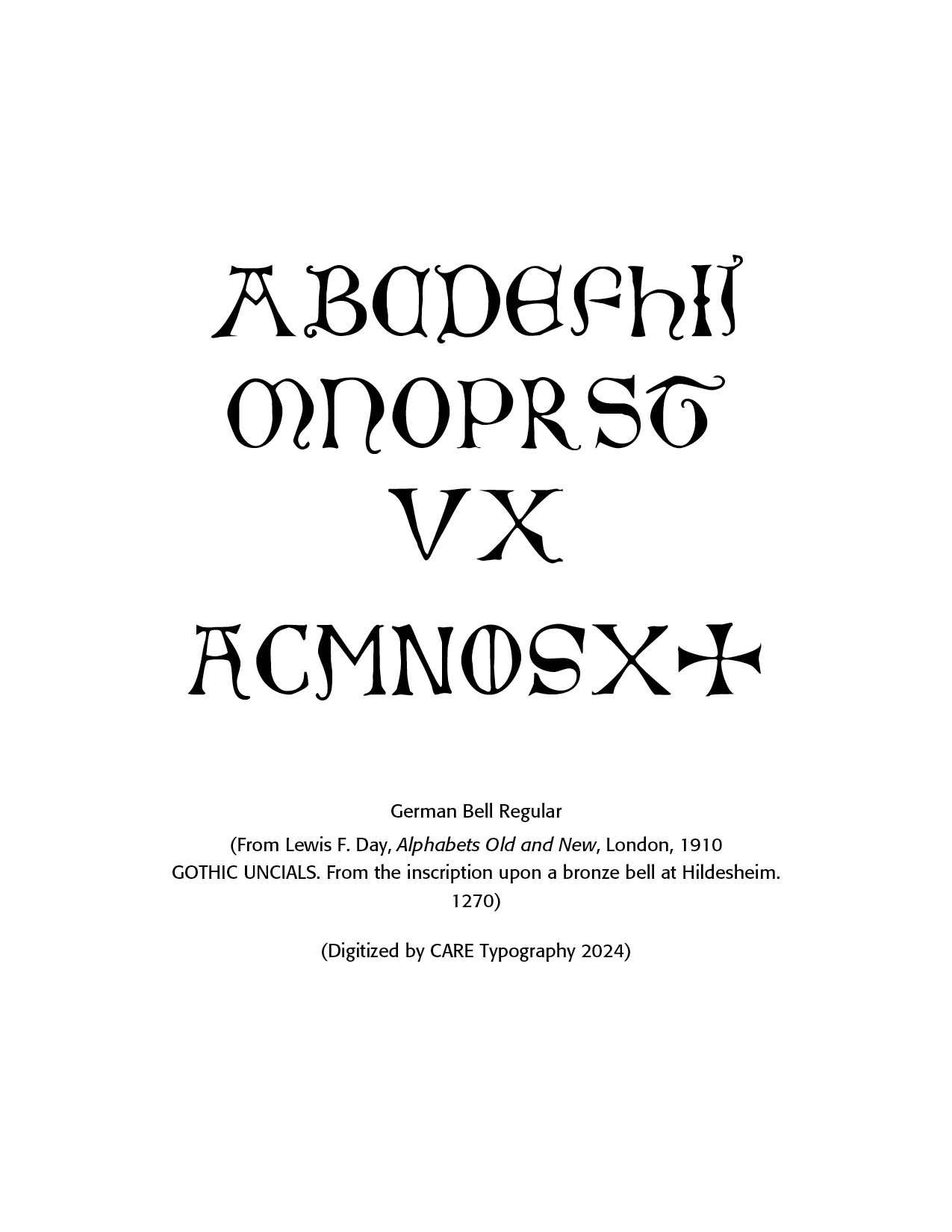
German Bell Font from Hildesheim. Note the traditional Gothic capitals style, with the flairs on the "J" and the alternate "A." Included is the symbol for the ancient Christian Cross.
Hildesheim is a historic city located in Lower Saxony, Germany, known for its rich history, cultural heritage, and medieval architecture. Here’s a detailed overview of the city: Hildesheim is situated about 30 km southeast of Hanover, near the northern foothills of the Harz Mountains. The Innerste River flows through the city.
Hildesheim has a long history dating back over a thousand years. The city was founded in 815 AD when Emperor Louis the Pious, the son of Charlemagne, established a bishopric here. It developed as a significant religious center during the Middle Ages. During the 11th century, Hildesheim became an important ecclesiastical center. Several Romanesque churches were built, which have become famous for their architecture and cultural significance.
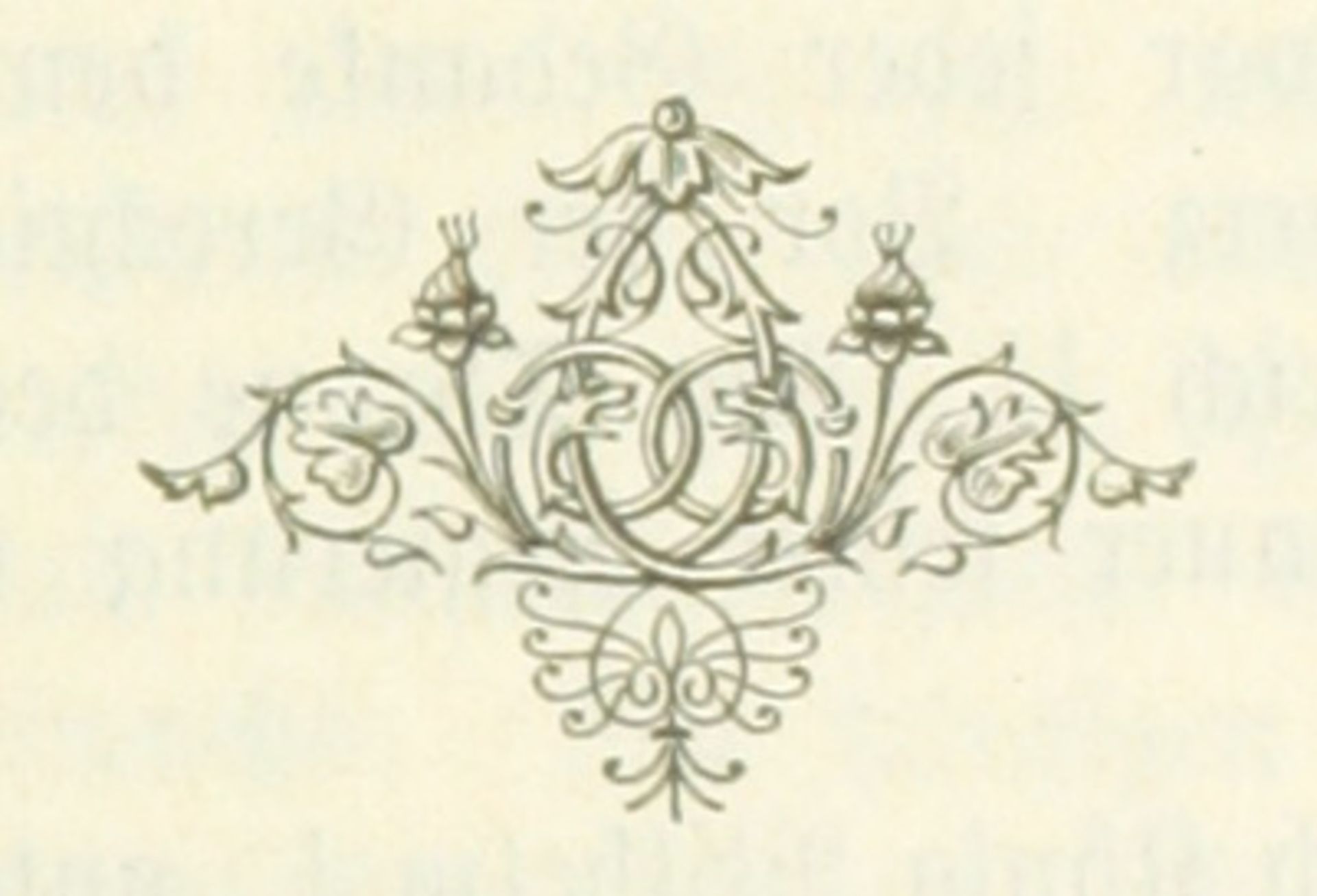
See the fancy graphic below. 224078382 © British Library Commons | Dreamstime.com
Italic Offerings. The transition from Gothic to Italic typefaces was part of the broader evolution of typography that took place during the Renaissance period, driven by shifts in cultural, aesthetic, and technological factors. Gothic script was primarily used for religious texts, legal documents, and early printed books like the Gutenberg Bible. It symbolized tradition, formality, and authority. Gothic type, as seen in my previous Blogs, was characterized by its dense, angular, and ornate letters, often with sharp vertical strokes, tight spacing, and elaborate flourishes. It was designed to mimic the style of manuscript writing at the time.
The Renaissance, beginning in Italy in the 14th century, marked a revival of classical antiquity and a move toward humanism. This brought a renewed interest in the legible, flowing scripts of Roman and Greek antiquity, which were more readable and aesthetically simple compared to Gothic lettering. The development of the printing press (ca. 1440) by Johannes Gutenberg created a need for more versatile and legible typefaces. The emerging humanist values aligned with a preference for typefaces that resembled the clear, round, and graceful writing of ancient Roman scripts.
The Italic typeface was introduced by Aldus Manutius in Venice around 1501. Manutius, a prominent printer and publisher, sought to create more compact and elegant typefaces that could fit more text on a page, catering to the rising demand for smaller, portable books. Italic was based on the handwriting of Niccolò de' Niccoli, a Renaissance scholar and calligrapher. Italic typefaces are defined by their slanted, cursive-like appearance, with letters that have a flowing, dynamic quality. It allowed for more text to be fitted on the page and mimicked the handwriting style of humanist scholars.
Italic type was not only more elegant than the Gothic but also more efficient in terms of space. It became the preferred choice for printed texts that emphasized classical learning, philosophy, poetry, and humanist literature. Italic was initially used for entire texts but later became more common for emphasis (such as book titles, headings, or foreign phrases) alongside Roman type. While Italic and Roman typefaces became dominant in Italy and spread throughout Europe, Gothic typefaces continued to be used in northern Europe, especially in Germany, until the 18th century. However, Gothic script gradually became associated with tradition and older religious or legal texts, while Italic and Roman types became synonymous with modern, humanist, and scholarly work.
Today, the transition from Gothic to Italic and Roman typefaces represents one of the key shifts in the history of typography, reflecting both technological advancements and cultural changes that valued clarity, readability, and classical elegance.

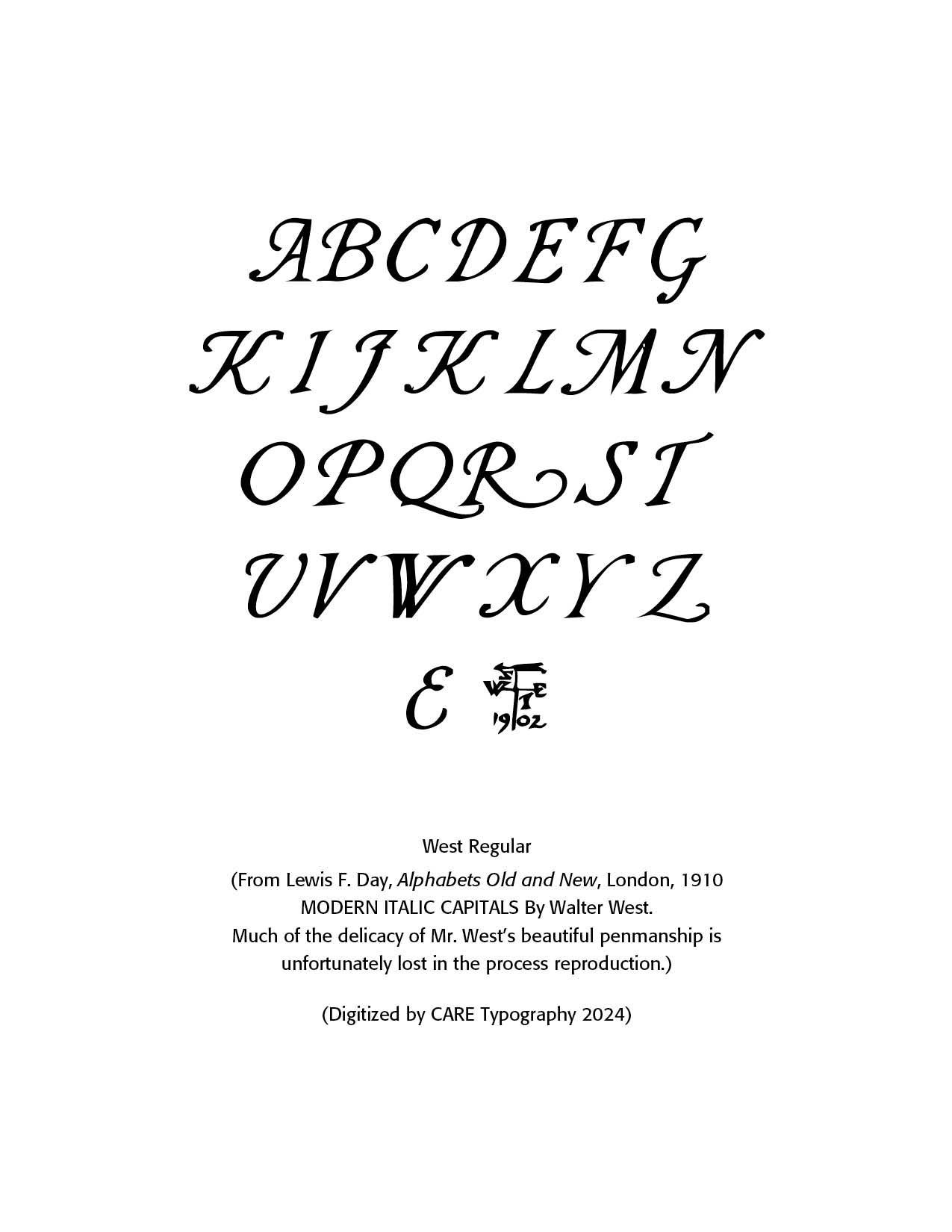
Walter West. Walter West was an influential typographer known for his innovative approach to type design and his contributions to the field of modern typography. While specific detailed records about his life and career may be sparse, West was often celebrated for blending traditional craftsmanship with contemporary aesthetics in his work. His designs typically showcased a deep understanding of typographic history while incorporating modern readability and functionality.
West's work is often cited in the context of the broader movement towards clearer, more legible typefaces in print and digital media, reflecting the changing needs of design as it shifted into the 21st century. His focus on the user experience in design and the importance of type in communication earned him a notable reputation in the design community.
Flemish Printers. Christophe Plantin (1520–1589). Plantin was one of the most prominent printers of the 16th century, and his work had a lasting impact on printing in Europe. Born in France, Plantin moved to Antwerp, which was then a thriving hub of commerce and culture. He founded the Plantin Press (Plantin-Moretus), which became one of the most successful printing houses in Europe. Plantin is best known for publishing the Polyglot Bible, one of the most ambitious and influential religious texts of the time. His printing house, now a UNESCO World Heritage Site, is still preserved as a museum.
The Moretus Family. After Plantin's death, the business was inherited by his son-in-law, Jan Moretus (1543–1610), who continued his legacy. The Moretus family maintained the Plantin Press for several generations, producing high-quality books and playing a major role in spreading printed works across Europe. The Moretus family was known for its skilled typography and meticulous attention to detail in book design
Dirk Martens (c. 1447–1534). Dirk Martens was one of the earliest Flemish printers and a pioneer of printing in the Low Countries. He established printing presses in cities like Aalst and Antwerp and was responsible for publishing key humanist works by Erasmus and Thomas More. His efforts helped make Antwerp a major center of printing and humanist thought during the Renaissance.
Jan van Ghelen (1512–1560). Jan van Ghelen was another prominent Flemish printer, especially known for his work in printing almanacs and religious works. He operated in Antwerp and was a central figure in the print industry during the mid-16th century. Van Ghelen is remembered for his editions of religious and scientific works, which were highly regarded across Europe. These Flemish printers were not just businesspeople but also cultural figures who contributed to the dissemination of knowledge, humanism, and the arts during the Renaissance and early modern periods. Their work helped shape the future of European literature and typography.
English Influences. By the late 16th century, London had become the central hub of printing in England. Several prominent printers and publishers emerged during the Elizabethan era, contributing to the spread of Renaissance ideas. Among them were Richard Grafton, who printed the first Bible in English, and John Day, who specialized in Protestant literature.
Christopher Barker, the Queen’s Printer, held exclusive rights to print official government documents, as well as Bibles and prayer books, which gave him immense influence. His son, Robert Barker, would go on to print the famous King James Bible in 1611.
Typography and Typefaces. The dominant typefaces used in Elizabethan printing were blackletter (Gothic) and roman types. Blackletter, with its dense and elaborate strokes, was widely used for religious and official documents, giving an air of authority and tradition. However, as Renaissance humanist ideas spread, roman typefaces (more legible and less ornate) began to gain popularity for non-religious texts, scholarly works, and poetry.
Printers like John Day were instrumental in promoting the use of roman type for English texts, which helped move England toward a more modern typographic style. Italic type was also occasionally used for emphasis or prefaces, adding variety to the page layouts.
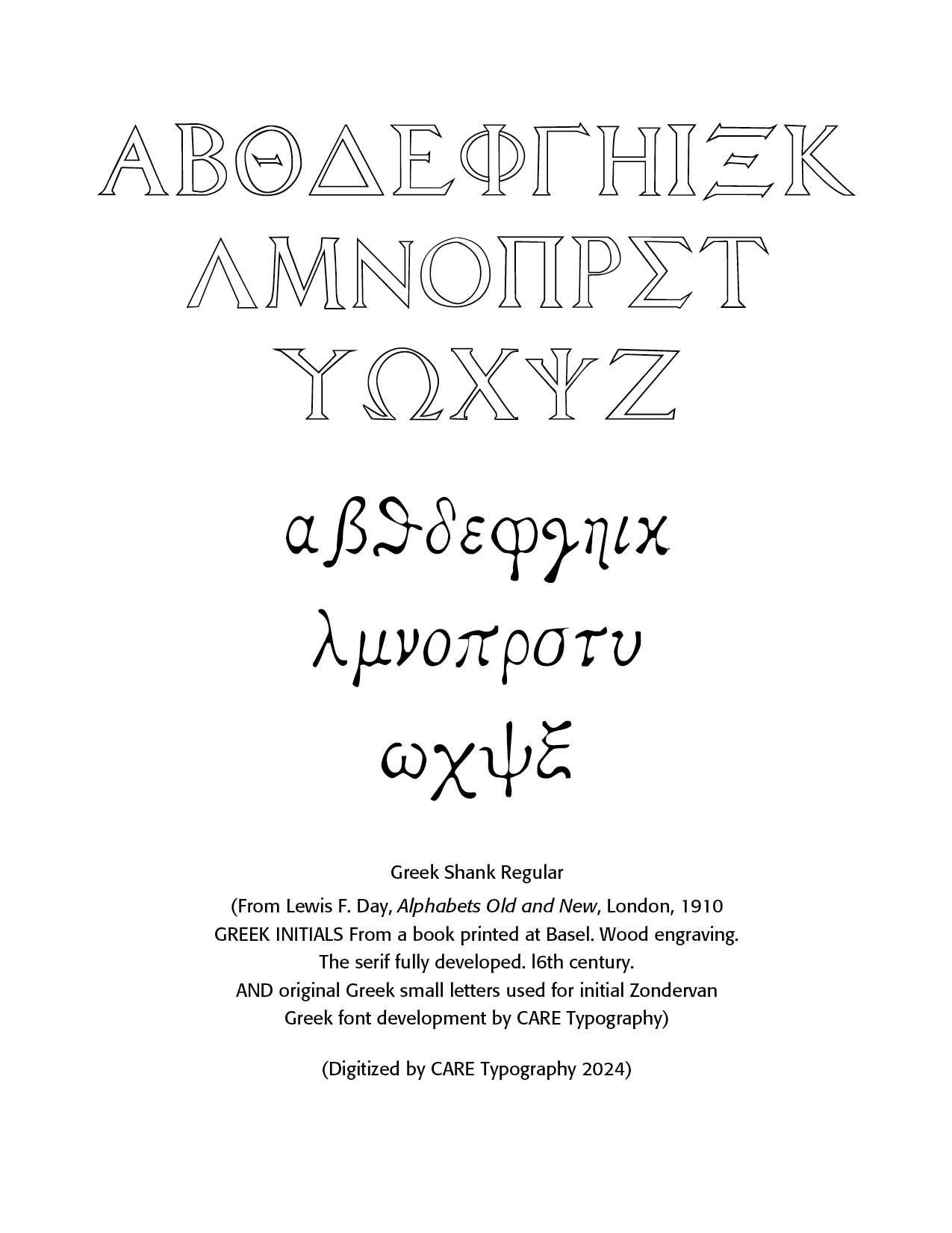
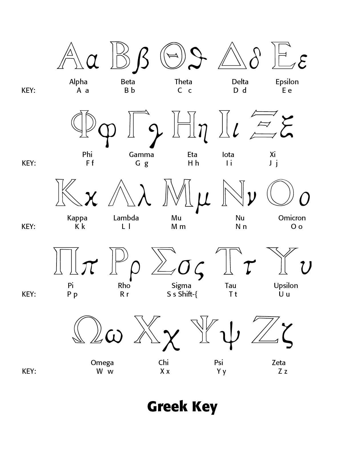
Foreign Language Fonts. Lewis F. Day includes in his survey of alphabetic fonts, both Hebrew and Greek lettering. While they both do not include all of the accented marks professional language fonts offer, they do provide clear and clean and crisp typefaces to use as a base for both languages. The Greek offering above includes Greek Initials from a book printed at Basel from wood engravings with obvious serif faces. The small letters are part of my original Greek font work for the Zondervan corporation back in the early 1990s. The Hebrew Consonants font consists of the twenty two letters of the Hebrew alphabet. Notice the outstanding rendering of the Hebrew letters.
Sources
ChatGPT
Lewis F. Day's Alphabets Old and New, London, 1910

Successful Layout & Design


