By Carl Shank
•
October 13, 2026
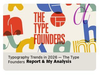
Type Trends 2026 Analysis Tiffany Wardle, The Type Founders copy and design service editor, has offered her perspectives on the state of type in 2026 (SEE https://bit.ly/4s5fgNV ) She offers the summary that “no single style has defined 2026.” She, instead, offers that “variety” is the defining feature of 2026 — “traditional and unconventional approaches, maximalism beside restraint, and pairings without an obvious connection that still suit their context.” She notes that familiar or bookish type is found in unexpected roles and scales, that “expressive type is paired with pragmatic type, and that character-rich typefaces used as logotypes with broader use of variable fonts for creativity and performance.” Instead of the traditional typeface advice of carefully selecting faces that harmonize with one another, and the classic sans-serif headlines with serif text, she notes that type in 2026 emphasizes contradiction — “Contradiction gives much current typography its appeal. A bold, mannered display face can sit beside a practical sans serif; the two need no obvious formal connection. Their contrast creates energy. These ideas are not new. Typography has always adapted and recombined earlier approaches for new purposes. What matters now is the particular mix—and the wide range of methods that can feel contemporary at once.” The age-old sage advice, that I posted in 2021, notes this about how to use and combine typefaces — "Robert Bringhurst wisely says — “The best type for a book about bicycle racing will be, first of all, an inherently good type. Second, it will be a good type for books, which is to say, a good type for comfortable long-distance reading. Third, it will be a type sympathetic to the theme. It will probably be lean, strong and swift; perhaps it will also be Italian. But it is unlikely to be carrying excess ornament or freight, and unlikely to be indulging in a masquerade.” ( The Elements of Typographic Style , 91). Jan White echoes this sentiment about choosing type in How To Spec Type — “There is no such thing as 'right' or 'correct' use of type. There is only vivid and eloquent effectiveness, or numbing and misleading ineffectiveness.” (10) Consequently, a math textbook will use a different typeface than a slogan on a can of soda or a bottle of wine. White suggests the following questions for the would-be use of a typeface in any context — [1] Does the way the type is handled in a specific circumstance fulfill its purpose? [2] Is it doing the job efficiently? [3] Is the message coming through clearly and vividly? is the message jumping off the page into the reader's mind crispy and memorably? (10) He goes on to say that “good typography is transparent, like blister-packaging — exposing the content inside and letting it speak for itself.” He agrees with Bringhurst about the use of type ornaments — “too often typography is used like gift wrapping, in the hope that cosmetic prettification will make the package seem more desirable.” (10) So then, “good typography links the verbal with the visual to produce arresting results. Good typography clarifies. It articulates. It elucidates. It expresses meaning.” (11) Many would-be editors and writers and office personnel try too hard when it comes to setting type. With the thousands of possible typefaces that are on the market today, produced by would-be typographers, playing with digital type producing programs, many people can get overwhelmed and confused and frustrated by what typeface to use.”(SEE my blog “How To Choose the Right Type for the Right Job,” March 29, 2021, www.caretypography.com ) This age-old and wise advice has been supplanted, I would suggest, by a post-modern theoretical, indeed theological, cast. Like Dutch De Stijl (See Reference ), or Dadaism (See Reference ), or Psychedelic (See Reference ) or Punk (See Reference ), or Grunge type (See Reference ), the cultural context of rebellion against any typography rules of readability and legibility and well-defined type go out the window in favor of whatever gives “energy” to an ad or a poster or a book that wins the day. Wardle goes on to say about 2026 type combinations — “Unexpected roles. Bookish, text-oriented, or familiar type appears at surprising scales or in applications not usually associated with it. Contrasting character. Maximalist or highly expressive type sits beside pragmatic type, with the overall composition mattering more than obvious stylistic harmony.” She says these contrasts “invite closer attention to the content and reasoning behind each choice.” Post-modernism rejects absolutes and what I would call “common-sense” order and structure. Everyone makes up their own rules, their own agendas, their own type combinations, ignoring centuries of time-tested typography. This is what “feeling contemporary” means. If I am correct, then the 2026 typeface choices and patterns will likewise disappear from regular use. Using what has been called display type for “normal” use betrays one of White’s criticisms — “too often typography is used like gift wrapping, in the hope that cosmetic prettification will make the package seem more desirable.” What is important is what is on the inside of the package, not the audacious gift wrapping. I would imagine that Wardle would point to White’s other typography notes that say “good typography links the verbal with the visual to produce arresting results. Good typography clarifies. It articulates. It elucidates. It expresses meaning.” She might point out the “energy” aspect of 2026 type choices and combinations and maintain that they accomplish the same thing as White suggests. I am not at all sure about that. Some of Fonts In Use samples below are what Wardle highlights (SEE https://fontsinuse.com ). You make the judgment call.