Modern Resumé Makeover

Carl Shank • May 2, 2023

A Modern Resumé Makeover. With companies laying off workers and hundreds, even thousands, of qualified and eager workers looking for jobs, a resumé is a must. But what kind of resumé? Obviously, Indeed.com and other sites offer digitally made resumés, and that may seem adequate for many job seekers. However, some companies and hiring managers, especially in the design arts, are looking for comps, for well-crafted designs, for portfolios of what the would-be worker is offering.


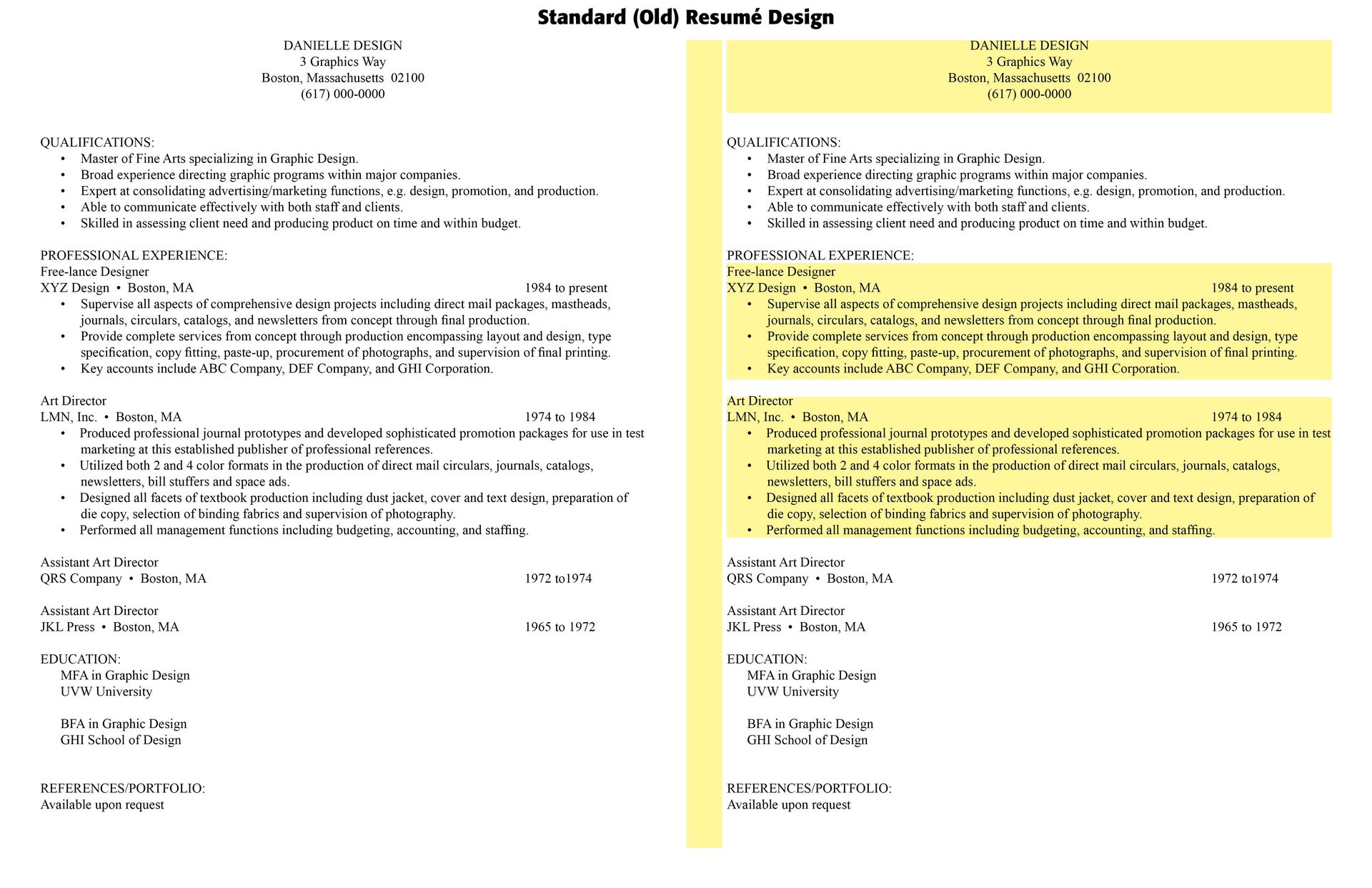
In the first diagram below, a standard (older style) resumé is offered. It has the necessary information, perhaps lacking an "objective" or "goal," but contains the relevant information employers and recruitment managers are searching for. It is sufficient, but tired, boring, unattractive and usually gets in the scrap heap with perhaps a passing glance. Those recruiters who do a six-second scan (the standard time) usually do what is called a "F-Scan" of the resumé. If something strikes his or her attention then the resumé is placed on a smaller pile for consideration.


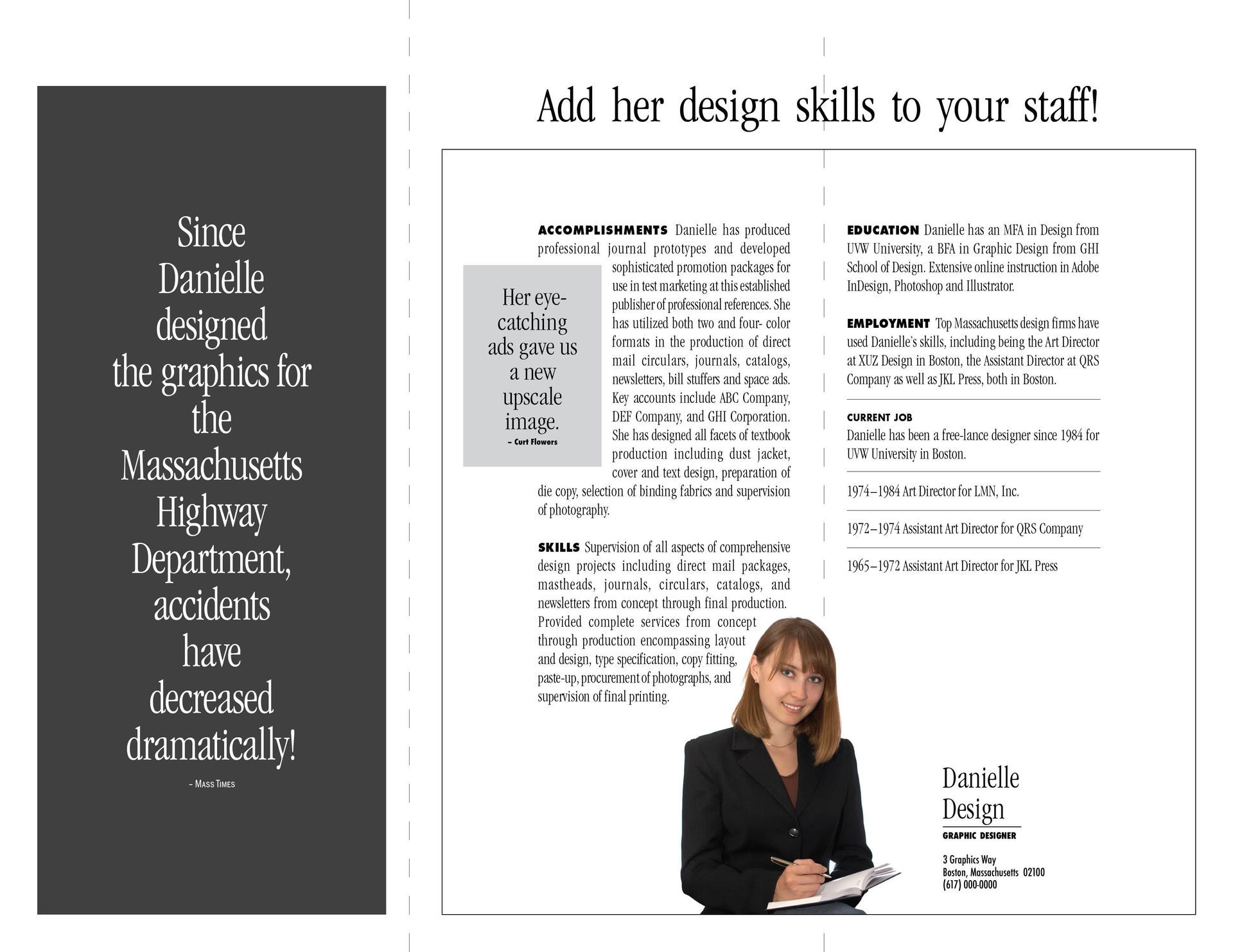
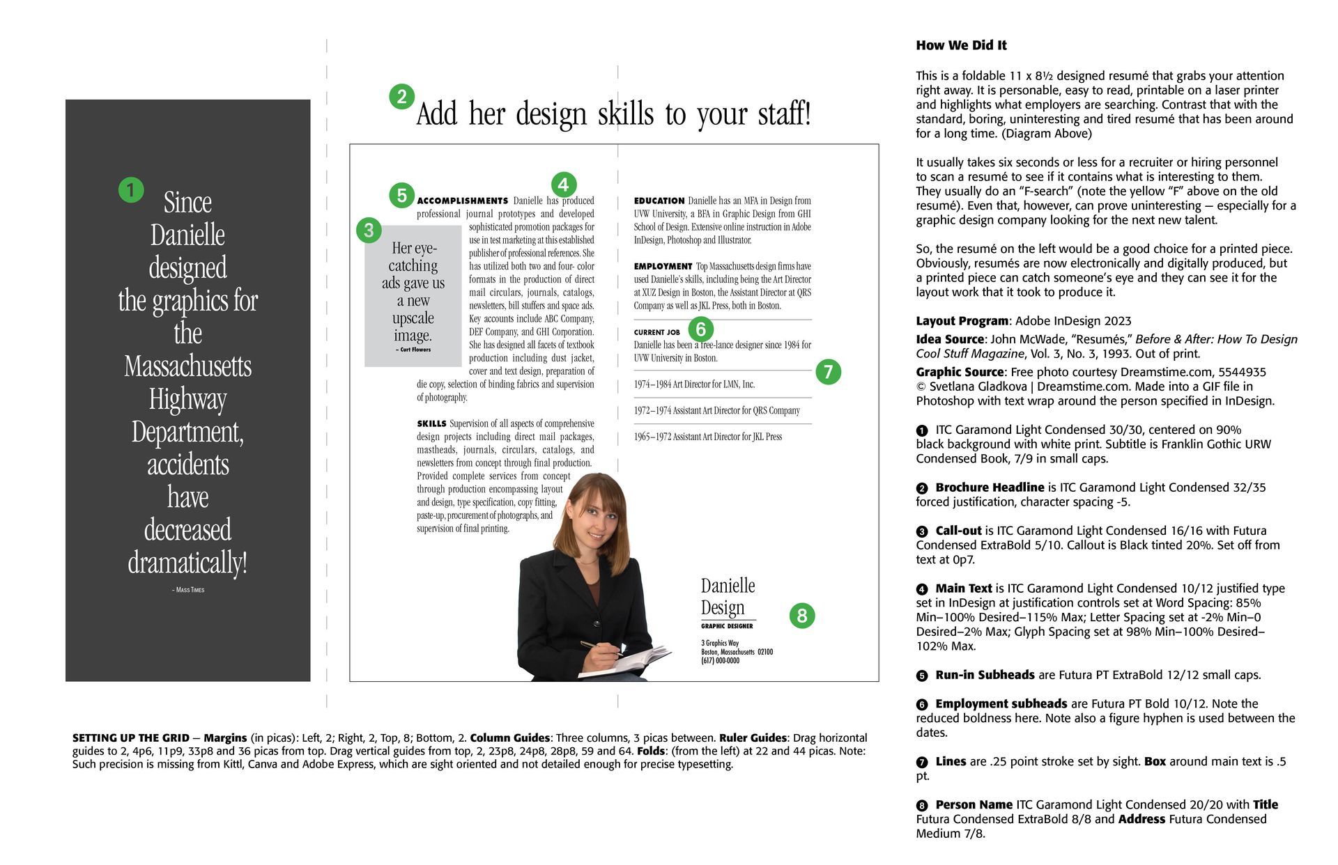
However, to assure a more than six-second look, a well-crafted, personable styled, typologically interesting resumé can command some extra attention from job recruiters,, especially in the design and typesetting or printing business. This is offered in the second diagram and then "How We Did It" is in the Third. Take a look. CARE Typography can design a noteworthy resumé for you. Give us a call or send an email with your old resumé and watch the magic happen.

Successful Layout & Design

By Carl Shank June 6, 2026
Reading through an old volume of Frederick Nelson Phillips, Inc, Type Faces:With Which We 'Prove It With Proofs' in Typography for Advertisements (New York, 1924), I came across some type that falls outside of the standard typography models, called "vanity type." The term “vanity typography” is not a formal category in typographic history like Old Style, Transitional, Modern, or Sans Serif. Designers typically use the phrase informally to describe typography that draws attention primarily to itself rather than serving the text or reader. Vanity typography occurs when type is used as a display of the designer's skill, fashion, or personal taste rather than to improve communication. Readability is sometimes sacrificed for self-expression and artistic flair. Such type styles use excessive ornamentation, decorative letterforms, overuse of effects like shadows, outlines, gradients and distortions, unusual spacing, and generally typography used to impress rather than inform. Notice in the sample by Phillips, the different "A's," "F's,", "G's," "H's," "L's," "M's," "S's," T's" and "W's." This is not calligraphy lettering, but rather type that could have been used for verses or opening letters to paragraphs or stories.
By Carl Shank May 15, 2026
Puritan Typography Theology Informing Type “Creational realities have not spilled out randomly without purpose; rather, they reflect the wisdom, design, and intention of the good God who made them. It’s our job, then, to observe and learn. . . . And indeed, long before [Jonathan] Edwards began to keep his notebook of earthly pointers to heavenly truths, the seventeenth-century English Puritans were writing lengthy volumes organized around exactly this sort of principle.”[1] “The Puritans were a group of ministers and laypeople within the Church of England who sought to promote Reformed and experiential piety while striving to purify the national church from Roman Catholic influences in doctrine and worship, beginning during the Elizabethan era and continuing as a powerful force until the early eighteenth century. More broadly defined, the Puritan movement included those who were firmly within the Reformed and experiential tradition that flourished not only in sixteenth- and seventeenth-century England, but also well into the eighteenth century north of Hadrian’s Wall (among the Scottish Presbyterians), across the North Sea (among the Dutch Further Reformation divines), and across the Atlantic Ocean (among the New England Puritans and eighteenth-century evangelicals).” [2] Puritan typography flows from Puritan theology. The English Puritans of the sixteenth and seventeenth centuries inherited a typographic world shaped by the late Renaissance, the Reformation, and early modern printing. Their type styles were not merely aesthetic choices. Rather, they reflected theology, scholarship, readability, economy, and cultural identity.
Show More