Helvetica's Better Substitutes
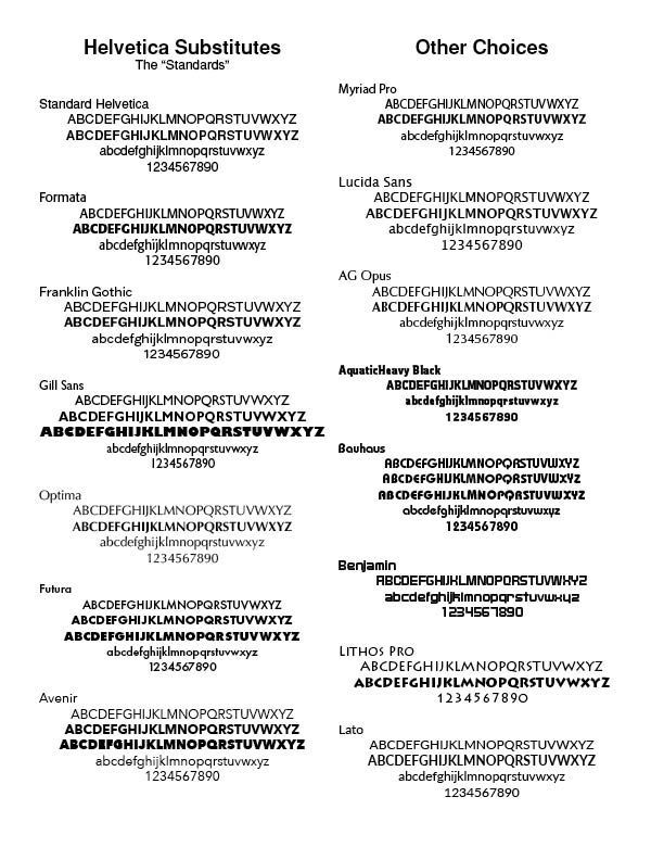
Helvetica's Better Substitutes. In the July/August 1995 edition of Adobe Magazine, Robin Williams, a noted typographer, says Helvetica, though immensely popular in the 60s and 70s, became passé. Like the beehive hairdo, Helvetica is continuously used but creates a tired and dated look. He says, "Just because it's on your computer doesn't mean you have to use it. The greatest single thing you could do for your publications is to invest in another sans serif ("without feet") face, one with a strong, bold black version in its family. As with all trends, Helvetica will someday be back in style—in about two hundred years."
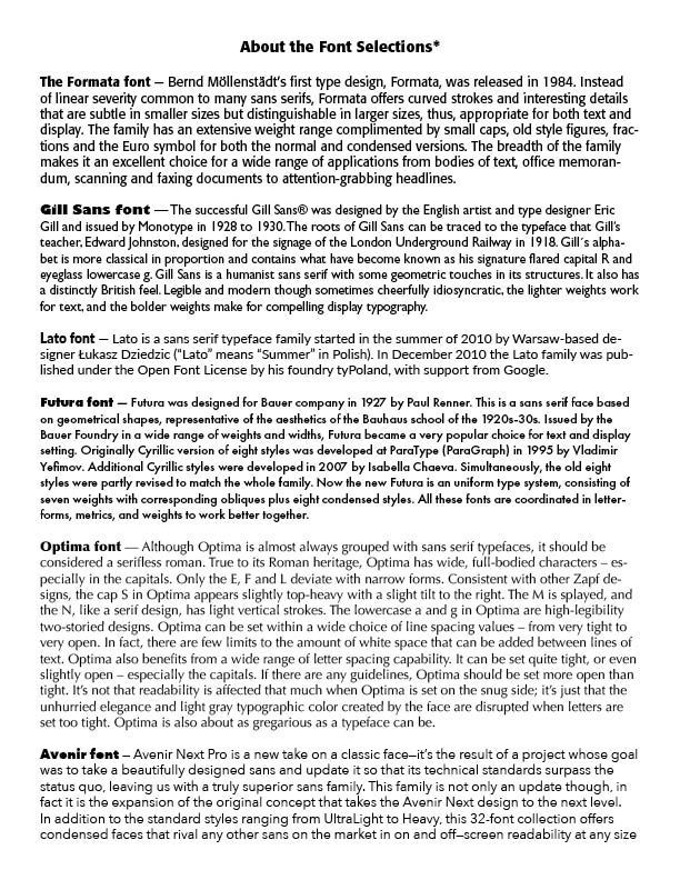
He gives in another article some alternatives to Helvetica — ITC Franklin Gothic, Futura, Gill Sans and ITC Stone Sans as examples. And Daniel Will Harris in "Add Impact to Type" in the magazine Technique, March/April 1994 issue, suggests a wide range of alternatives to Helvetica — Agfa Roti's Sans, Avenue, Eras, Formata, Franklin Gothic, Frutiger, Gill Sans, ITC Goudy Sans, Lucida Sans, Optima, Shannon or Univers.
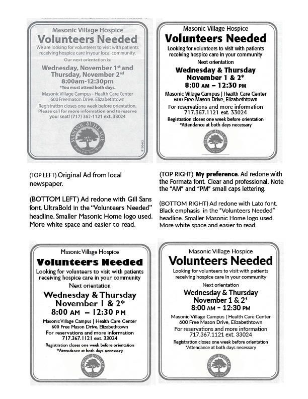
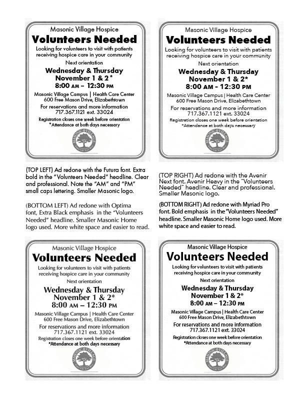
However, I find in hometown newspapers all over, the tired and dated, and boring, use of Helvetica persists. In my hometown, a local printer, well-known and established for many years, uses Helvetica for ads that not only do not stand out, but fail in modern typographical terms. I am sure the rationale for Helvetica's use is that this is the typeface they have used for ages, is the most convenient, is the fastest to use on a compressed time factor, and no one has ever complained. However, there are typographical alternatives to Helvetica, even in a rather traditionally based hometown, that would give better results. I note them below with a copy of a typical ad.
I fully understand that busy print shops and overworked staff, and perhaps not very well trained in modern typographical practices, simply default to Helvetica. But I believe we can all do better. Note the alternatives below and some information on the alternative typefaces used.
Successful Layout & Design


