Decluttering A Layout

Carl Shank • June 21, 2023

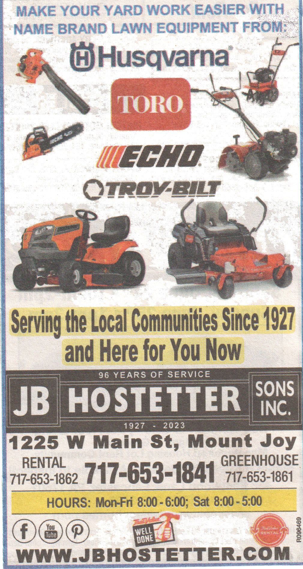
How do you go about decluttering or revamping a busy image? The image below was a local ad for a hardware store emphasizing lawn work equipment. The type should be easy to read and the graphics and fonts used should enhance the theme of the ad. I find the original ad "clunky" and hard to decipher what is really important. Is it the hardware store? Is it the lawn equipment? Is it the emphasis on servicing the local communities for quite some time?


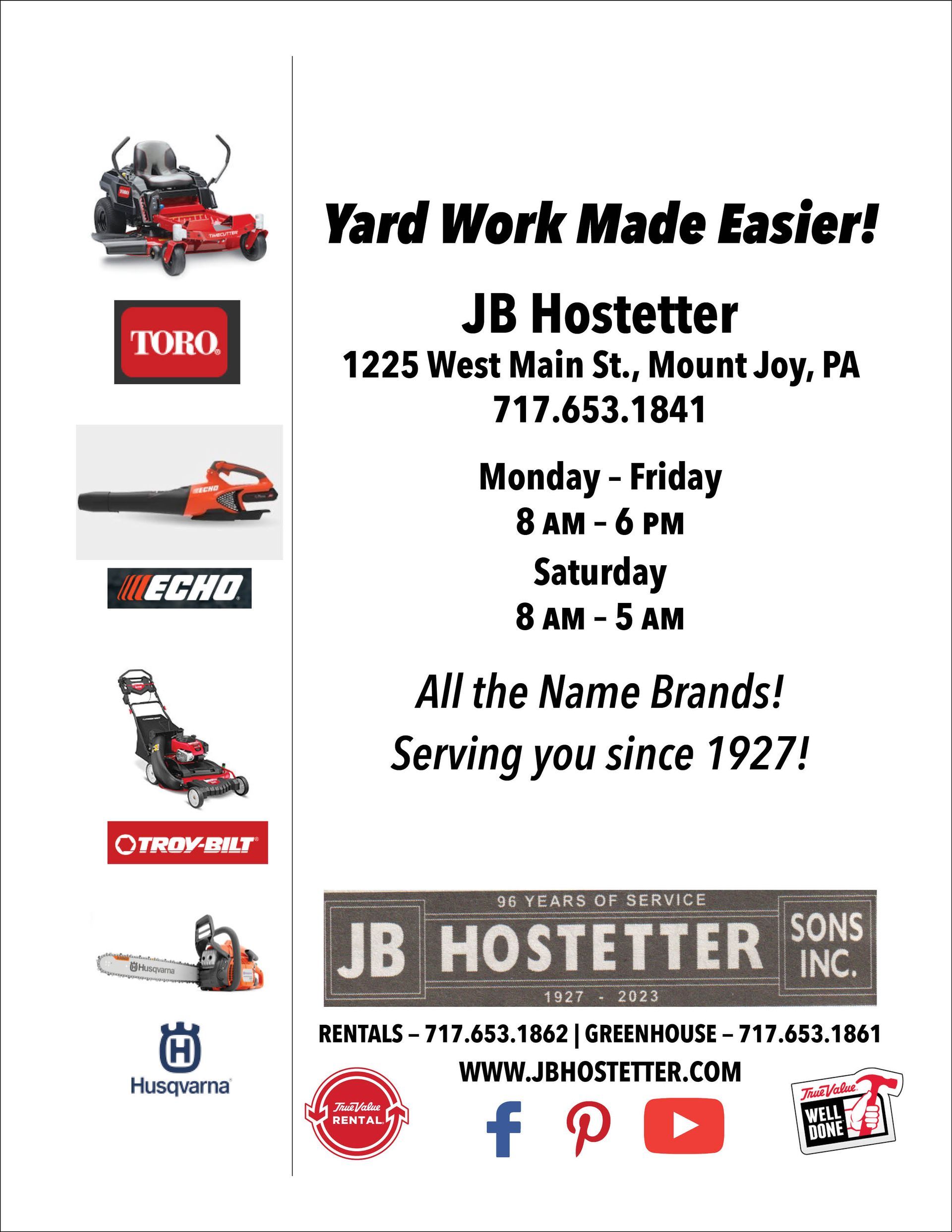
One major problem is using fonts that are sized incorrectly for the ad to stand out to the viewer. The remade ad uses a family of fonts, namely Avenir Next Condensed in various styles. Using the same font clarifies and highlights rather than obscures the message of the flyer. While the revamped flyer is limited to one major font style, you can generally use as many as three fonts in a publication to keep it from being cluttered. Because of the variety of font styles in the Avenir Next family, we can have both display fonts and text fonts from the same basic font family.


About those graphics. The graphics chosen to illustrate lawn equipment are scattered, not sharp and stand in contention with the companies advertised — Toro, Echo, Husqvarna and Troy-Bilt. Are we supposed to focus on the companies or the products of these companies? That is unclear. The Hostetter logo is indeed central to the ad, but the hours of operation are not emphasized. I suppose the yellow marker used is suppose to highlight those times as well as long standing service to the community.


The point in a display ad such as this one is to increase readability and invite the reader to investigate what is being offered. The revamped ad does this in a clean and clear way.

Successful Layout & Design

By Carl Shank November 8, 2025
What Happened to Type After Gutenberg? A Brief Historical Sketch from 1460-1640 At the end of the 15th century, German printing was at the forefront of a revolutionary transformation in Europe, driven by the invention of the movable-type printing press by Johannes Gutenberg in the mid-15th century. This development had a profound impact on culture, education, and the dissemination of knowledge. By the end of the century, Germany had become one of the key centers of printing in Europe, particularly in cities like Mainz, Nuremberg, and Augsburg. Books printed before 1501 are referred to as incunabula . German printers produced a significant portion of the incunabula, with many focusing on religious texts such as the Bible, liturgical works, and theological treatises. Secular works, including classical texts, legal documents, and scientific works, also gained prominence towards the end of the century. Incunabular typography can be said to have two major sources of inspiration —fifteenth century scribes and German typecutters, the second group of which drew largely on (and sometimes coincided with) the first. Fifteenth-century typography was characterized by both continuity and innovation. Typecutters like Nicolas Jenson and Johan Veldener found themselves highly influential in their regions, designing typefaces for many printers, but scribes also contributed their weight to the design of typography. German printers played a key role in developing early typefaces. However, they were not the only typeface creators and users. There were altogether in the Netherlands twenty-two towns where books were issued before 1500. When printing had once been introduced it spread rapidly, all but three towns starting within the first ten years. Jacob Gibbons notes that types “changed hands” and were sold or rented across Europe, Germany to Italy and France, France and the Rhine valley to England, the Netherlands to England and France to the Netherlands. Type founding and paper making were international businesses. Typography became a vehicle of cultural exchange in late medieval and early modern Europe. Thus typography was as mobile as the printing press itself in fifteenth century Europe, and perhaps a more subtle carrier of cultural, regional, national, and even personal identity. One of the most popular typeface was Blackletter (also called Gothic script or Fraktur), which dominated printed works in Germany during this period. The dense and elaborate script was particularly suited to religious and formal texts. However, that Gothic Blackletter script was developed with nuances across Europe. Gutenberg’s textura quadrata face, used in printing his famous Bible, became Gutenberg textura used in university and legal settings. Albrecht Pfister produced his own typeface, somewhat distinct from Gutenberg, though possibly derived from it. Ulrich Zell used Fust and Schoeffer’s Durandus typeface. Rotunda type became a readable alternative to Gutenberg’s. Zainer’s Cotico Antiqua was used until 1485. The Schwabacher type was a dense but softer face, paving the way until the Fraktur face in the sixteenth century and beyond. By 1500, there were over 1,000 printers operating in various German cities, making Germany a leading hub for the printing industry. Notable printing centers included: Mainz—The birthplace of Gutenberg’s press; Nuremberg — An important center for both printing and intellectual activity; and, Augsburg—A commercial and printing hub. What is often lost in typographical history in the years closely following Gutenberg are the important printers and typographers in Germany, Italy, Switzerland, France, the Netherlands, Spain, England, Austria, Sweden, Holland, Denmark, Scotland, Mexico, Ireland and the United States who furthered the cause of typography and printed works. This Blog serves as a historical sketch of a number of these important people.
By Carl Shank November 1, 2025
SWISS TYPE BEAUTY DESIGNERS LIKE JAN TSCHICHOLD were foundational to many of the Swiss design principles. This style evolved from Constructivist, De Stijl and Bauhaus design principles, particularly the ideas of grid systems, sans-serif type and minimalism. Emerging in Switzerland during the 1940s and 1950s, this typography, also known as the International Typographic Style, directly responded to the type chaos of Dada and the stylization of Art Deco. The Swiss style emphasized readability, visual harmony and universality. Clarity, objectivity and functionality were key components. Contributors included Max Miedinger, creator of the Helvetica typeface and Adrian Frutiger, creator of the Univers typeface, both in 1957. The Journey of Helvetica We all use Helvetica. In fact, some say it has been overused through modern years. Helvetica derives its powerful simplicity and display qualities from the 1896 typeface Akzidenz-Grotesk. “The design originates from Royal Grotesk light by Ferdinand Theinhardt who also supplied the regular, medium and bold weights. Throughout the years, Berthold has expanded this extremely popular and versatile family. AG Super was developed in 1968 by Günter Gerhard Lange and is an excellent choice for headlines. In 2001, Günter Gerhard Lange added more weights for Berthold including Super Italic and Extra Bold italic.”[1] “Helvetica is a twentieth-century Swiss revision of a late nineteenth­ century German Realist face. The first weights were drawn in 1956 by Max Miedinger, based on the Berthold Foundry’s old Odd-job Sans-serif, or Akzidenz Grotesk, as it is called in German. The heavy, unmodulated line and tiny aperture evoke an image of uncultivated strength, force and persistence. The very light weights issued in recent years have done much to reduce Helvetica’s coarseness but little to increase its readability.”[2]
Show More