Choosing & Combining Type
How To Choose the Right Type for the Right Job

In his masterful book about typography, Robert Bringhurst wisely says — "The best type for a book about bicycle racing will be, first of all, an inherently good type. Second, it will be a good type for books, which is to say, a good type for comfortable long-distance reading. Third, it will be a type sympathetic to the theme. It will probably be lean, strong and swift; perhaps it will also be Italian. But it is unlikely to be carrying excess ornament or freight, and unlikely to be indulging in a masquerade." (The Elements of Typographic Style, 91). Jan White echoes this sentiment about choosing type in How To Spec Type — "There is no such thing as 'right' or 'correct' use of type. There is only vivid and eloquent effectiveness, or numbing and misleading ineffectiveness." (10) Consequently, a math textbook will use a different typeface than a slogan on a can of soda or a bottle of wine.
White suggest the following questions for the would-be use of a typeface in any context — [1] Does the way the type is handled in a specific circumstance fulfill its purpose? [2] Is it doing the job efficiently? [3] Is the message coming through clearly and vividly? is the message jumping off the page into the reader's mind crispy and memorably? (10) He goes on to say that "good typography is transparent, like blister-packaging — exposing the content inside and letting it speak for itself." He agrees with Bringhurst about the use of type ornaments — "too often typography is used like gift wrapping, in the hope that cosmetic prettification will make the package seem more desirable." (10) So then, "good typography links the verbal with the visual to produce arresting results. Good typography clarifies. It articulates. It elucidates. It expresses meaning." (11) Many would-be editors and writers and office personnel try too hard when it comes to setting type. With the thousands of possible typefaces that are on the market today, produced by would-be typographers, playing with digital type producing programs, many people can get overwhelmed and confused and frustrated by what typeface to use. So, here's some suggestions.
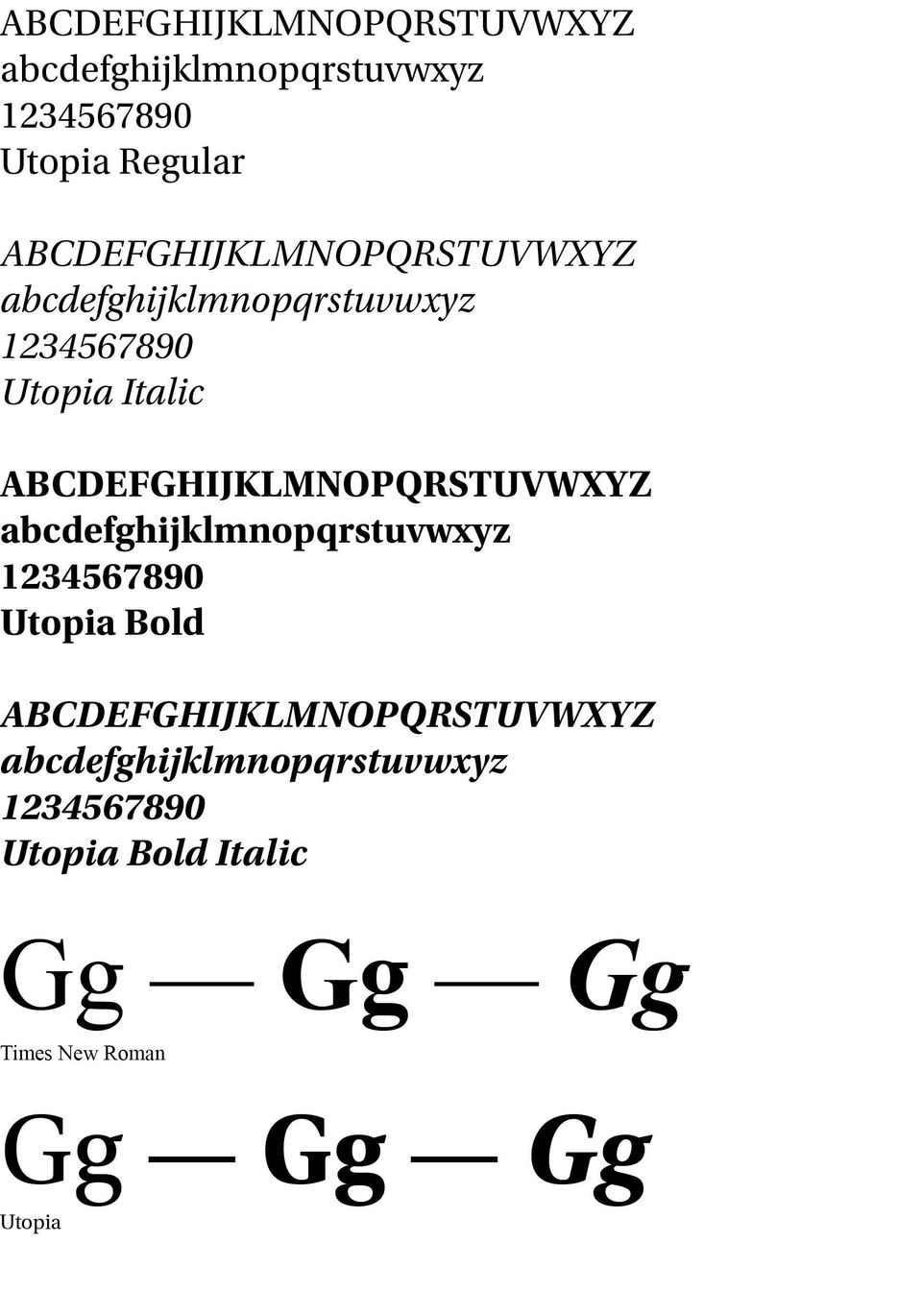
Be careful of a poorly designed typeface. Such a font is missing what should constitute a font family — regular or book, italic, bold, bold italic, ligatures, small caps, text figures, diacritics and important analphabetics. If you don't know what these are, and are content with the standard regular, italic, bold and bold italic then use them in an ordinary way, not trying to be cute or extravagant with them. An example would be Times New Roman —
This is a standard Times Roman.
This is a standard Times Roman Italic.
This is a standard Times Bold.
This is a standard Times Bold Italic.
Even here, "Boldface romans, however, are a nineteenth-century invention. Bold Italic is even more recent, and it is hard to find a successful version designed before 1950. Bold romans and italics have been added retroactively to many earlier faces, but they are often simply parodies of the original designs." (Bringhurst, 99) He would suggest avoiding Garamond and Baskerville, both popular faces available on many systems. Instead, use Robert Slimbach's Utopia font family (See sample below. Note especially the bold small "g" in the Times Roman as contrasted with the small "g" in Utopia.)
Use font variations within the font family. A well-designed font has a number of weights from which to choose for optimum use. So, the font Utopia has Utopia Caption, Regular, Subhead, Display, and the Semibold similar instances as well as the Bold instances. A Utopia Black face is also included. Such variations allow visual interest and adaptability. Here are the weights of the web font Alegreya —
Alegreya Normal
Alegreya Medium
Alegreya Bold
Alegreya Bolder
Alegreya Boldest
Use contrasting sans serif headliners with serif text fonts. But be careful to do some well-defined matching here. Sans serif ("without feet") fonts need to have a similar inner structure to the serif text face used. Thus, Formata Bold in small amounts goes with many text fonts —
Formata Bold with Minion OR with Georgia OR with even Times Roman.
All of this may seem tedious and too time consuming with which to bother. After all, most people do not look at type the way a trained typographer would. But there are obvious overused and overdone font combinations that not only do not please the eye but are simply atrocious. A little care here can mean a great deal to a pleasing report, book or paper.
Successful Layout & Design


