Ancient Alphabets

Carl Shank • October 28, 2023

Ancient Alphabets. How did our alphabet come to exist? Much of what we know about the alphabet comes from Middle Eastern and Egyptian sources. In my previous BLOG ("What's In A Name?") I investigated the creation of the alphabet and how our modern letters were formed. Again, I refer the interested reader and researcher to the excellent work by David Sacks, Letter Perfect: The Marvelous History of Our Alphabet from A to Z, available at Amazon.com. This particular blog offers readers and historical users the opportunity to see and download several ancient alphabetic fonts that history has uncovered.


It should be noted that in the computer world, Google fonts has produced several ancient fonts, only in Unicode offerings. They are Noto Sans Cuneiform, Noto Sans Egyptian Hieroglyphs, Noto Sans  Ugaritic, Noto Sans Old Persian and Noto Sans Imperial Aramaic. These are extensive fonts with hundreds or even thousands of characters in Unicode format. What that means is that finding a particular pictogram or etching (what ancient fonts look like) for a particular letter is next to impossible, unless one knows the exact letter font coding. They are also open source fonts, available for use and reconstitution.


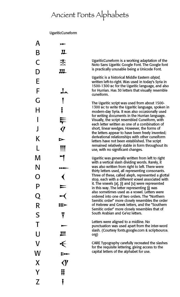
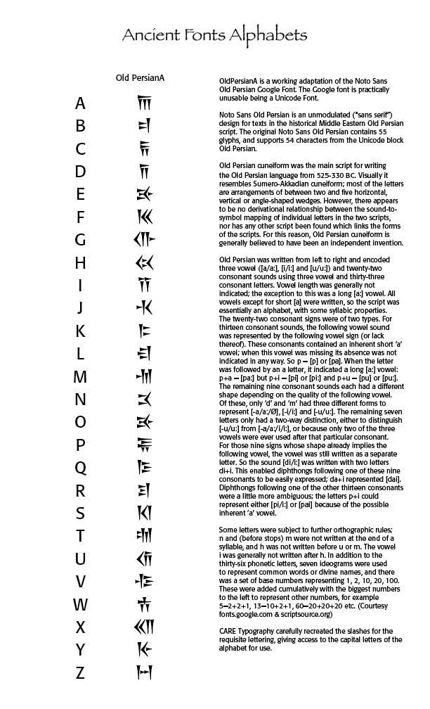
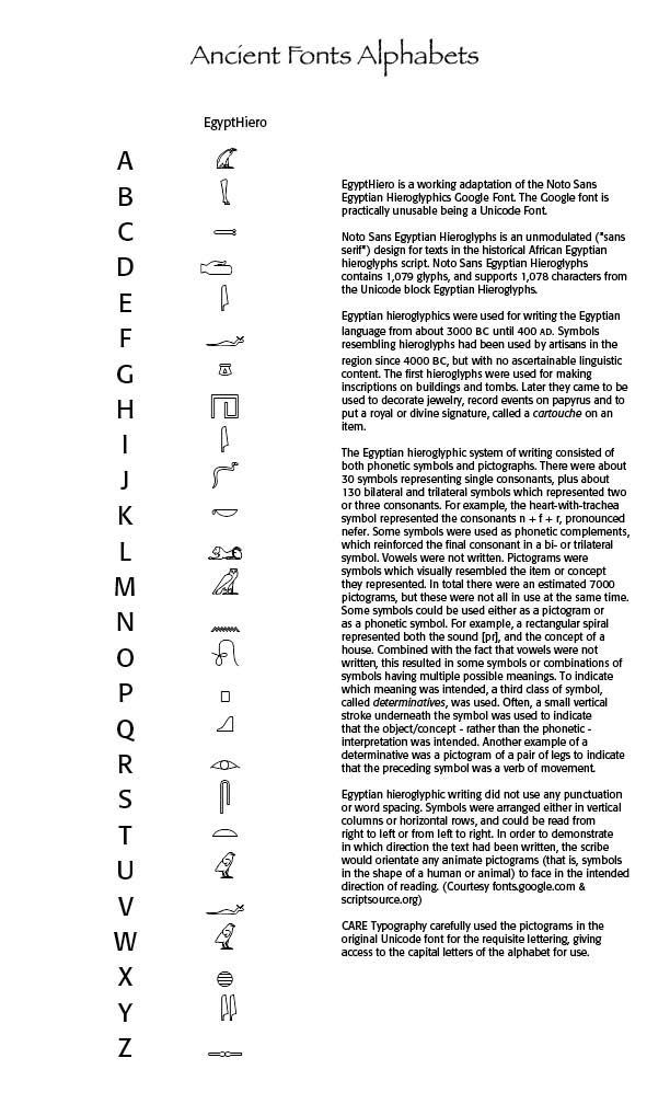
Using a reliable historical source, we can match letters or numbers to font glyphs. Consequently, what CARE Typography has been able to do is to recreate some of these ancient fonts that match the alphabet's capital lettering. Thus, in the Noto Sans font for Egyptian Hieroglyphs when you type the letter "A" you get back "A," not the Egyptian Hieroglyph for "A." The same holds true for the other Noto Sans fonts. We were able to reformulate some of the ancient fonts so that "A," for instance, gives you the correct ancient letter or pictogram. Note the diagrams below.


EgyptHiero. This is the reconstituted Noto Sans Egyptian Hieroglyph only for the capital letters of our alphabet. A bit of history here. Egyptian hieroglyphics were used for writing the Egyptian language from about 3000 BC until 400 AD. Symbols resembling hieroglyphs had been used by artisans in the region since 4000 BC, but with no ascertainable linguistic content. The first hieroglyphs were used for making inscriptions on buildings and tombs. Later they came to be used to decorate jewelry, record events on papyrus and to put a royal or divine signature, called a cartouche on an item. The Egyptian hieroglyphic system of writing consisted of both phonetic symbols and pictographs. There were about 30 symbols representing single consonants.


UgariticCuneform. This is the reconstituted Noto Sans Ugaritic font only for the capital letters of our alphabet. Ugaritic is a historical Middle Eastern abjad, written left-to-right. Was used in today’s Syria in 1500-1300 BC for the Ugaritic language, and also for Hurrian. Has 30 letters that visually resemble cuneiform. The Ugaritic script was used from about 1500-1300 BC to write the Ugaritic language, spoken in modern-day Syria. It was also occasionally used for writing documents in the Hurrian language. Visually, the script resembled Cuneiform, with each letter written as one of a combination of short, linear wedges.


OldPersianA. This is the reconstituted Noto Sans Old Persian font, again only for the capital letters of our alphabet. Old Persian cuneiform was the main script for writing the Old Persian language from 525-330 BC. Visually it resembles Sumero-Akkadian cuneiform; most of the letters are arrangements of between two and five horizontal, vertical or angle-shaped wedges. However, there appears to be no derivational relationship between the sound-to-symbol mapping of individual letters in the two scripts, nor has any other script been found which links the forms of the scripts. For this reason, Old Persian cuneiform is generally believed to have been an independent invention.


Successful Layout & Design

By Carl Shank December 1, 2025
Mid-Century Modernism & Corporate Typography (1945–1980) Designers like Jan Tschichold were foundational to many of the Swiss design principles. This style evolved from Constructivist, De Stijl and Bauhaus design principles, particularly the ideas of grid systems, sans-serif type and minimalism. Emerging in Switzerland during the 1940s and 1950s, this typography, also known as the International Typographic Style, directly responded to the type chaos of Dada and the stylization of Art Deco. The International Typographic Style (or the Swiss Style) in the 1950s and 1960s focused on grid systems, objective communication and sans-serifs. Key figures were Josef Muller-Brockmann, Emil Ruder and Armin Hofmann. The Swiss style emphasized readability, visual harmony and universality. Clarity, objectivity and functionality were key components. Contributors included Max Miedinger, creator of the Helvetica typeface (1957 by Miedinger & Eduard Hoffmann), and Adrian Frutiger, creator of the Univers typeface in 1957, and Hermann Zapf, creator of Optima in 1958. Swiss style became the dominant graphic language of postwar corporate identity. Other Blogs I have written noted the development of Helvetica ( “Helvetica’s Journey” July 13, 2024 ). Adrian Frutiger (1928–2015) was a Swiss typeface designer whose career spanned hot metal, phototypesetting and digital typesetting eras. Frutiger’s most famous designs, Univers, Frutiger and Avenir, are landmark sans-serif families spanning the three main genres of sans-serif typefaces —neogrotesque, humanist and geometric. Univers is a clear, objective form suitable for typesetting of longer texts in the sans-serif style. Starting from old sketches from his student days at the School for the Applied Arts in Zurich, he created the Univers type family. Folded into the Linotype collection in the 1980s, Univers has been updated to Univers Next, available with 59 weights. This lasting legible font is suitable for almost any typographic need. It combines well with Old Style fonts like Janson, Meridien, and Sabon, Slab Serif fonts like Egyptienne F, Script and Brush fonts like Brush Script, Blackletter fonts like Duc De Berry, Grace, San Marco and even some fun fonts. Univers is not a “free” font and must be purchased from Linotype. Other faces by Frutiger are Frutiger and Avenir. These fonts were designed to be legible, versatile and anonymous, avoiding stylistic “noise” to focus on clear communication. Swiss type used a systematized approach to typography, enabling consistent spacing, alignment and hierarchy, crucial for multilingual and complex layouts. Typography was seen as part of a harmonious, modern composition. Generous white space facilitated clarity and focus.
By Carl Shank December 1, 2025
Advances in Typography: Twentieth Century A Historical Sketch (Part 1 ) Early Twentieth Century: Form Follows Function Bauhaus Precursor The Deutscher Werkbund (German Work Foundation, est. 1907, Munich) was a pivotal German association of artists, architects, designers, and industrialists that advanced rational, industrial design and laid the foundation for modernist sans-serifs. The Werkbund emphasized functionalism, simplicity, honest use of materials, and alignment with industrial production, rejecting unnecessary ornamentation and anticipating the principle “form follows function.” Its purpose was to elevate German industrial products by integrating artistic excellence, technical innovation, and industrial manufacturing, summarized by the motto: “From work to form”—good design as a cultural and economic asset. Key founders included Hermann Muthesius, Peter Behrens, Fritz Schumacher, and Karl Schmidt. Their goals were to enhance everyday objects through quality design, foster a unified visual culture in Germany, partner artists with industrial manufacturers, promote standardization and modern production techniques, and compete internationally in design excellence. The Werkbund is recognized as a precursor to the Bauhaus and modern industrial design. Notable members included Walter Gropius, Ludwig Mies van der Rohe, and Peter Behrens. The organization established principles of functional, simplified forms, standardized mass production, and the concept of design as a cultural force. They hosted influential exhibitions, notably the 1914 Cologne Exhibition, as well as publishing journals and defining standards for high-quality design. Futura & Geometric Modernism (1920s–1930s) As we saw in my last post, between 1500 and 1900 typography evolved from Renaissance humanist forms to industrial mass production and artistic revival. Old style typefaces (like Garamond) moved to Transitional faces (like Baskerville) to Modern/Didone faces (like Didot and Bodoni) to Industrial display types (fat faces, slab serifs, sans serifs) to the Arts & Crafts revivals. Art Nouveau was a reaction against the academicism, eclecticism and historicism of nineteenth century architecture and decorative art. The new art movement had its roots in Britain, in the floral designs of William Morris, and in the Arts and Crafts movement founded by the pupils of Morris.
Show More