A New Tool Font

Carl Shank • November 6, 2023

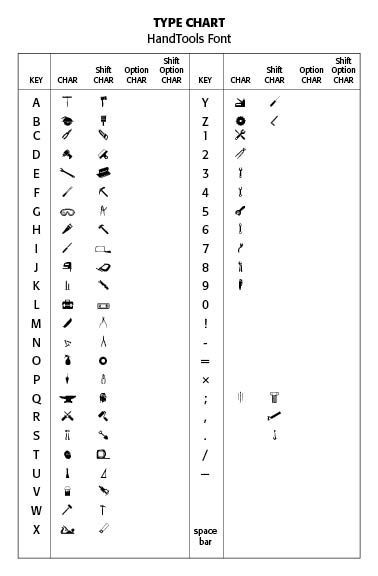
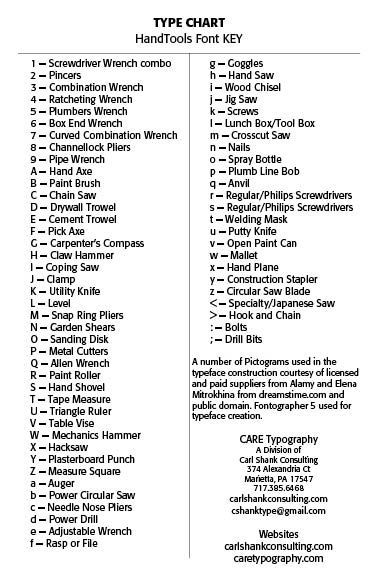
A New Tool Font. CARE Typography is pleased to announce a new pictogram font, the HandTools Font. This is a font for Macs, Windows and Linux machines crafted in the Open Type (otf) format. While there are many illustrations of hand tools available for image uploads, this font provides some of the more basic hand tools used by a carpenter or construction crew. My father was a finish carpenter and used probably all of these tools at one time or another. The font is black on white and can be used in ads, flyers, articles, news clippings, and so forth. The fact that it is a font allows the user the flexibility to use the font in large sizes, as well as regular text sizes, without losing sharpness of detail.


The HandTools font is available for purchase on this website, either as a single font, or it can be combined with other recently crafted pictogram fonts by CARE Typography. We hope you will like the font!

Successful Layout & Design

By Carl Shank November 1, 2025
SWISS TYPE BEAUTY DESIGNERS LIKE JAN TSCHICHOLD were foundational to many of the Swiss design principles. This style evolved from Constructivist, De Stijl and Bauhaus design principles, particularly the ideas of grid systems, sans-serif type and minimalism. Emerging in Switzerland during the 1940s and 1950s, this typography, also known as the International Typographic Style, directly responded to the type chaos of Dada and the stylization of Art Deco. The Swiss style emphasized readability, visual harmony and universality. Clarity, objectivity and functionality were key components. Contributors included Max Miedinger, creator of the Helvetica typeface and Adrian Frutiger, creator of the Univers typeface, both in 1957. The Journey of Helvetica We all use Helvetica. In fact, some say it has been overused through modern years. Helvetica derives its powerful simplicity and display qualities from the 1896 typeface Akzidenz-Grotesk. “The design originates from Royal Grotesk light by Ferdinand Theinhardt who also supplied the regular, medium and bold weights. Throughout the years, Berthold has expanded this extremely popular and versatile family. AG Super was developed in 1968 by Günter Gerhard Lange and is an excellent choice for headlines. In 2001, Günter Gerhard Lange added more weights for Berthold including Super Italic and Extra Bold italic.”[1] “Helvetica is a twentieth-century Swiss revision of a late nineteenth­ century German Realist face. The first weights were drawn in 1956 by Max Miedinger, based on the Berthold Foundry’s old Odd-job Sans-serif, or Akzidenz Grotesk, as it is called in German. The heavy, unmodulated line and tiny aperture evoke an image of uncultivated strength, force and persistence. The very light weights issued in recent years have done much to reduce Helvetica’s coarseness but little to increase its readability.”[2]
By Carl Shank November 1, 2025
CONSTRUCTIVISM (1915-1934) Typography in Constructivism was a rational, disciplined and ideologically charged tool. It served society, especially early Russian forces, and reflected the spirit of the machine age. Constructivism redefined the role of art, design, and typography. Unlike Dadaism’s chaos and anti-art stance, constructivism type, favoring horizontal and vertical axes, creating a clean, mathematical visual language, was highly rational, utilitarian, and politically driven. ChatGPT notes that the movement’s legacy endures in its clarity, structure and purpose-driven design that define much of modern typographic practice. Constructivist movement produced strong, sans-serif (without feet) fonts like the typeface molot . Like Dadaism in some aspect, typography was bold, in-your-face, promoting Suprematism’s geometric abstraction and Futurism’s emphasis on dynamism.[1]
Show More