All About Color
All About Color. In modern typography and printing, the use of color, once thought too expensive, is now commonplace. Color laser printers are found in many offices, churches and certainly printer shops. Not many people, however, understand the science of color and how we get colored images and scans to the printed page. So, while I am certainly no expert in color technology, here are a few definitions and pointers in color printing.
DPI vs LPI. Let's start at the beginning. Every laser printer has a DPI, or dots per inch, that it places on a sheet of paper. Many older laser printers are rated at least at 300 DPI, with many more today at 600 DPI and above. What is DPI? Dots Per Inch (DPI) is literally a measurement of the maximum number of dots any printer has access to per inch. The dots reference the unit in which all printers and computers are measured, namely, binary code. As such, each dot is either off or on. These dots make up a grid pattern which can only print in black and white. There are no colors or shades of colors (such as grey). The higher the DPI the "smoother" the print looks to the human eye.
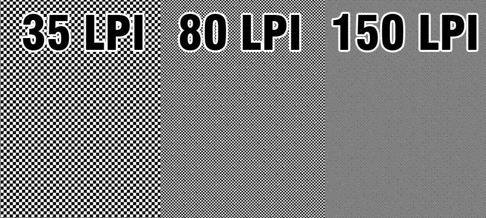
LPI, or Lines per Inch, is a measurement of the number of rounded dots that are in an inch. LPI is also known as a screen, and is given its name because each rounded dot has a centre point that’s created in varying sizes. The LPI is directly related to the DPI which is directly related to resolution. Depending on the resolution, one may acquire a picture that seems ‘grainier’ than others – that is, pixilated. For instance, to get a dot that actually appears round rather than square, or pixilated, one must have a DPI of at least 600. A glossy magazine is usually printed with an LPI of 150; as it relates to DPI, which means that the resolution was 2400 DPI or higher. 53 LPI is typical of an office laser. Newspapers are about 90 LPI.
Halftones. We use halftones to print tints. This uniform field of small dots lets paper show through. The more paper that shows through, the lighter the tint. The bigger the spots, the darker the tint. A halftone is measured in lines per inch (LPI). The more lines per inch, the finer the halftone (See Sample Below). To camouflage the rows of spots, a halftone is printed at an angle. If we printed a black halftone at 0 degrees we would see the rows of dots. So printing at an angle tricks our eyes so that we do not realize we are seeing rows and columns of dots at all. Now we are ready to talk about color.
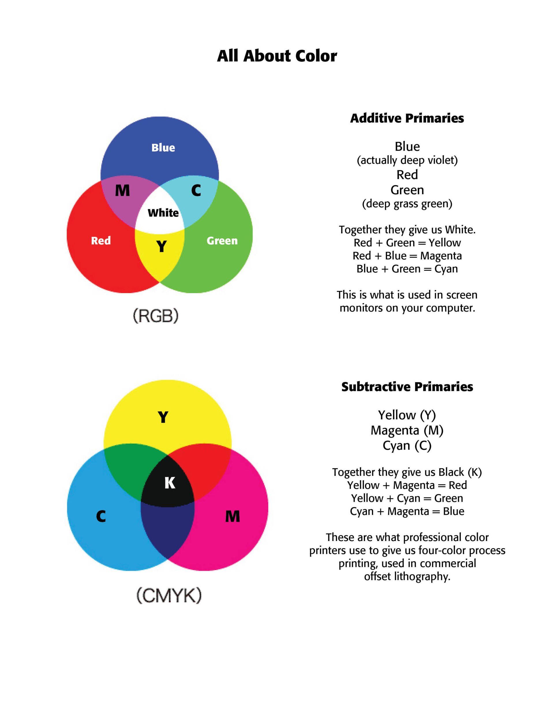
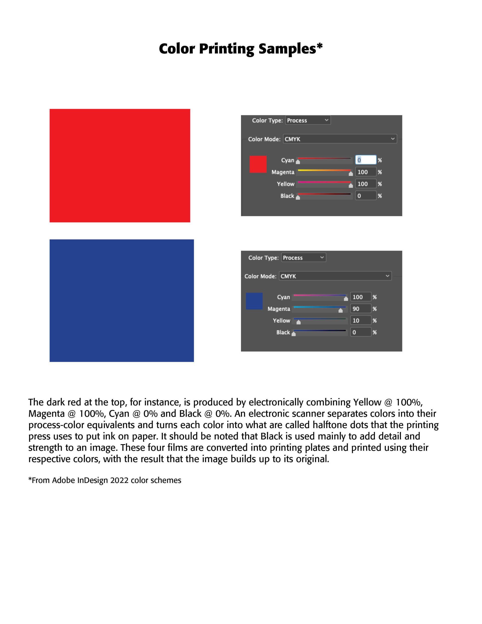
About Color. Color exists as an effect of light. The white light from say the sun is made up of a rainbow of impulses that our brain interprets as colors. All the colors of the rainbow, when added up, make a white light. They are called primary additive colors. (See "All About Color" below.) Computer monitors use three primary colors —Red, Green and Blue—otherwise know as RGB. Since the colors of objects are really white light minus the waves absorbed by the object, they are called primary subtractive colors, otherwise knows as printing colors, or CMYK colors—Cyan, made up of blue and green, Magenta, made up of blue and red, Yellow, made up of red and green. (See "All About Color" below). The K color is actually Black, usually added to give strength and body to a printed picture or image.
Color separations are used for each of the four process colors by a professional lithographic printer. The final result of a color separation is four sheets of film, one for each of the process colors. The films are then used to create the four plates of a process-color printing press.
Going back to halftone angles. Black, the most visible, is printed at a 45 degree angle, Cyan at a 75 degree angle, Magenta at a 15 degree angle, and Yellow at a 0 degree angle. Four halftones are superimposed on each other. To minimize any interference patterns (called "moirés") the halftones are angled 30 degrees apart, yielding a tight, nondistracting compilation. Technological improvements now create microdots that don't use any angles at all. The spots now fall side by side, not atop one another and fit so neatly together that the viewer is unaware spots even exist in their image or photo.
Read More:
Difference Between DPI and LPI | Difference Between http://www.differencebetween.net/technology/difference-between-dpi-and-lpi/#ixzz7dy33lfNT. I am indebted to Jan V. White as well for his "Understanding Color Separations." See his book, Color For Impact. Also Mix & Match: Designer's Colors, Quarto Publishing, 1990. Also, credit to John McWade, Before & After, Vol 4, No. 2, 1994.
Successful Layout & Design


