New Font Offerings
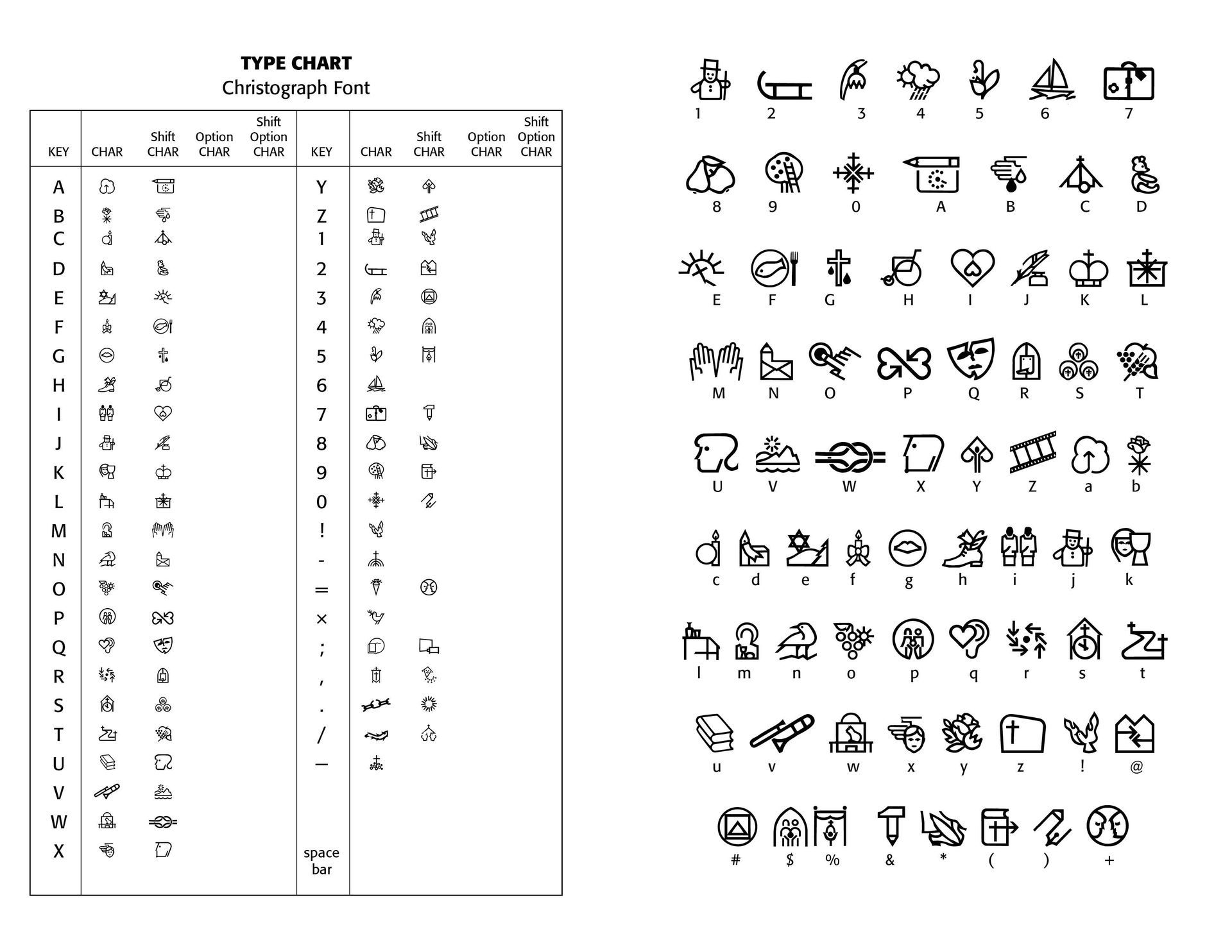
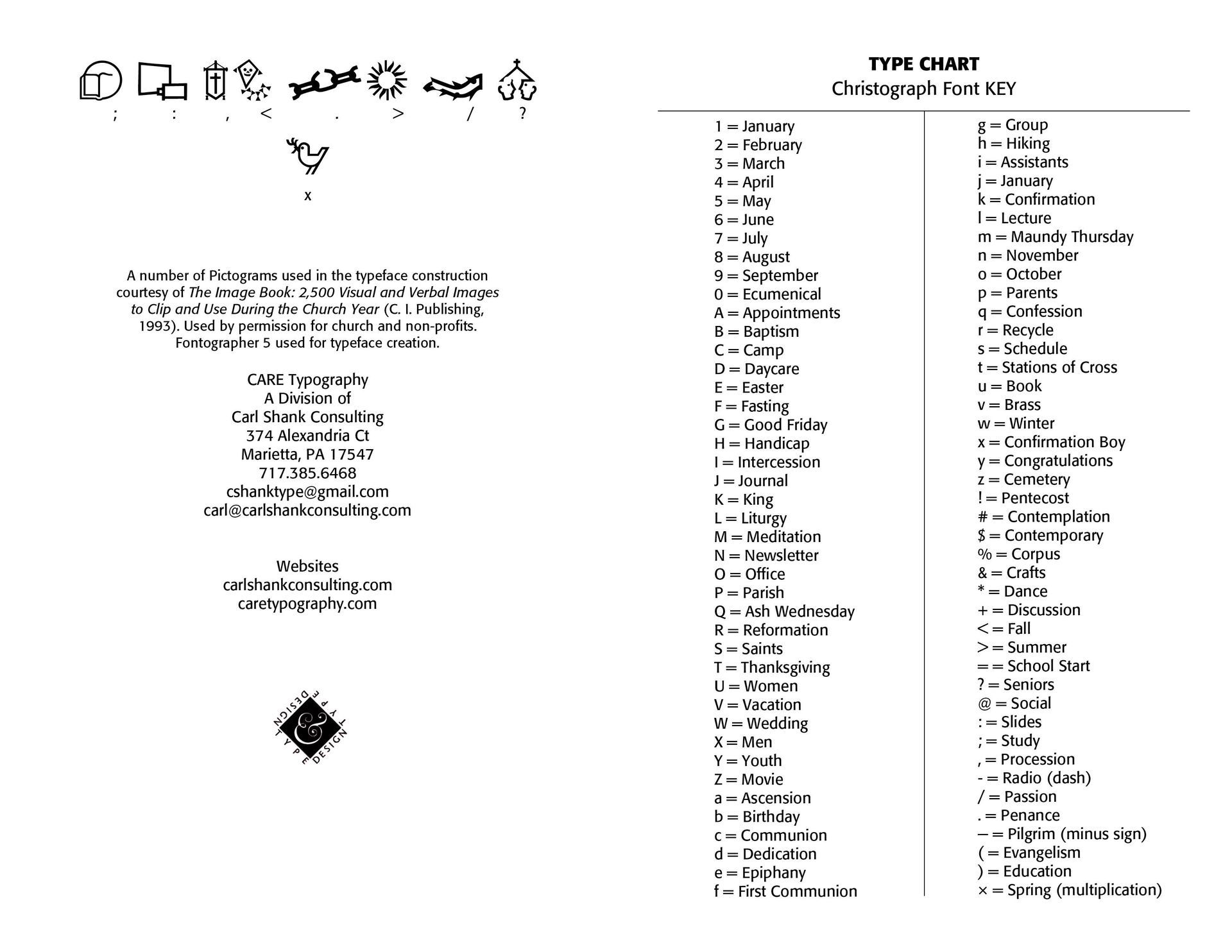
Introducing the Christograph Font & FancifulAlphabets Font. CARE Typography is pleased to announce two new font offerings, especially for use in churches and ministries—the Christograph Font and the FancifulAlphabets Font. These are pictograph fonts, designed from pictograms courtesy of The Image Book: 2,500 Visual and Verbal Images to Clip and Use During the Church Year (C.I. Publishing, 1993). The pictograms used have been cleanly drawn and sized to fit a normal sized font display. There are 83 pictograms in the Christograph font that occupy font glyphs. They cover the church year adequately and can be used in a variety of newsletter and display materials. These fonts are true Open Type Postscript fonts, the kind preferred by Adobe systems.
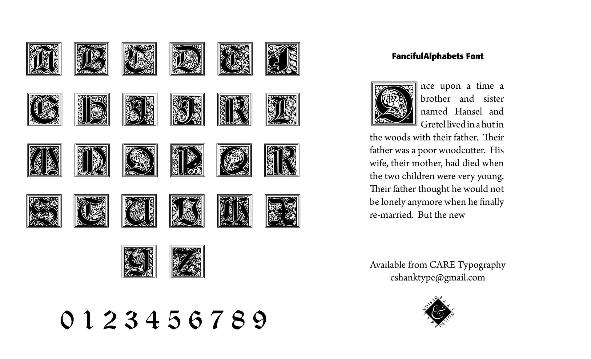
The FancifulAlphabets Font is a decorative capital letter font, from A to Z, suitable for fancy text introductions or stand alone old time graphics. One of the nice things about having such fancy lettering in a font family is that they can be sized to fit most any text or advertising use, especially in the larger sizes.
The fonts are free to all churches and ministries. To secure your copy of the fonts, send an email to CARE Typography at cshanktype@gmail.com. The fonts are copyrighted by CARE Typography and can be used only by permission from the creator.
We believe these fonts can be helpful to many!
Successful Layout & Design


