7 Layout Tips
Carl Shank • January 15, 2021
7 Layout Tips for Your Next Piece
How do I produce a newsletter that is inviting, eye-catching and easy to read? What are the time-honored rules of layout and design that will help me? This is a vast topic, to be sure, but here are seven (7) basic rules to give attention to for you to "look good" in print and digital media.
- Know where you are going. Have a good understanding of the goals and purpose of your piece. What do you want to accomplish through this piece? Here, "form" follows "function." Roger Parker in his Looking Good In Print notes: "There should be a logical reason for the way you employ every graphic tool. That tool should relate to the idea it expresses as well as the environment in which the final product will appear." (p. 4)
- Place the right fonts and graphics well. There are time-honored rules for mixing and using different fonts, or typefaces, in a piece. Most print pieces use a serif (with "feet") font for the main text and a sans-serif (without "feet") font for headlines. This rule has been used successfully for ages, but digital use has relaxed the rules somewhat. The issue here is readability. What should stand out, stands out, and what should be read for information is clear. Clarity, organization and simplicity should rule.
- Guide the reader through your piece. "The design of that map [a reading roadmap] should follow the readers' natural tendency to read an advertisement or publication from upper left to lower right." (p. 6)
- Use plenty of what is called "white space." Don't try to crowd into a piece all that can or even should be said. Separate headings from text, points from one another, and use sufficient white space to separate graphics from textual elements. If it looks "crowded" it probably is crowded.
- Don't try to "show off" in your piece. This is not "art for art's sake" or to show your ability to mix colors and fonts and graphics or to display your talents. This is to get the point across in the most direct and pleasing way possible.
- Pay attention to spelling and grammar. Probably the most overlooked and underrated truth about many newsletters is that they ignore proper spelling and the right use of grammatical constructs. Buy a "style manual" and consult it for proper sentence, paragraph and topical styles, especially if you footnote something. By the way — be especially careful of plagiarizing. This is unfortunately a major "sin" in church and ministry communications. Give credit to where credit is due.
- Use spell checkers and layout helps. Microsoft and Adobe and many other publishers have publishing helps and advice which you should give attention to and use and adapt for your needs.
Hopefully, these introductory points will help your publications shine!
Successful Layout & Design
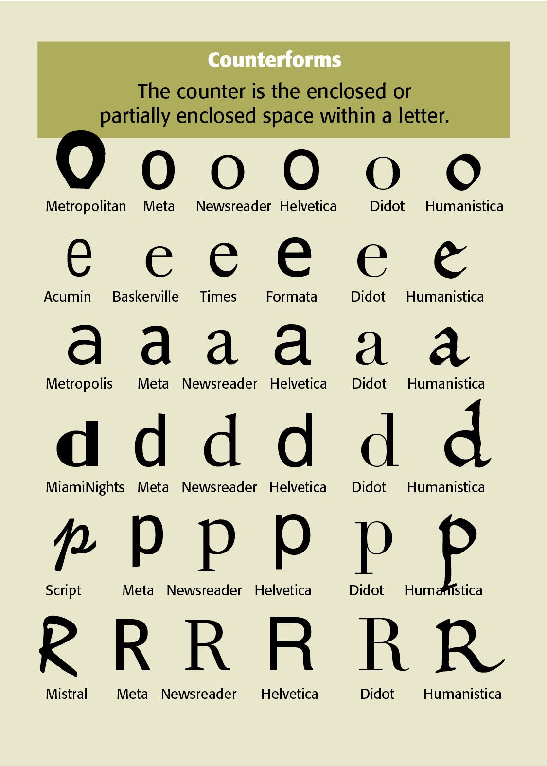
Typeface characteristics are the visual and structural features that distinguish one typeface from another. They determine a typeface’s historical appearance, readability, personality, and appropriate use. Useful Ways to Analyze Any Typeface. When examining an unfamiliar typeface, ask these questions in order (provided by ChatGPT) — Does it have serifs? What kind of serifs? How much thick/thin contrast is present? What is the stress angle? What is the x-height? How wide or narrow are the letters? How are the counters constructed? What do the terminals look like? What are distinctive letters such as a, g, e, R, and Q doing? How does the typeface behave in a paragraph—open, dark, dense, airy, mechanical, or calligraphic? What historical or technological process does its construction suggest? What personality does the combination of these characteristics produce? There are a number of online sources to help identify typefaces ( See Feb. 6, 2022 Blog for more explanation and use.) Sources include — MyFonts ( www.myfonts.com/WhatTheFont ), FontSquirrel ( www.fontsquirrel.com/matcherator ) WhtFontIs ( www.whatfontis.com ) Identifont ( www.identifont.com ) is one of the best. Here are the questions it will ask you — Does it have feet (serifs) or not (sans-serifs)? What style is the tail on uppercase Q? What style is the ampersand (the &)? Is the numeral “4” open or closed? What style of vertical line does the Dollar sign ($) have? How high is the center vertex of the uppercase M? Sit on the line or not? What type of bar does the uppercase G have? How far below the baseline does the uppercase J extend? What about the uppercase R? How far does the center bar extend? Is there a gap with the vertical part of the letter? Does it meet or cross the vertical? What about the question mark (?) What shape is the dot at the bottom? Is it circular, square, triangular, rectangular or even missing? The important point is that a typeface should not be identified by a single characteristic. Its identity comes from the interaction of serifs, contrast, stress, proportions, counters, terminals, spacing, and letterform construction.
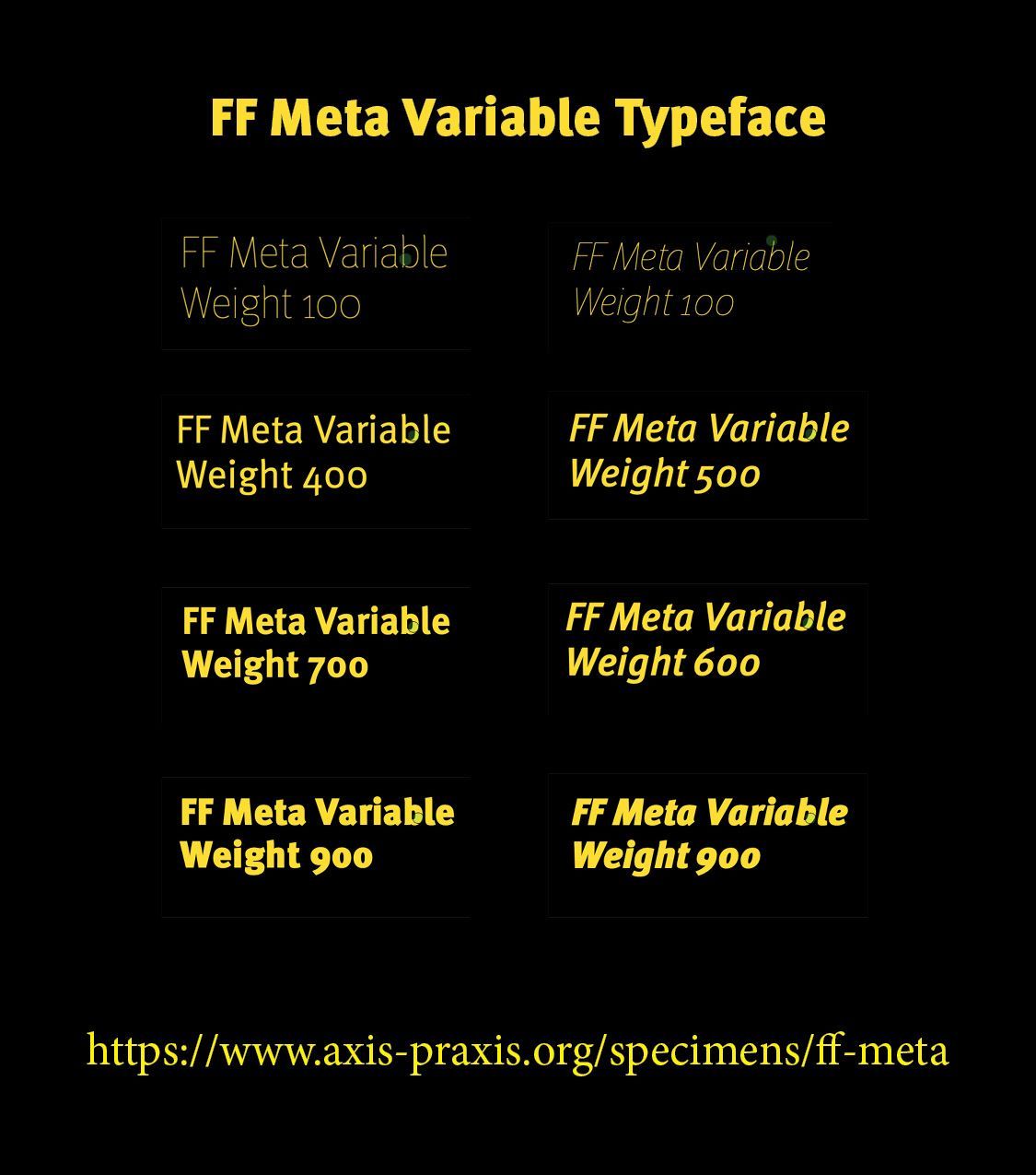
Google’s variable font selection includes IBM Plex Sans, Inter, Newsreader, Open Sans, Playfair Display, Express Fraunces and Roboto. FF Meta Variable is now a licensed font from Monotype (myFonts.com). Formata Variable is a demonstration only font from CARE Typography. We consider two Google Variable typefaces here — Playfair Display and Express Fraunces. Playfair Display Playfair Display is a high-contrast transitional/display serif typeface designed by Claus Eggers Sørensen and released through Google Fonts in 2011. It was designed primarily for large display sizes, especially headlines, titles, and editorial typography. Its appearance draws inspiration from the late eighteenth-century transition from traditional broad-nib writing toward pointed steel pens, as well as from the elegant typefaces associated with the European Enlightenment and neoclassical period. Playfair Display is a contemporary high-contrast serif designed primarily for display typography. Its visual ancestry lies in the 18th-century transitional period, particularly the movement from broad-nib calligraphic forms toward the sharper, more vertical forms that ultimately produced Didot and Bodoni.

