Making Good PowerPoint Presentations
How do you make good, eye-catching, informative and interesting PowerPoint™ presentations? Busy office people generally use either too much of a good thing (like templates) or too little and bore their audiences. Or, they see PowerPoint as the sum of all things and fail to give enough information for an accurate study or diagnosis of a project. The image below is an example of good information, but arranged in a boring and unattractive and clunky manner.
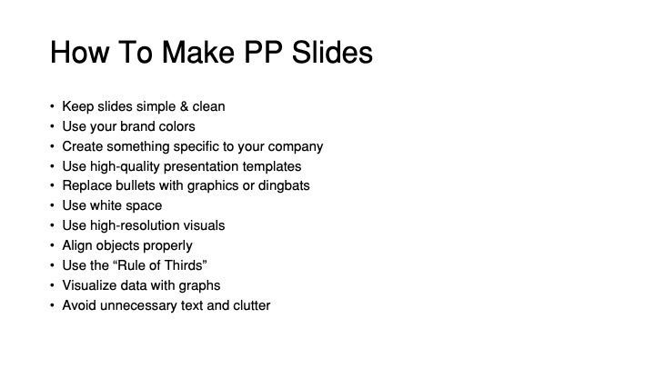
The slide on the left has problems. First, it gives too much data for one slide. The very first rule of PowerPoint (PP) is to make each slide clean and simple and uncluttered. There is too much here for one slide. Then, the font used (office Helvetica) is too bland and uninteresting. There is no differentiation between the title font and the content. There is not enough "white space" on the slide since everything is crowded in on it. And the size of the text is too small to read at a distance.

Note in the redone PP slides above, there is sufficient interest, clarity and an uncluttered feel. There is a distinction between the header font (here Formata Bold) and the text font (here ITC Stone Serif). They are large enough to read at a convenient distance. Indeed, this slide does not contain everything the original had, but then you use multiple slides. I like the black-on-white slide better than the white-on-black, but the point is clarity, simplicity and directness in a black and white format. Note also we dodge the standard bullet (•) in favor of what is called a "dingbat" (from Zaph Dingbat font). This adds interest. In addition, the company logo is on each slide, reminding the viewer of the source of the presentation. But what about colors?
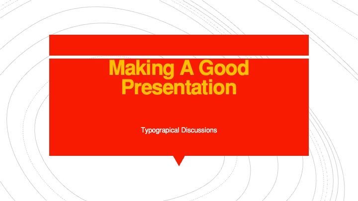
Here we use a convenient colorful Microsoft PP Template. But note the washed out yellow on red background, which is never a good choice. And the small and insignificant same type used for the subtitle. Also, the alignment is off with "Making A Good Presentation" too close to the white line at the top. A better choice recommended by the template itself is below.
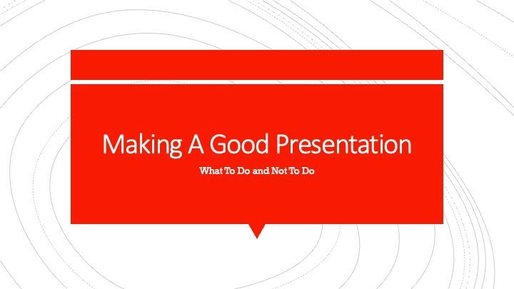
The choice of fonts used is better and the template is more interesting. I still think the subtitle is still too small for distance viewers. Here let me point out that there are a multitude of templates on Microsoft PowerPoint™ that are available, but most users have no idea how to use them and what to use of them in a presentation. Consequently, a too gaudy template choice is often used for a simple presentation and can be distracting to the audience. People pay attention to the bells and whistles of the template choice rather than the information being presented. What about motion graphics and animations on a slide?
This is the opening slide to an orientation for new staff to an architectural firm. In a day of animations and video snaps, this might be seen as an acceptable and "cute" way to begin the new staff orientation. However, it also may seem rather childish and unprofessional. The key here in PP is to use those animation elements and video snapshots carefully and professionally, not detracting from the business. This might be more appropriate to a children's classroom presentation or a fun get-together.
The free Lottie Animation is from Thomas Kiguru.
USING GRAPHICS & VISUALS
Using abstract concepts, like flow charts or complex ideas and data, custom illustrations can help create consistency and communication value with your audience. Make sure the graphics fit the image of the company. Do not use grainy, pixelated, low-resolution images or clip art in your presentations. (From Camille del Rosario, Design Pickle, "How To Improve PowerPoint Presentations: 15 Proven Tips)

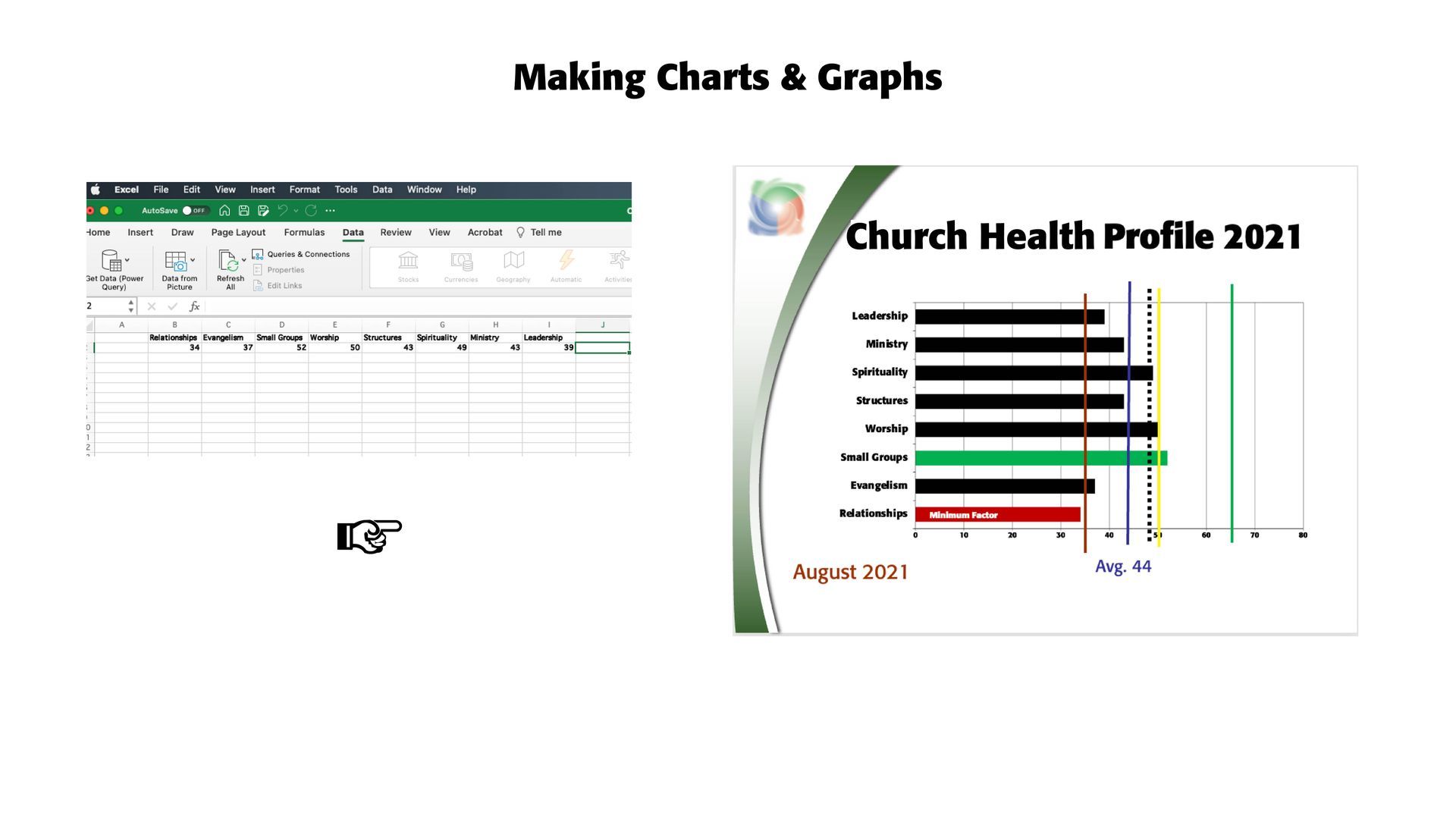
CHARTS & GRAPHS. The key here in providing a compelling PP presentation is to lead the way. Point your audience to where you want them to be and to get your message across to them. Make the headline big and bold and set off the categories so that they are clear and readable. Then, make sure that what's important to you gets across to them. In the chart and graphic below, part of a PP church health presentation, the dull Excel stats are made into a viewable and attractive bar chart or graphic. The eight qualities tested through surveys are listed on the left of the bar chart. The lines are given to the church to indicate where they fall within universal health guidelines, the "red" line being the minimum health line, the "yellow" line the median health line, and the "green" line the best health mark for a growing and healthy church or congregation. The "purple"line is this church's average health for August 2021, with the dotted "black" line the average church health in the Northeast part of America in this time period. At a glance, this church can see where they fall on universal church health markers. The green bar indicates their healthiest factor, while the red bar, called the "minimum factor" in church health terms, indicates where work is needed. Note the background graphic used on the slide to indicate the source of the information analyzed (NCDAmerica).
Successful Layout & Design


