The StoryBook Font & Fairy Tale Font

Carl Shank • December 15, 2023

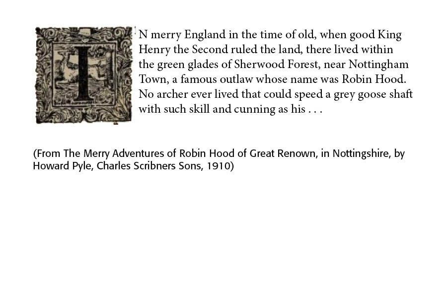
Introducing the StoryBook and Fairy Tale Fonts. I like reading old books with fanciful crafted title caps (called "versals" in the typographic world). They remind me of days gone by when a children's book, full of illustrations of well-know children's tales and Mother Goose stories, captured the attention of children and adults alike (See Illustration Below).  What happened to those old, fun-loving illustrations and typefaces of long ago? Many would say they have outlived their time and usefulness. I disagree and have set about designing two new typefaces, called StoryBook and FairyTale, which seek to get us back to these fantastic old books and illustrations.


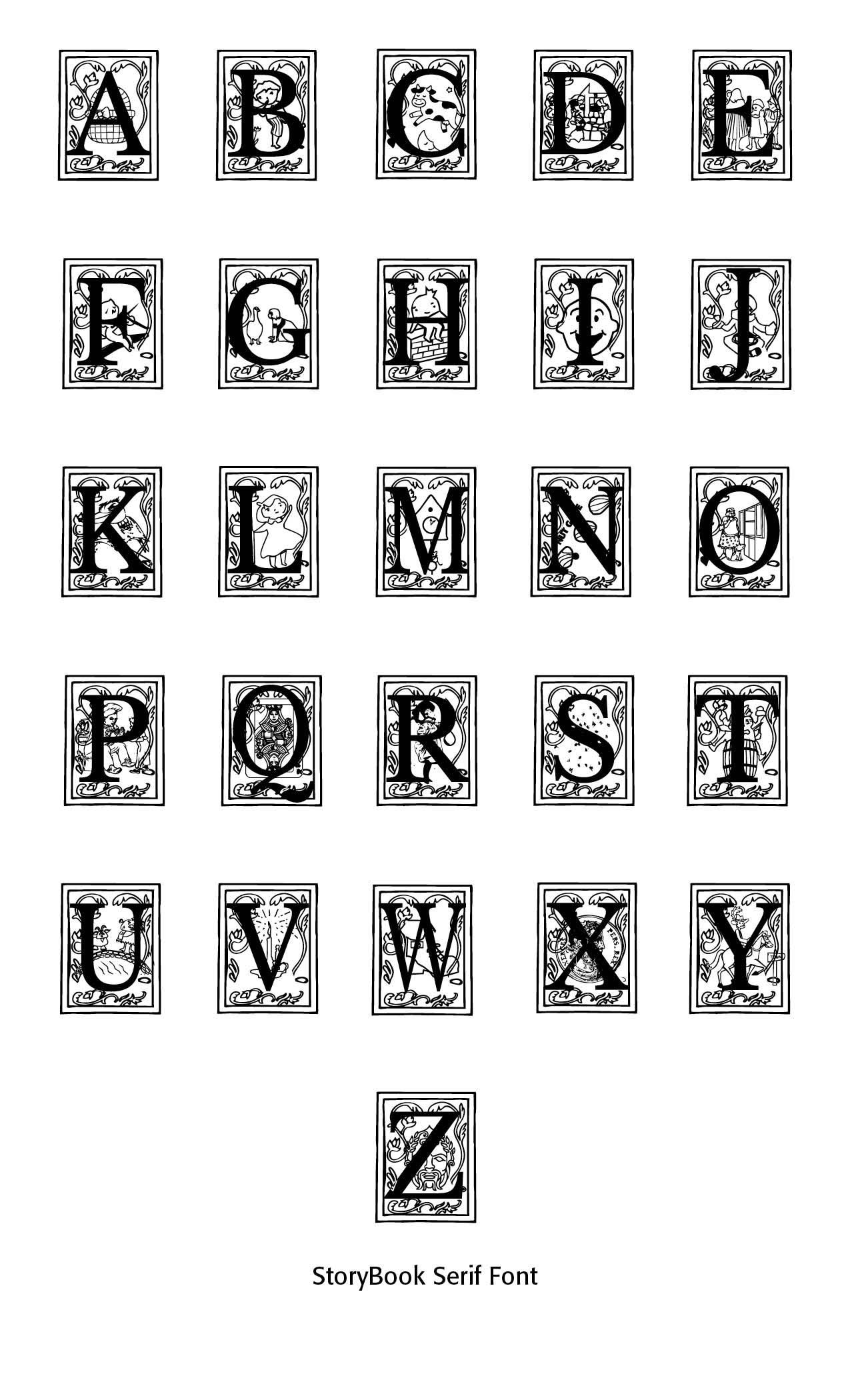
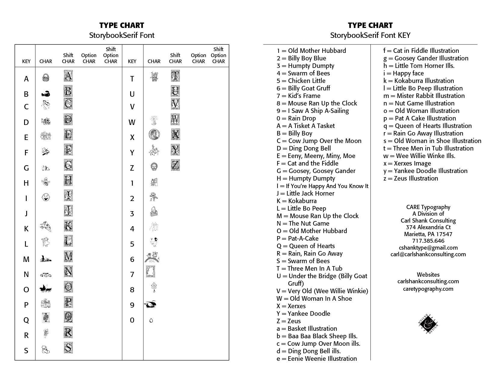
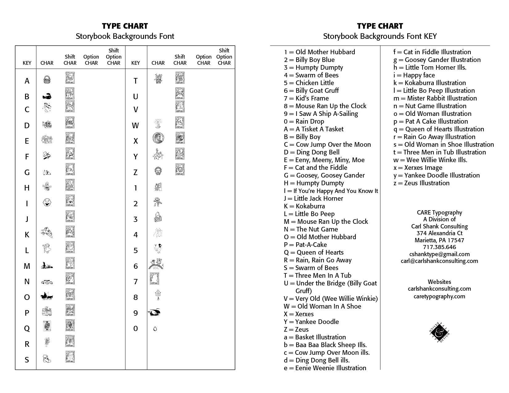
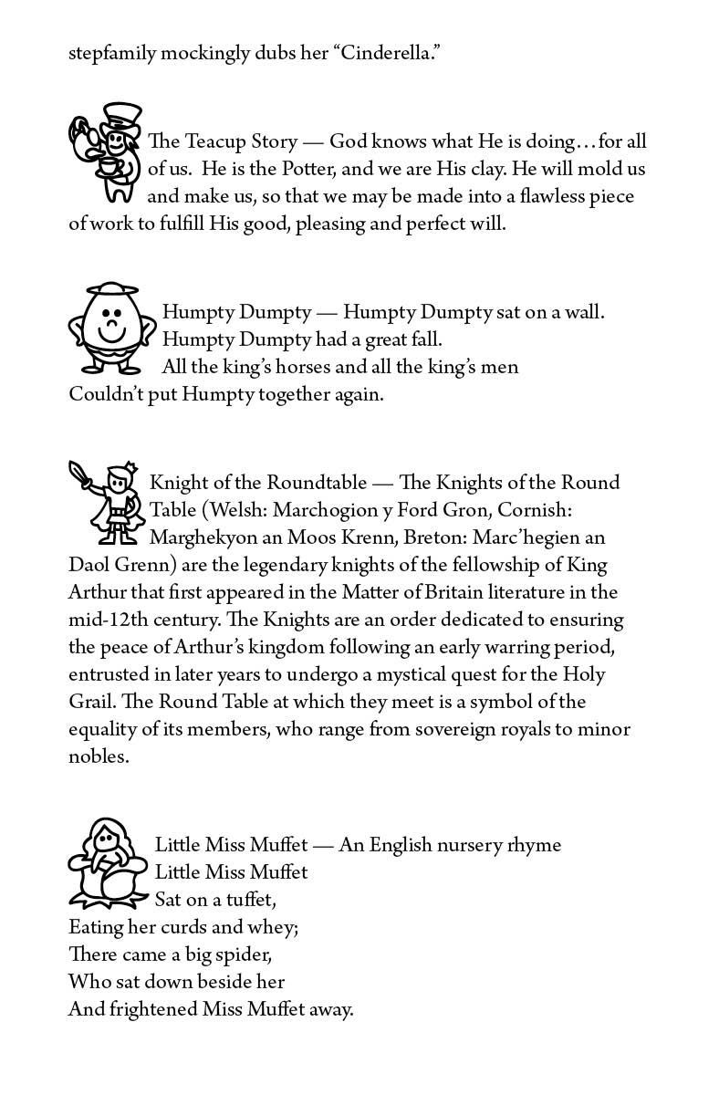
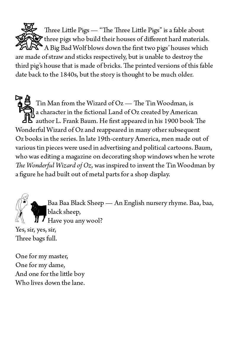
Using a flowery old-fashioned border in the StoryBook Font, I have set capital letters against a backdrop of well-known nursery rhyme illustrations. These fanciful caps can be set as opening letters to a children's book or series of children's stories. I have attempted to find either public domain illustrations and then make outlines of the main characters using Adobe InDesign and Photoshop tools, or have purchased resources for fair use in such background designs.


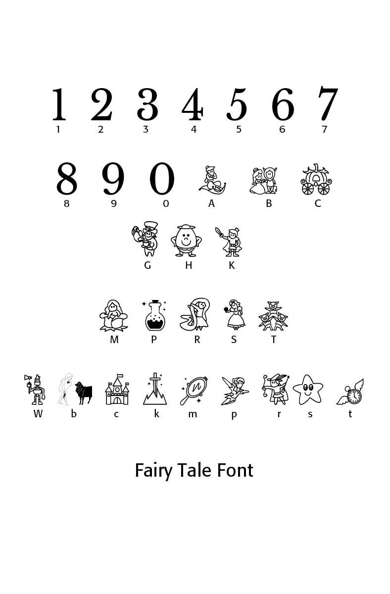
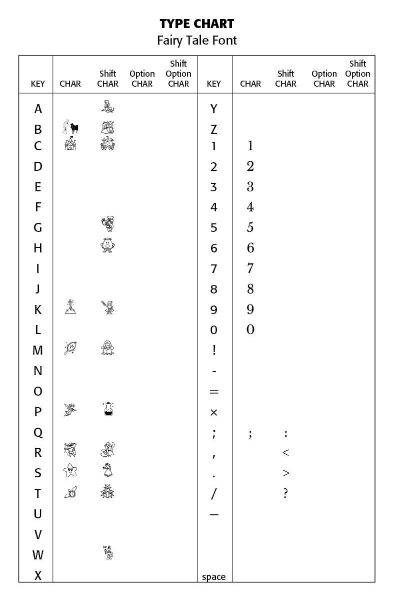
In the Fairy Tale Font, which has specialized characters,  I have mostly utilized the fine work of others and adapted such work to scannable pieces from which I could create a suitable font. You will have to be the judge of the final product. I am very interested in your evaluations and comments.


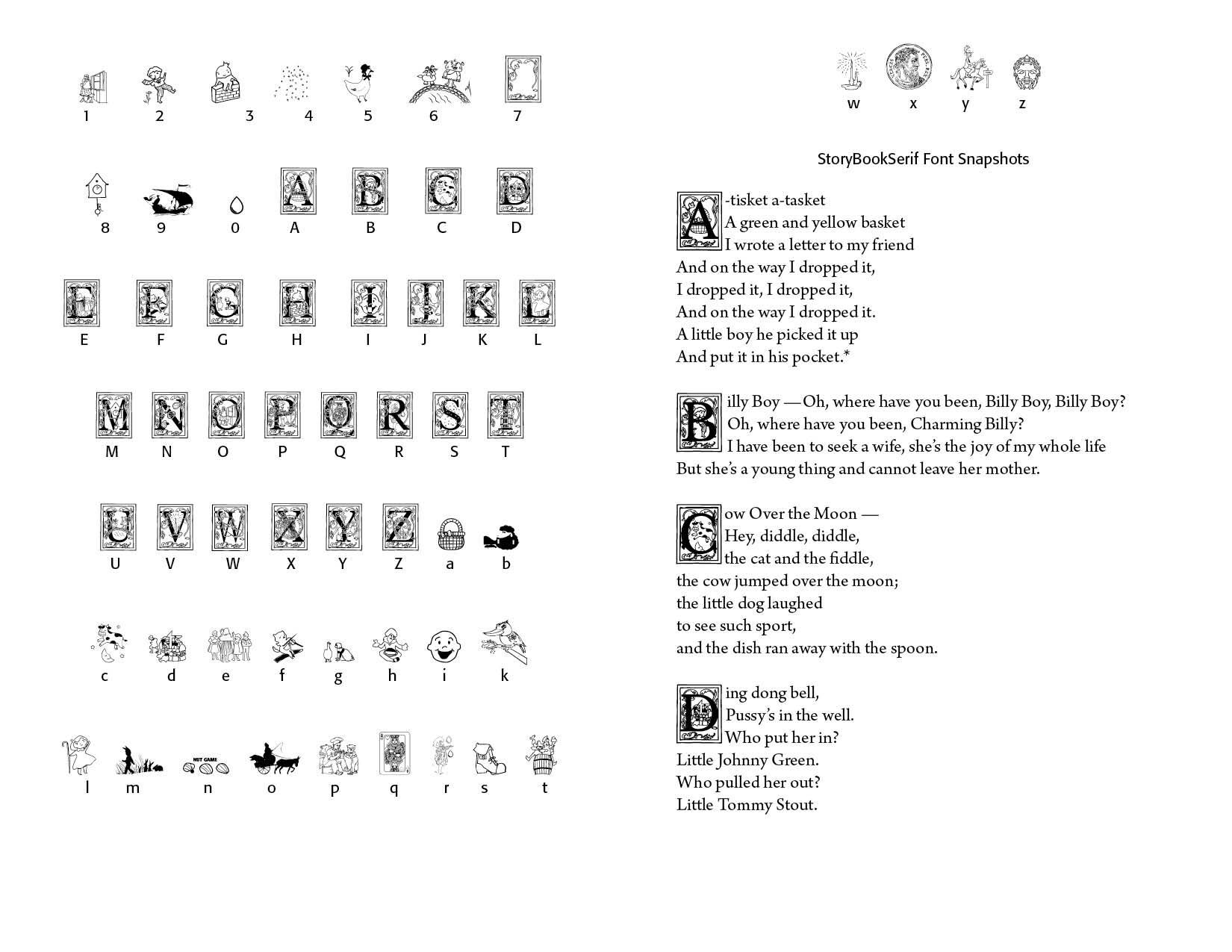
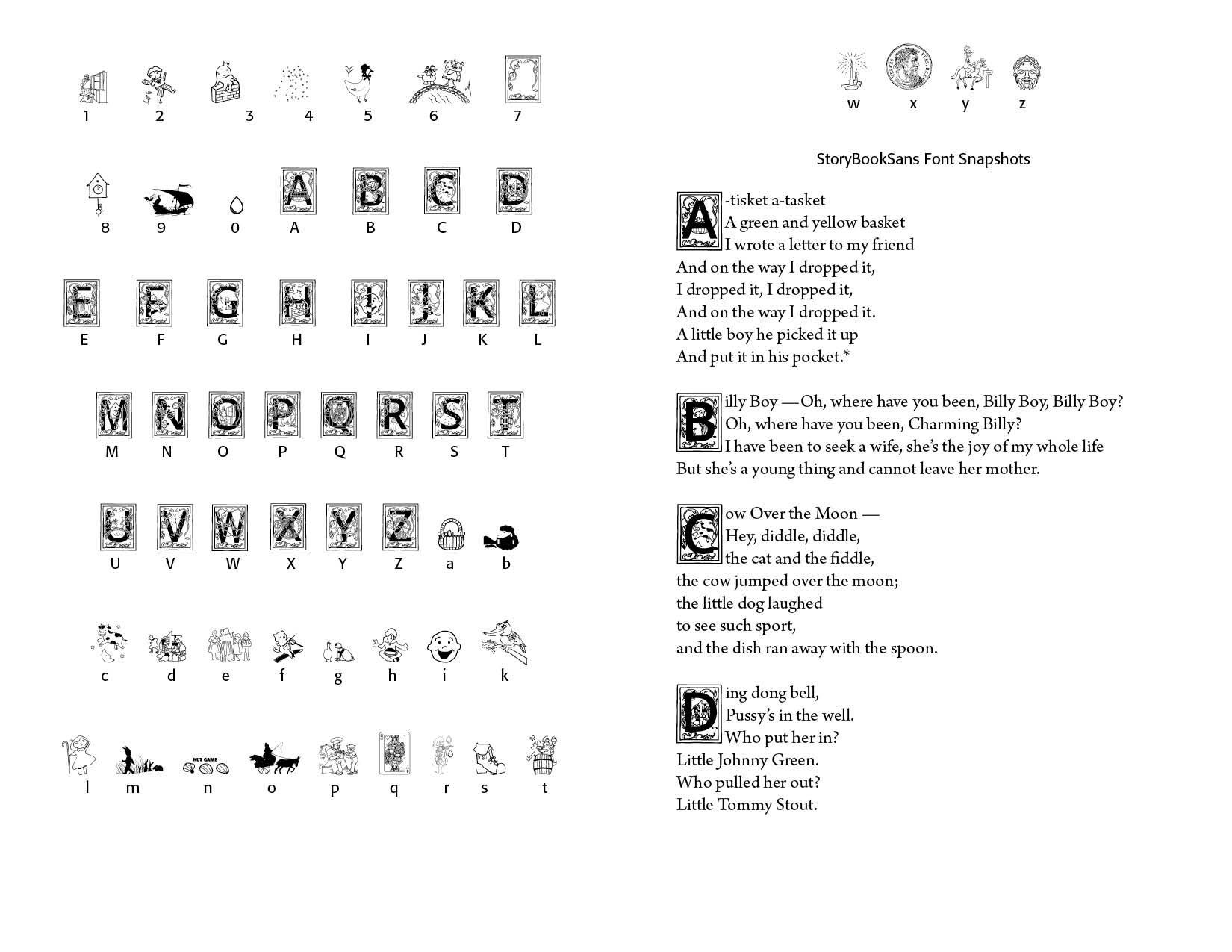
There are three iterations of the StoryBook font — StorybookSerif, StoryBookSansSerif, and StoryBookBackgrounds. The Serif font version uses letters adapted from the open source Libre Baskerville font. The SansSerif version uses Sans Serif open source font. The Backgrounds version has no inset font in the background diagrams. It also has a page where the font diagrams have been transformed into outline versions, thus allowing the user to employ the background in a variety of ways. One such variation is to use an outline font placed over the backgrounds to give the user more "storybook" like appeal.


The StoryBook font is a collection of capitals along with some  illustrations that can be utilized in a children's book. The Fairy Tale Font are illustrative pieces that can be used in texts or displays. I have also included in the Fairy Tale Font additional explanatory pages of the origins and use of the font. Samples of the fonts, used in well-known nursery and children's rhymes throughout the ages, are below. If you are interested in using the fonts, contact CARE Typography at cshanktype@gmail.com, for securing them.


Successful Layout & Design

By Carl Shank September 6, 2025
Art Nouveau fonts grew out of the late 19th-century Art Nouveau movement (c. 1890–1910), which sought to break away from academic, historicist styles and create a new art for the modern age. The style flourished across Europe and America in architecture, furniture, illustration, and typography. In lettering, Art Nouveau embraced organic forms, flowing curves, floral motifs, and asymmetry, reflecting the movement’s fascination with natural growth and hand-drawn ornament. Art Nouveau took its name from the Maison de l'Art Nouveau, a Parisian gallery that exhibited the works of artists and designers who were associated with the movement. The style was characterized by flowing, curvilinear forms inspired by natural shapes and motifs such as flowers, vines, and insects. It also incorporated elements from other artistic traditions, such as Japanese art and the Arts and Crafts movement. Art Nouveau was particularly popular in Europe, where it influenced a wide range of artistic disciplines, including architecture, interior design, furniture, jewelry, and graphic design. Some of the most notable Art Nouveau architects included Hector Guimard, Antoni Gaudí, and Victor Horta, while artists such as Alphonse Mucha, Aubrey Beardsley, and Gustav Klimt were celebrated for their decorative and ornamental works. Art Nouveau declined in popularity after World War I, as artists and designers began to embrace new, more modernist styles. However, its influence can still be seen in many aspects of contemporary design, and it remains an important and influential movement in the history of art and design. 
By Carl Shank August 30, 2025
Gothics History. Gothic typefaces are a broad group of styles rooted in medieval calligraphy and evolved into distinct print types during and after the invention of movable type via Gutenberg in the 15th century. They are sometimes confusingly named. In Europe “Gothic” usually refers to blackletter (medieval scripts), while in the U.S. “Gothic” often refers to sans-serif typefaces since the 1830s. Gothic script is a broad term for the entire family of medieval European scripts that developed from Carolingian minuscule around the twelfth century. “Minuscules” are lower case letters as distinct from capital letters, or uncials. Type developed in the sixth through tenth centuries with modern lettering evolving from Carolingian scripts. The Emperor Charlemagne used these letters as an educational standard. These densely packed scripts featured tall, narrow letterforms, strong vertical emphasis, sharp, angular connections, a dramatic thick/thin contrast and minimal spacing between letters. Gothic-inspired fonts create immediate medieval impact and work beautifully for titles, logos, and short display text. They are used today in Fantasy Gaming, Historical Projects, Themed Entertainment (like the Renaissance Fair), Book Design, Certificates, Breweries and Distilleries. Jack Nolan, a professional graphics designer, has provided a fetching display of such faces in his "33 Medieval Fonts Perfect for ‘Ye Olde’ Designs in 2025."(1)
Show More