About Me
Hi, I'm Carl Shank.
I'm a layout, font designer and consultant specializing in church and ministry work under the umbrella of Carl Shank Consulting, a church health and leadership mentoring service.
Let’s Talk
Do you have a project or layout challenge that needs help?
Perhaps it is a special church logo or letterhead design that needs a facelift. Perhaps it is a wider ministry issue.
Whatever the design or consulting needs, we can help your ministry process.
Contact Us


Blog
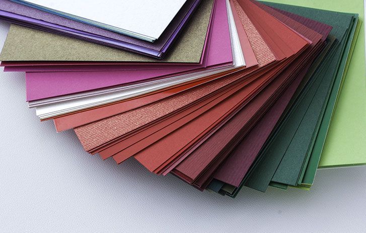
About Paper In a blog last year (March 9, 2023) I wrote about “Which paper?” Since that blog I came across an interesting archival copy of National Geographic Magazine (March 1997) on “The Magic of Paper” by Jon R. Luoma.(1) He added to my knowledge about paper, its origins and its lasting qualities, along with modern problems that paper production has raised. This blog is therefore a revision of my original blog on paper. Importance of Paper Luoma states, “On paper the lessons of history and the fire of human genius have blazed across space and time—the notes of Mozart, the words of Shakespeare, the sketches of Picasso, the wisdom of Gandhi. Words on paper changed the way people thought. Martin Luther went so far as to call printing ‘God’s highest and extremest act of grace.’” He goes on to note that paper and printing rescued Europe out of the Dark Ages, especially with Johannes Gutenberg’s invention of the printing press. (For a summary and pictorial history see Blog on “Typography: A History of Machines, March 12, 2023). Luoma says that “just 50 years after Johannes Gutenberg invented his printing press in the mid-15 th century, more than six million books had been published on law and science, politics and religion, exploration and poetry.” A third of a billion tons of paper are produced each year by paper producers across the world. Indeed, as of 1997, “in the U.S. alone a 170-billion-dollar industry makes enough paper each year for two billion books, 24 billion newspapers, and some 372 billion square feet of corrugated cardboard.” In modern day printing, a large part of using type correctly, persuasively and aesthetically pleasing depends upon the kind of paper used. You do not print a wedding invitation on any cheap copy paper that you might have at the office copier. You want to submit a resumé and want it to showcase your character and standards. The paper choice is important for this. You want a colorful, playful, shiny paper for a kid’s party. What paper should you use? While many have gone the route of digital printing and digital typography, for Facebook and other social media use, others have seen the continued need to choose the right paper at the right time for the right job. But with the plethora of papers available, which one(s) do I choose? Origins of Paper The invention of paper can be traced back to ancient China, where it was first developed (according to AI from ChatGPT) during the Han Dynasty (206 BC–220 AD). Tradition has it that centuries before Gutenberg, Ts’ai Lun created paper from hemp, tree bark, rags and fishnet in AD 105. Prior to this, various materials were used for writing, such as bamboo, silk, and animal skins. However, these materials were expensive and difficult to obtain, so the Chinese began experimenting with other materials. The earliest known paper was made from mulberry bark, hemp, and rags. The fibers were pounded into a pulp and then pressed and dried into sheets. This process allowed for the production of large quantities of paper at a much lower cost than other writing materials, making paper accessible to a wider range of people. Luoma notes that long before Gutenberg, “the Chinese invented movable type. They were the first to make paper money, toilet paper and paper books. It was forbidden even to step on a piece of paper with writing on it.” The art of washi, handmade paper, existed, and still does, among the households of many Japanese. Indeed, they have intermingled their faith and lives with paper. The writer and poet, Fu Hsien, noted this about fine paper — “Luxury but at a small price / Matter immaculate and pure in its nature / Embodied in beauty with elegance incarnate / Truly it pleases men of letters.” The knowledge of paper-making eventually spread to other parts of the world, including the Arab world and Europe. During the Middle Ages, paper mills were established throughout Europe, and paper became an important commodity for trade and commerce. In Gutenberg’s time, printers used paper made of hemp and linen rags, thus ensuring the survival of great works for hundreds of years. While nonacidic paper is used today in printing, in the 19 th century, fiber from trees was cemented together with lignin, which eventually oxidizes, turning the paper brown. This was enhanced by acid sizing added during the production process. This is why books and papers from that era are more and more difficult to find and preserve, and thus the modern need for digital storage and retrieval. Some Definitions About Paper Paper Sizes . The standard known U.S. size paper is 8.5 x 11 inches, in either Portrait or Landscape mode. Legal size is 8.5 x 14 inches, used for contracts within legal, real estate and accounting professions. Tabloid or ledger size is 11 x 17 inches, used in offices for diagrams and documentation requiring larger drawings, like architectural and CAD drawings. To many people worldwide, excluding North America and Canada, the most familiar paper size is A4 (a familiar 210 mm x 297 mm). It is commonly used for letters and correspondence in the UK and it is the standard paper size for most home printers. The A4 size paper measures 8.27 x 11.69 inches, only slightly larger than the close equivalent to U.S. letter size 8.5 x 11 inches. Most printers and copiers in this country are preset for letter sized paper. Paper Weight & Thickness. Paper weight and thickness reveal the sturdiness and often opaqueness of the stock, with weightier paper providing more durability than a thin weighted paper stock. Paper is measured in points, where one point equals .001 inch, so that 10 point paper is .01 inches thick, 30 point is .03 inches and so forth. But paper weight can also be measured in GSM (grammes per square meter), so that fine art papers are usually made in the range of 120 gsm to 850 gsm. Drawing papers are usually 130 gsm and the Snowdon Cartridge papers are 300 gsm. Thicker paper can withstand erasing and mark making. Such paper is ideal for printing processes including etching, silkscreen and offset lithography. Oriental papers tend to be lighter in weight, such as Japanese papers made with long fibers and great strength, often an artisan skill passed from generation to generation. Cover stocks are at the higher end of the weight spectrum and feel like thin cardboard. A ream of paper is 500 sheets, and office paper is usually sold in reams. Peter Giffen (2) notes that in the United States, the weight of paper stocks is usually done in pounds, which is the actual weight of 500 sheets of the “basis size” of the paper in question. Since the basis size may vary, comparing paper weights can be hard to do. For example, a 28-pound multipurpose paper is probably not the same weight or thickness as a 28-pound premium or cardstock paper. Standard copy paper is rated at 20 pounds and sometimes 24 or 28 pounds. I use 28 pound paper in my color printer for sharper images and no text see-through on the back of a sheet. Copiers use 20 pound paper as the cheapest stock for most office projects and memos and day to day use. Paper Brightness & Opacity . Brightness refers to the amount of light that reflects off a sheet of paper and opacity refers to whether one can see the writing on the other side of the sheet. One hundred percent opacity (100%) means that no light shines through and zero percent opacity (0%) is see-through tracing paper. Black text tends to stand out on most paper brightness levels, so text documents only need an ordinary level brightness in the 80s and low 90s when measured on a scale of 100. A colorful design or fine-art reproduction may require the highest level of brightness. Paper Types . There are generally five common paper types — matte, glossy, silk, bond and cardstock. Matte paper stock is generally used for text-heavy leaflets and flyers, with easy to read ink and sharp black and white contrasts. Glossy paper is used often for colorful flyers, leaflets, menus and other projects requiring sharp images. Such paper gives a high quality, professional appearance. Silk paper is soft to the touch and fills magazine pages, portfolios and other high quality printing. Bond paper is the durable traditional stationery paper for documents that you want to last a long time. Cardstock is used for business cards, booklets, leaflets and can stand extra wear and tear and constant use. Inkjet papers are specially designed to absorb the inks used in the printing process. Laser paper can withstand the heat (from the printer’s fuser) of laser printing. Photo paper can be matte or glossy and is used for printing photographs. Bond paper has a high content of cotton rags or cotton textile fibers in its composition. The name goes back to the late 19th century when such paper was used to print government bonds and other official documents. Bond paper today is often used for stationery, letterhead and drawing paper. The best archival grade paper(3) is made from 100 percent cotton which gives a strong, acid free material which lasts longest, and is the most resistant to discoloration and deterioration. The interweaving of the fibers gives paper its inherent strength, which is improved by the use of ‘size’, the paper being too absorbent on its own, is prone to disintegrating when too wet. Saunders Waterford, Somerset papers, Arches and some Fabriano papers, which are all 100 percent cotton, are sized to respond well to water based media. Japanese papers have a subtle beauty all of their own; generally very light weight they are made with long fibres and have great strength. “Acid-free” indicates the paper is made without rosin and alum sizing which would make the paper acidic. Acid-based paper is prone to fade over time and atmospheric conditions. Microscopic impurities on or in the paper can in time create little brown marks, called “foxing.” Specialty papers can be especially environmentally-friendly due to materials used or how fast they biodegrade. Recycled paper according to the ftc (Federal Trade Commission) is “a paper that only contains 100 percent post-consumer recovery fiber. If less that 100 percent the paper is called recycled-content paper.” Recycled paper can be made from pre-consumer materials, recovered from the leftovers in the manufacturing process, or post-consumer waste, gathered from used newspapers, for instance. Premium paper has all the top attributes of weight, coating, brightness, opacity and material, making them good for presentations and quality print jobs. Such paper is made from a blend of wood pulp and cotton (usually 75 percent and 25 percent) and has a luxurious feel and is made to last for archival projects. Premium paper is often used for resumés, portfolios, quality reports, business proposals, announcements and high-level presentations. They have great brightness and durable weight. Midori, or MD paper, is Japanese paper with whisper thin texture. It is lightweight and smooth, yet there is no bleed through for fountain pens. It can be used for notebooks, writing letters, or for calligraphy. Calirefontaine is French classic thick and opaque smooth, lined paper. Classica paper is designed and made in Italy, with a soft, almost fabric-like feel and is used for stationery sets. Problems With Paper Environmentalists have long claimed that the paper business denudes forests and pollutes air, land and water by poisons like dioxins as an industrial by product. The truth is, however, that less than 9 percent of the total timber harvest in the U.S. is pulpwood used for paper production. Old manufacturing methods of paper production leaked chemicals into nearby streams and rivers, chemicals that came from bleached pulp with chlorine, reacting to form organochlorines, which eventually work their way into the fatty tissues of fish and other creatures. Modern industrial methods of paper production use a series of tanks to close the water loop so that harmful chemical discharges into area streams is greatly reduced. Also, other bleaching methods are used to reduce organochlorines dramatically. Again, Peter Giffen is helpful here — “Sustainable papers come from carefully controlled forests that are replanted and renewed. They meet specific environmental standards, helping users support practices that better protect forests and the environment. Some papers boast an fsc certification. The Forest Stewardship Council is a widely respected not-for-profit organization that seeks to protect the world’s forests by monitoring and improving timber production. The fsc has worked with key players in the lumber industry to inspect and track timber and pulp through production chains, ensuring that woodlands are managed sustainably. Any paper products certified by the fsc are created with sustainable practices. While some businesses might be hesitant to use recycled paper since its texture and quality can differ slightly from virgin paper brands, fsc-certified products are virtually indistinguishable. Generally speaking, recycled paper costs more than unrecycled paper because there is more demand for the latter, and recycled paper costs more to process.” Hammermill Papers is an example of a modern paper making company seeking to tackle paper making problems. Back in 1898, five years before the Wright brothers took off at Kitty Hawk, three brothers from Germany founded the Hammermill Paper Company in Erie, Pennsylvania. As immigrant success stories go, the Behrend brothers rank right up there in the history of American business. Especially since, more than 120 years later, Hammermill paper is still being made in America. unlike imported papers, the paper mills that produce Hammermill are strategically located near sustainably-managed forests. That means shorter transportation distances, which lead to less fuel usage, reduced emissions, and a healthier planet. But the biggest benefit of being made in America is this: Hammermill paper helps to preserve American forests. This may sound counter-intuitive, but the claim is a sound one. First, our entire business model depends a sustainable supply of paper fiber from healthy forests. And second, 90 percent of Hammermill paper fiber is sourced from sustainably-managed, privately-owned forestland.(4) Which Paper Should I Use? While most offices order and use the cheapest 20-pound copy paper available for almost anything they print and copy, care should govern the choice and use of paper appropriate for the job or task at hand. Writing paper should be good quality stationary. Use premium paper. Write on white, ivory or cream letter paper. This will give the recipient the feeling of quality and that your letter is of importance to them. If you are not using headed paper, ensure your full address is written in the top right hand corner of the letter. Notepad paper can’t be too thick or too thin, since flimsy paper tears too easily and thick paper is too bulky. MD paper can be used if bulky space is an issue. Instead, opt for a happy medium with 70 pound opaque notepad paper that offers a smooth writing experience and enough stability to hold up to vigorous note-taking.(5) The choice of paper for typesetting and printing depends on several factors, including the printing method, the purpose of the printed material, and the desired aesthetic effect. Generally, papers that have a smooth, even surface and good opacity are considered best for typesetting, as they allow for crisp, clear text and images. If you are printing on both sides, front and back, you do not want the type to show through. I regularly use a 28 pound high quality bright paper for layout and printing work. PaperDirect is a good resource for all kinds of paper (https://www.paperdirect.com). Notes 1. Jon R. Luoma, The Magic of Paper in National Geographic Archive, March 1997. 2. Peter Giffen in https://www.officedepot.com/l/ideas-center/buying-guides/paper-buying-guide. 3. According to https://www.pegasusart.co.uk/types-of-art-paper.irs. 4. From the Hammermill website at https://www.hammermill.com/blog/hammermill-paper-is-made-and-remade-and-remade-in-america. 5. https://www.psprint.com/resources/notepad-printing-techniques/
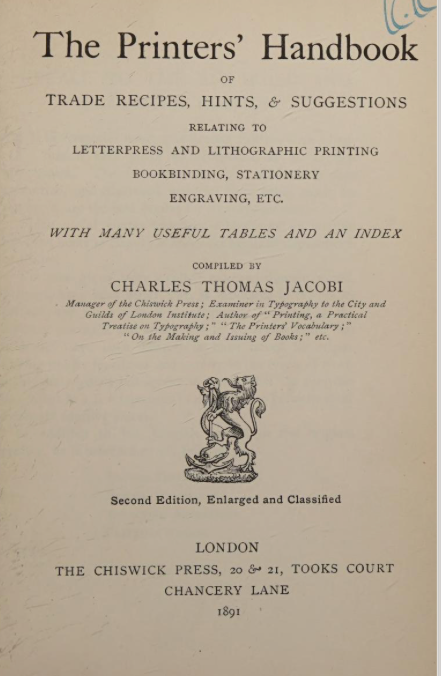
Printers Maxims & Other Notes Printers and typesetters can gain much wisdom from older printers. The Printers’ Handbook of Trade Recipes, Hints & Suggestions Relating to Letterpress and Lithographic Printing, Bookbinding, Stationery, Engraving, Etc. , compiled by Charles Thomas Jacobi, London, 1891, gives what is called “Maxims for Printers.” These maxims and many others have guided the printing trade for many years. They distill the wisdom of centuries of printing and typography. We would do well to heed such advice. 1. It is better to remain idle than to work at a loss. 2. Genius is as rare in printing as in any other art. 3. Legitimate competition is a sign of life and health. 4. Do your work carefully, striving for constant improvement. 5. Follow copy, provided it is good, and never copy anything bad. 6. You cannot be a successful printer if the imprint of care and study is not upon brain and hands. 7. Preserve all specimens of good work that come into your possession, and spend your leisure time in their study. 8. Unless an apprentice is possessed of an ambition and determination to excel, the chances are that he will always be but a poor workman. 9. Skill in business, a well-earned reputation for uniformly superior work, a good financial credit, promptness, honorable and liberal dealing, correct and steady personal and business habits, are absolutely necessary concomitants of success. 10. No matter how good a printer you are, you will learn something every day; and in every job you do for a customer, study how you can improve it next time. Never let a poor or carelessly executed job go out of your office, no matter even if, by mistake in “estimating,” or for any other reason, you may lose money on this particular one. 11. Study the work of first-class printers. A skilled workman has expended time, thought, and labor in its production. 12. It is not the grace or beauty of a single line that produces the result sought. The specimen must be judged as a whole. 13. Never curve a line where it would look better straight. 14. Do not crowd a job to put in a flourish or ornament. 15. Elaborate borders can only be used effectively by first-class workmen. 16. A plain rule border, with a neat corner, is more effective than a display border on a small card. 17. Ornament has to be kept strictly within the stern chasteness of taste, and permits of no extravagance of detail. 18. Ornament should always be subservient to its proper use. Any superfluity or preponderance destroys the proper effect. 19. Better do a good, plain job in black ink and one style of type, than an outrageous combination of fantastic ornaments in the glowing hues of the rainbow. 20. The use of ornaments requires a cultivated taste. They were intended to “light up,” not smother; to give an “airy grace,” not detract; to do away with “monotony,” not make a dreary waste. Color Blindness The land, especially during the holiday season, is flooded with abominations of tint and taste, with miserable chromos and calendars that are a disgrace to the art. When will craftsmen learn to avoid the delusions and pitfalls of color, and assert the strict taste embodied in black and white? Zebra-striped and rainbow-illuminated monstrosities will ever be a plague to the inventor, and are worthy only of some demented members of the paste-brush brigade. Hints on Composition Understand your take fully before leaving the foreman or copy hook. Time spent in this way is profitably invested. At least read through the outlines of the job. If pamphlet or book-work, the reading of the first page or two will be sufficient. Determine upon display lines. Spelling, style of punctuation, capitalizing and paragraphs, should be according to usage of establishment. If possible, absorb the subject of your take; it will render work more engaging. The Origin & Use of Italic The form of Roman now known as Italic was originally called Aldine. The first volume printed in this character had the capitals with their stems upright like those of the current round hand. These first editions were the works of Virgil, printed by Aldus Pius Manutius, in 1512, and it is known that this celebrated printer made use of a manuscript text entirely copied by Francesco Petrarca. Thus, it is said, that Manutius desiring to pay public and reverent homage to the author of the Canzoni, appropriately wished a hanging character cut in imitation of his writing, entrusting the design and the cutting to a skilled artist, one Francesco de Bologna. But the fashion of these editions in cursive italic type lasted only a short time, having been imitated by foreign printers in a careless and illegible manner. The cursive character was at that time known both in Italy and outside of the country under the name of Aldine, but later the title of cursive was given to it from the writing of the Roman Chancellery, called cursiveti seu cancellarii ; a title which in Italy has superseded every other. Other information on Italics can be found in Robert Bringhurst, The Elements of Typographic Style — “Early italic fonts had only modest slope and were designed to be used with upright roman capitals. There are some beautiful fifteenth-century manuscript italics with no slope whatsoever, and some excellent typographic versions, old and new, that slope as little as 2°or 3°. Yet others slope as much as 20°. Italic and roman lived quite separate lives until the middle of the sixteenth century. Before that date, books were set in either roman or italic, but not in both. In the late Renaissance, typographers began to use the two for different features in the same book. Typically, roman was used for the main text and italic for the preface, headnotes, sidenotes and for verse or block quotations. The custom of combining italic and roman in thesame line, using italic to emphasize individual words and mark classes of information, developed late in the sixteenth century and flowered in the seventeenth.” (Robert Bringhurst, The Elements of Typographic Style (Hartley & Marks, 1992 edition, 54) Bringhurst goes on to comment on font use — "Don't use a font you don't need. The marriage of type and text requires courtesy to the in-laws, but it does not mean that all of them ought to move in, nor even that all must come to visit. Boldface roman type did not exist until the nineteenth century, and bold italic is even more recent.Generations of good typographers were quite content without such variations. Font manufacturers nevertheless now often sell these extra weights as part of a basic package, thereby encouraging typographers - beginners especially - to use bold roman and italic whether they need them or not." (Bringhurst, 52) “Some of what a typographer must set, like some of what any musician must play, is simply passage work. Even an edition of Plato or Shakespeare will contain a certain amount of routine text: page numbers,scene numbers, textual notes, the copyright claim, the publisher's name and address, and the hyperbole onthe jacket, not to mention the passage work or background writing that is implicit in the text itself. Butjust as a good musician can make a heart-wrenching ballad from a few banal words and a trivial tune, so thetypographer can make poignant and lovely typography from bibliographical paraphernalia and textual chaff.The ability to do so rests on respect for the text as a whole, and on respect for the letters themselves. Perhaps the rule should read: Give full typographical attention especially to incidental details.” (Robert Bringhurst, 24)
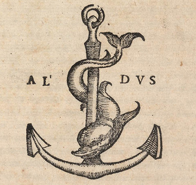
About Printers’ Marks — Highlighting Crosses Printers’ Marks are symbols or logos that have been used as trademarks by early printers, starting in the fifteenth century. Before the introduction of copyrights, printers’ marks legitimized a printer’s work. Copyright legislation would not be introduced until the eighteenth century. Such marks usually appeared on the last page of a printed work. The first known mark can be found on the Mainz Psalter, produced by Johann Fust and Peter Schoeffer in 1457 (See Example below). This mark depicted two shields bearing a saltire, a diagonal cross and a chevron surrounded by three stars. At the outset these were marks of the printer, but the practice was gradually adopted by publishers. In early works a statement at the end listed the date of completion and the location. Sometimes the name of the printer or scribe or their initials were included. In printing and typography this is called a colophon , derived from the Greek word κολοφών, meaning summit, or finishing touch. The printer’s mark was added and gradually moved to the title page of the book. The earliest marks were simple designs produced by using a woodcut stamp. Maggie Patton in her excellent introduction to printers’ marks notes that “the design of a printer’s mark used visual puns, wordplay or sometimes a rebus, a puzzle combining illustrations and letters to depict a motto or printer’s initials. Sacred symbols, the cross and the orb, real and mythical animals, heraldic symbols, and scientific instruments were used in thousands of combinations. The sixteenth century was the highpoint for printers’ marks, when lavish illustrations incorporating a printer’s mark decorated title pages. Many famous images and symbols originate from printers’ marks. The design used by Venetian printer Aldus Manutius depicts a dolphin wrapped around an anchor. The printer’s mark used by French printer Robert Estienne shows a man standing by an olive tree, symbolising the tree of knowledge. Christophe Plantin, in Antwerp, used a pair of compasses held by a hand extending from a bank of clouds, the compass points signifying labour and constancy.” [1] An extensive work on printers’ marks written by William Roberts in 1893 ( Printers’ Marks: A Chapter in the History of Typography ) showcases a number of printers through the centuries and their trademarks. His work has been reproduced by Project Gutenberg as an eBook.[2] Printers’ Marks: The Crosses There is an extensive use of the symbol of a cross on many of the earliest printers’ marks. In researching and digitally reproducing these marks, as a typographer and theologian, I find Roberts’ discussion of this phase of printers’ marks unfortunate and demeaning. He says that “there are many points which will forever remain in the region of doubt and obscurity. Tradition is proverbially difficult to eradicate; and all the glamour which surrounds the history of the Cross, and which found expression in, among other popular books, the Legenda Aurea, maintained all its pristine force and attractiveness down to the end of the sixteenth century. The invention of printing and the gradual enlightenment of mankind did much in reducing these legends into their proper place.” [3] He goes on to question the marks with these words — “Why at the extreme top of the cross is the lateral line formed into a sort of triangular four? Why, without this inexplicable sign, has the cross a number of cyphers, two, or even three, cross-bars? Why should the tail of the cypher 4 itself be traversed by one or sometimes two perpendicular bars which themselves would appear to form another cross of another kind? Why, among the ornamental accessories, do certain species of stars form several crosses, entangled or isolated? Why, at the base of the cross is the V duplicated?" All these are problems which it would be exceedingly difficult to solve with satisfaction.” [4] In my own study and exploration of these cross marks, what I have found is that the symbolism of the cross at the top with a globe and initials at the bottom indicated a humble submission to the Lordship of Jesus Christ over the earth and its inhabitants, inclusive of the printers themselves. Many of these symbols were crafted by religious men who, instead of capitulating to the times, wanted to express their faith stance for all to see. I have attached below a carefully crafted redrawing of many of these cross printers’ marks, made available by CARE Typography as a typeface. (See Below) Thus, the cross mark, as Roberts has to point out, is “a very striking proof of what M. Delalain calls "la persistance de la croix." It has appeared in all forms and in almost every conceivable shape. Its presence may be taken as indicating a deference and a submission to, as well as a respect for, the Christian religion, and M. Delalain is of the opinion that the sign "eu pour origine l'affliation à une confrérie religieuse." [5] The earliest printer’s mark by Fust and Schoeffer in 1457 indicated a diagonal cross. It was placed as a colophon at the end of the Psalter printing, the second work of Gutenberg. The Somachi Fathers operated a press, being a Catholic Order founded for men in Italy in the sixteenth century. Providing staff for boys’ homes and serving 95 parishes, as well as other ministries, their printer’s mark signaled a devotion to the Cross. John Siberch (1476–1554) was the first Cambridge printer and an associate of Erasmus. He had links with some of the key figures in North European printing and bookselling and, in turn, formed connections with leading theologians and scholars like Erasmus. Wikipedia notes that Siberch knew “the authors, translators and dedicatees who comprised many of the major contemporary figures of church, state and academia, including bishops John Fisher of Rochester and Nicholas West of Ely, Richard Pace, Secretary of State to Henry VIII, the royal physician Thomas Linacre and, above all, the great humanist scholar Desiderius Erasmus and his circle, while the books touched upon significant issues of the day, such as religious reform and the new humanist learning.” [6] The St Alban’s Press was the third printing press established in England in 1479 as part of the Benedictine Monastery of St Albans, clearly a religious establishment that promoted the Cross as central to their printing. Erhart Oglin was a German printer focusing on printing music. In 1512 he was the first printer in Germany to produce “a printed sheet music, the Deutsche Liederbuch , which contains 43 German sacred and secular songs as well as six Latin songs.” [7] Juan Rosenbach was a Spanish printer whose printer’s mark can be seen in the Library of Congress today. The evident Cross stands over a sacred “h” perhaps referencing ancient Horus. [8] Bernardino Giolito de Ferrari, known as Stagnino, used at least three printers’ marks with variations — “The device employed most often is reproduced here from his edition of the Roman missal, printed April 7, 1511: the letter B is enclosed within a heart, surmounted by a cross; the staff of the cross pierces the letter S. While the letters B and S presumably identify the printer, an alternate device shows the figure of St. Bernardino of Siena (1380-1444), an Observant Franciscan friar, with similar initials. Stagnino's mark represented the saint with the IS monogram and three cast-off miters, symbolizing the three bishoprics he rejected in order to continue preaching his popular sermons against Catholic heresy and immorality.” [9] Indeed, a profoundly religious use of the mark. The mark of Hercules Nani, with the Cross, above three hills or mountains, may imply meditation and heavenly communion — “The Mountains of Myrrh and the Hills of Frankincense, to which the writer of the Song of Solomon says he will retreat, are ideally the same as those ‘silver mountains’ over which, according to Sir Walter Raleigh, ‘My soul, like quiet palmer/ Travelleth towards the land of heaven.’ Among the Jews the three-peaked Mount Olivet was esteemed to be holy, and accounted to be the residence of the Deity.” [10] The point here is that this printer’s mark indicates much more than a mere cultural convenience or capitulation to the period. Modern uses of printers’ marks continue, with the examples below of the Banner of Truth Trust, Penguin Publishing House and New North Press. The Banner printer’s mark has a deeply religious meaning and message. Often these marks are on the copyright or title page of the book today. They may also adorn the cover of such books. CARE Typography has meticulously digitized these marks and made them available as a typeface for your use. They are public domain images, free to use with the attribution — Digitized by CARE Typography, 2024. Notes [1] Maggie Patton, “The Printer’s Mark: That Curious Penguin on the Spine of Your Favorite Paperback Isn’t There Just for Decoration,” Openbook , Autumn 2022. [2] William Roberts, The Project Gutenberg Ebook of Printers’ Marks , June 1, 2008, Ebook #25663, from inages made available by The Internet Archive. [3] Roberts, pp. 24–26 [4] Ibid. [5] “the persistence of the cross;” “originated from affiliation with a religious brotherhood” quoted by Roberts, 24. [6] https://en.wikipedia.org/wiki/John_Siberch [7] https://de.wikipedia.org/wiki/Erhart_Öglin [8] Harold Bayley, The Lost Language of Symbolism: An Inquiry Into the Origin of Certain Letters. Words, Names, Fairy Tales, Folklore, Etc. , 1912, p. 161, from Internet Archive Books. [9] Library Quarterly Information, Community, Policy , Vol. 83, No 1, pp. 39–41, The University of Chicago, 2023. [10] Bayley, Lost Language of Symbolism , 35.

CARE Typography is a Christian based type and design service.
